Jack Daniel’s (Redesigned)

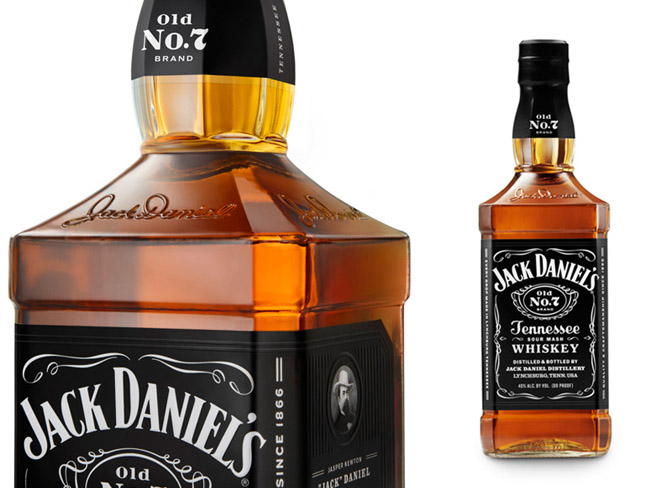

Designed by Cue, United States.
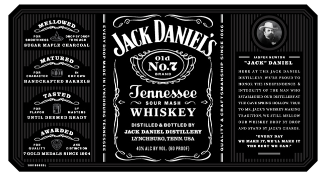
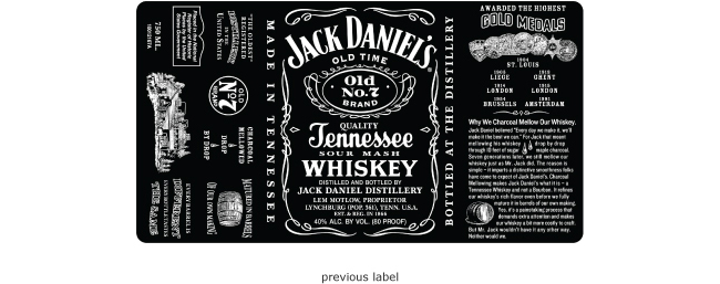
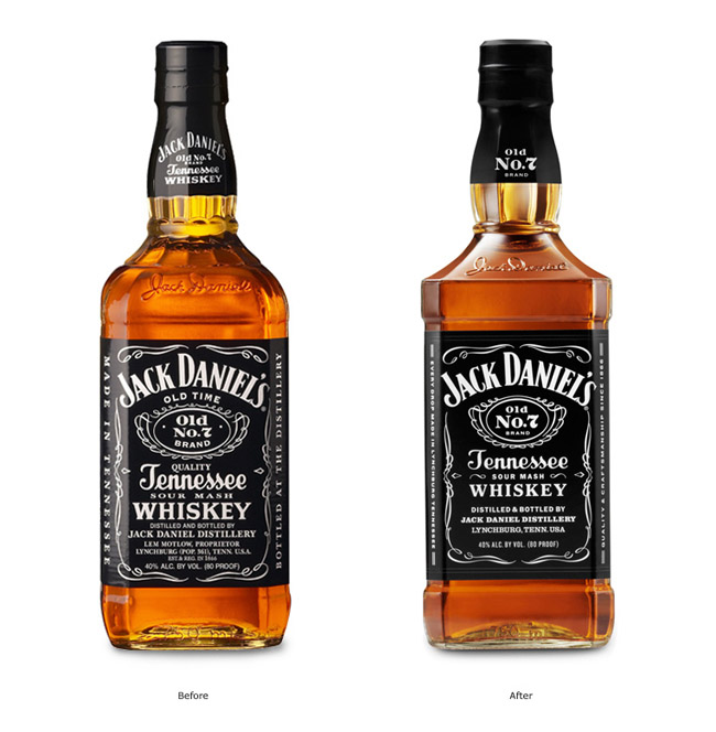
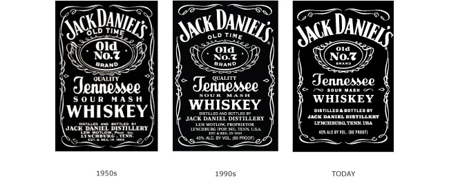
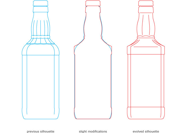
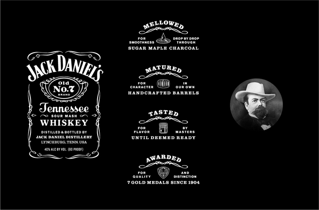
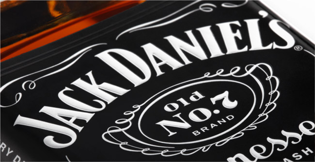
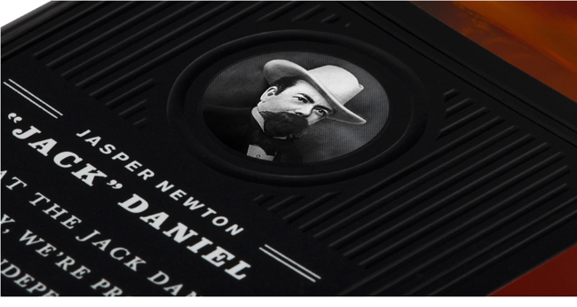
The challenge was to honor the brand’s legendary status while reinforcing its meaning in the world. New packaging uses language, imagery and iconography to tell the Jack Daniel’s story in a way that is as well crafted as the whiskey itself. We evaluated the equity of the brand elements, then edited carefully to clarify their meaning. The result is packaging that exudes quality and relevance, and is unmistakably Jack Daniel’s. The refined identity solidifies the brand’s position as a cultural icon.
Materials Glass, Ceramic
Year 2011
Country United States
Region North America
Project type Commissioned Work