Yellow Plus Blue

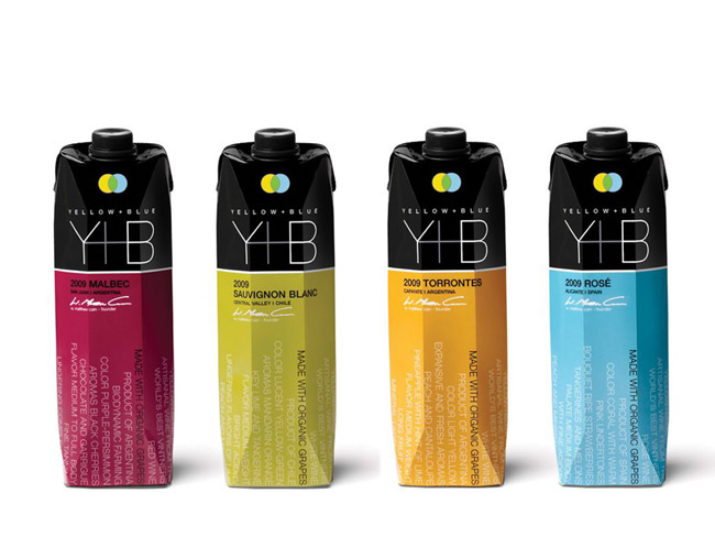

Designed by Spear Design Group, New York, United States.
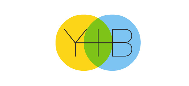
Spear collaborated with multi-award winning PR agency Maloney&Fox to re-brand this fast growing organic wine company. Yellow+Blue = Green. The two interlocking circles represent: The elements sun, water and earth. Unified the letterforms become the Y+B mark. We developed packaging that tells the Y+B story. A quality wine made by artisans and signed by the Founder & President. Wine descriptors and factoids wrap around the eco-friendly carton. The type grows up vertically to create visual impact. Drink Well, Do Good
Year 2011
Country United States
Region North America
Project type Commissioned Work