Rhoost

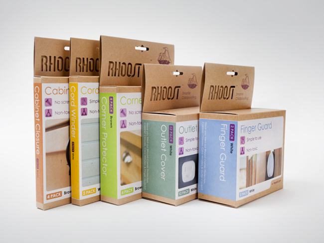
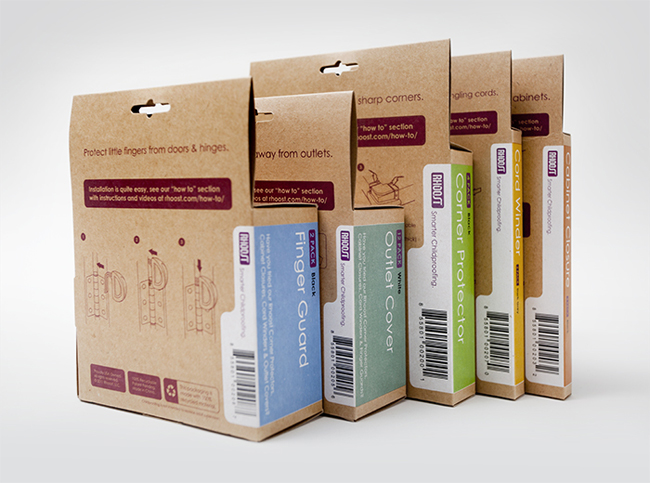
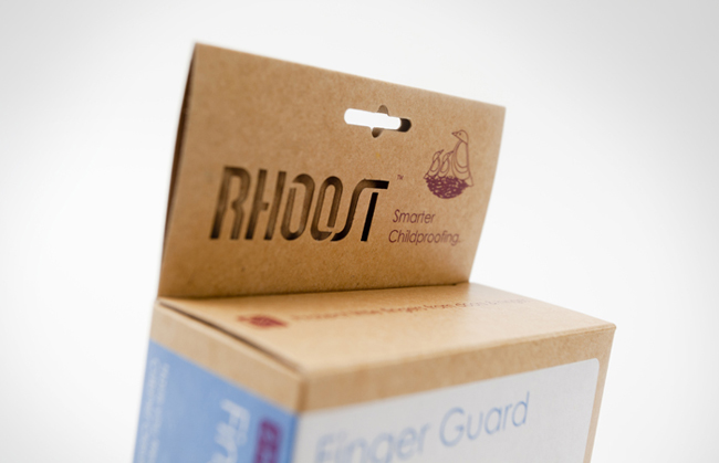
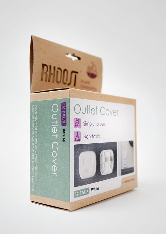
Designed by Alphabet Arm, United States.
Rhoost has set themselves apart from their industry by using sustainable materials and designing products that parents aren’t embarrassed to use in their home. This is the second evolution of their packaging that Alphabet Arm has developed and the consistent feedback from buyers, distributors and parents has been overwhelmingly positive. We wanted to retain the minimal, boutique-friendly feel we had previously achieved, while incorporating a full color product image on the front of the packaging, which large retailers had requested. We achieved this by screen-printing a flood of white and their much loved purple before printing with four color process. The end result feels both on brand and updated. Watch those corners!