Minos Foods / Sweet Brioche


In its effort to appeal to consumers with vegetarian dietary habits, Minos is introducing an innovative approach to the packaging design of its new baked goods. Three different colors represent three distinct flavors:
Yellow for the raisin bread
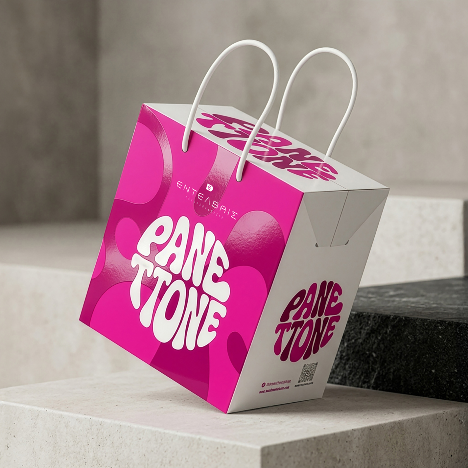
Magenta for the cranberry brioche
Olive green for the olive bread
These color choices define the flavor identity of each product and enhance shelf recognition. Additionally, 50% of the packaging is visually transparent, allowing consumers to have direct visual contact with the product, fostering a stronger connection on a more immediate level.
At the same time, the clear labeling of the product as “Lenten” and “Vegan” strengthens consumer trust and confidence. With this approach, Minos Foods is not only targeting vegans or those following a Lenten diet but also any consumer seeking healthy and high-quality choices for their weekly nutrition. The design direction we followed reflects Minos’ commitment to innovation and transparency—key pillars in its strategy for growth and success in the modern market.