

















Carolice

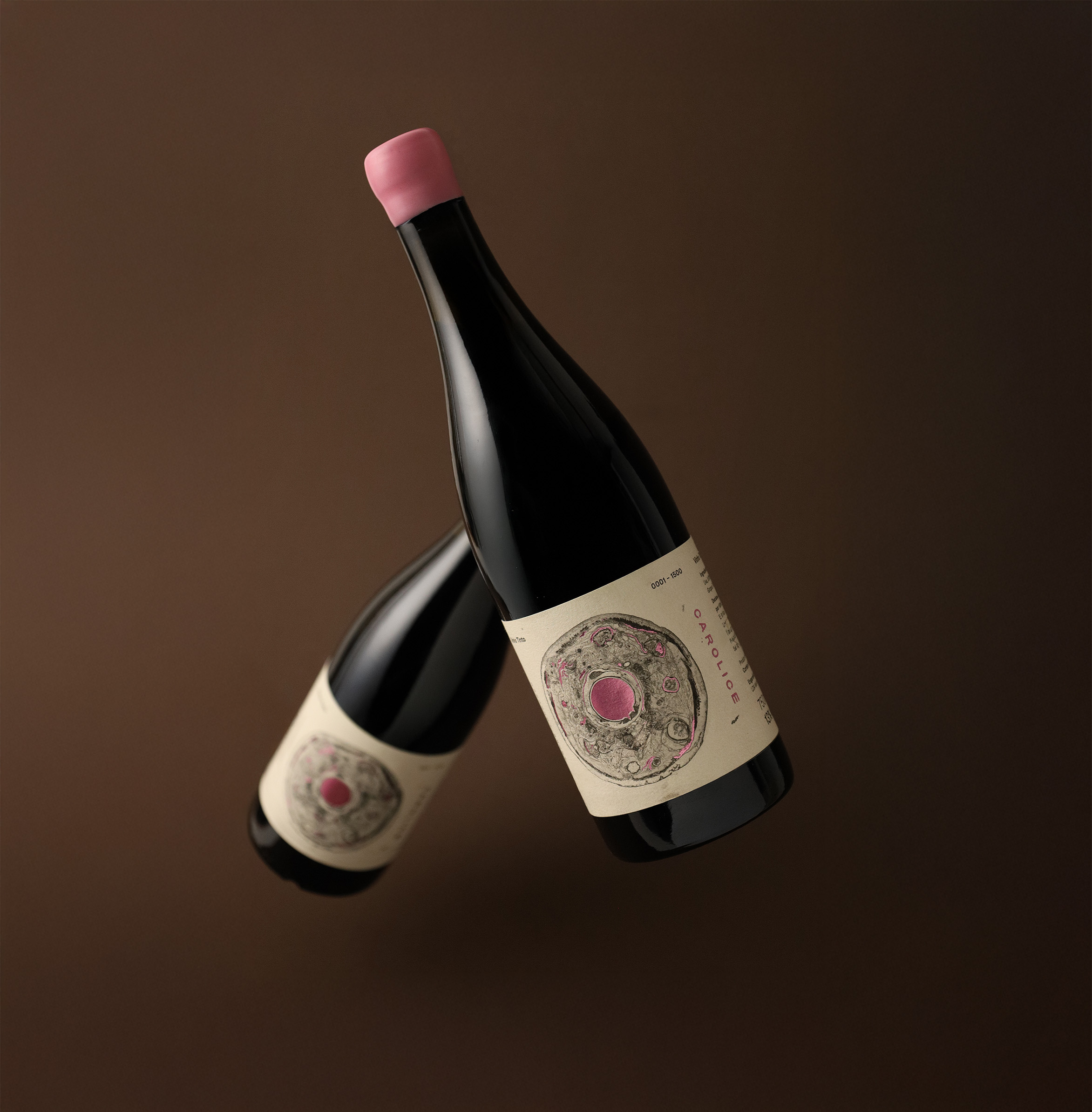
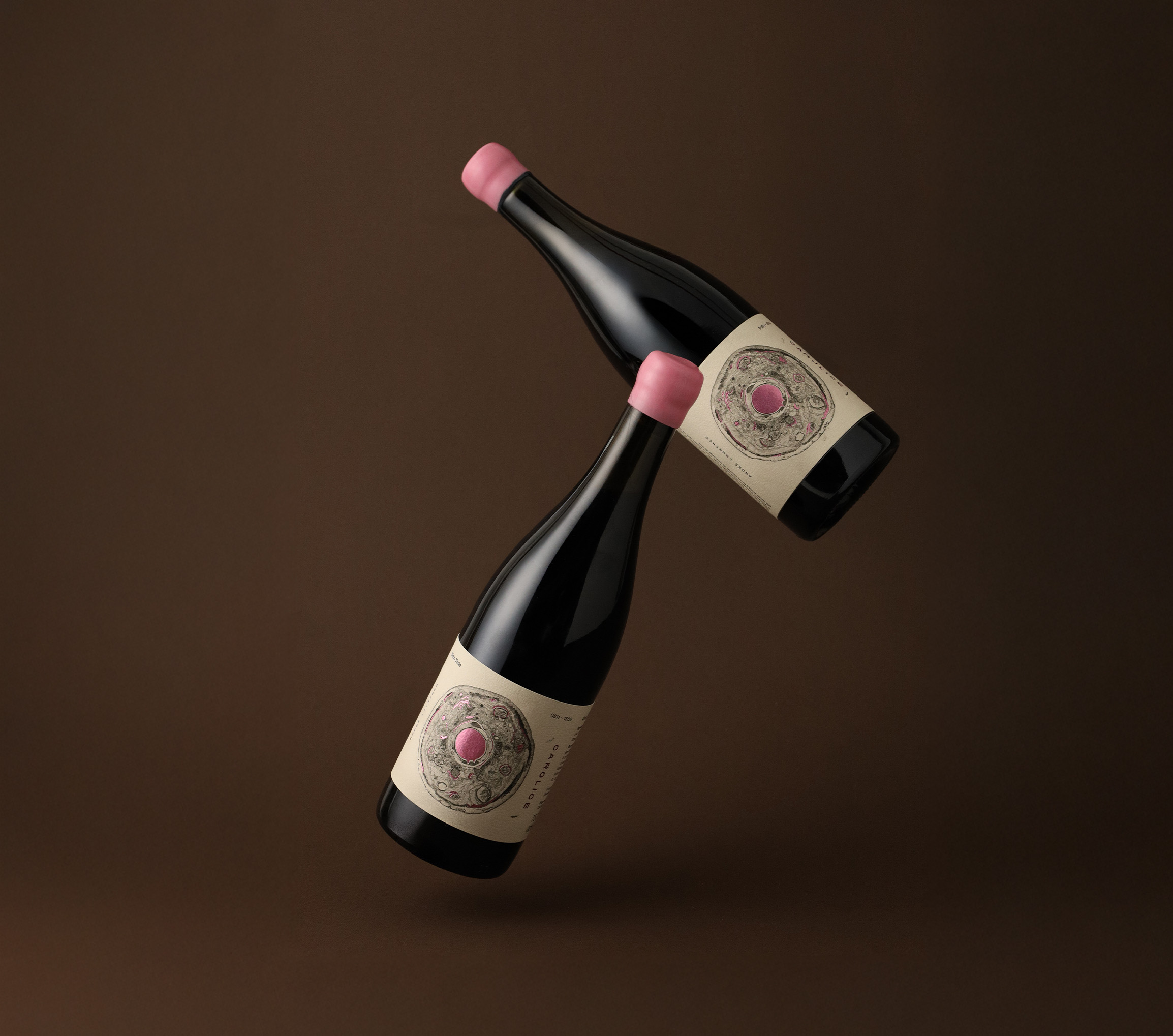
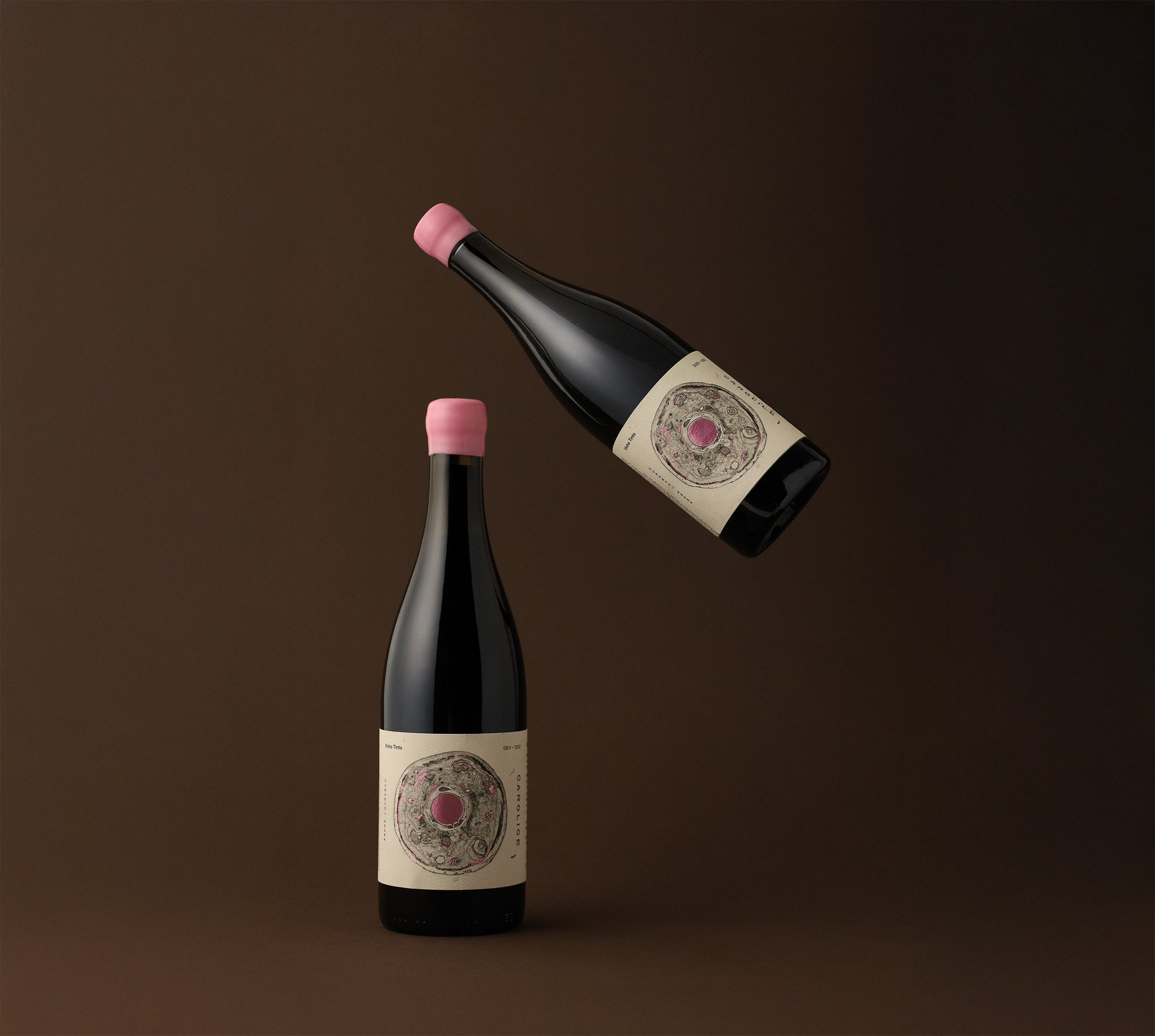
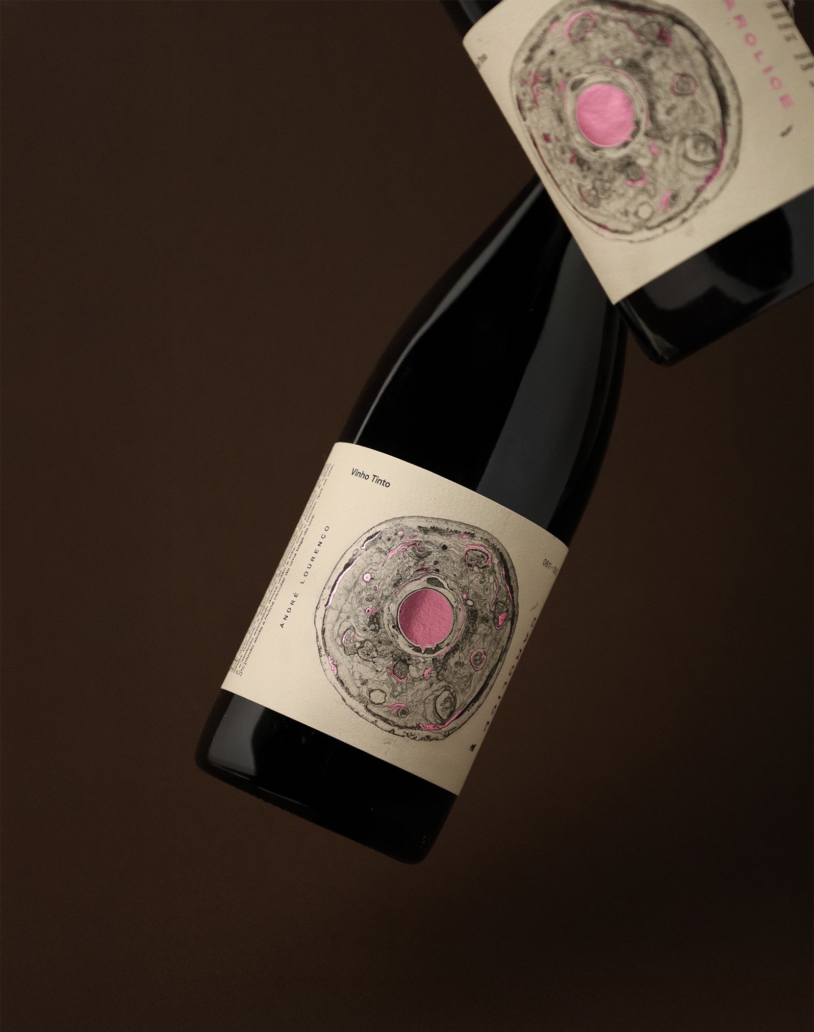
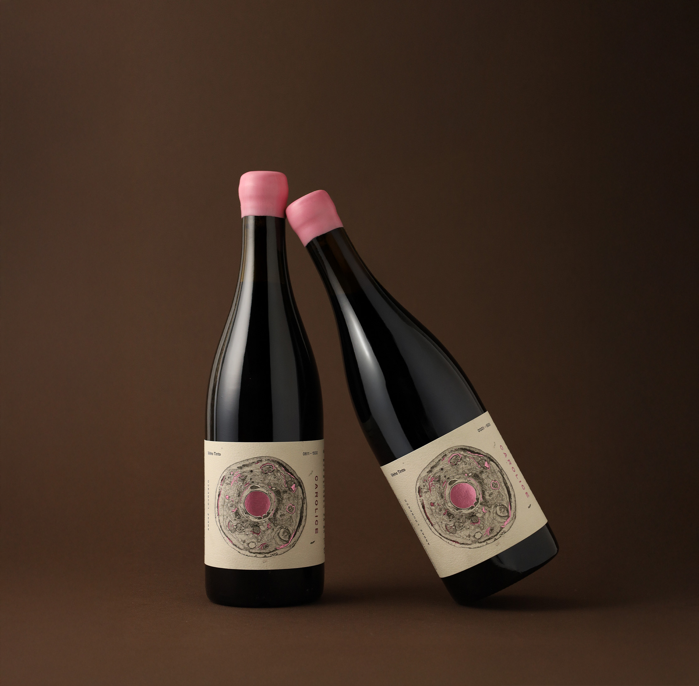
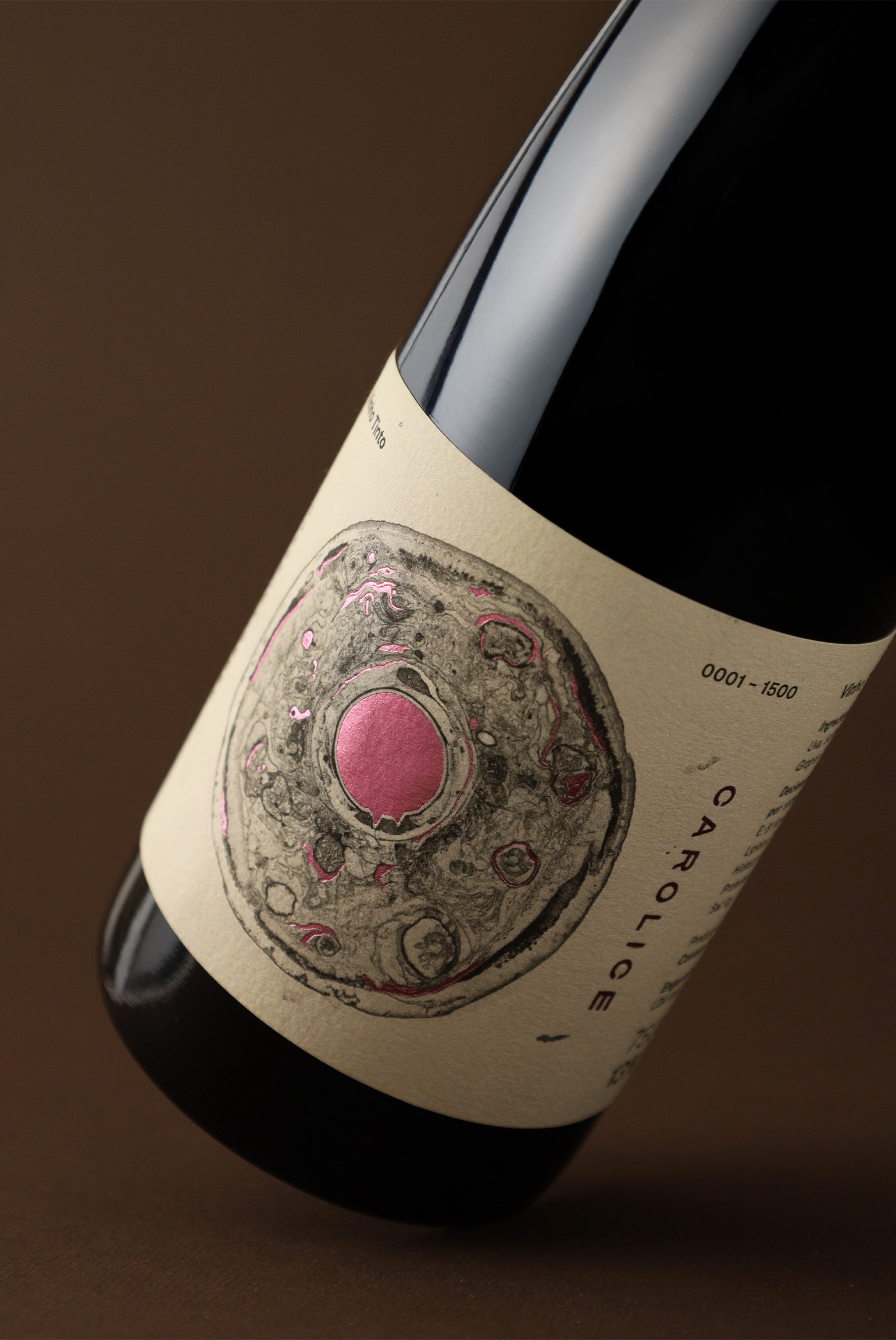
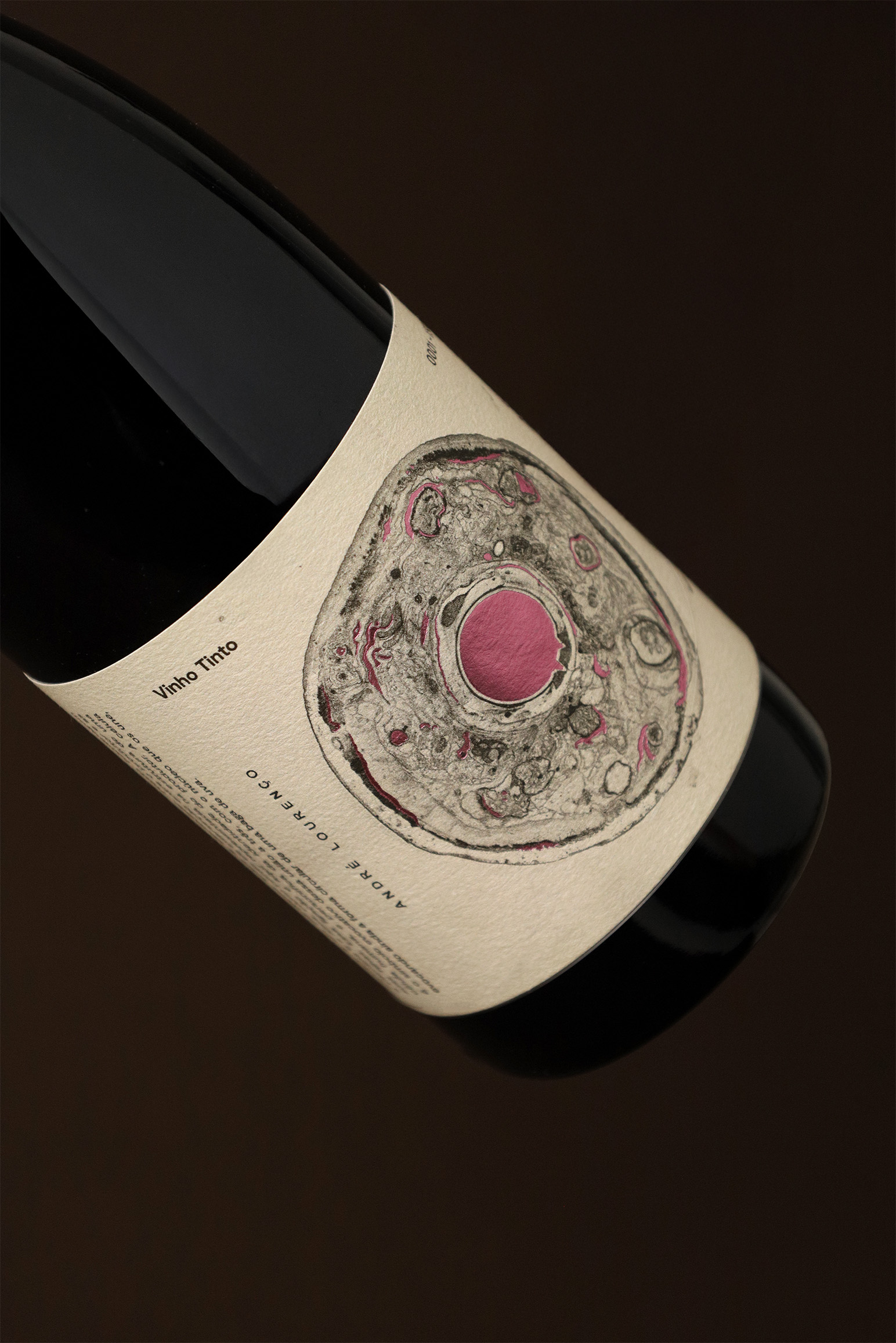
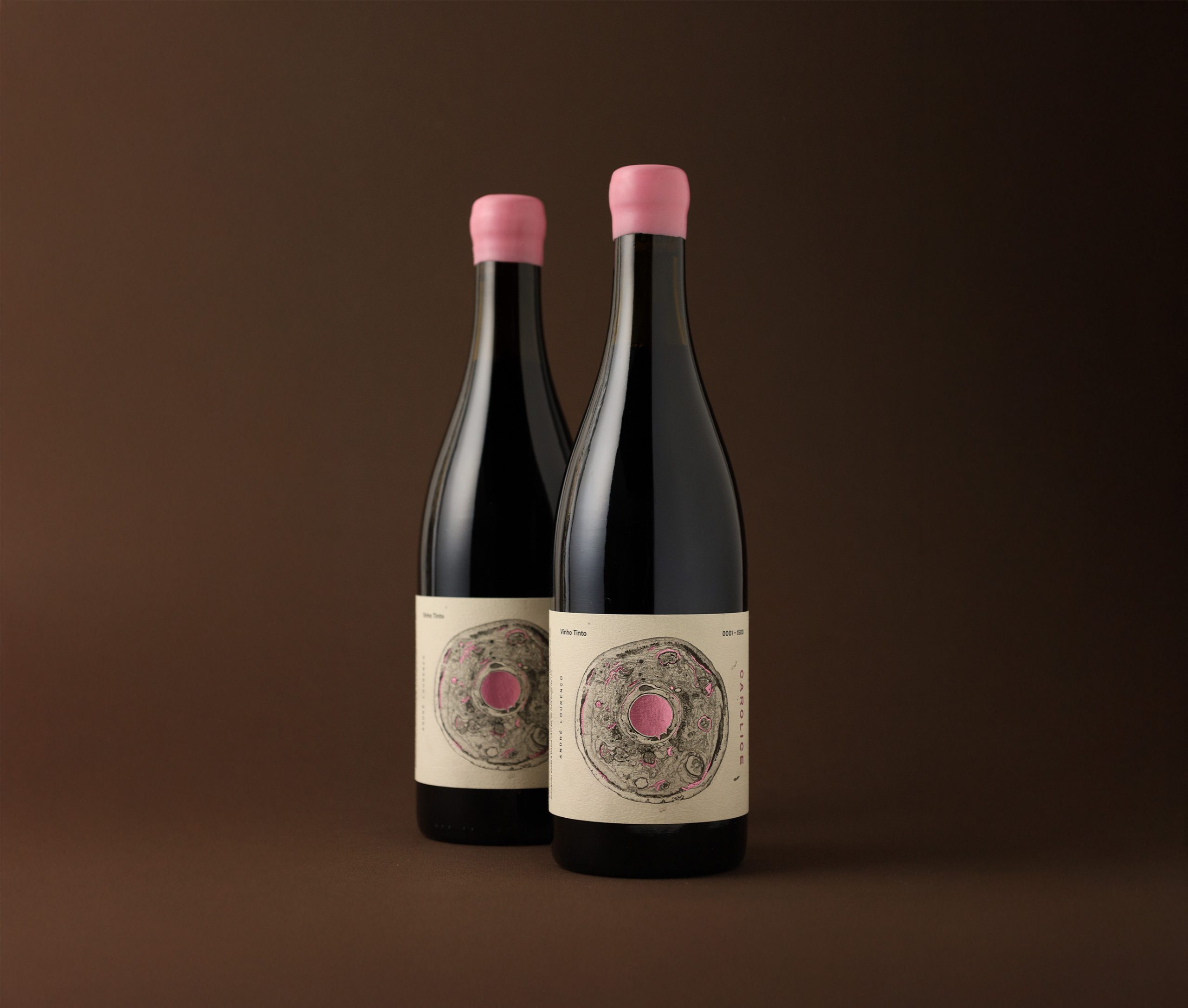


Carolice is a project developed for Gardunha Sul, exploring the expression of identity. It draws inspiration from the morphology of the human cell as both a creative starting point and symbolic analogy. The label represents the meeting point between the producer and his daughters — a connection symbolized through the structure of a human cell, paying tribute to what defines us and binds us together.
Year 2025
Country Portugal
Region Europe
Project type Conceptual Design
Client Gardunha Sul


