

















Black River Wine


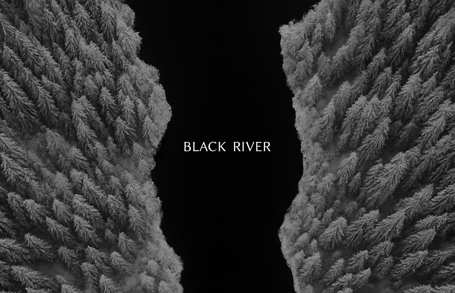
Task The goal was to create a wine label that would stand out on the shelf while reflecting the sophistication, cultural depth, and refined aesthetics associated with Japanese winemaking. The design needed to convey a sense of craftsmanship, minimalism, and quiet luxury — appealing to both wine connoisseurs and design-conscious consumers.
Solution The final concept draws inspiration from the Japanese philosophy of wabi-sabi, finding beauty in simplicity and imperfection. The torn paper motif becomes the central visual element, symbolizing the discovery of hidden layers — much like the experience of tasting fine wine, where each sip reveals new complexity. The silhouette in the tear evokes the image of a river flowing between two landscapes, a poetic metaphor for the “Black River” name.
Minimalist typography, balanced composition, and the tactile texture of the paper work together to create a premium, contemplative feel. The design invites the consumer not just to purchase wine, but to engage in a quiet moment of appreciation — an experience that mirrors the elegance and precision of Japanese craftsmanship.
<span data-mce-type="bookmark" style="display: inline-block; width: 0px; overflow: hidden; line-height: 0;" class="mce_SELRES_start"> </span>

