T.A.B. packaging/identity

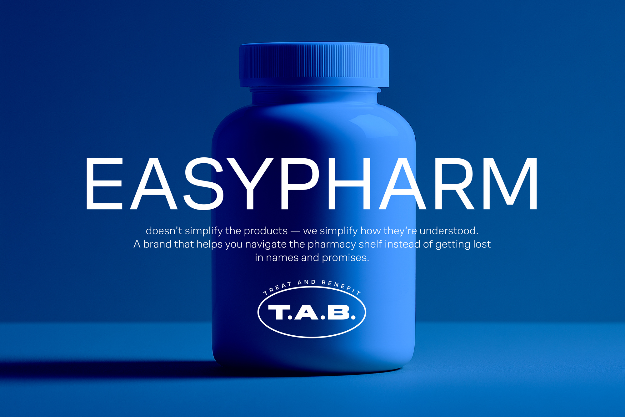
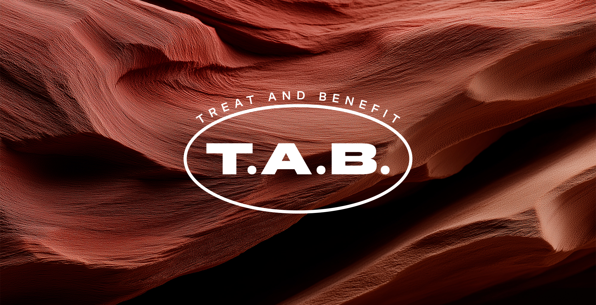
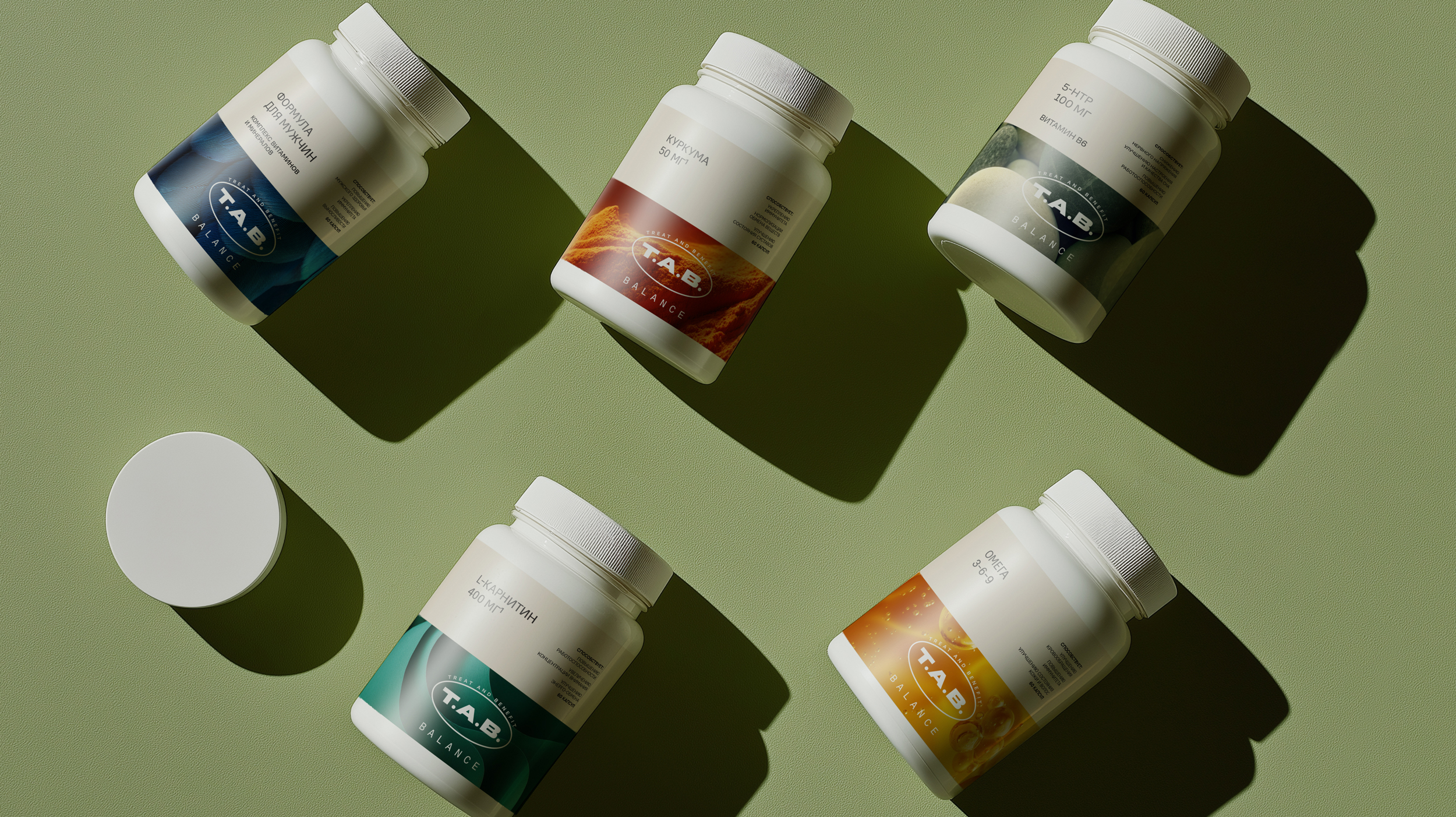





T.A.B. — Brand Creation Magnit Pharmacy launched its own brand that includes vitamins, dietary supplements, and pharmaceutical products.
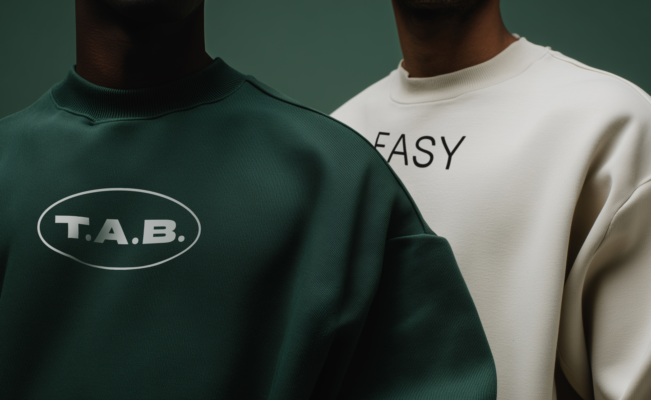
Its positioning reflects the core idea: EASYPHARM.
T.A.B. — honest navigation in the world of pharmacies. I created a visual system and packaging design that helps people navigate without unnecessary complexity.
Everything difficult — from formulation to certification — has already been done by the brand. My task was to convey this through design: clear, simple, and confident. On the pharmacy shelf, there are too many overloaded packages.
T.A.B. simplifies choice — in both form and meaning.
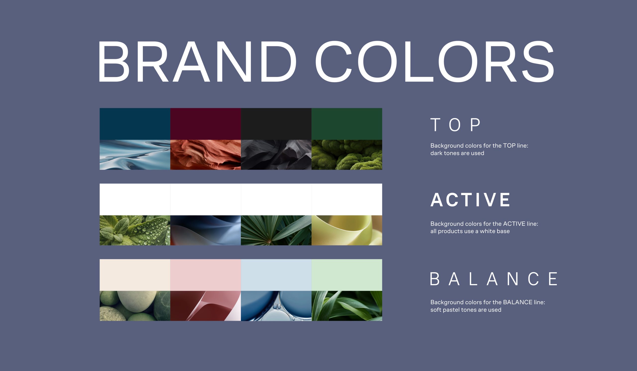
The brand consists of three segments:
TOP — premium-level products
ACTIVE — targeted solutions for specific needs
BALANCE — essential support
Color coding helps differentiate the lines while maintaining a unified design structure.