

















Ayuza Wellness


Project Description – Ayuza Wellness
Client: Ayuza Wellness Design Studio: AbbyDraw Design Country: India Packaging Contents: Herbal powders (Amla, Hibiscus, Bhringraj — and other botanical powders) Packaging Substrate / Materials: Matte laminated pouches (flexible film), with selective gloss/spot-UV accents Printing Process: Offset, Screen, and Spot UV for highlights
Project Overview
Ayuza Wellness—an emerging herbal-wellness brand—required a packaging identity that communicates purity, provenance, and modern trustworthiness. The redesign transforms everyday herbal powders into a visually rich, shelf-ready brand story that connects urban consumers with farm origins and Ayurvedic tradition.
The packaging series uses vibrant botanical illustrations, farm landscapes and a warm, natural color system to celebrate the ingredients and the people behind them. The result is an approachable, premium brand language that feels both contemporary and rooted.
Design Concept
“Botanical Origins, Modern Clarity.”
We focused on clear product storytelling through bold illustrative scenes, ingredient-first compositions, and a friendly human touch (illustrated farmer characters). The aim: let the ingredients and their origin lead the conversation—no clutter, just honest, attractive visuals.
Packaging Design Elements Common System
Structure: Stand-up pouches with a clean front panel hierarchy — illustration/hero ingredient, product name, short benefit copy, and icons.
Typography: Modern sans-serif for product names and a hand-lettered accent for callouts (gives an artisanal warmth).
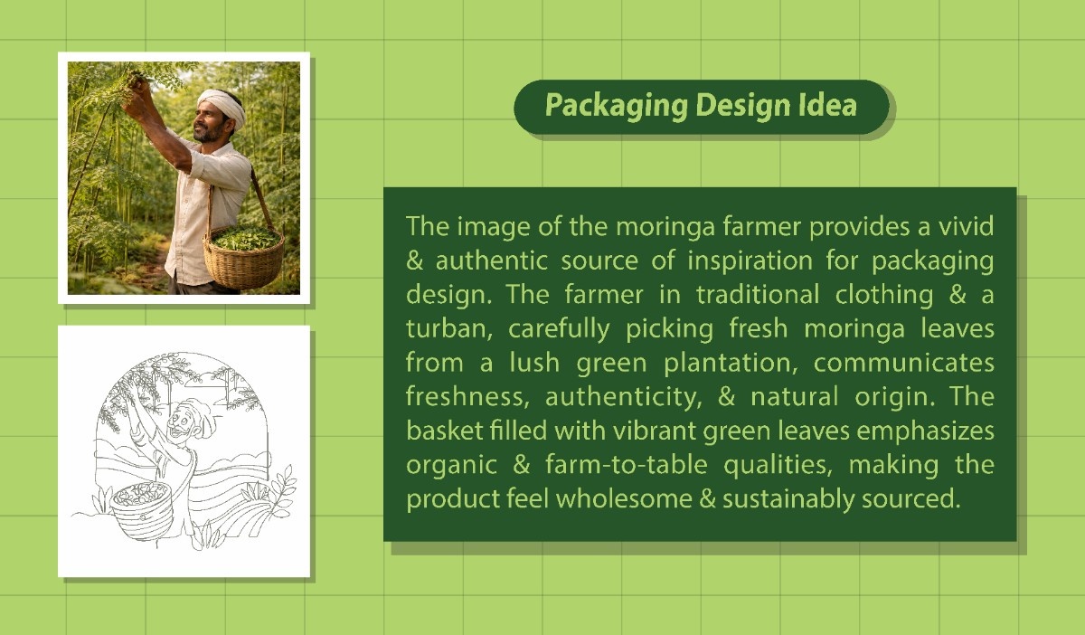
Illustration Style: Flat, vector-style landscapes and a central farmer/harvest character — combining contemporary graphics with cultural cues.
Color Strategy: Product-specific palettes (deep amla green, hibiscus magenta, bhringraj forest green) for instant SKU identification.
Finishes: Matte base with selective gloss/spot UV on the ingredient illustration or logo for premium shelf presence.
Information Layout: Ingredient name, net weight, benefits, and certification icons arranged for quick scanning.
Amla (Example SKU)
Palette: Lively green with warm brown accents.
Front Message: “Ayuza Amla Powder — Pure, Cold-Pressed Goodness.”
Visuals: Hand-illustrated amla fruit and orchard scene; farmer character with basket.
Feature Icons: Cold-Pressed | 100% Natural | No Preservatives | Farm Sourced
Hibiscus (Example SKU)
Palette: Vibrant floral magenta + muted terracotta.
Front Message: “Ayuza Hibiscus — Floral Strength, Natural Shine.”
Visuals: Hibiscus bloom motifs layered over a field horizon.
Feature Icons: Organic Extract | Hair & Skin Friendly | Pure Botanical
Bhringraj (Example SKU)
Palette: Deep herbal green with soft beige.
Front Message: “Ayuza Bhringraj — Ancient Herb, Modern Care.”
Visuals: Serene herbal fields and leaves with an illustrated farmer.
Feature Icons: Traditional Remedy | Cold-Dried | Pure Herb
Back-of-Pack Story (Example)
“From small farms to your home — Ayuza sources carefully and crafts each powder with minimal processing to keep the herb’s natural integrity. Scan the QR code to learn about our farmers, see batch details, and explore recipes.”
Sustainability & User Experience
Material choice: Flexible film pouches designed for recyclability where local facilities exist; matte finish to reduce visual waste and highlight the artwork.
Inks & Processes: Soy-based inks recommended; reduced varnish coverage to improve recyclability.
Transparency: Optional clear strip/window or ingredient photography on select SKUs to build trust (used selectively so the illustration system remains dominant).
Digital Integration: QR code linking to farmer stories, traceability, and usage suggestions in multiple Indian languages.
Design Philosophy
Ayuza’s packaging balances heritage and modernity: the illustrated farmer and landscape motifs reconnect the brand with its agricultural roots, while clean typography and structured layouts meet contemporary shopper expectations. The aim is emotional trust supported by clear functional information.
Shelf Impact
In crowded aisles, the Ayuza system stands out through:
Distinct product color families for easy recognition.
Large, emotive illustrations that read from a distance.
Minimal, bold typography for instant comprehension.
Tactile finishes (matte + spot gloss) that feel premium to touch.
Final Thought
Ayuza Wellness packaging turns botanical powders into stories — each packet feels like a small celebration of the herb it contains and the people who grow it. The system is scalable across SKUs, regionally adaptable, and designed to build trust through clarity, craft, and provenance.
www.abbydrawdesigns.com
More by Abbydraw Designs Unique Conceptual Branding & Packaging Designing Ideas View profile

 Vir Vijay Spices – A Legacy Reimagined

 SEB Skincare Packaging Design – Fresh Look, Bold Identity

 SARVAROOP – Branding & Packaging Design

 ChitraShila Premium Rangoli Powder Packaging Design

 PopLotus — Roasted Makhana

 Ojavera

 Reveda Wellness Gummies Packaging Design – Modern Gut Health Bra

 Cream Pot – Rebranding & Packaging Design