

















KŌMYŌ | Corporate identity design and packaging






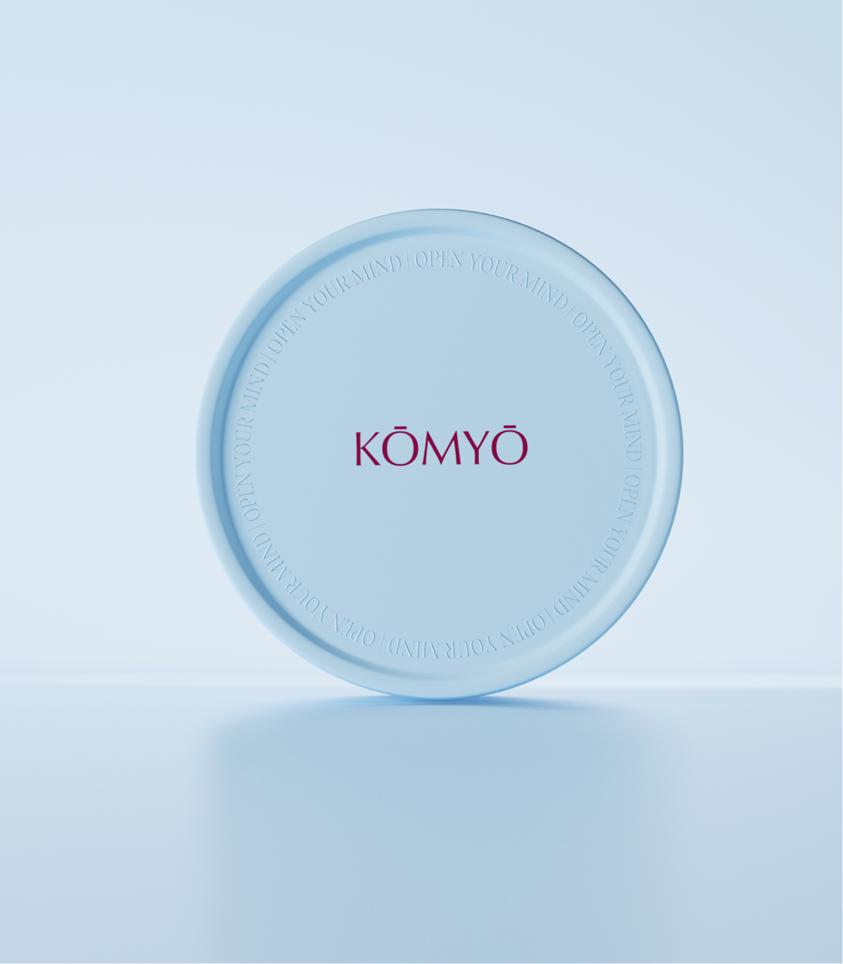


KŌMYŌ | Corporate identity design and packaging
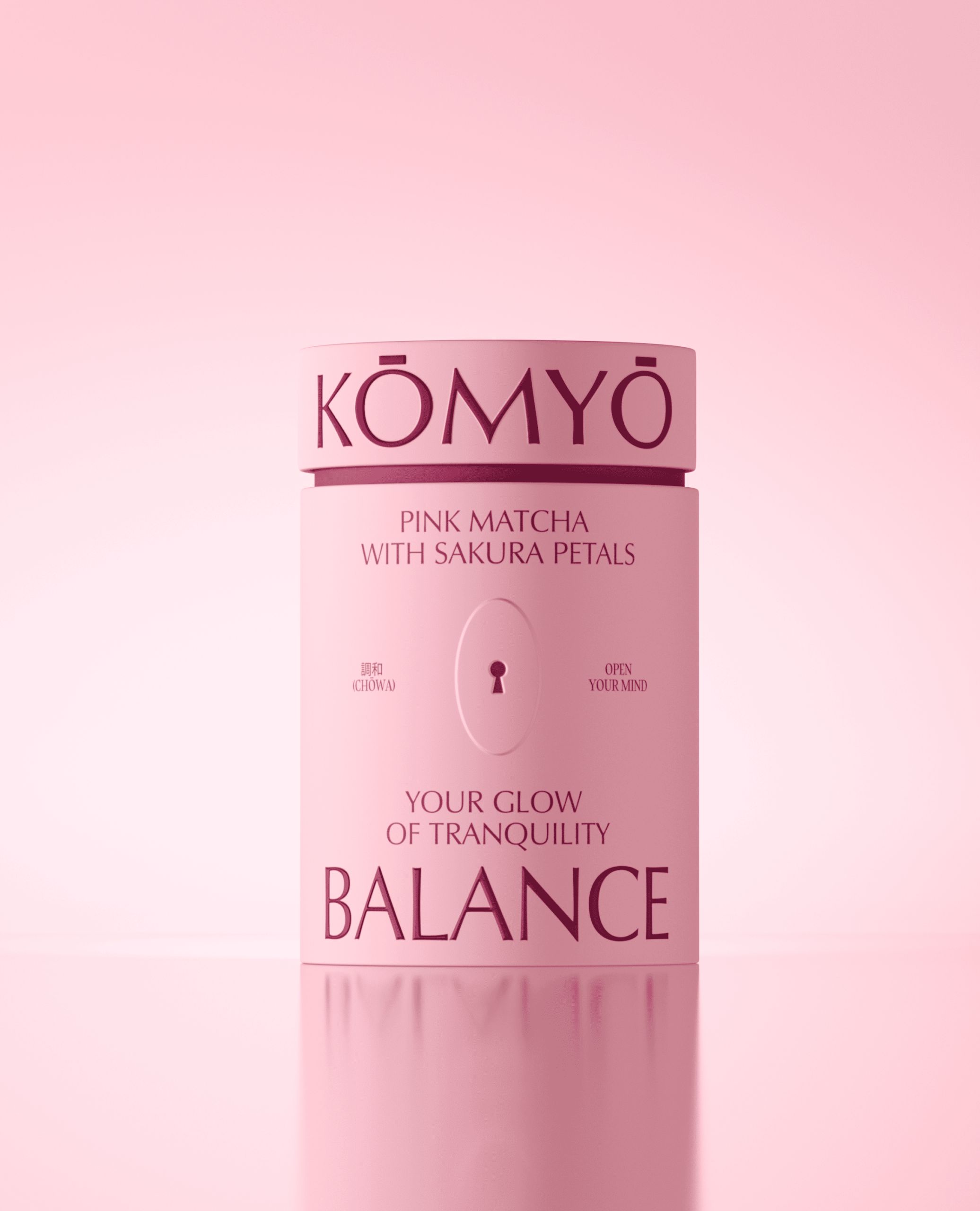
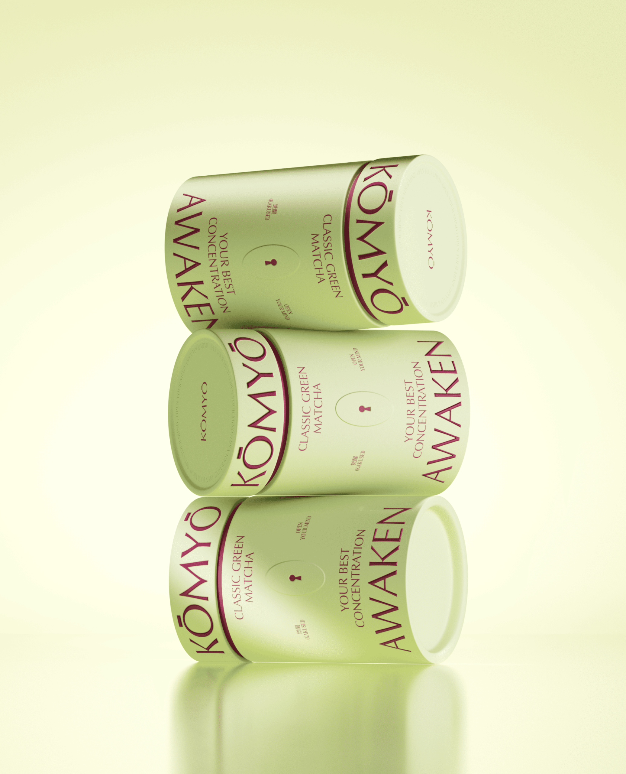
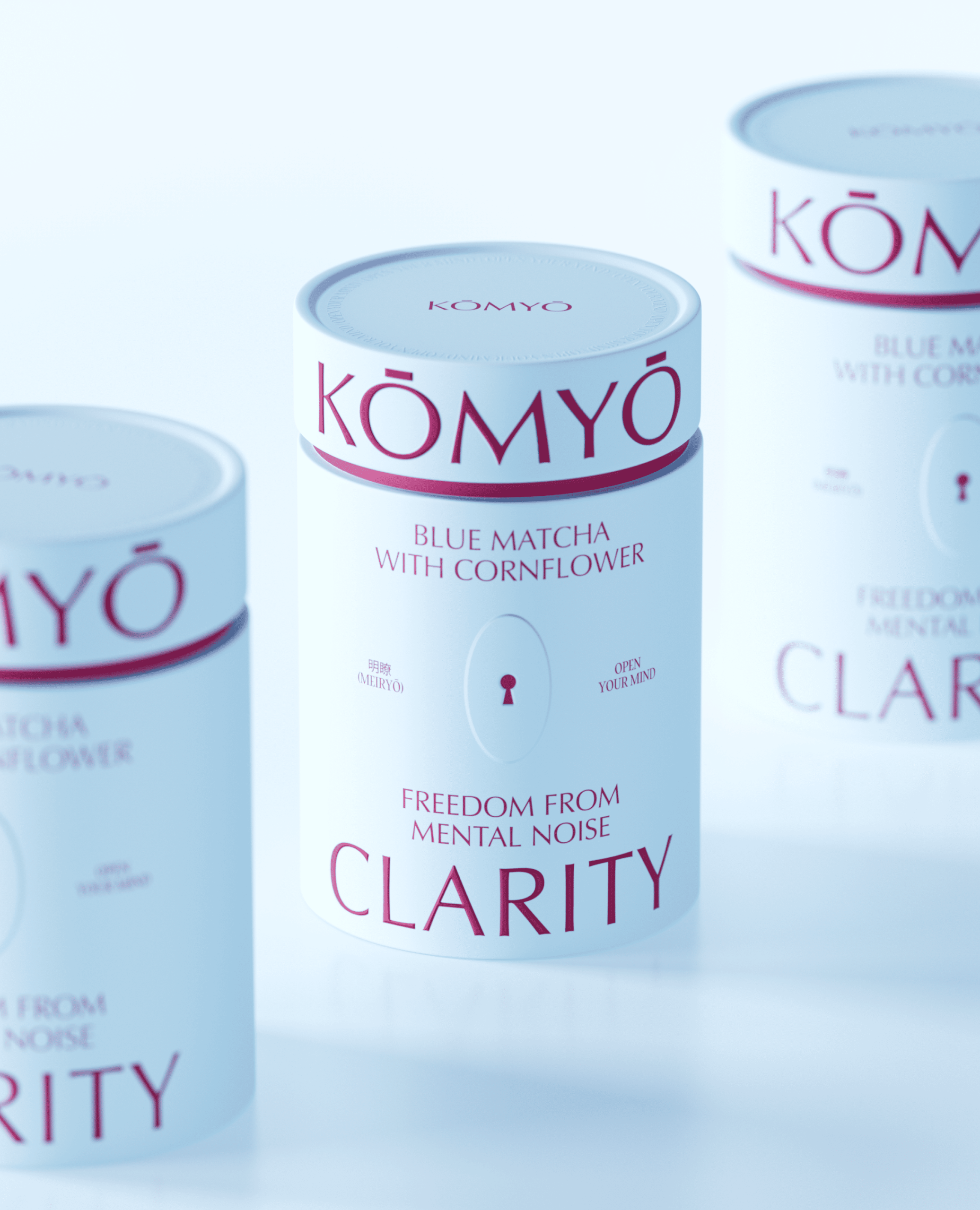
KŌMYŀ is a conceptual premium matcha brand where packaging becomes the physical embodiment of the philosophy of “inner light.”
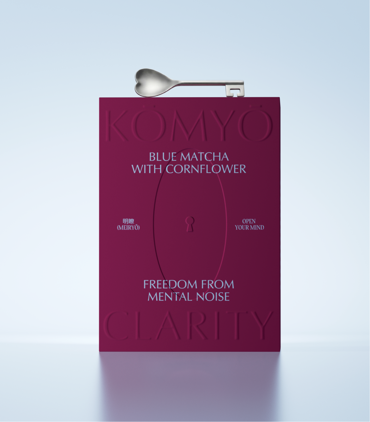
The central metaphor is a keyhole as a portal to three states of consciousness: energy (AWAKEN), harmony (BALANCE), and clarity (CLARITY). Each flavor is visually encoded with a unique color, revealed only through this “portal.”
The entire brand identity, from typography to the iconography system, is subordinated to a single idea: matcha as a key to a mindful state of being.
Materials Carton
Year 2026
Country United States
Region North America
Project type Conceptual Design


