

















Matcha Society


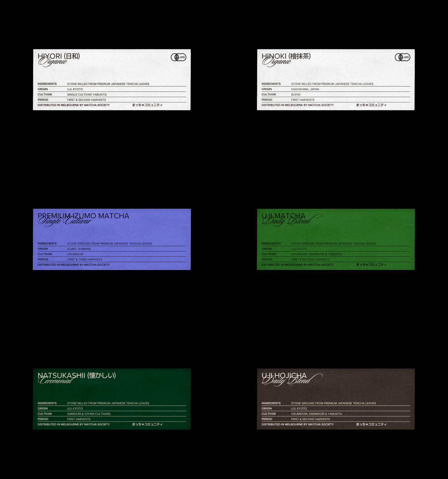


Matcha Society is a branding project that redefines the timeless values of authenticity and quality through the modern lens of Melbourne. The core concept focuses on the visual juxtaposition of Urban Chic and the refined aesthetics of Japanese Tradition.
The central design motif, the ‘Receipt,’ serves as more than just a decorative element; it stands as a metaphor for the brand’s transparency. Borrowing the receipt’s utilitarian function of recording and proof, the label acts as a certificate of quality, clearly visualizing complex specifications such as origin, cultivar, and ingredients. These details are arranged within an orderly Japanese grid system, transforming raw data into a structured aesthetic experience.
The color strategy is systematized into a six-color palette that visualizes the unique character of each product. The background colors are carefully selected to reflect the essence of the tea, ranging from deep greens for matcha and rich browns for hojicha to soft pastels for the organic line.
On these varied base colors, text and line graphics are applied in either Black or White, depending on the background’s brightness. This high-contrast approach not only ensures clarity but also creates a modern, graphic look that complements the cold, metallic texture of the tin packaging. Furthermore, the interplay between the flowing English cursive logotype and the structured Japanese typography establishes a unique identity where Melbourne’s free-spirited hip sensibility coexists harmoniously with Japanese tradition.