Confluentia Wines

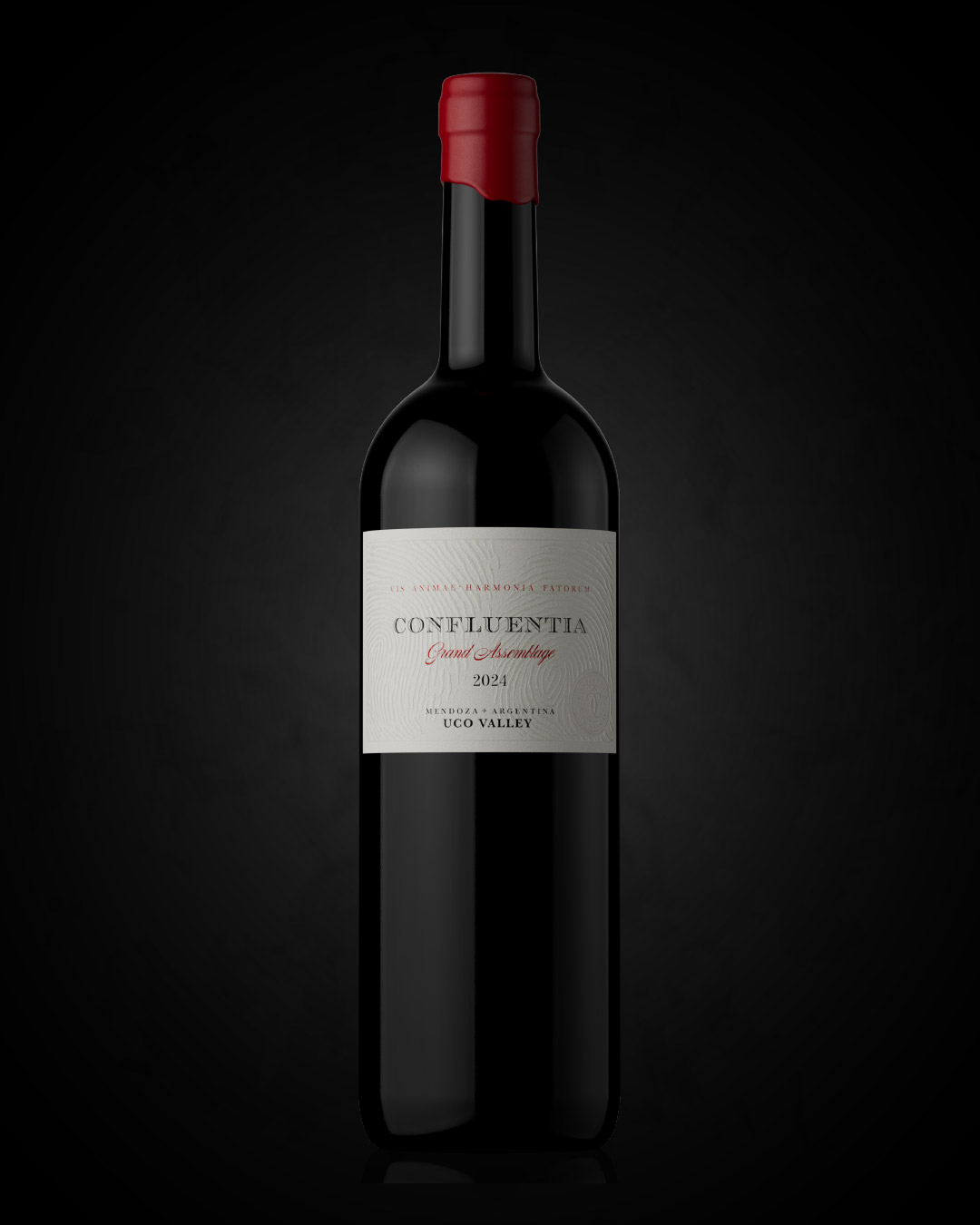



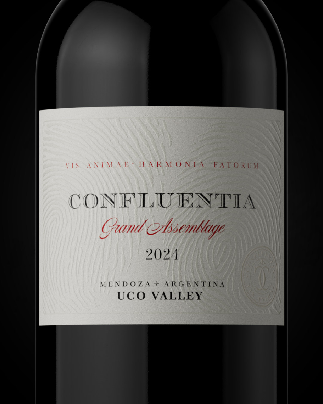
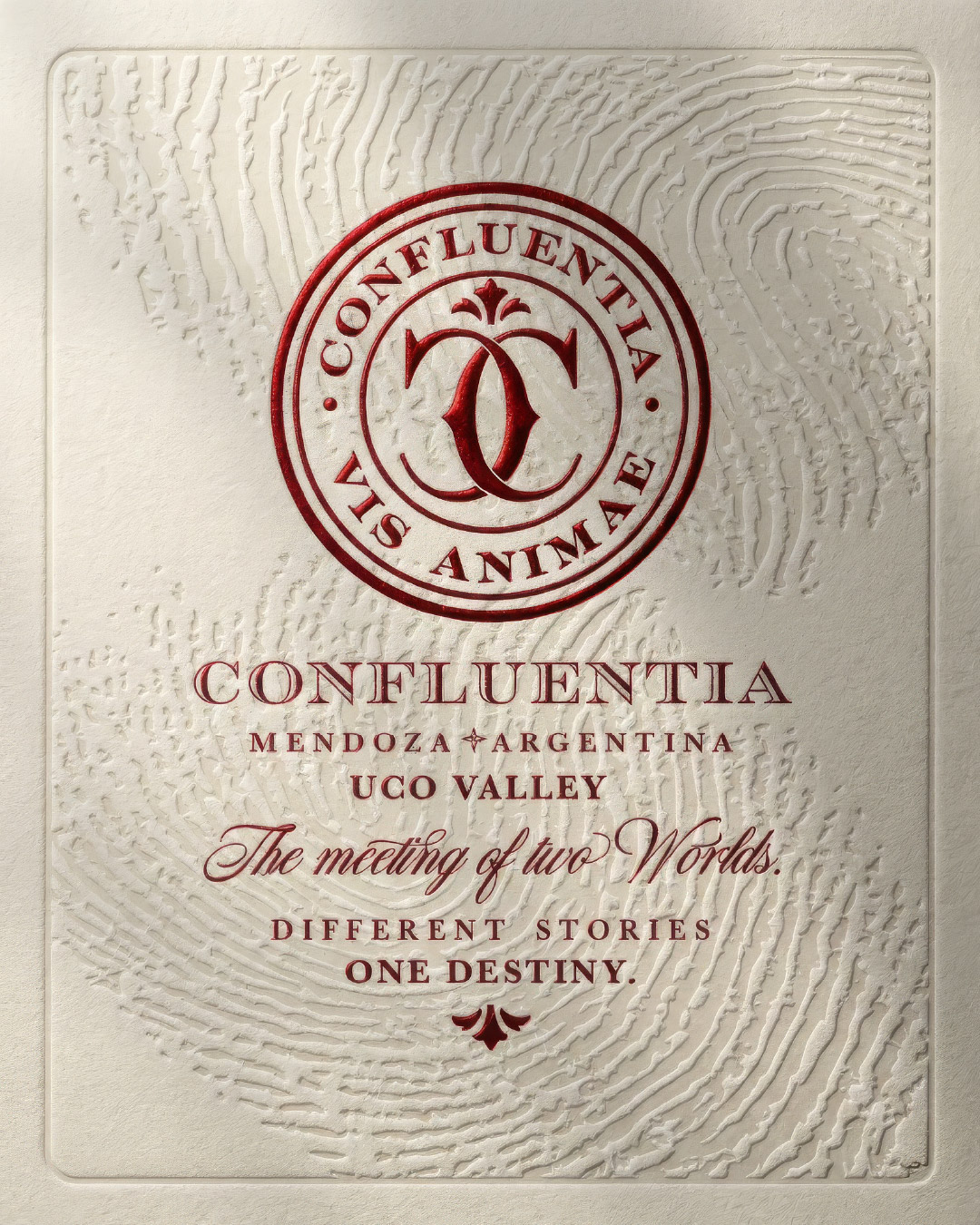
Confluentia is born at a crossroads where different histories, cultures, and worlds converge to shape a singular expression. The project emerges from the friendship and shared vision of two founders—one Brazilian, one Argentine—whose personal and professional paths found a common language through wine. This encounter is not anecdotal; it is structural. The brand’s identity is built upon convergence.
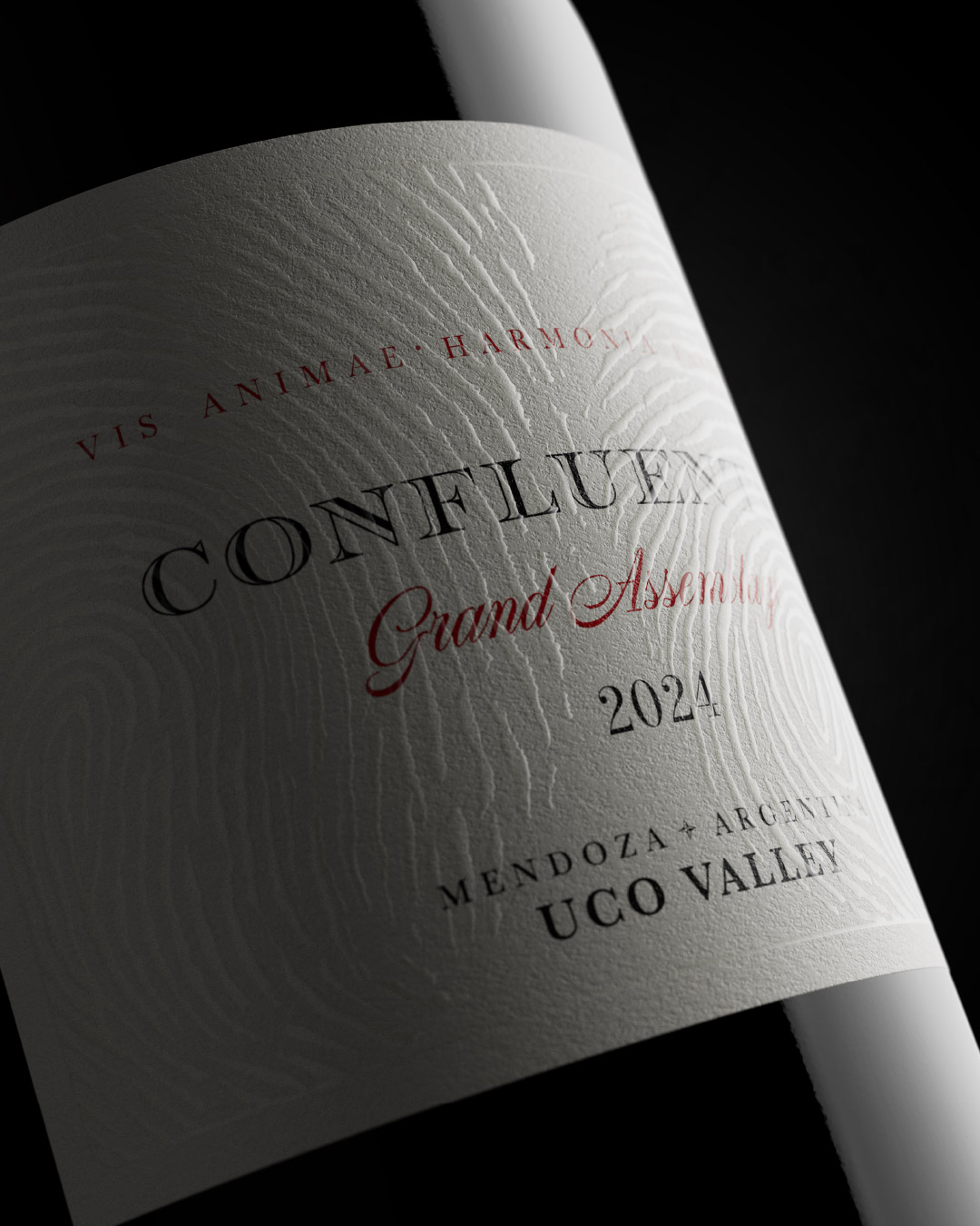
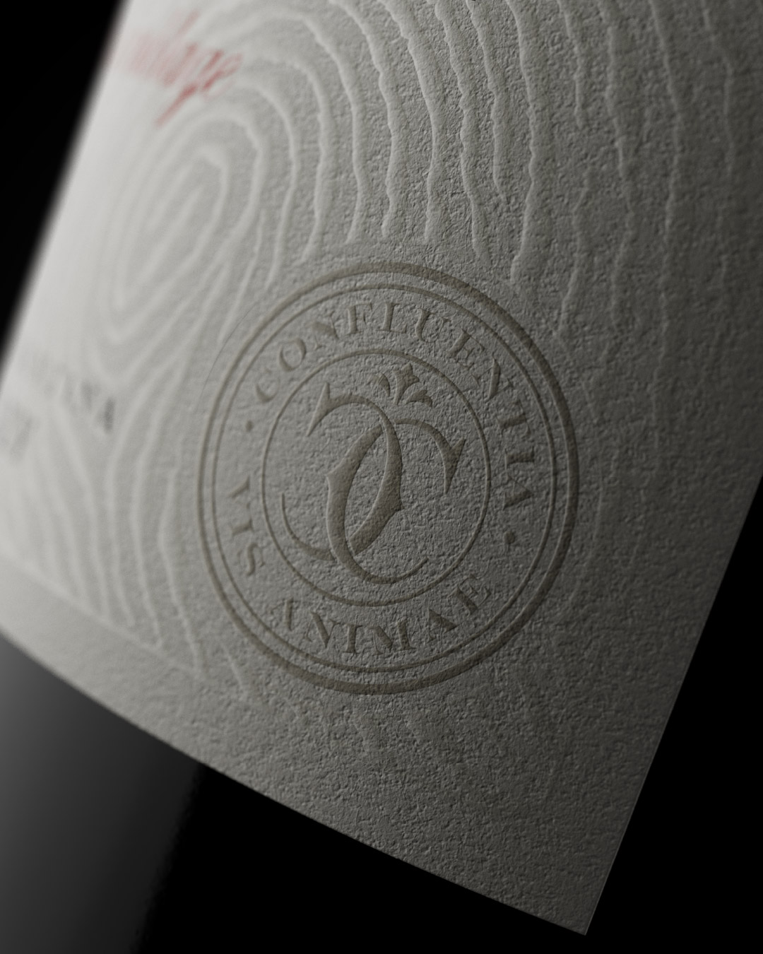
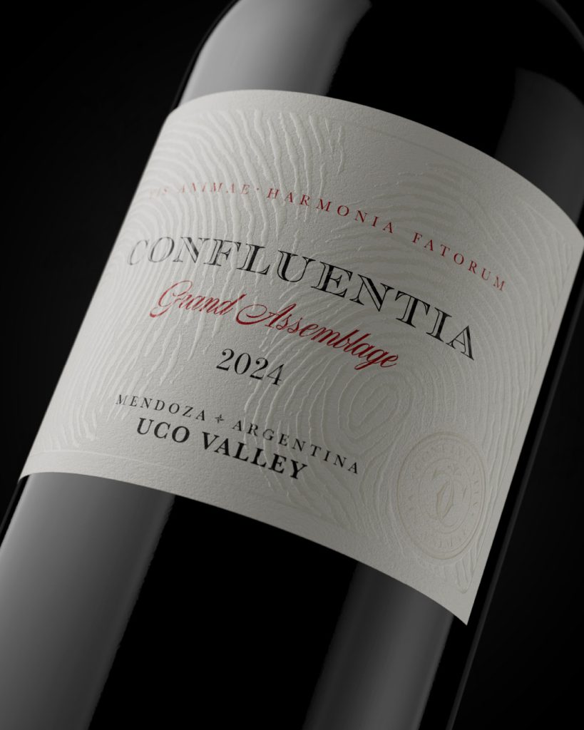
The label design translates this concept into form and texture. Its aesthetic is sober, elegant, and timeless, grounded in a restrained, classical composition where every element is deliberate. The true narrative reveals itself through the surface: a subtle pattern of fingerprints runs across the label, belonging to the founders themselves. This is not decoration, but a symbolic act. Two identities, two histories, two countries, imprinted onto a single skin. The label becomes a tangible record of the crossing that gave birth to Confluentia, where encounter turns into memory and design becomes storytelling.
Packaging design by Vantablack Studio.