Paltis


The design of the Paltis label was born from a clear vision: to tell the story of wine as an interpreter of the mountains.
From this idea emerges a powerful yet essential symbol—one that evokes the alpine landscape and the emotional flow that wine conveys.
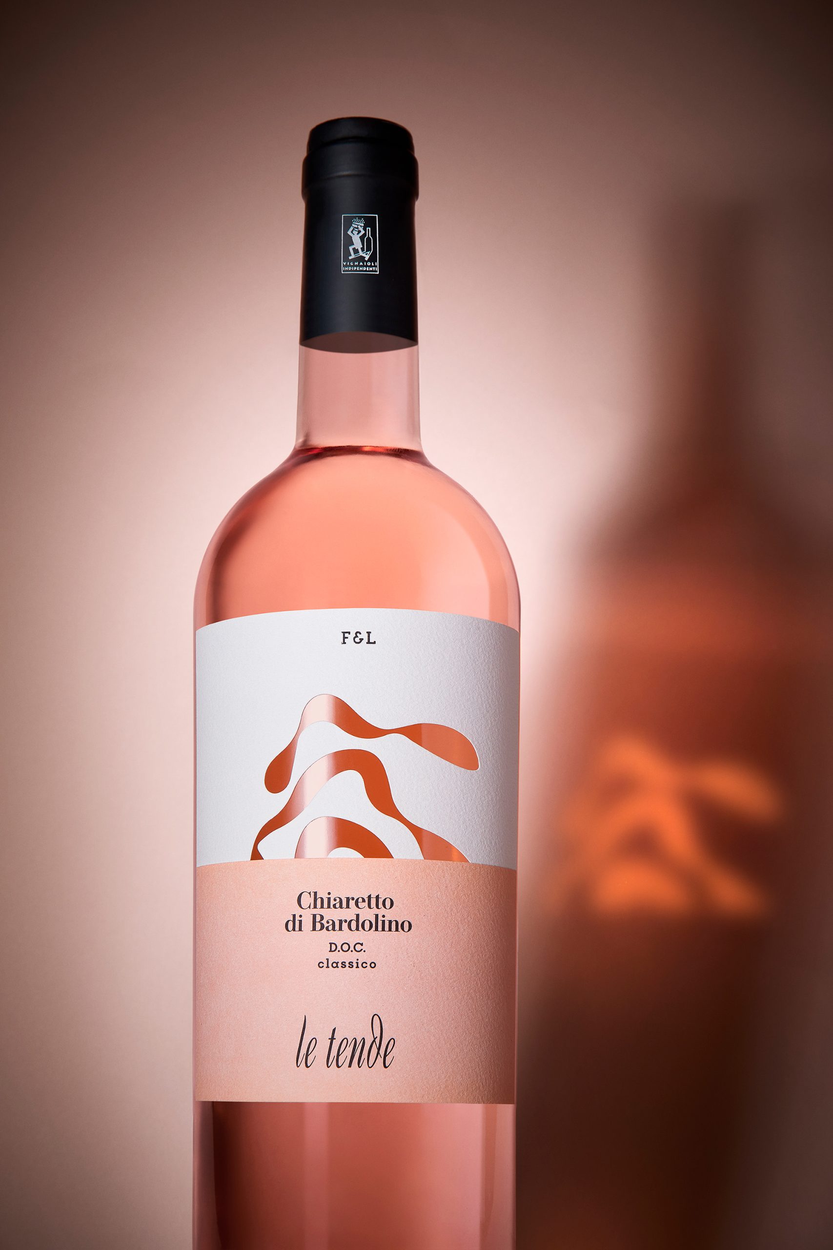
At the heart of the label runs a black wave, die-cut into cotton paper. This graphic and tactile gesture is more than decoration: it’s an opening, a visual threshold that reveals the bottle’s glass—revealing the living heart of the wine. Each wine features a different wave modulation. Three wines, three interpretations. Three voices narrating the same place, each with a different tone.
The wave doesn’t just represent the mountain profile: It becomes a metaphor for harmony to be discovered, for a landscape to be interpreted.
Completing the project is a natural cotton paper that gives a tactile, velvety feel.