

















Sol Brothers




Why We Designed It This Way
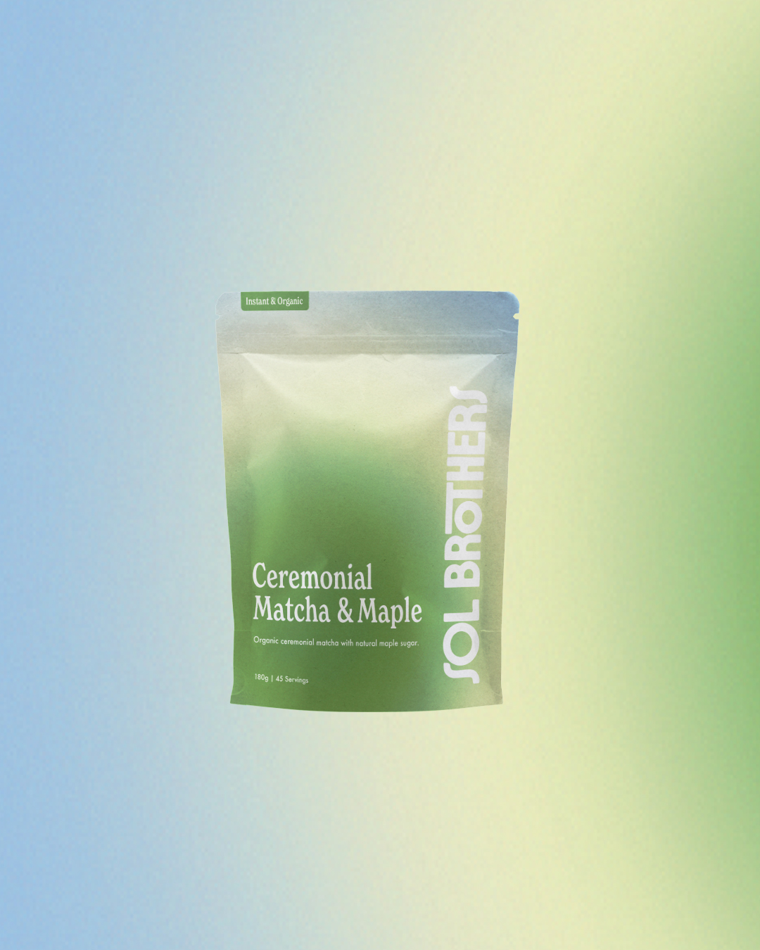
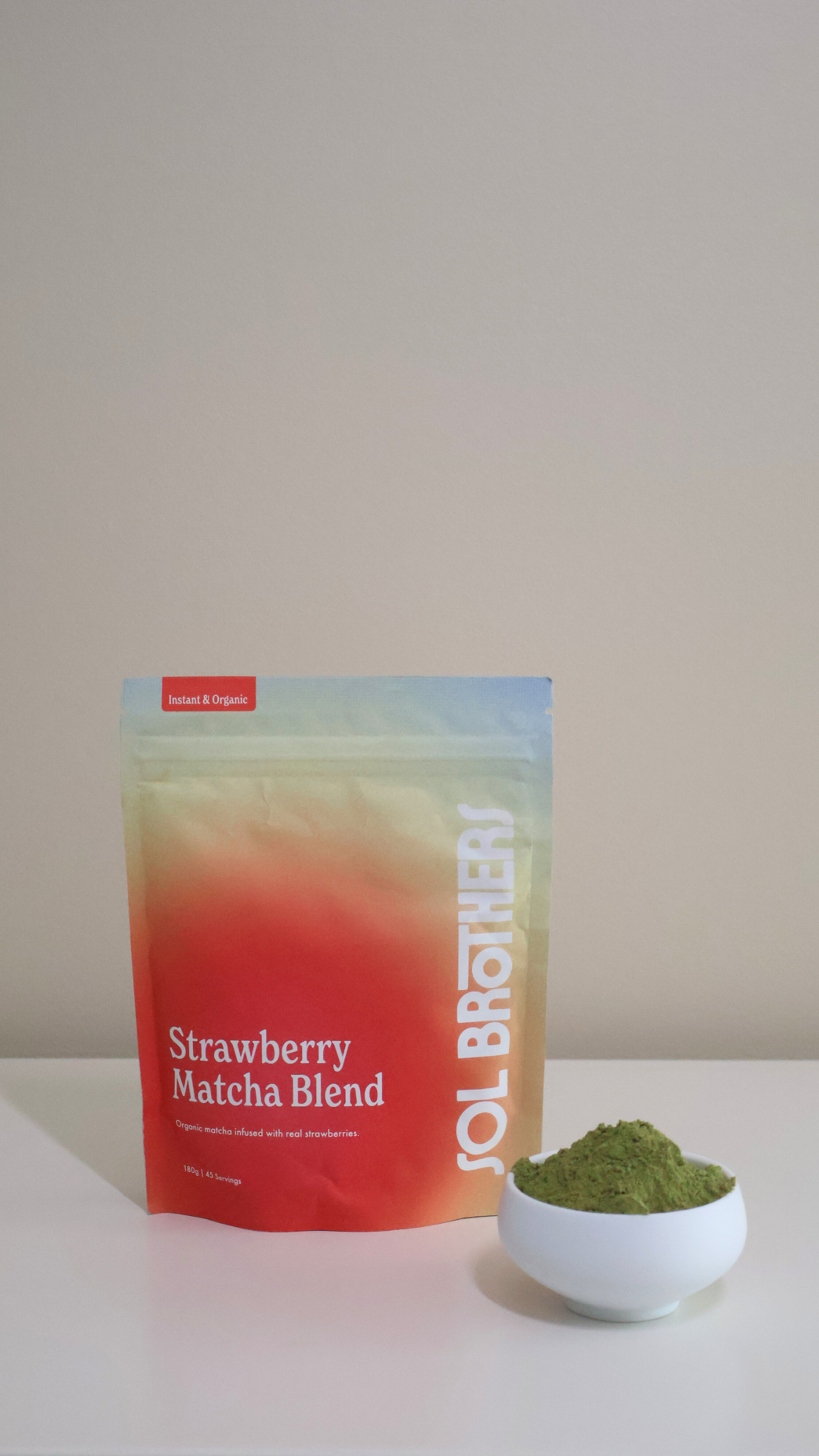
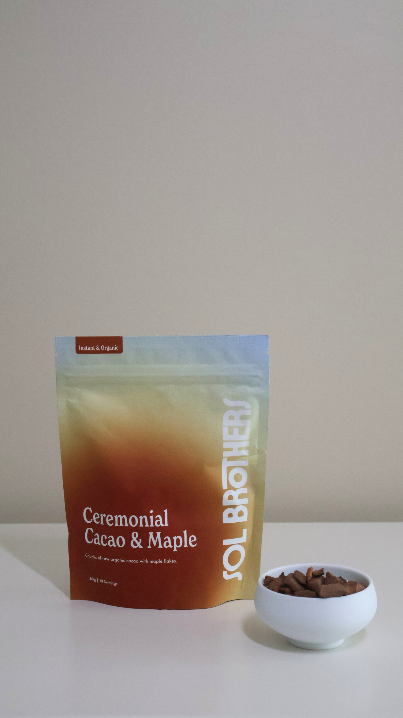
The moment you pick up a Sol Brothers drink, we want you to feel the morning. Our packaging takes its colour palette and hue directly from the sun – those warm, saturated golds, ambers, and burnt oranges aren’t just a nod to our flavours and ingredients, they’re also tied to our name and the energy that inspired it. Sol means sun, and everything about the design of our pouches reflects that sentiment.
Materials Paper, Paperboard, Card stock
Year 2026
Country Australia
Region Oceania
Project type Conceptual Design
Client Sol Brothers