solnuts CRUNCHERS


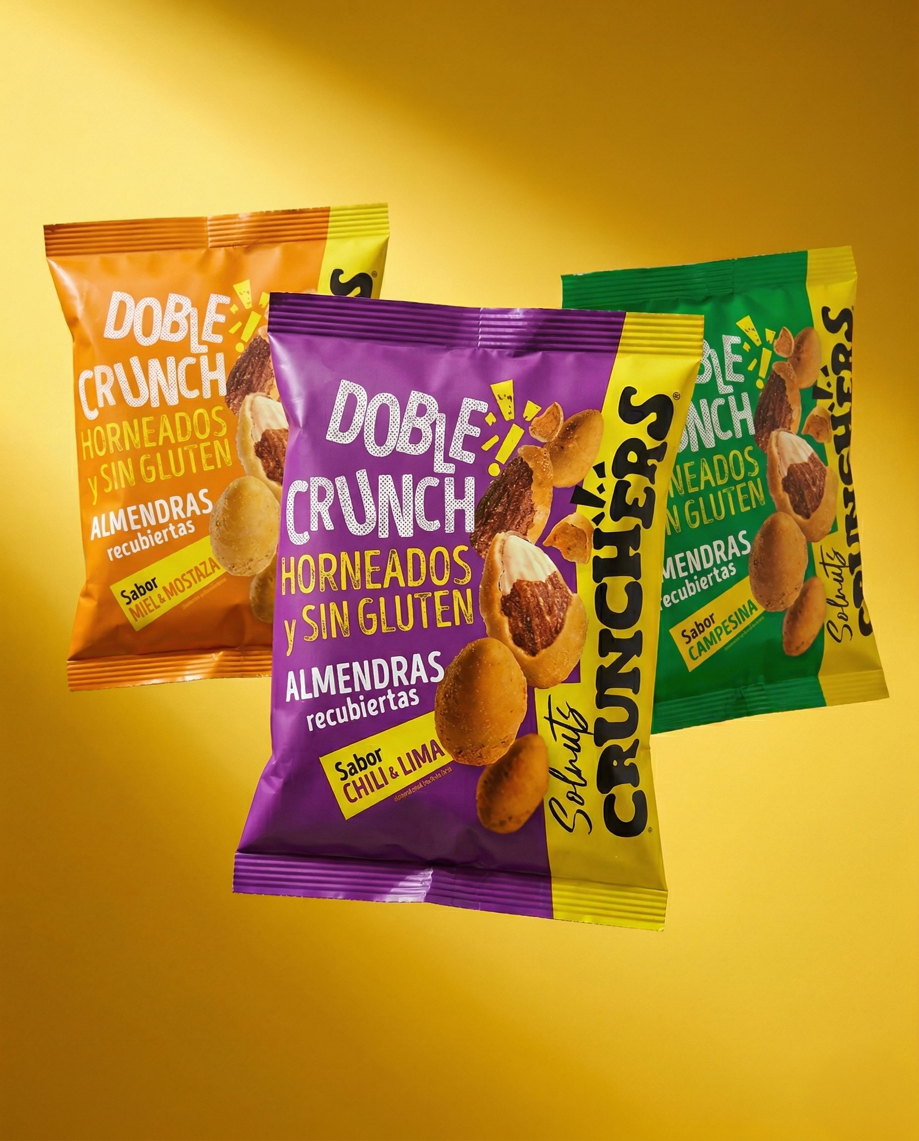
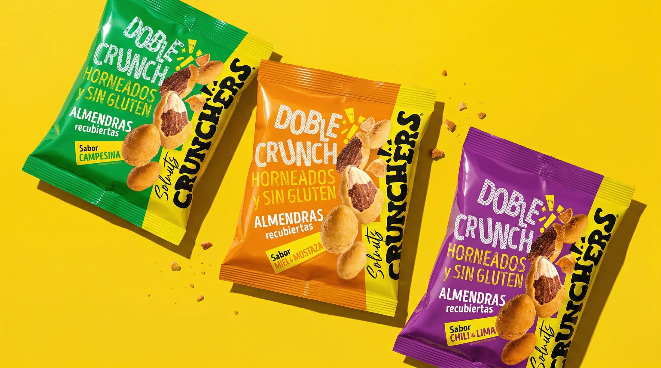
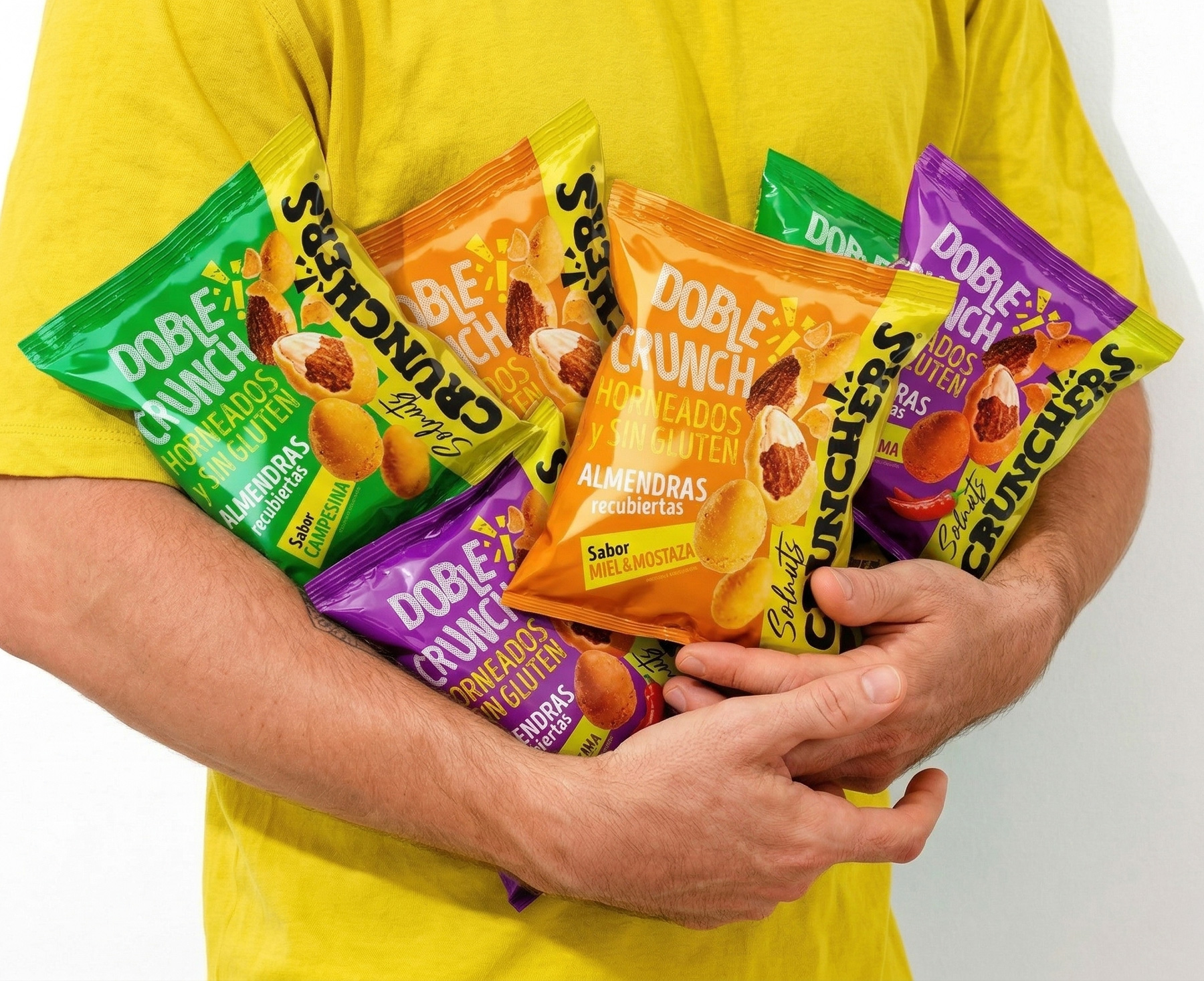
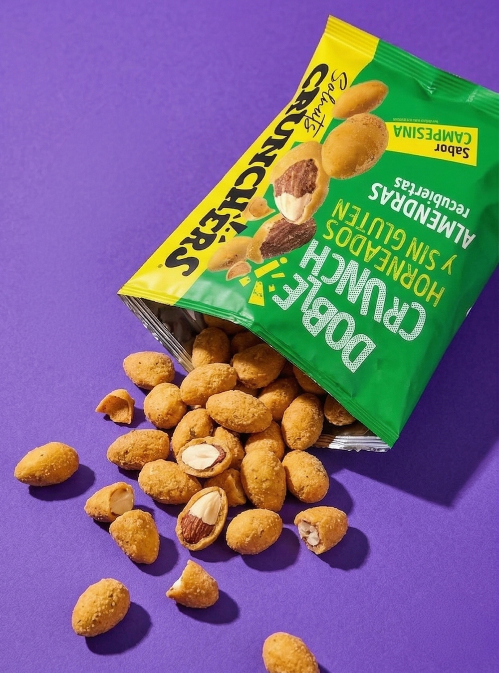

Solnuts Crunchers: The Architecture of a Living System With the launch of Crunchers, Solnuts departs from its industrial origins and enters a contemporary design paradigm where the visual system behaves as a living structure. The objective extends beyond packaging: it is about translating the Double Crunch experience — a baked, gluten-free sensory construct — into a cohesive visual and tactile language.
Yellow Disruption: Constructing Visibility Within a category dominated by predictable red codes, the shelf collapses into uniformity. The strategic adoption of yellow operates as a deliberate act of disruption — a built-in spotlight engineered to capture attention instantly. This chromatic decision not only anchors the brand within its lineage (Sol de Alba), but projects a distinct energy and freshness unattainable through conventional category codes.
Typographic Heritage, Graphic Friction Vintage-inspired typography establishes a framework of trust and recognizability. However, the system resists nostalgia as a static resource. Through halftones, fragmentation, and dynamic textures, the graphics introduce controlled tension and rhythm — a direct visual translation of the crunch itself.
Materiality becomes part of the narrative. The interplay between matte and gloss varnishes amplifies perception, activating light as a functional layer of the design. Each flavor operates as a calibrated expression:
Honey & Mustard: A calibrated contrast between golden sweetness and assertive sharpness.
Savoury Tomato & Onion: Depth and warmth, rooted in the codes of traditional cuisine.
Chili & Lime: Citrus-driven energy balanced by a sustained, controlled heat.
Cheese: Intensity refined into a familiar, indulgent, and highly legible profile.
Redefining the Category Solnuts Crunchers does not adhere to established CPG conventions — it rearticulates them. Developed under the direction of Hugo Zapata — a reputed international designer, recipient of multiple awards — the project positions itself as a reference point in the evolution of premium snacking: a system designed not only to compete, but to redefine the visual and sensory standards of the category.