IL NIDO
 AboutYou Food · May 29, 2026




IL NIDO A place of goodness
Il Nido was developed to build a new brand identity starting from a complete repositioning of the existing system.
The project begins with the definition of a packaging system, with the aim of translating the brand positioning into a clear, recognizable, and shelf-consistent visual language.
The name “Il Nido” summarizes the new approach: an identity built around care, warmth, and quality, also reinforced by the physical context of the company, located in a former nursery school.
SOLUTION
Developed with Andrea Castelletti Studio (creative direction), the project builds a packaging system as the main tool for brand identity.
A competitive analysis guided the definition of a visual language that is both distinctive and immediate, designed to ensure strong recognition within the food sector.
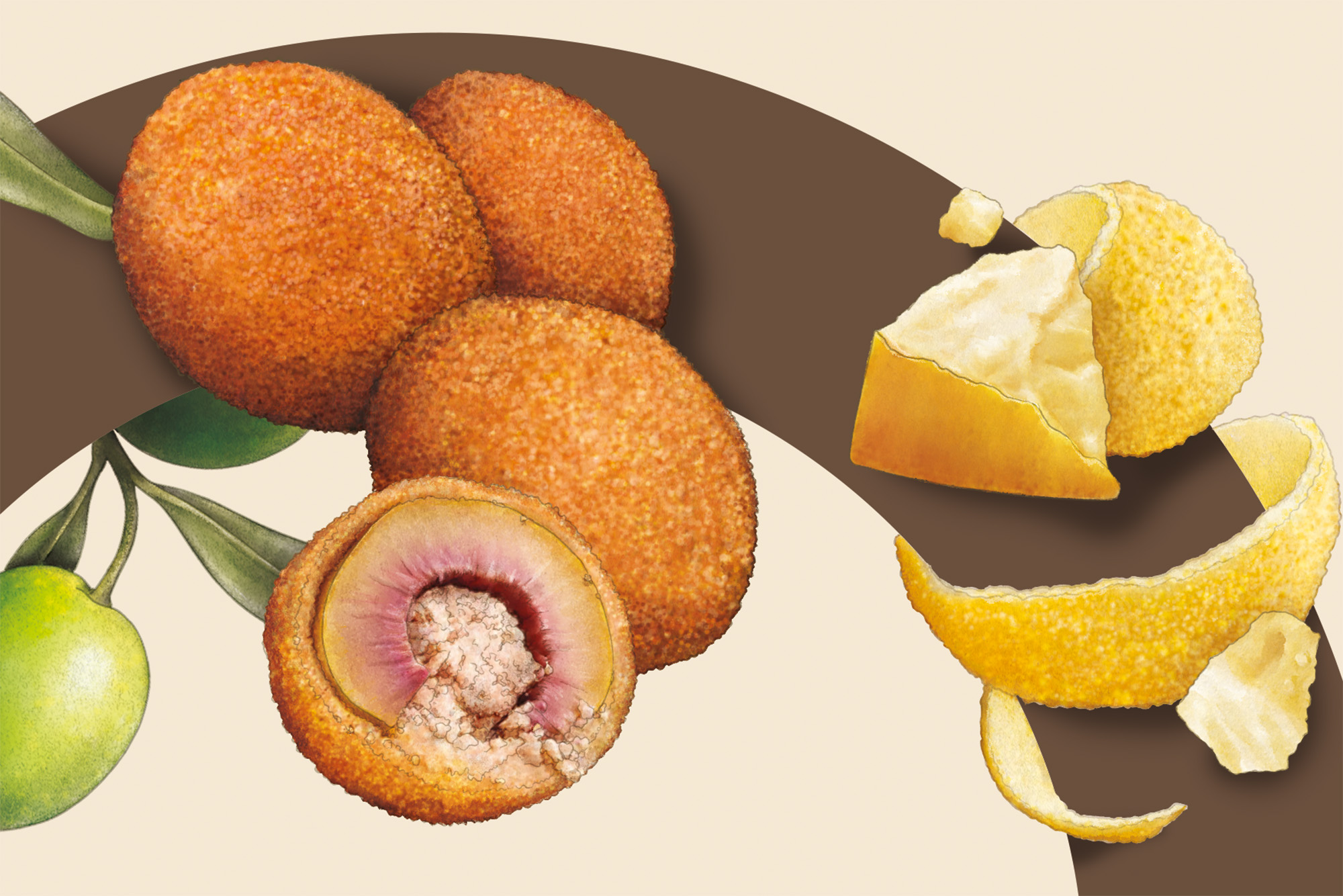
The system is supported by an illustration language developed by Claudia Bartoli, introducing a narrative layer aligned with the brand positioning.
The packaging becomes an integrated communication system, where product and visual identity coincide.
RESULT
The result is a packaging system that translates the project into a clear and immediately readable identity.
Il Nido positions itself as a recognizable and consistent brand within its category, communicating quality and closeness through a simple and direct visual language.