

















Rude Olive



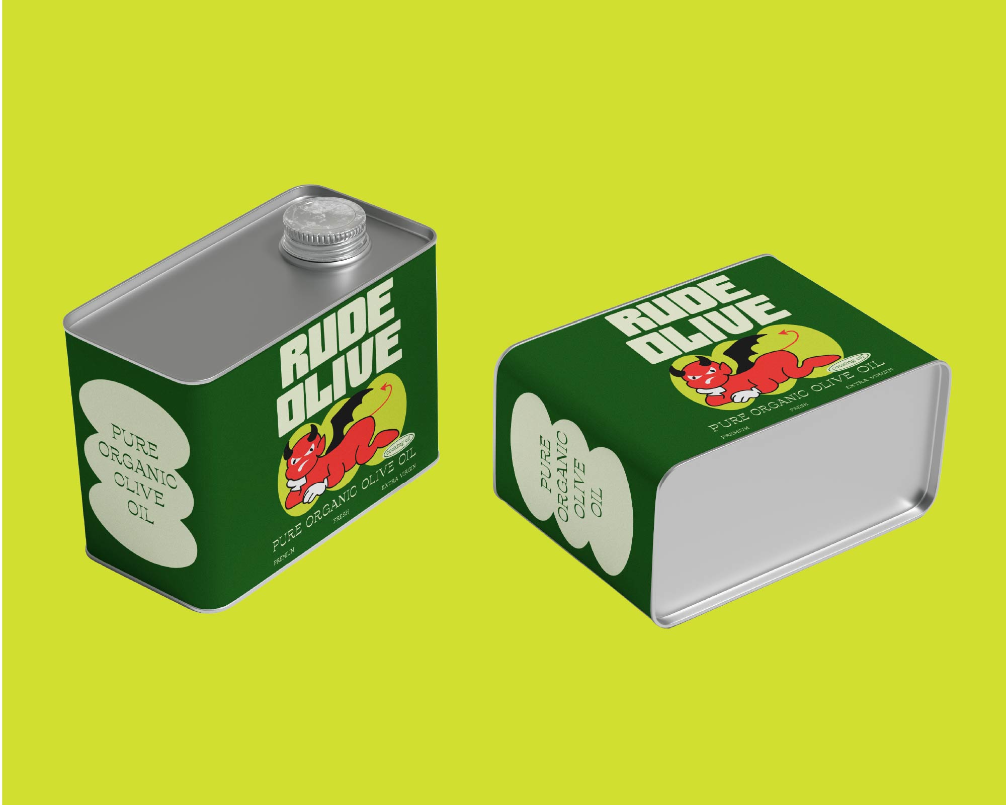

RUDE OLIVE
Not every snack needs to be polite.
alty. Briny. Slightly disrespectful.
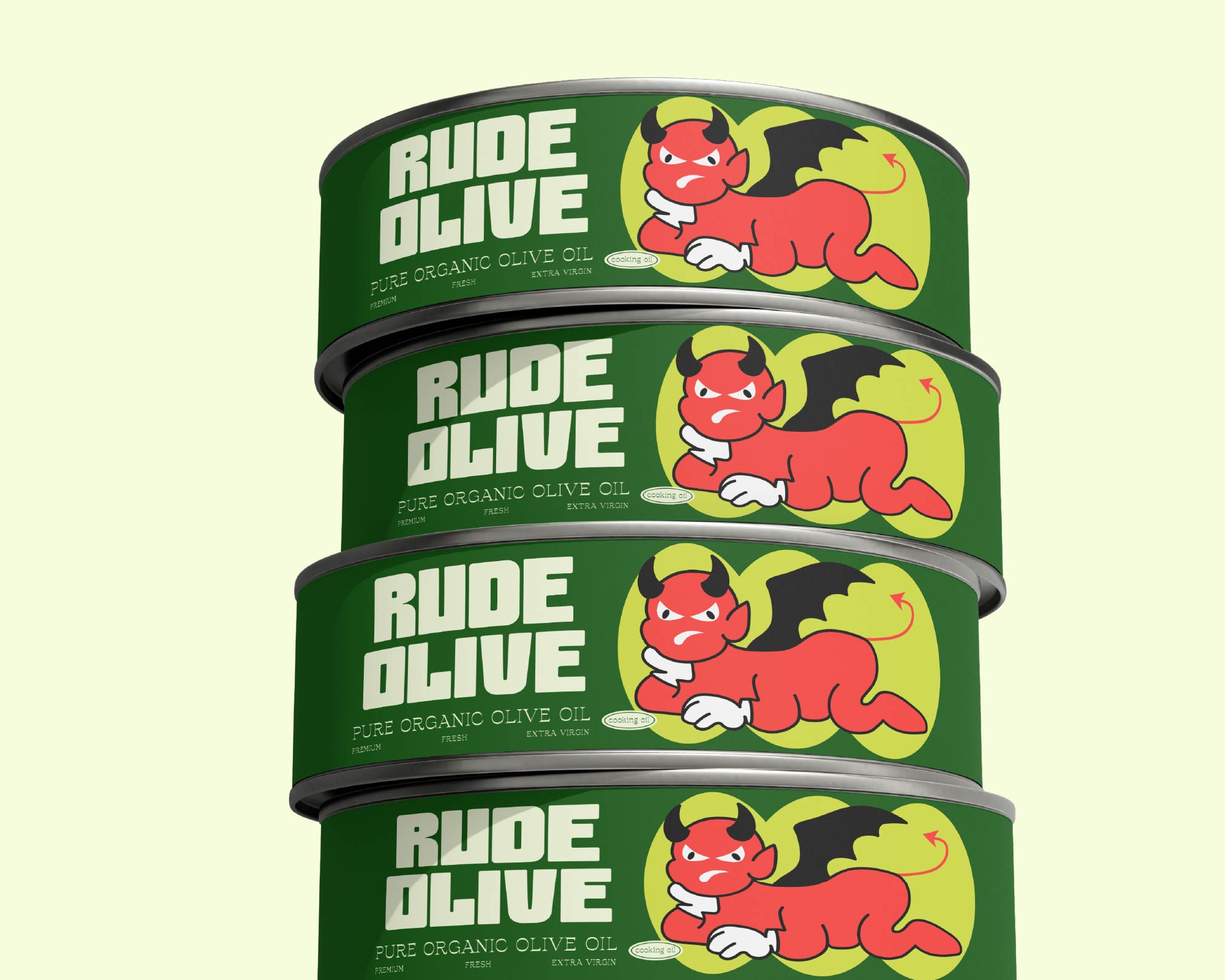
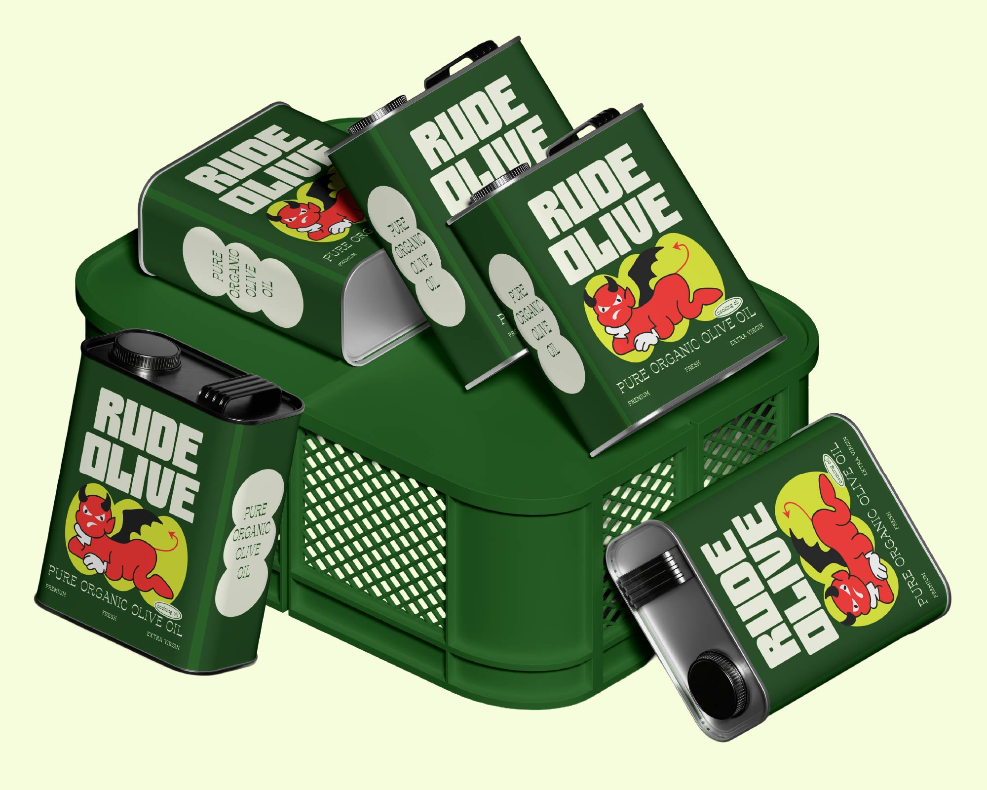
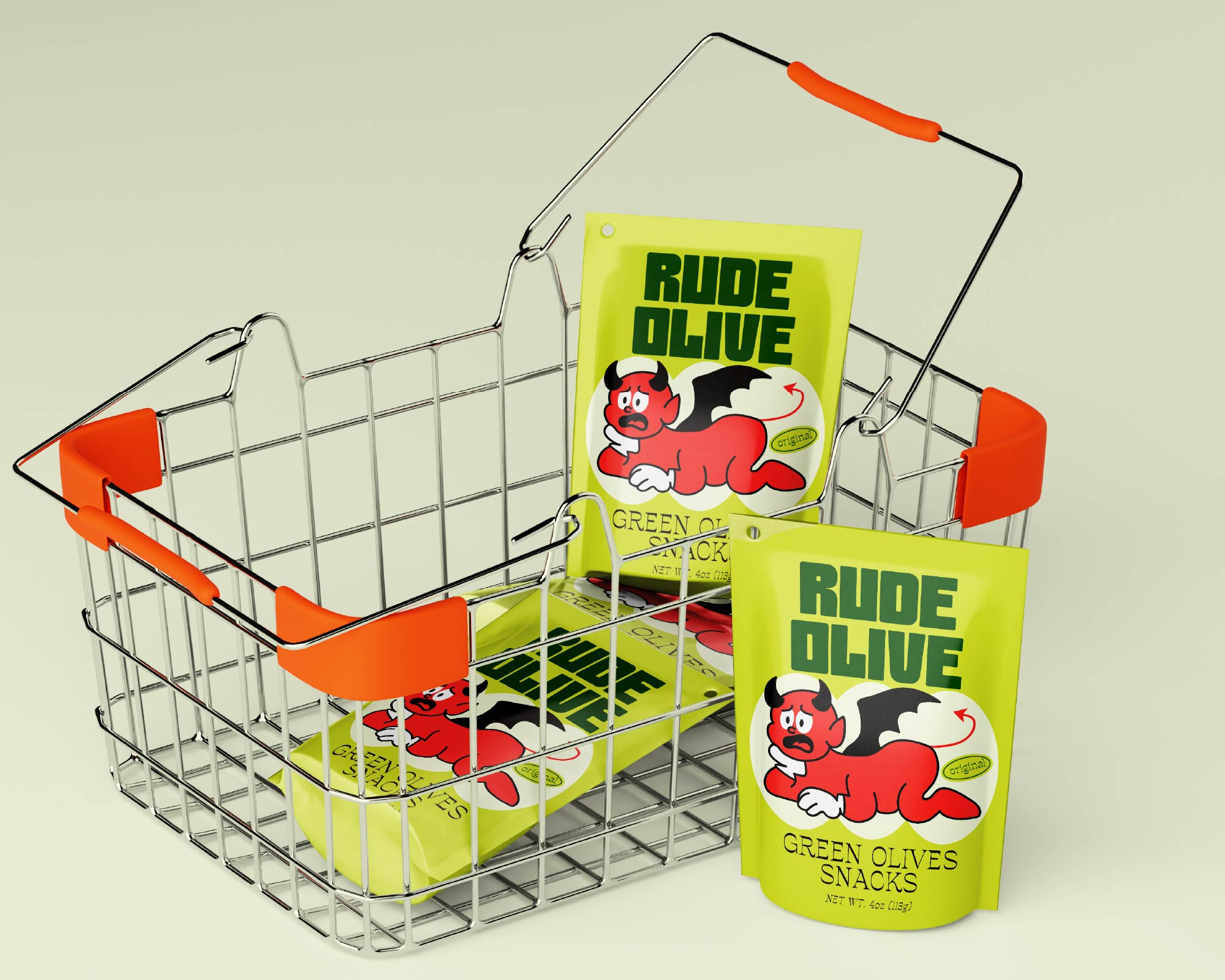
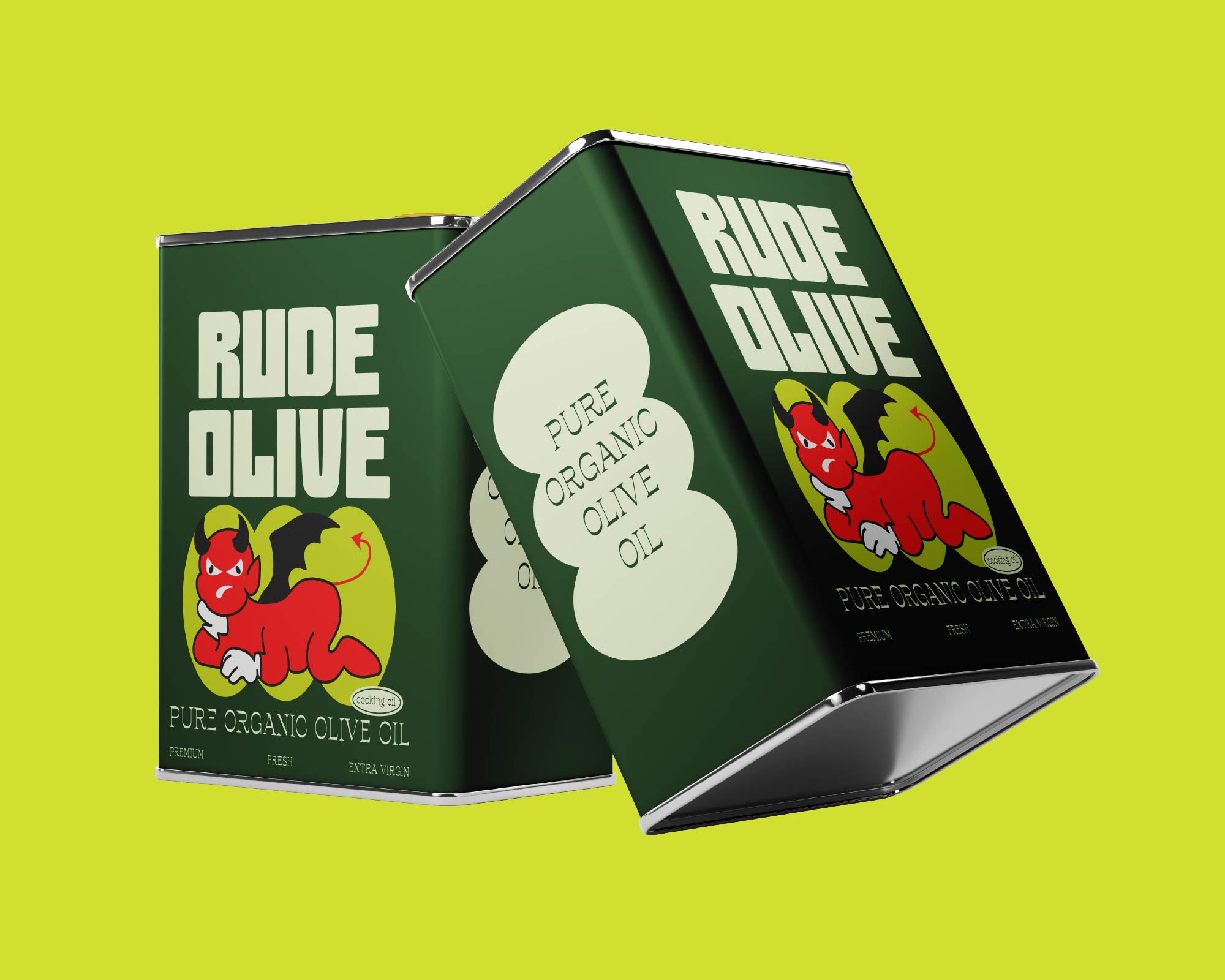
Rude Olive turns the humble olive into a bold grab-and-go experience packed with personality, attitude, and unapologetic flavor. Built for olive lovers who crave that salty, briny kick, the brand embraces a rebellious spirit with loud visuals, confident typography, and packaging that refuses to blend in.
The identity challenges the category’s traditional, premium aesthetic, replacing it with something playful, disruptive, and impossible to ignore—because great snacks should be as addictive as they are memorable.
Brand Identity • Packaging Design • Art Direction
Materials Metal, Tin, Steel, Paper, Paperboard, Card stock, Plastic, Polymer, Polyethylene, Film, Sustainable
Year 2026
Country Sri Lanka
Region Asia
Project type Conceptual Design
Client RUDE OLIVE


