Verena Roschy


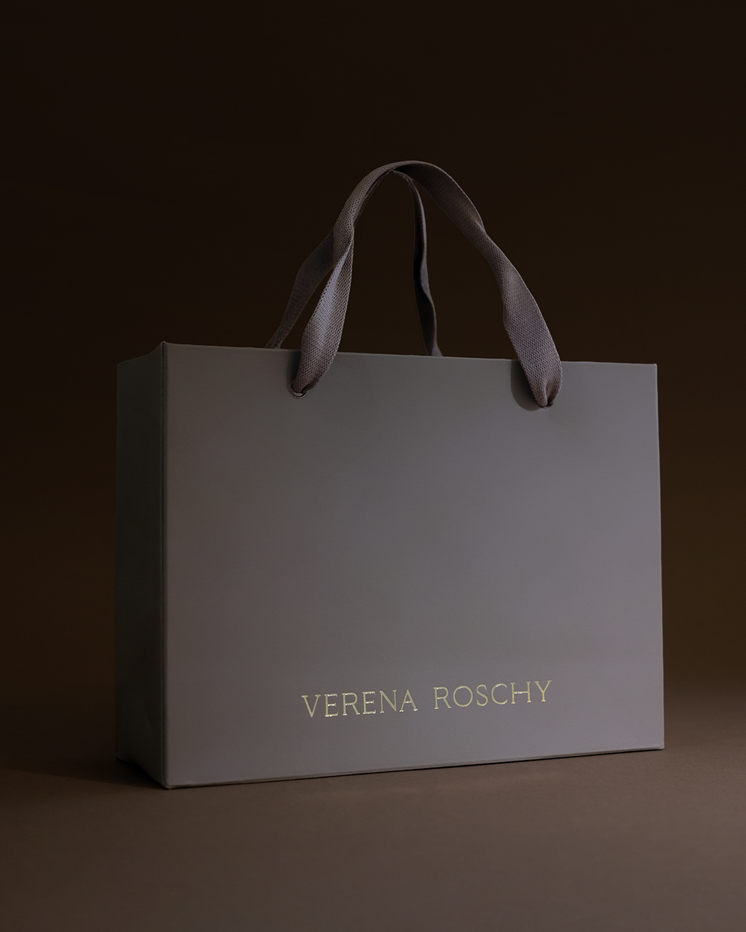


Design: @hej_mona
A comprehensive branding, logo, and packaging design concept was developed for master goldsmith Verena Roschy of Neustadt an der Weinstraße.
At the heart of the brand identity are a connection to nature, sustainability, and the conscious selection of high-quality materials such as ethically sourced gold, gemstones from responsible sources, recycled materials, and lab-grown diamonds.
The visual identity is based on a flexible logo concept consisting of a minimalist figurative mark/signet and two variants of the wordmark (compact and full-form). These can be used individually or combined in a modular fashion depending on the application.
The deer signet is based on deliberately organic and imperfect-looking block shapes reminiscent of traditional metal hallmarks. This creates an exciting contrast between modern design and classic craftsmanship. At the same time, the deer holds personal significance for Verena and symbolizes a mindful approach to resources and sustainable materials.
For the packaging of jewelry (rings, engagement rings, necklaces, and earrings), natural-colored packaging, as well as jute bags and paper carrier bags, were developed and finished with gold foil stamping.
In keeping with the natural theme, dark brown business cards with white lettering were designed to create a subtle eye-catcher.
To add a personal finishing touch, a wax seal featuring the logo was designed to enhance paper products and subtly highlight the brand’s craftsmanship.