Packaging & visual identity for olive oil

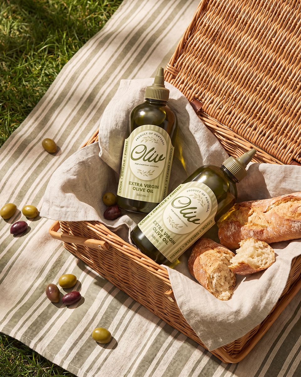
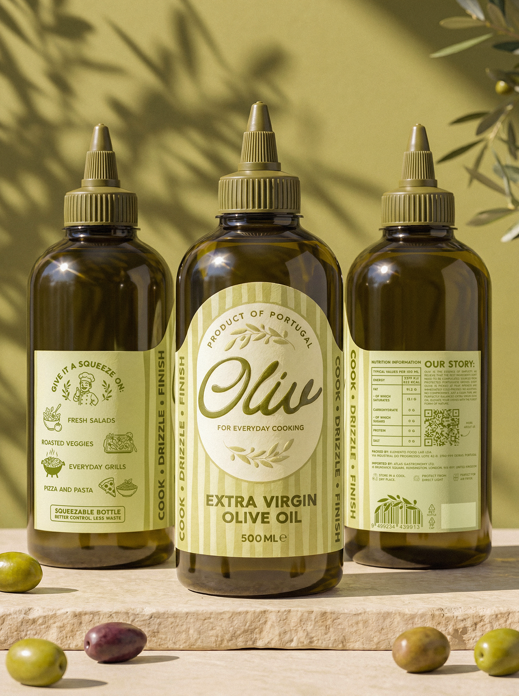
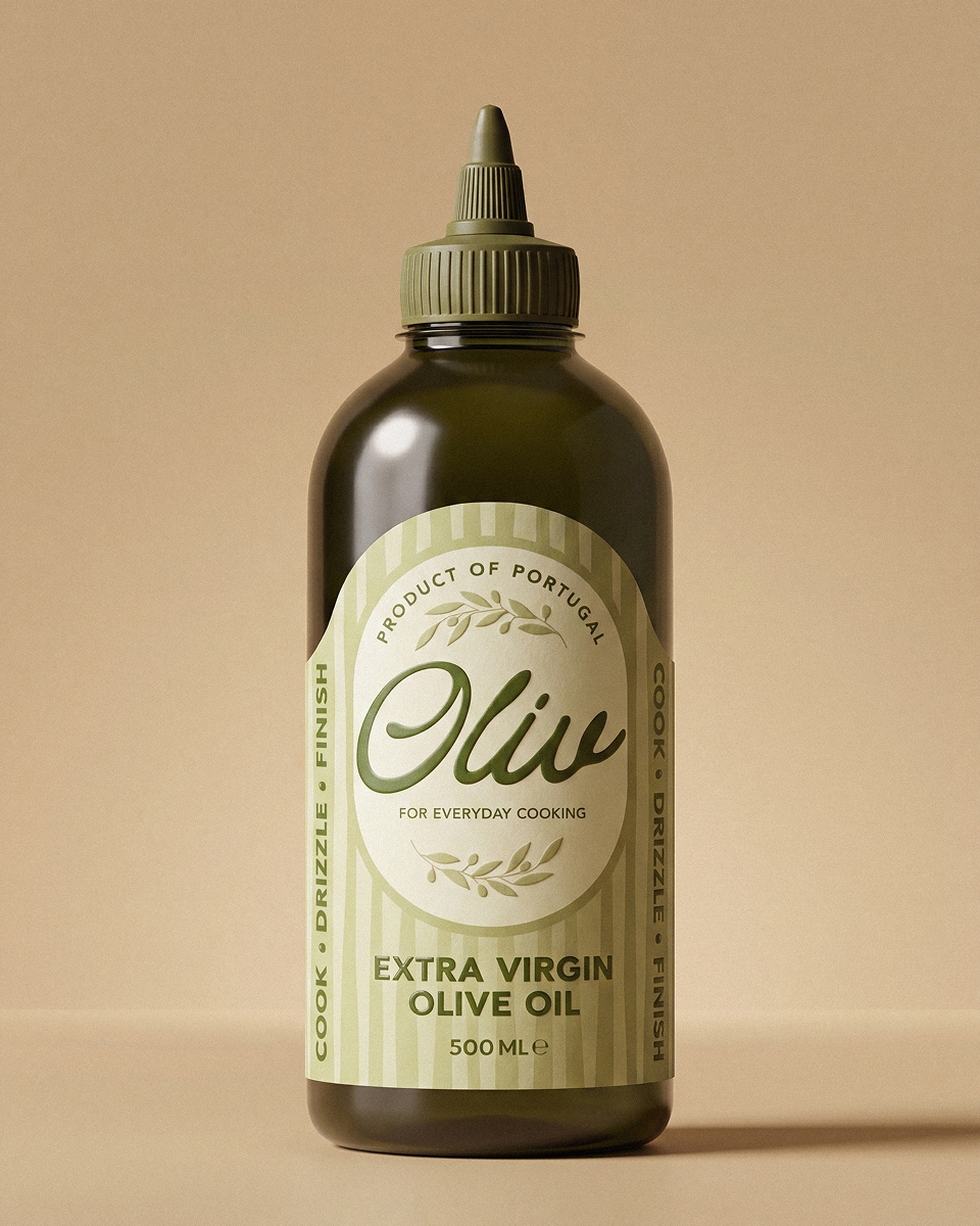

The challenge: To create a modern, approachable olive oil brand that stands out in e-commerce and redefines olive oil as a lifestyle product: vibrant, spontaneous, effortlessly beautiful.
Audience: Design-conscious urban professionals, 25–40. People who care about what sits on their countertop as much as what goes into their pan.
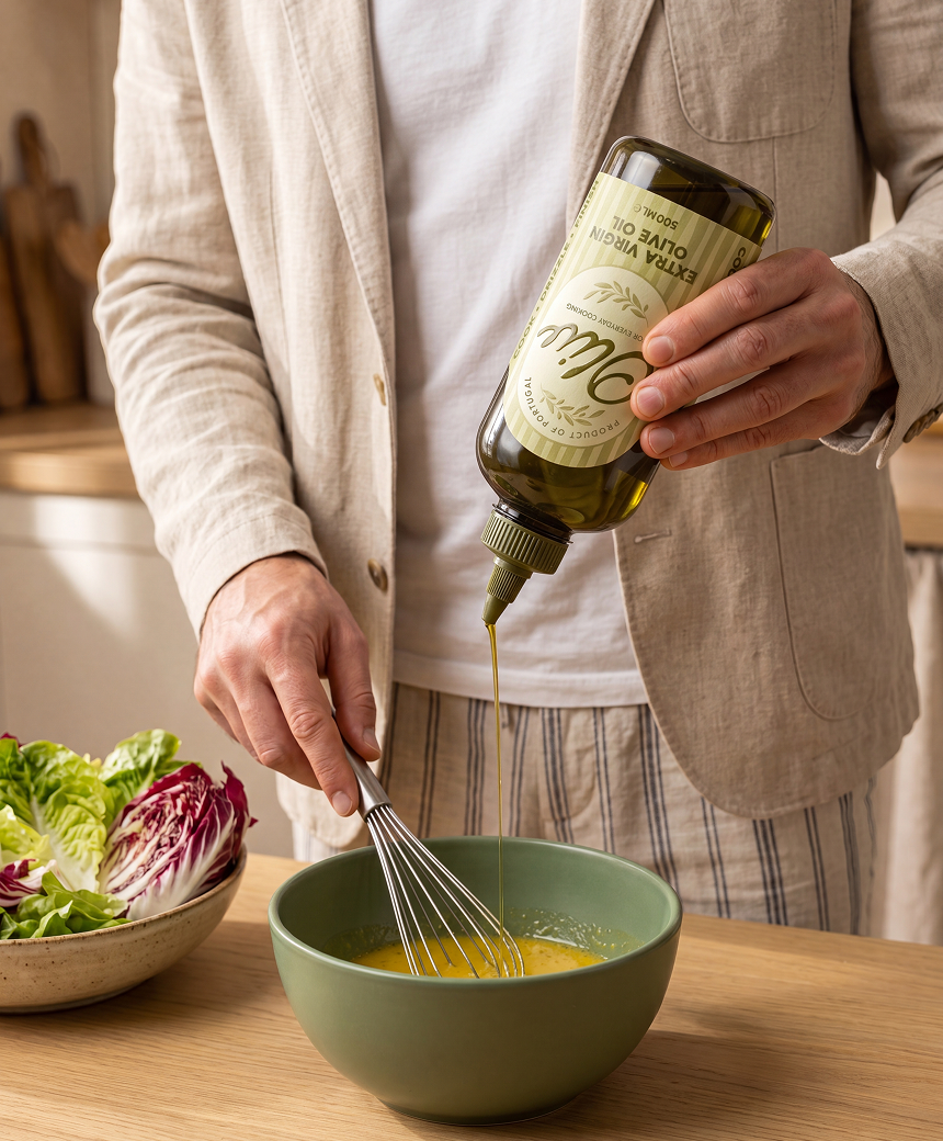
The big Idea: A squeezable bottle offers precise control, from a delicate drizzle to a generous pour. Combined with the rhythm and ease of modern Mediterranean living, this functional behavior becomes the visual language of the brand.
Design decisions:
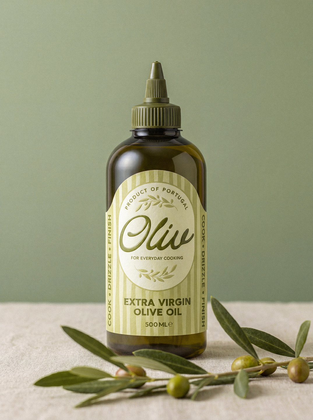
1. The stripes Soft, slightly fluid — not perfectly straight. The variation in width runs from fine and precise to bold and expressive, making the background feel alive, not mechanical. Overall, they echo the smooth flow of olive oil as it pours.
2. The label An arch at the top follows the bottle shoulder; a rectangular wrap covers the body. Form follows the container, not the other way around. The Oval echoes the shape of an olive. A calm visual anchor over the dynamic background, giving the brand name a clear, structured space.
3. Printing techniques
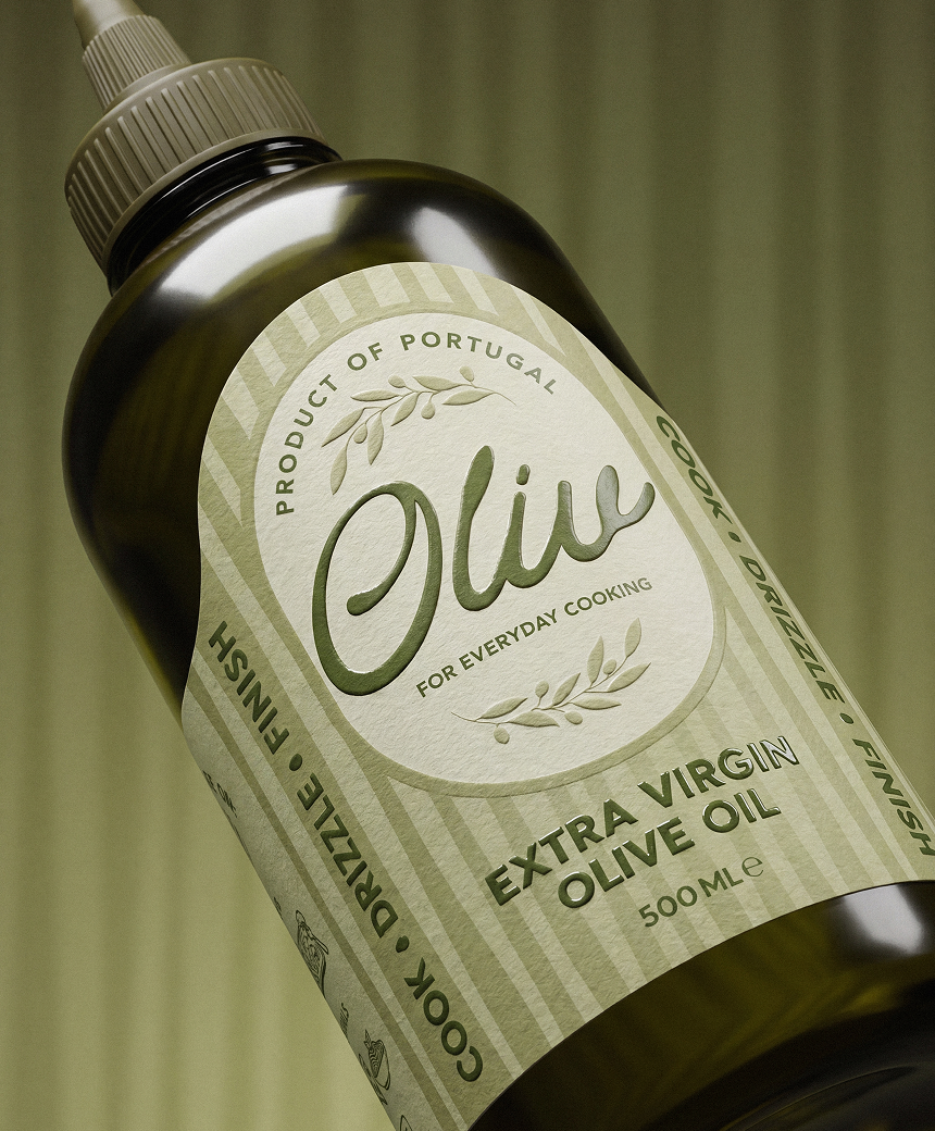
Design Paper Textured label stock with a natural, handcrafted feel.
Embossing Elevates key brand elements through touch and depth.
3D Spot UV Draws attention to the product name with a subtle glossy accent.
Together, these details create a memorable tactile experience while keeping the packaging clean, modern, and approachable.
4. Logo An elegant, flowing typeface with soft curves to express the brand’s craft nature and friendly, approachable character. The smooth letterforms visually relate to the rich, viscous texture of olive oil. The “O” subtly hints at the shape of an olive in a refined and non-literal way.
5. Colors The palette is built around warm, natural, “edible” tones: a creamy light-green base paired with pistachio and deep olive green. These colors reference nature, freshness, and the authentic origin of the product, supporting its high-quality positioning.