Comet

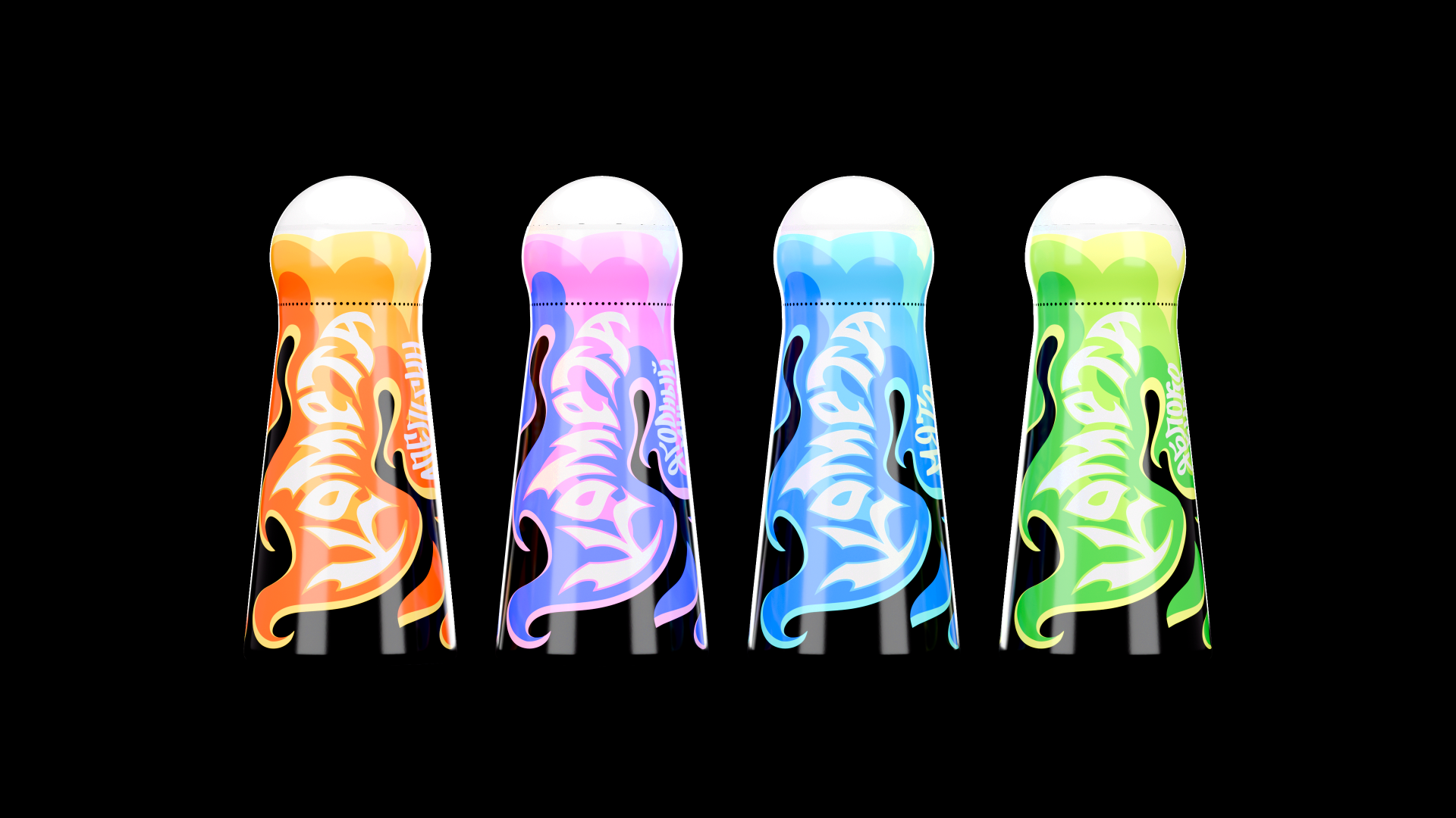

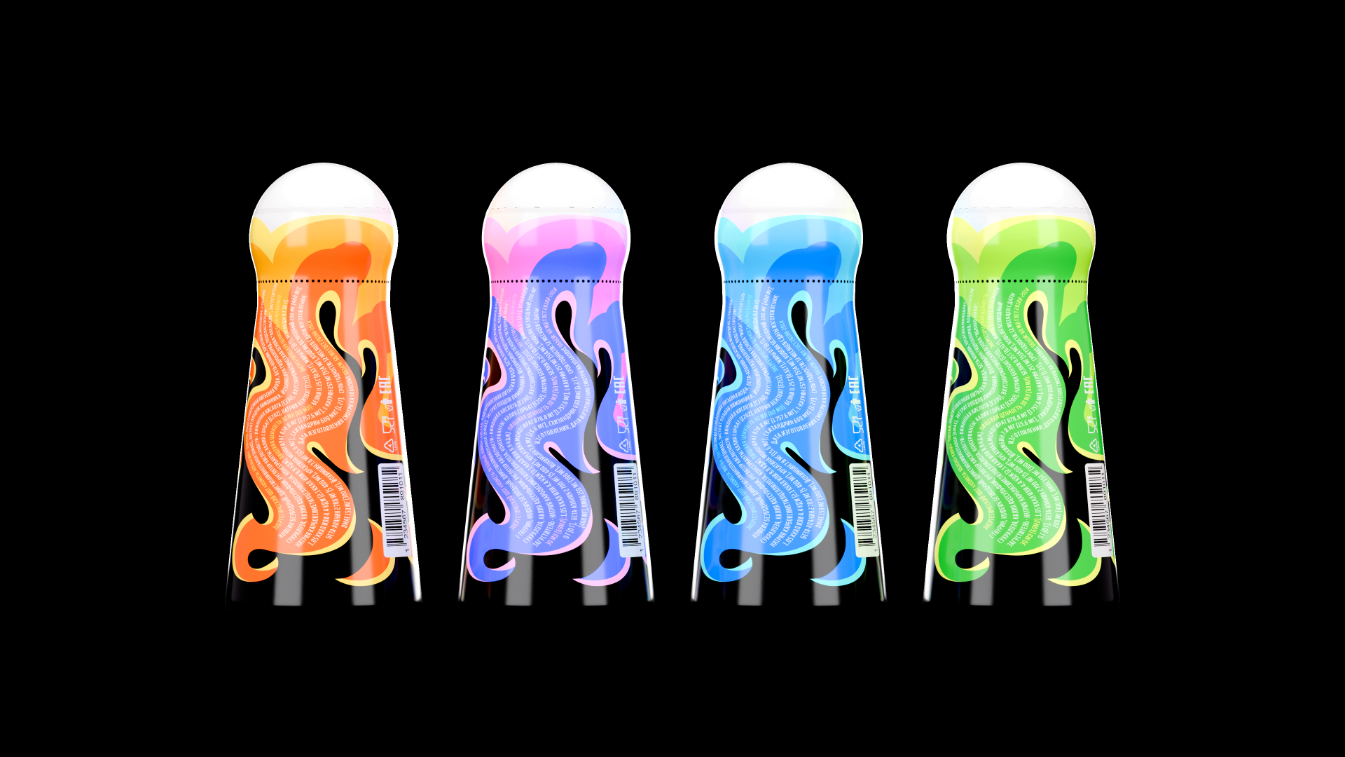


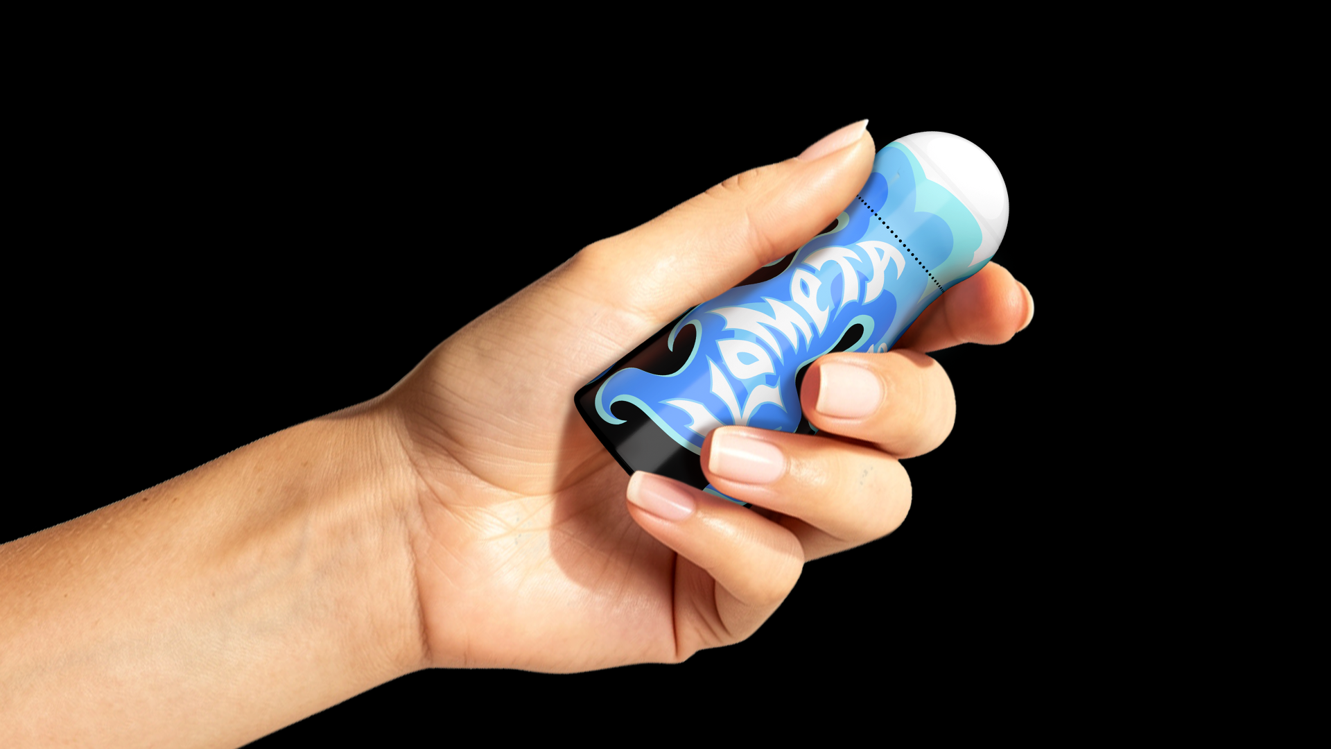

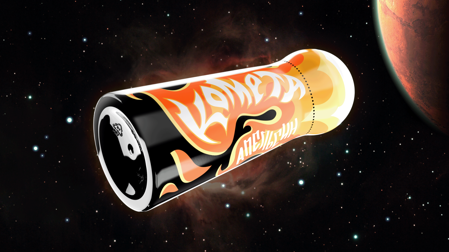
Comet is a brand of energy shots. The packaging’s core concept is based on the metaphor of a comet in flight. The bottle transforms into a bright, glowing tail, while the rounded cap embodies the celestial body, together forming a silhouette that reads instantly as a comet cutting through space.
Each SKU carries its own distinct color scheme, making the lineup visually rich yet cohesive.
The dynamic design embodies the brand’s tagline — “Explosive energy in every shot.”
Design by Kate Reichel, 3D renders by Kate Reichel
Materials Plastic, Polymer, Polyethylene, Film
Year 2026
Country Russian Federation
Region Europe
Project type Conceptual Design