Packaging You Shouldn’t Miss #144




Issue #144 showcases ten packaging projects chosen for the clarity of their concepts and the confidence of their branding, each balancing visual identity with structural intention. Selected by the Packaging of the World community, these designs stand out for how form and surface come together to communicate something distinct, whether through restrained minimalism or expressive graphic language. Together, they reflect an approach where packaging does more than hold a product, it shapes how that product is perceived.
Follow us on Instagram, Facebook, and Pinterest to stay updated with the latest in packaging design and creative work. Got a project worth sharing? We welcome submissions from designers, studios, and brands worldwide.
Sign in or create an account to submit your work to our global community.
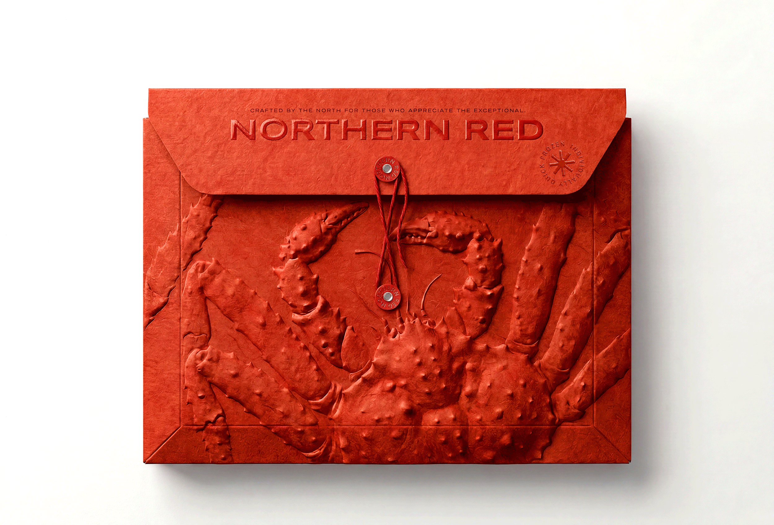
NORTHERN RED designed by Bolimond
This concept elevates premium Red King Crab through an envelope-style structure that trades conventional seafood packaging for refined, sculptural craftsmanship. A deeply embossed crab relief emerges directly from the paper surface, giving the design a strong tactile presence, while rich red tones reinforce a bold, confident brand identity. The string-and-button closure adds a sense of ceremony, making the package feel like a personal delivery or keepsake rather than standard product packaging. It stands out for treating seafood as a luxury object, using material choice, texture, and construction to communicate authenticity and craftsmanship rather than relying on imagery or literal packaging conventions alone.
Find out more
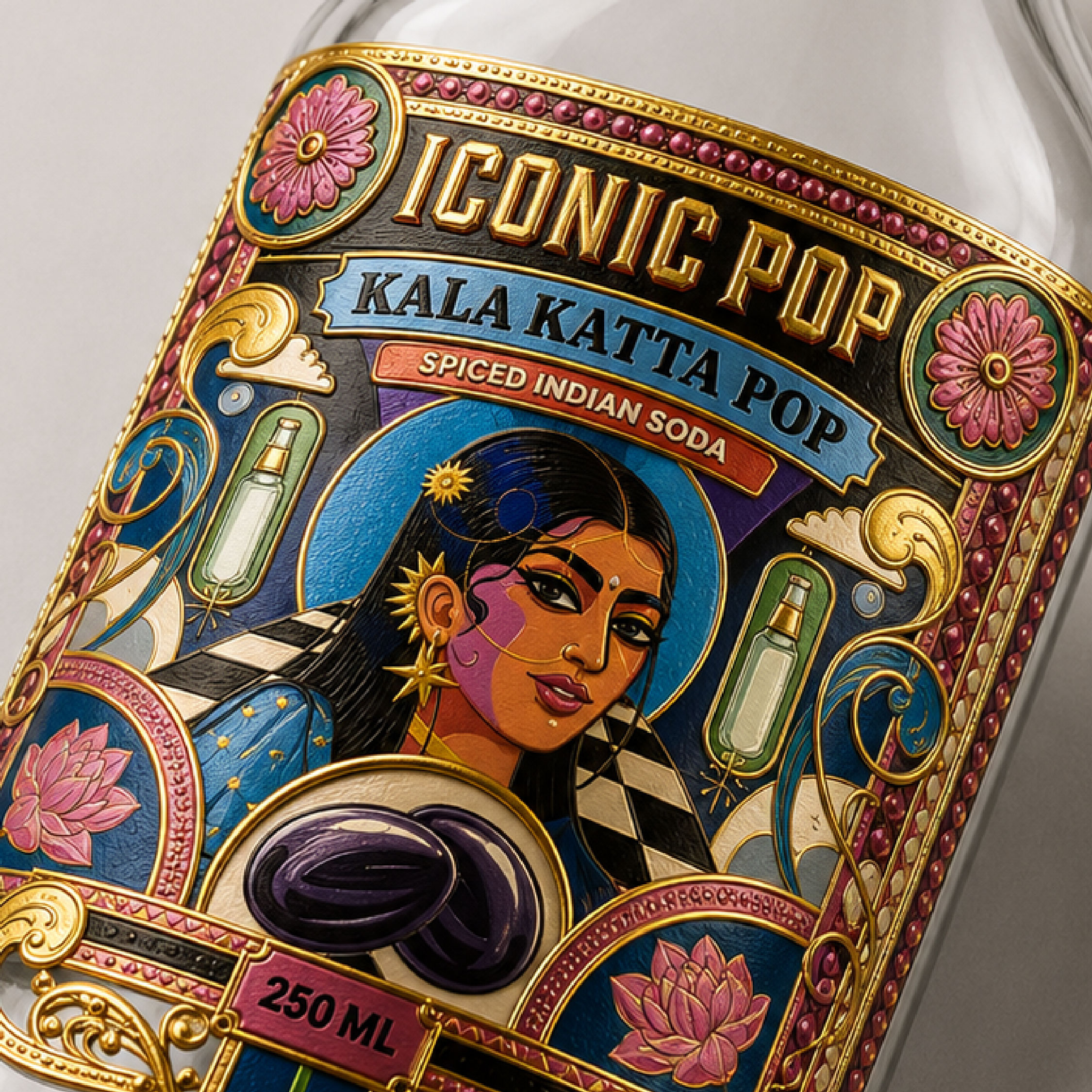
Iconic Pop — Logo & Label Design by Studio Pistache
Iconic Pop’s label draws on India’s street flavour culture, translating memories like kala khatta and aam panna into a bold carbonated drink identity by Studio Pistache. The design leans into a retro-disco-desi visual world, pulling from mela graphics, vintage soda signage and pop-art influences to build something maximalist yet controlled. What earns it a place on the list is the compositional discipline beneath the density: a clear focal hierarchy, a rich but limited palette, and ornamental detail that never competes with the brand name. The pairing of hand-crafted illustration with a fizzy, modern product adds a layer of tension that gives the branding real character rather than surface-level nostalgia.
Find out more
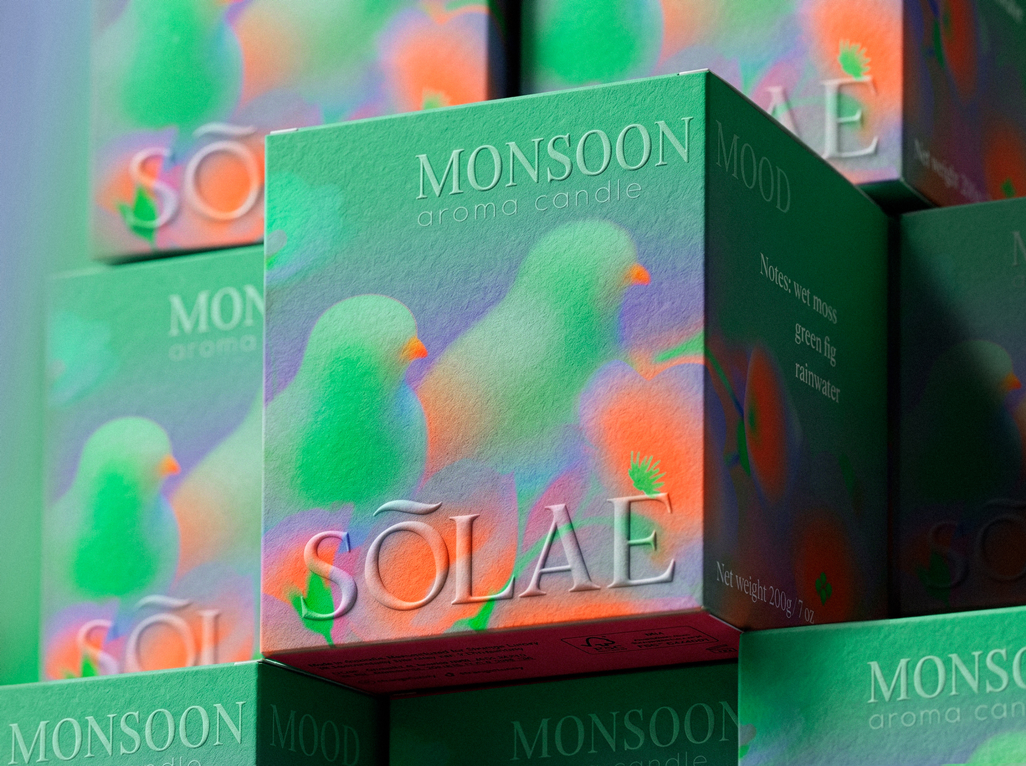
Solae designed by Alice Macarova
SOLAE brings a dopamine aesthetic sensibility to scented candle branding, using soft abstract illustration and tropical motifs to build an identity centred on warmth and everyday joy. Flowing foliage, organic shapes and bird silhouettes create a consistent visual world that feels playful rather than purely decorative. The packaging is executed in premium matte paperboard, with blind embossing that reveals illustrative detail as light shifts across the surface, giving the design a tactile, considered finish. What holds the concept together is the discipline behind the colour and emotion led approach, along with a type system and product form that feel fully integrated with the packaging rather than treated as a separate exercise.
Find out more
CLOUD MELT | Lip Mousse Balm Packaging designed by CO+LAB
CLOUD MELT’s identity translates the idea of lightness into a fully tactile lip balm concept, using soft organic shapes, glossy bubble forms and a pastel palette to build a sense of airiness and comfort. The spherical caps carry much of the storytelling, their scale and glossy finish giving the packaging a toy-like, sensory quality before any text is read. What sets the branding apart is its restraint, three fruit-inspired shades that remain cohesive as a family rather than feeling scattered. It’s a strong example of packaging communicating emotion through form alone, letting texture, light and shape do the work instead of relying on illustration or pattern.
Find out more
MAY (I COME IN?) designed by Anstaxy
MAY (I COME IN?) takes a playful approach to condom packaging, building its identity around the arrival of spring and the sense of anticipation that comes with it. Each variant is represented by a distinct flower shape rather than explanatory label copy, giving the range a consistent visual language while quietly guiding product choice. The semi-transparent matte packaging adds a layer of restraint, hinting at what’s inside without overstating it. Paired with a blush-pink palette, the wordplay of the brand name ties the concept together with confidence. It’s a rare example of intimate products being treated with genuine design thought rather than defaulting to clinical or overly literal cues.
Find out more
Cake Social designed by Affogato Brand Design
Cake Social’s identity draws directly from the craft of cake decoration, with tins designed to resemble beautifully decorated cakes when viewed from above. Frosting swirls, piped borders and a central spiral motif inspired by buttercream techniques are translated into a contemporary graphic system that feels both playful and refined. Mosaic-like radial patterns and hand-lettered style typography add richness without tipping into cliché, while a palette of rich reds, icing whites and chocolate browns grounds the brand in indulgence. What makes the concept work is how the packaging becomes part of the celebration itself, functioning less as a container and more as a keepsake designed to be kept.
Find out more
360° designed by Anna Garibaldi
360° builds its sunscreen identity around a clever metaphor: the further an object sits from the sun, the weaker its light exposure becomes, translated directly into a visual system for SPF levels. A “We Are Here” marker, borrowed from map logic, gives each level a sense of position rather than an abstract number, making the range instantly intuitive. A recurring yellow orb cap ties the collection together as a single, consistent symbol across the line. The concept earns its place through restraint, using one clear visual idea to communicate function, rather than layering on decorative detail or relying on text to explain the system.
Find out more
Amaro del Palombaro designed by Stefano Bracci
Amaro del Palombaro’s label brings an Abruzzo legend to life through a surreal illustration of a helmeted deep-sea diver fused with an octopus, giving the amaro a distinct visual character rather than a decorative motif. Copper foil detailing and a richly textured substrate add depth that rewards closer inspection, elevating the label beyond flat print. The typography stays quiet and restrained, allowing the artwork to carry the brand’s presence. It’s a strong example of heritage storytelling handled with confidence, avoiding cliché while giving the product genuine shelf character.
Find out more
Gafi Juice – Packaging Built Around Personality designed by Hakob
Gafi Juice builds its identity around a character rather than the product itself, using a dachshund mascot to bring personality into a category dominated by fruit imagery and flavour cues. The clever detail is the striped ribbon, which reads as a graphic device but also doubles as the character’s clothing as it wraps around the can, tying illustration and structure into a single seamless element. Bold red and navy tones keep the character legible at shelf distance, giving the brand strong standout among competitors. It’s a well-executed example of character-driven branding, where recognition comes from personality rather than product depiction.
Find out more
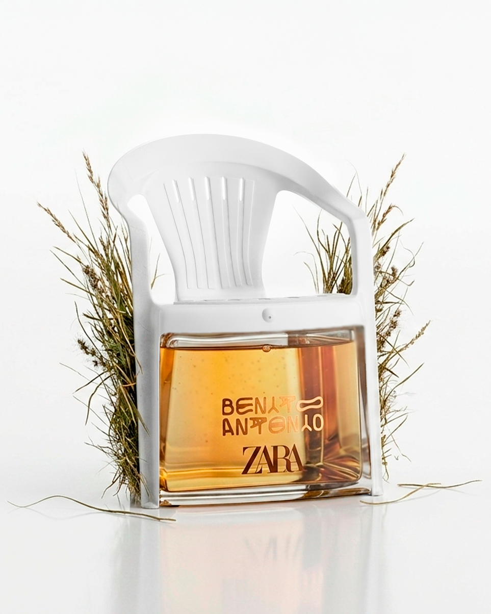
ZARA x Bad Bunny designed by Marco Arroyo-Vázquez
This ZARA x Bad Bunny concept fragrance imagines what an iconic cologne from the DtMF era might look like, built around the mood of Puerto Rican summer nights and nostalgia. The design leans on restraint, letting a white resin chair, dried grass, and a warm amber bottle carry the storytelling rather than relying on obvious tropical cues. A fragmented logotype gives the branding a personal, handmade quality instead of a polished commercial feel. The concept stands out for committing fully to a specific atmosphere, treating the packaging as a scene rather than a product shot, which is uncommon in this category.
Find out more