

















SAINT EMILION




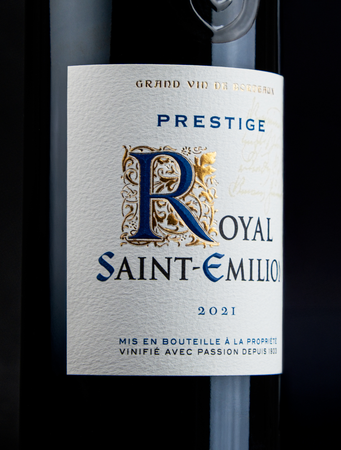
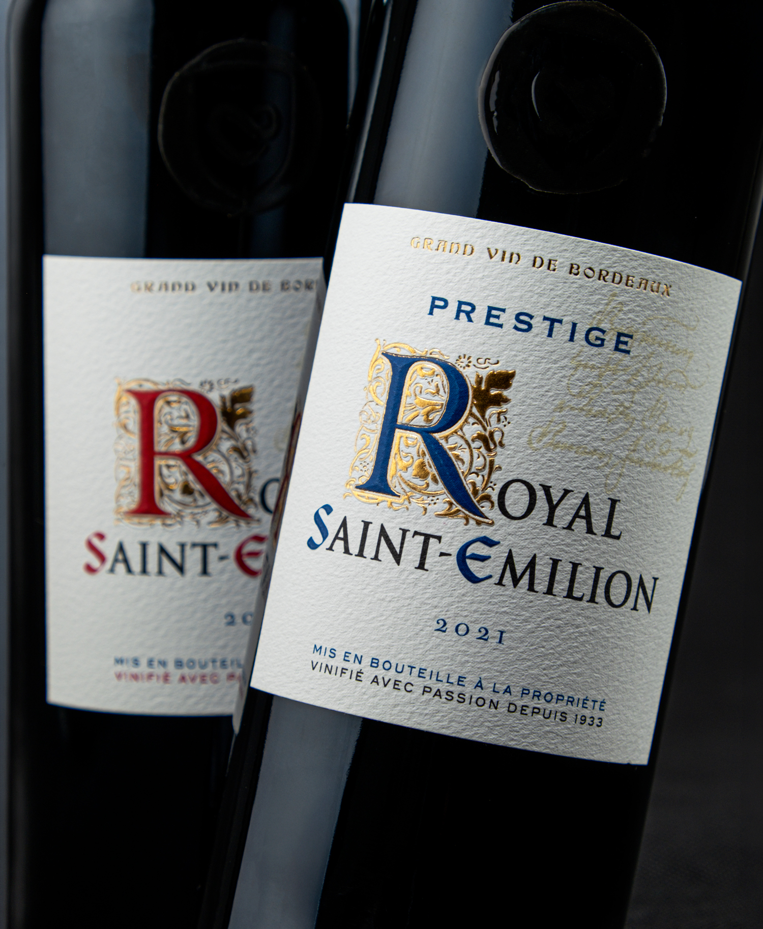

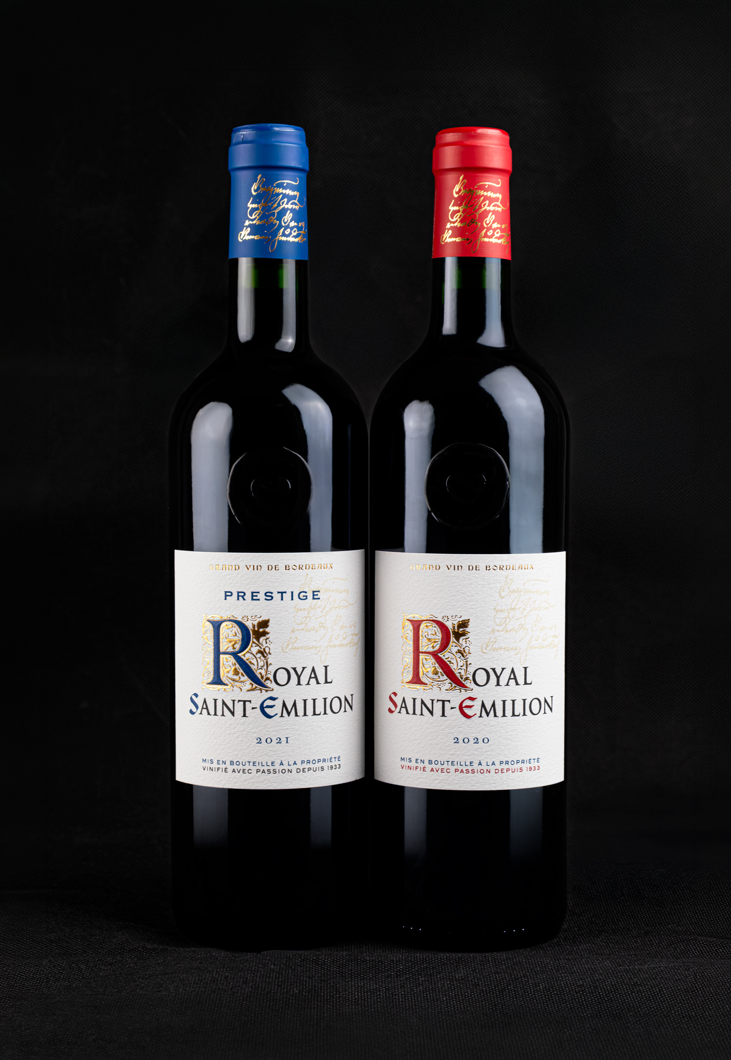

The Union of Saint-Émilion Winegrowers entrusted us with the redesign of their historic brand, originally established in 1933.
Created from a meticulous parcel-by-parcel selection of the appellation’s most representative vineyards, Royal Saint-Émilion has always embodied a promise of excellence, reflecting the prestigious and internationally renowned reputation of Saint-Émilion.
Our mission was to reinterpret the brand without making a radical departure from its historic visual language. A beautifully crafted decorative initial sets the tone, paying tribute to the masterful craftsmanship and dedication of the region’s winemakers.
The elegant curved label and flawless printing were expertly produced by MCC Label on the timeless Cotton White material from Avery Dennison.
@unionproducteurssaintemilion @Passionsaintemilion @mcclabel @averydennison @m_uselive
Site internet : https://www.adcoteaux.com/
#agencedescoteaux #wine #design #packagingdesign#drinkspackaging #SaintEmilion #BordeauxWines #RoyalSaintEmilion


