

















Revitalising an iconic beer brand


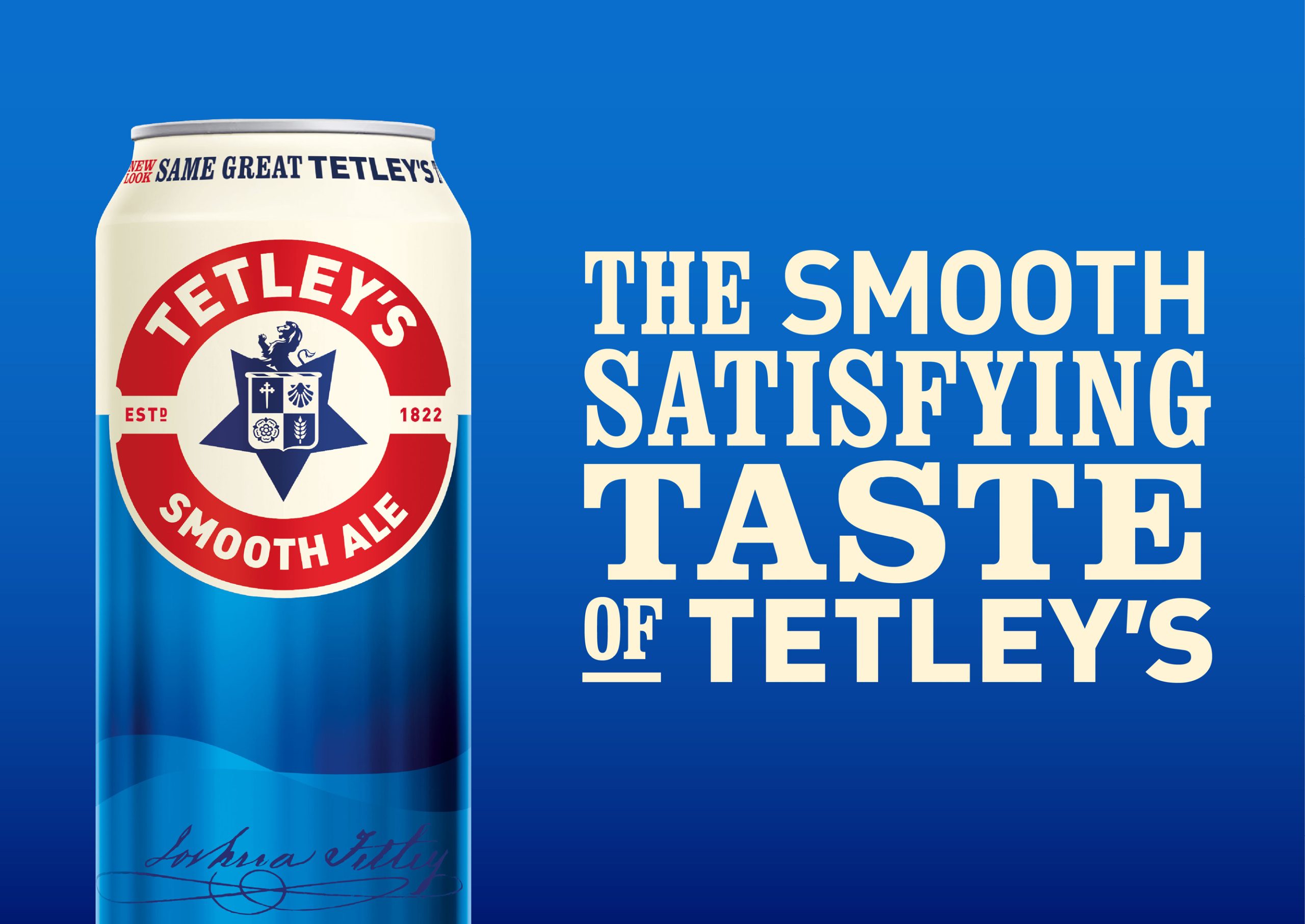

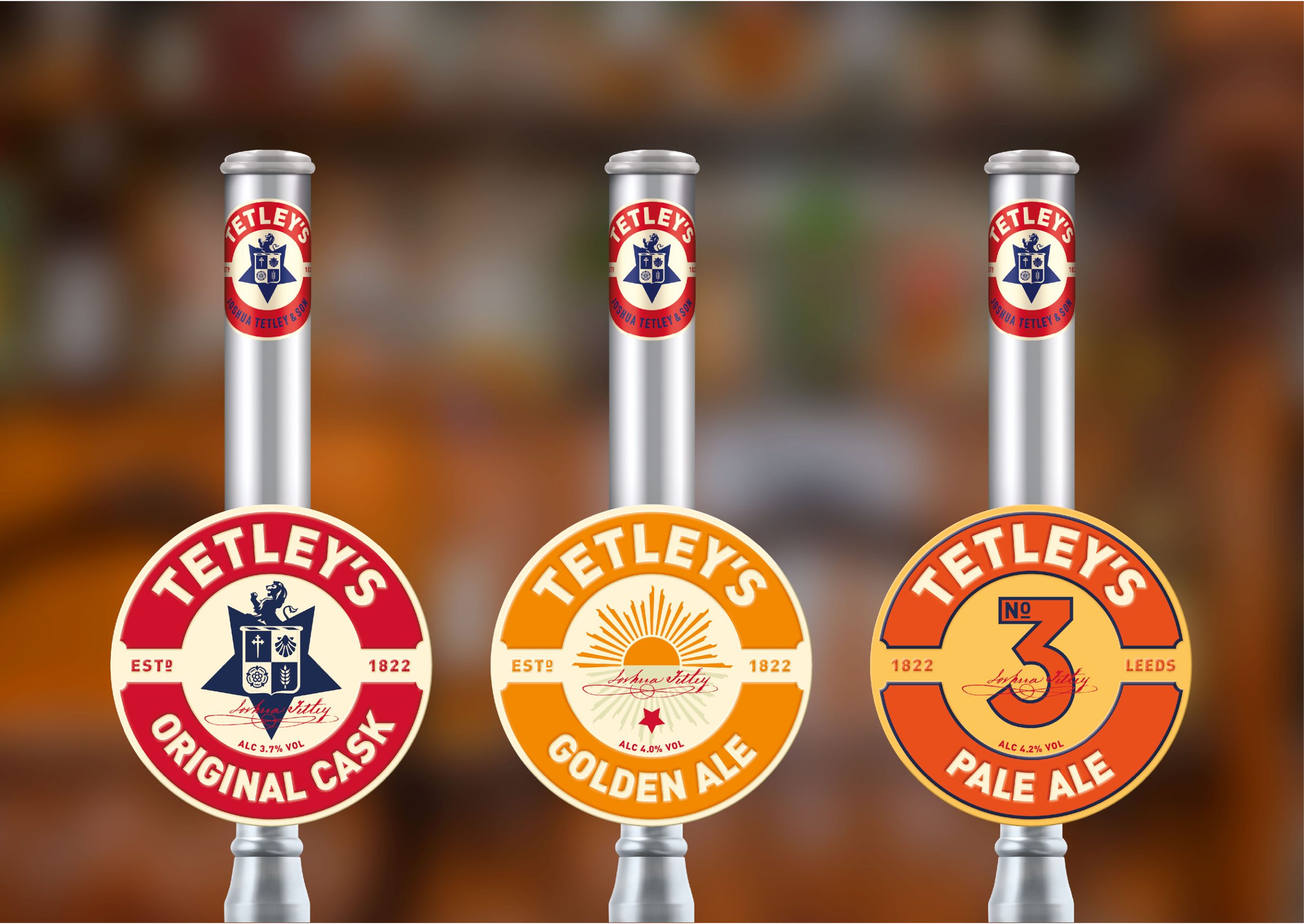


Tetley’s is one of Britain’s best selling ales. The brand and packaging needed reinvigorating to realign the brand with its core customer base, whilst making it relevant for today’s drinkers. The Huntsman had served Tetley’s well for nearly 100 years, however, we identified that a change of symbol would be key to creating a symbol of change for the brand. Tetley’s Cask, the flagship brand, was totally redesigned with an embossed metal pump clip that positions the ale as premium. We revived Tetley’s refreshing beers for the on-trade. We also introduced NPD for Tetley’s, based on their original recipe. The symbols in the new logo, derived from the original coat of arms, are inspired by the Tetley family’s previous business as Maltsters.
Year 2026
Country United Kingdom
Region Europe
Project type Commissioned Work
Client Carlsberg Group
More by WPA Pinfold View profile

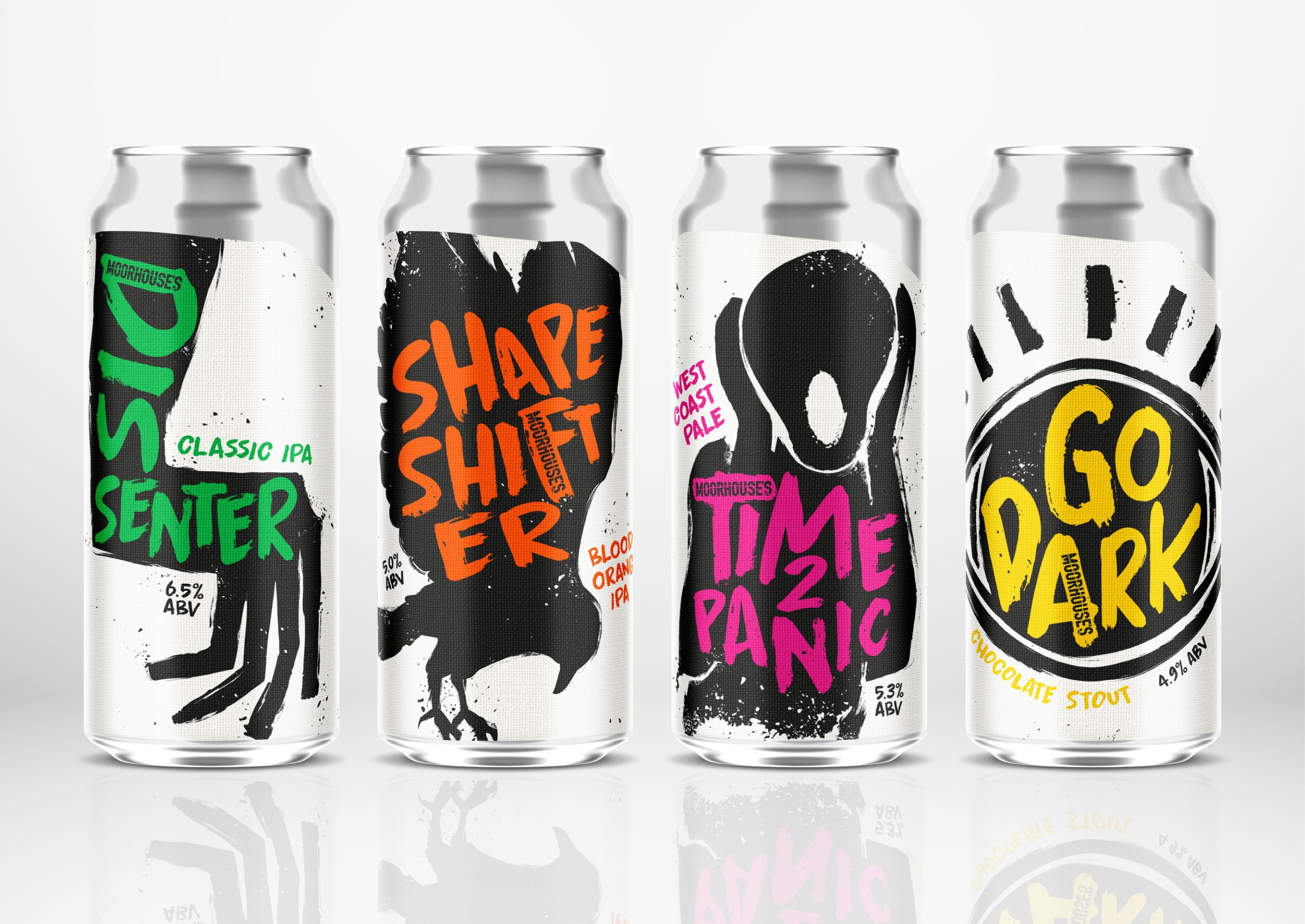 Out of the shadows… a new craft beer range

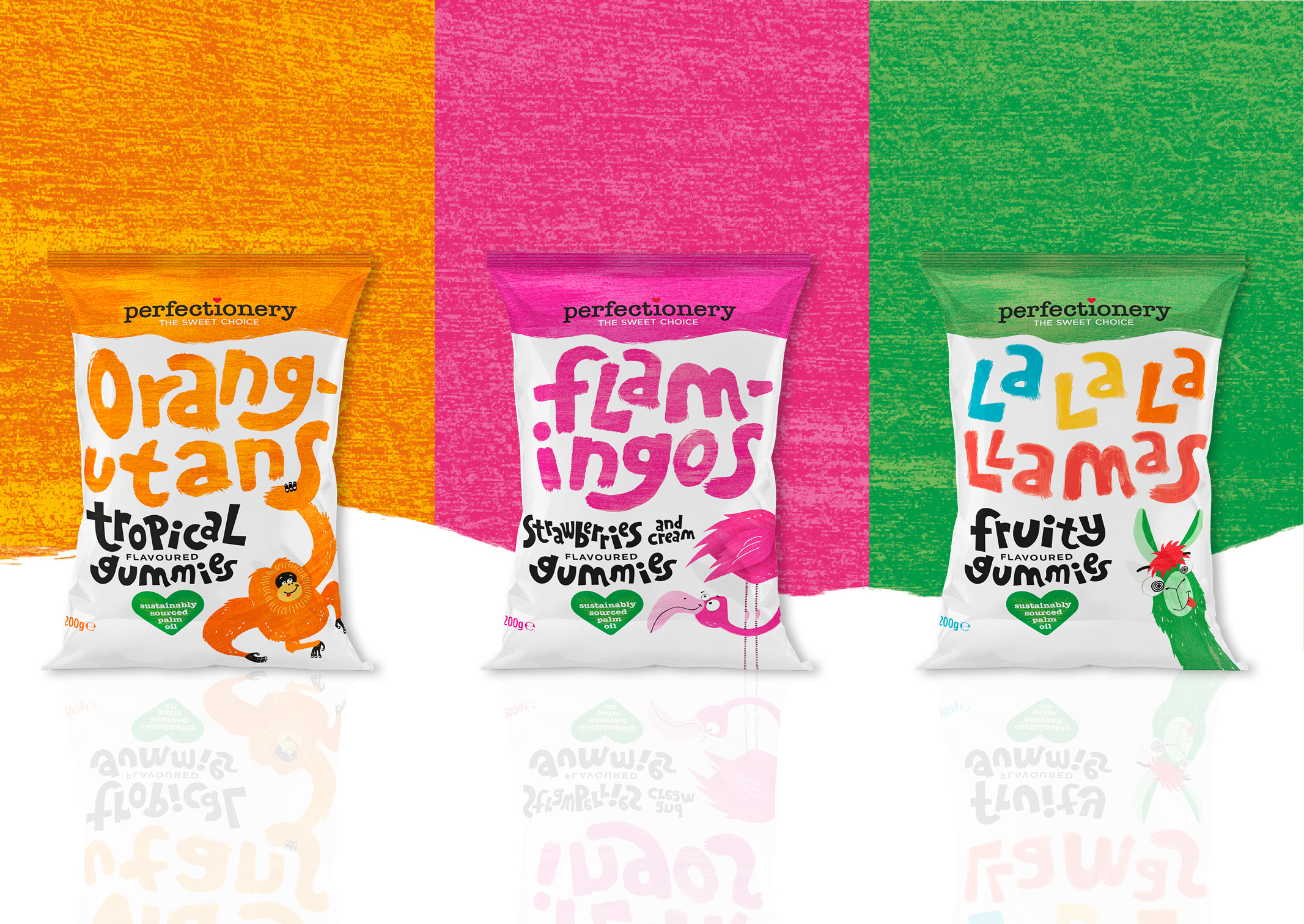 Perfecting a new confectionery brand

 Repositioning a global pet food brand for growth

 Repositioning a legendary brand for growth

 Repositioning Harvey’s craft for a fresh generation

 Re-positioning an iconic brand to create growth

 Brennan’s Irish Stout

 Hairy Bikers x Theakston – the road to success