

















Cake Packaging & Brand Illustration


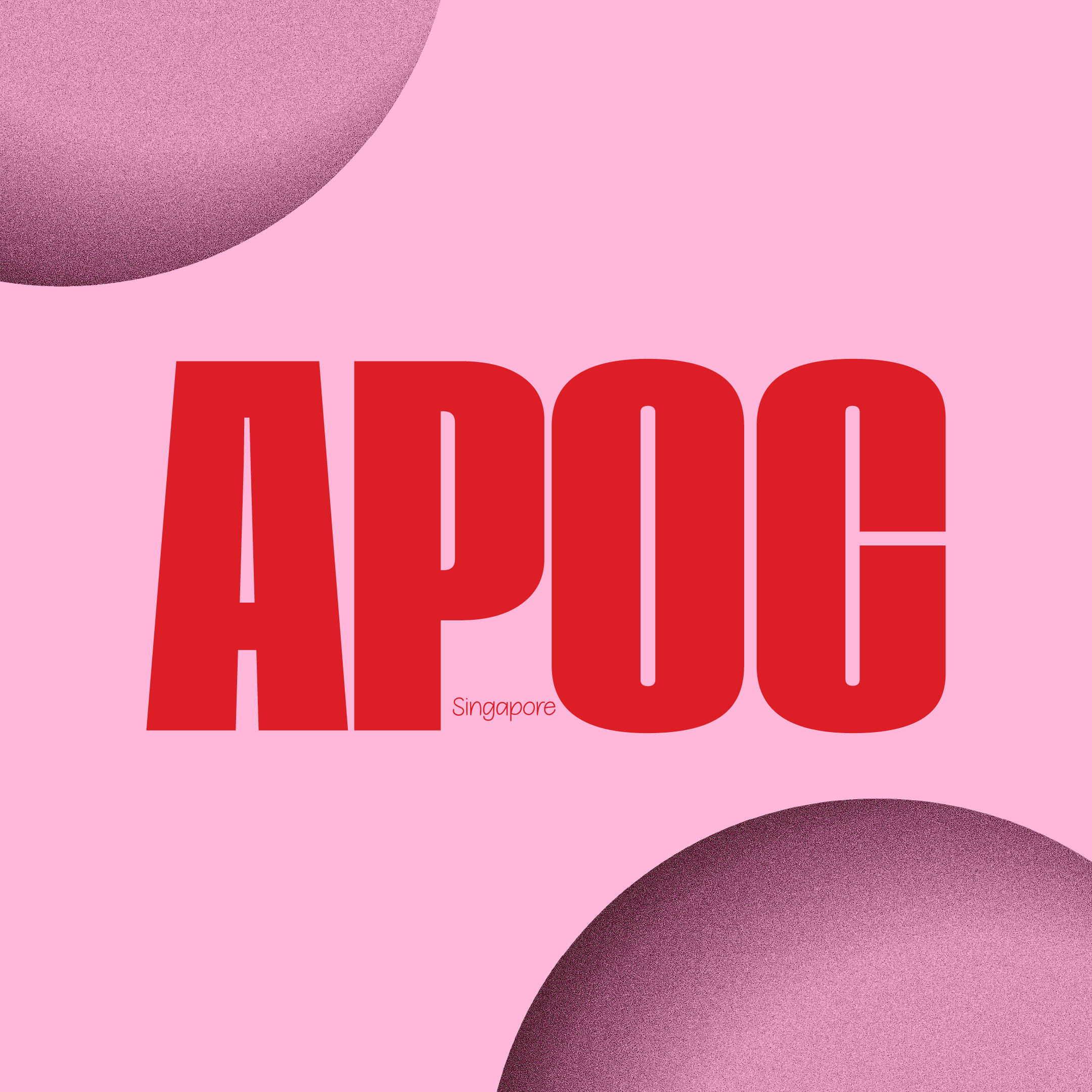
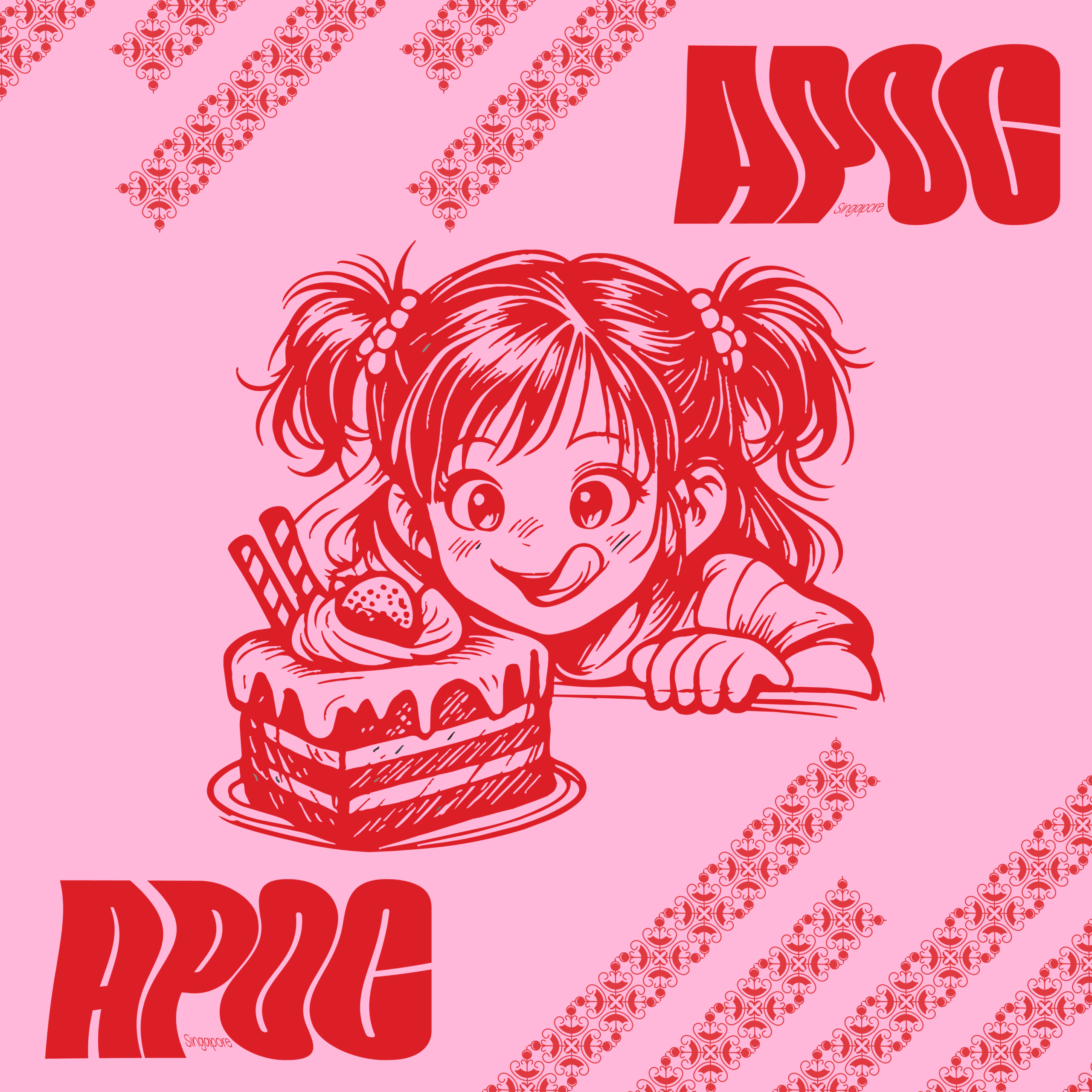
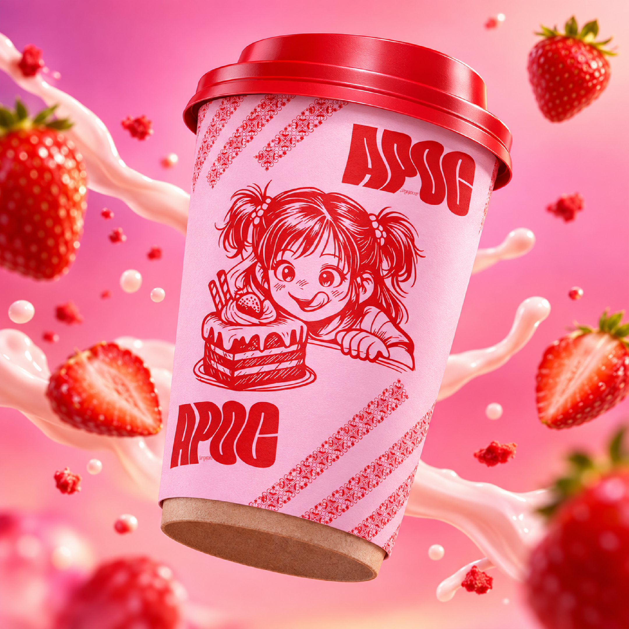
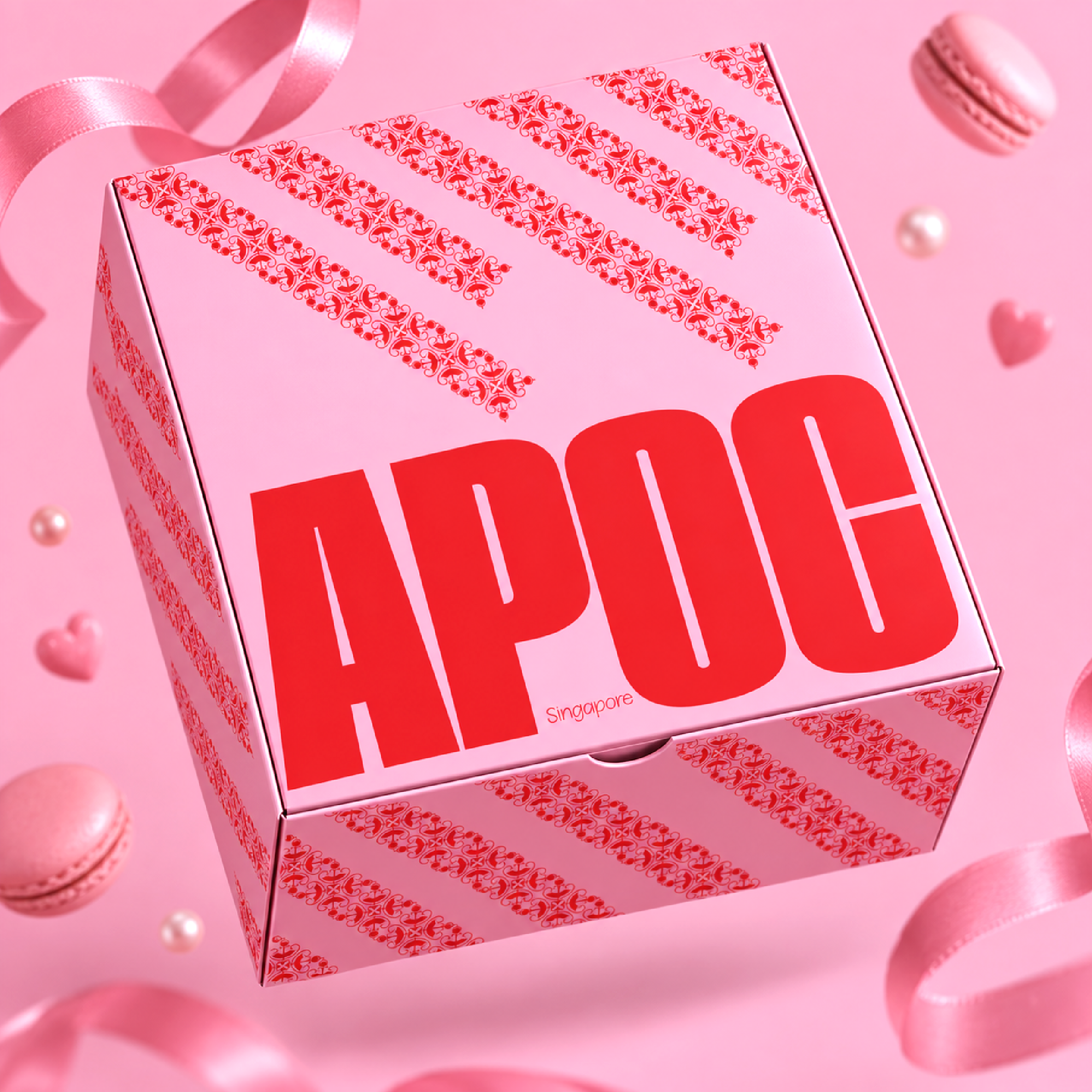
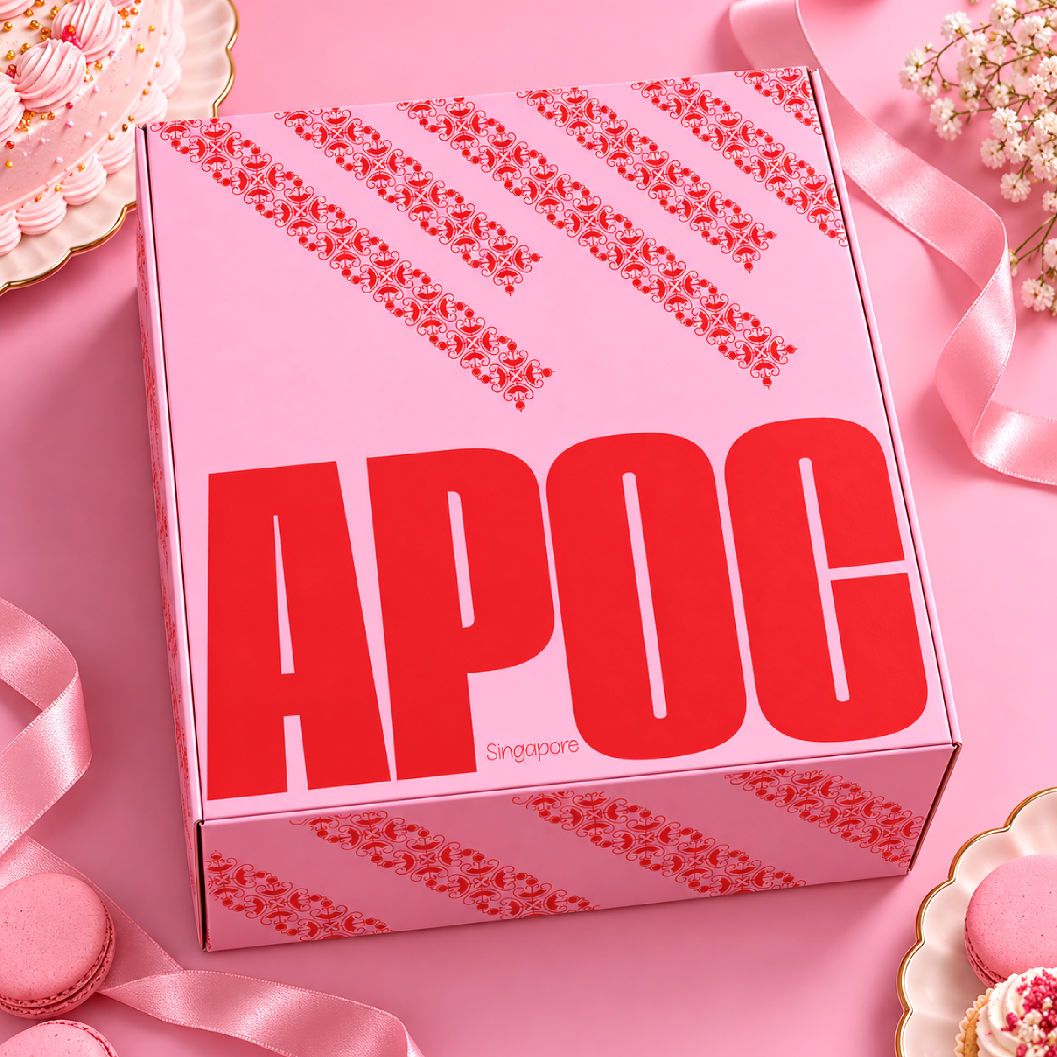

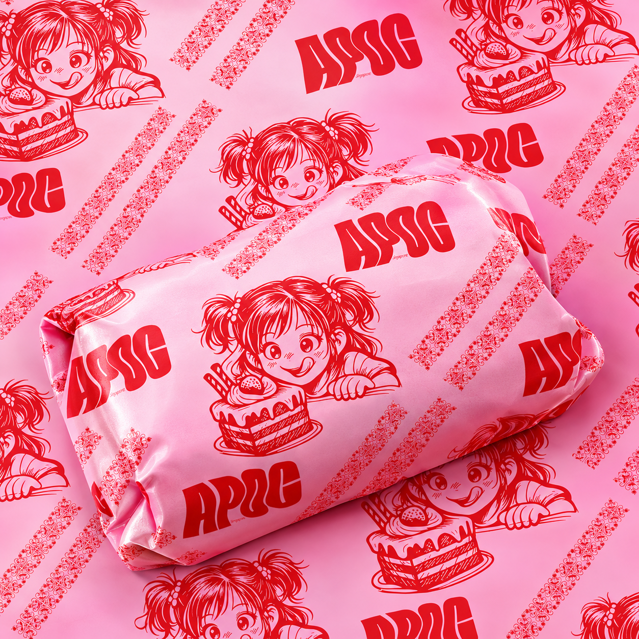
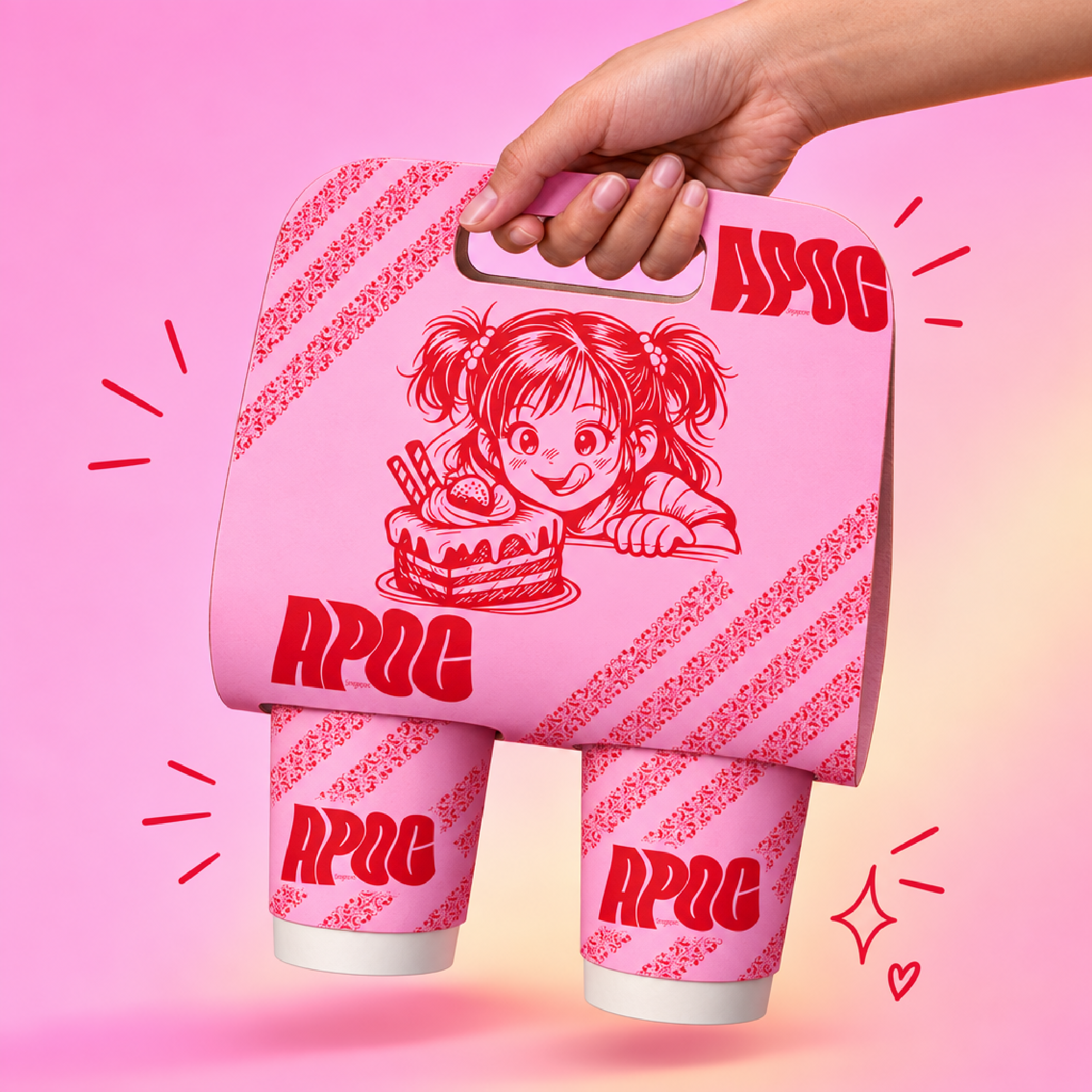
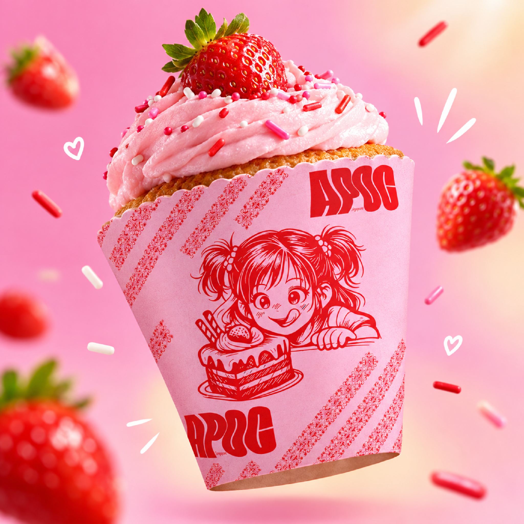
I wanted to build a visual identity for APOC that feels energetic, playful, and instantly recognizable. The core concept leans into a youthful, manga-inspired vibe—capturing that nostalgic feeling of excitement when you’re about to dig into a fresh piece of strawberry cake.
Design & Visual Breakdown
Centered around a custom hand-drawn character illustration featuring a wide-eyed anime/manga girl eyeing a cake. It gives the brand a distinct, friendly personality right on the front of the cup and print collateral.
Used a ultra-heavy, stylized block typeface for the “APOC” wordmark. The thick red lettering creates a solid contrast against the soft pink backgrounds, making the logo pop from across the room.
Developed a repeat diagonal typography tape pattern running across the packaging edges. It ties the takeaway cup and bakery box together while giving the layout a modern street-style edge.
Kept the palette focused on high-contrast shades of strawberry red and creamy bubblegum pink. It immediately signals flavor, indulgence, and fun.
More by Atiq Alam View profile

 Liftlab Skincare | Comprehensive Branding & Packaging Design

 Hair Care Sea Salt Spray | Packaging & Branding Design

 The Dough Duke | The Modern Neighbourhood Bakery Branding

 Olive Oil | The Flow of Flavor Captured in Optical Waves

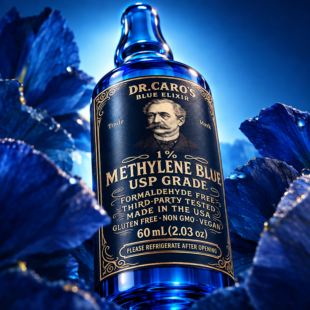 Blue Elixir 1% Methylene Blue USP Grade Bottle

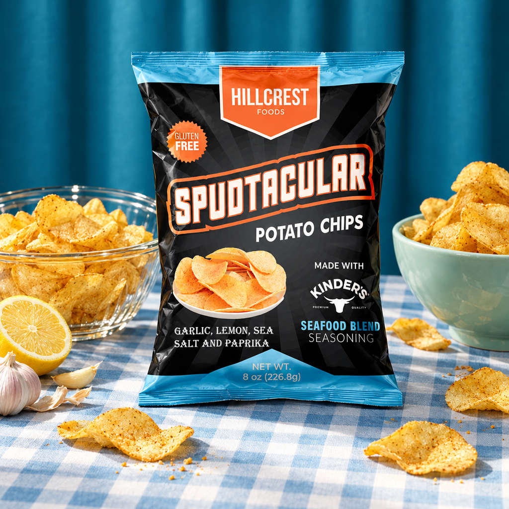 Potato Chips Packaging Line | Snacks Food Packaging

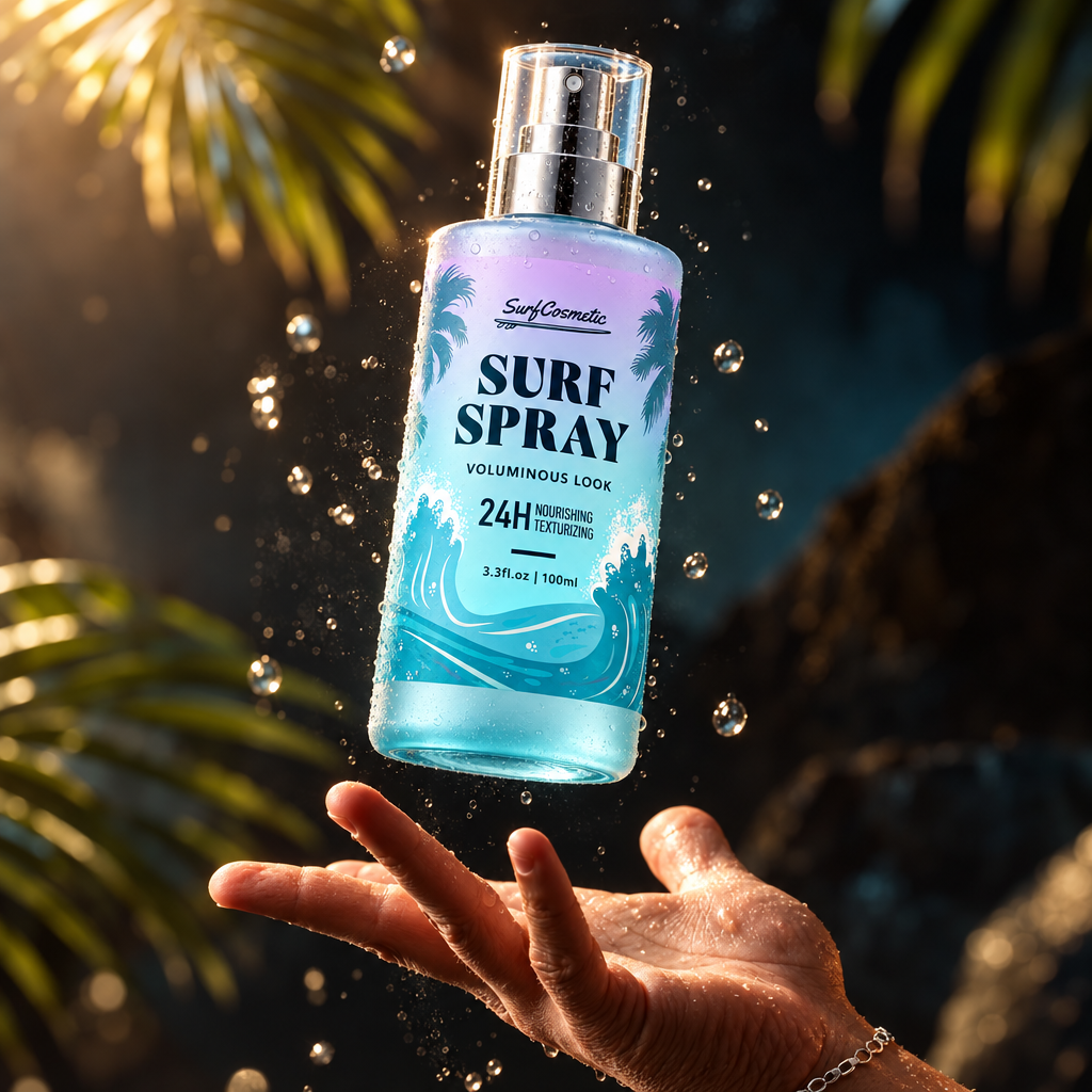 Surf Spray Hair Styling Spray Bottle Packaging Design

 Jamaican Jerk Seasoning Spices Jar