Chicken Eggs — Romanovsky

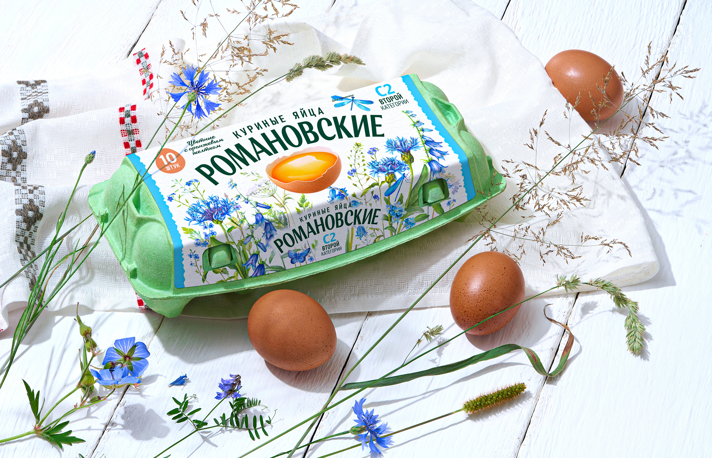
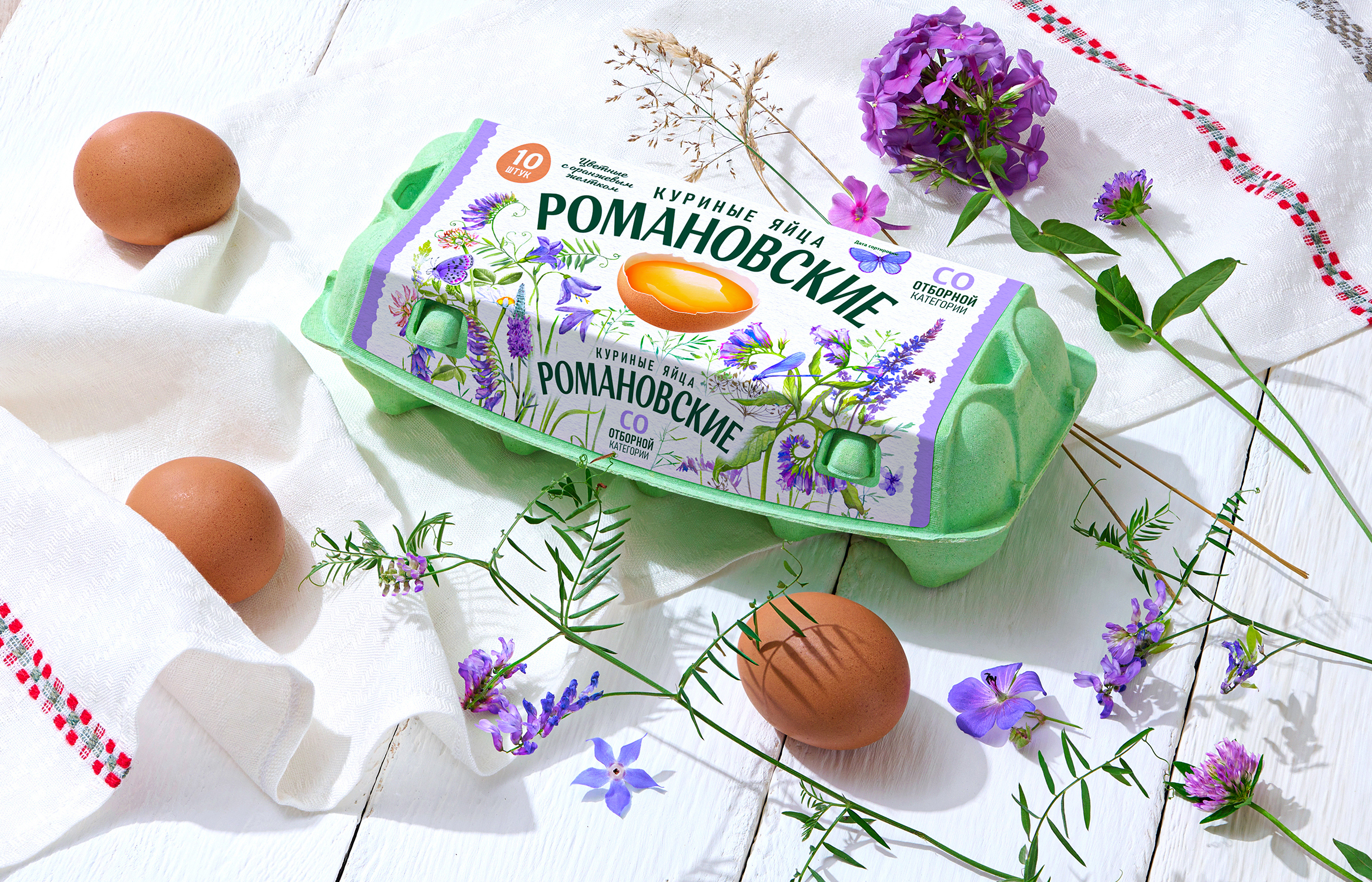
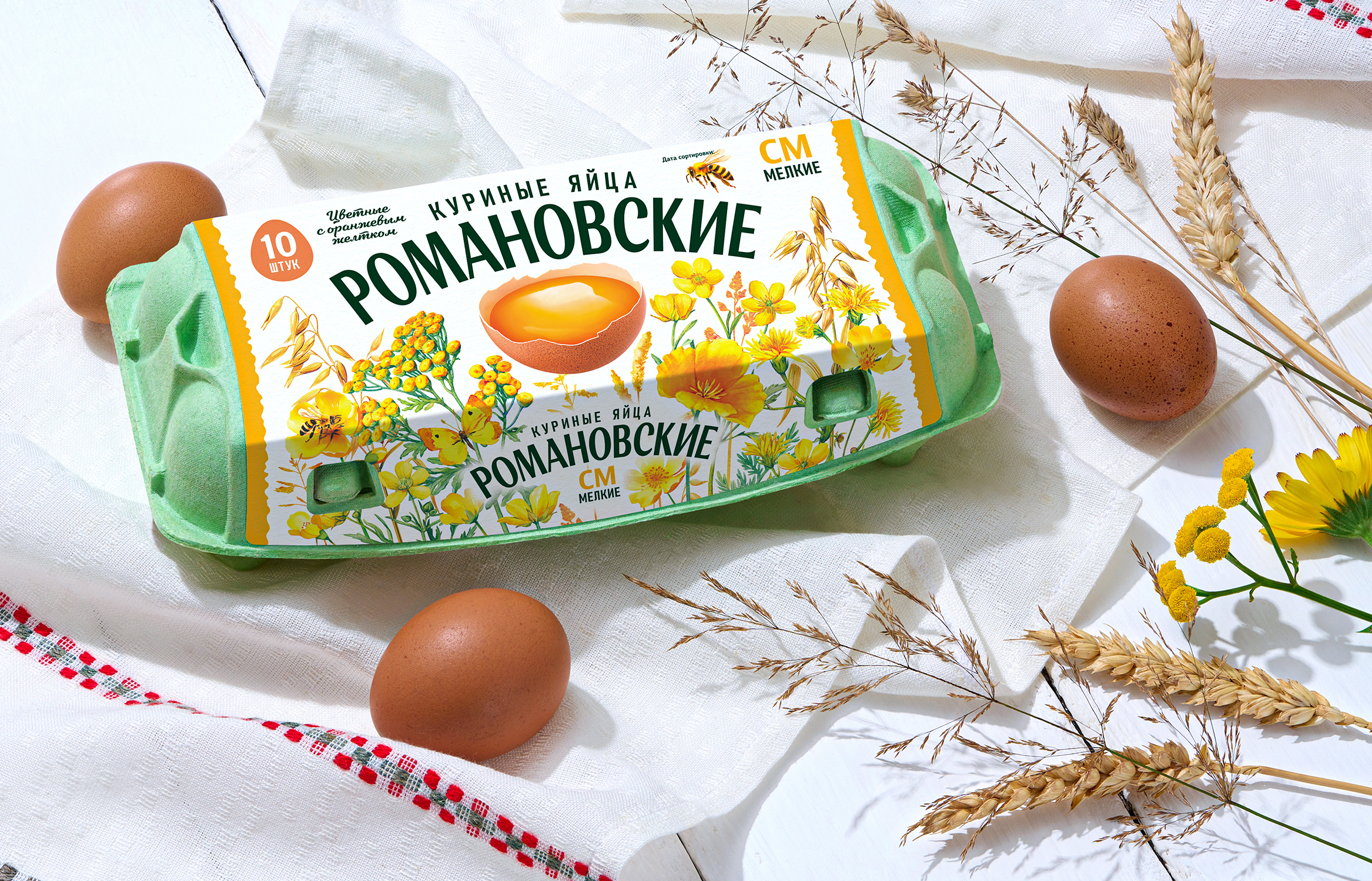
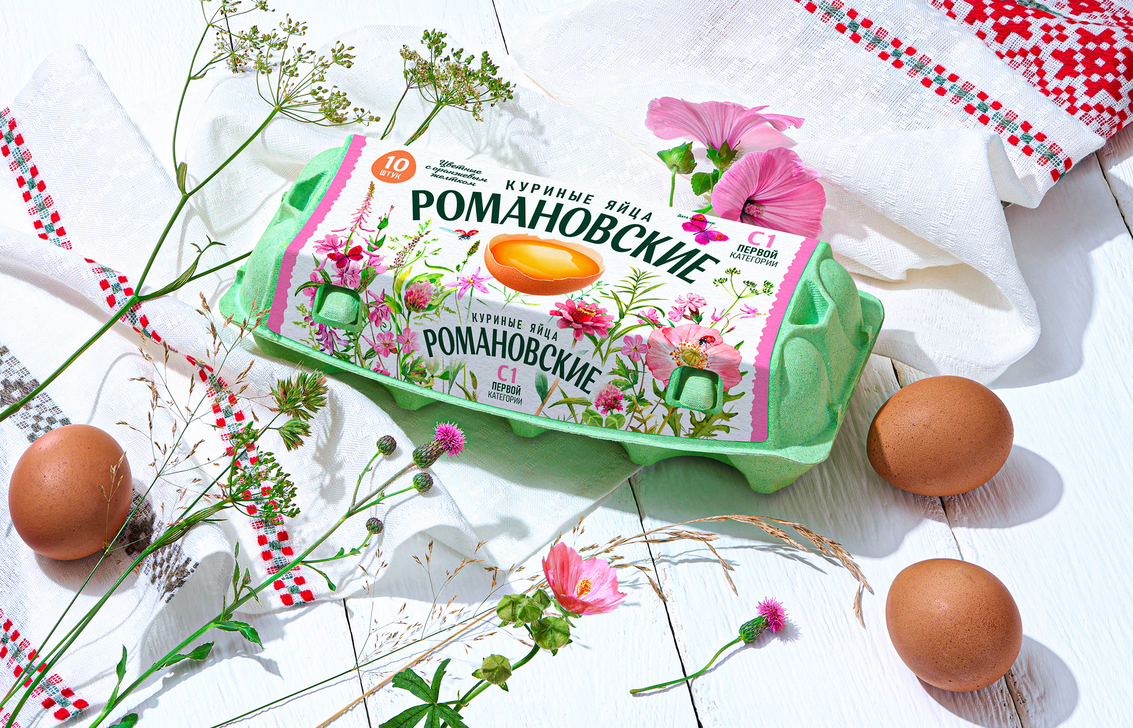


The concept is based on the idea of naturalness, eco-friendliness, and connection with nature. The label design conveys a sense of freshness and a product created in a natural environment.
A key graphic element is a botanical illustration: wildflowers, grasses, ferns, and wild plants form a vibrant natural pattern around the central image—an egg with a rich yellow yolk. The richness of the plant forms creates a sense of natural diversity and emphasizes the product’s natural origins.
The large typography of the Romanovskie name is seamlessly integrated into the composition: it is easy to read, does not compete with the illustration, and creates a memorable visual image of the brand.
A unified color differentiation system has been developed for the line, allowing for quick identification of egg categories thanks to individual color schemes. At the same time, all variants maintain the overall style and integrity of the brand, and the variety of shades supports the idea of the richness and diversity of natural forms.
A calm, muted palette, botanical motifs, and textured illustrations convey the aesthetics of an eco-friendly farm-to-table product, combining naturalness with a modern visual language. The result is packaging that combines naturalness with contemporary branding.
Expressive typography, botanical graphics, and a well-thought-out color scheme help the line stand out on the shelf while maintaining the feeling of a simple, honest, and natural product.