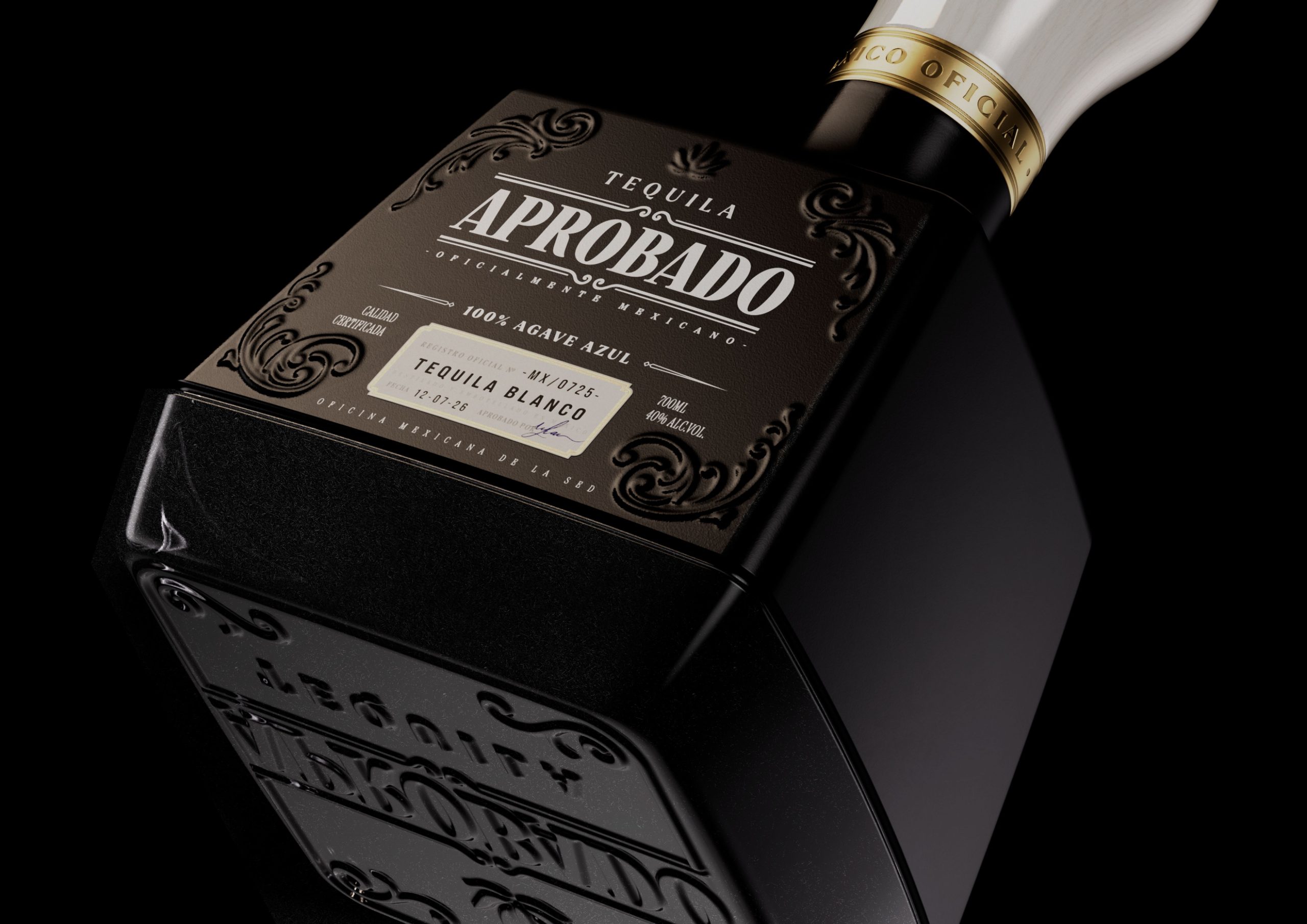
Ker Moren – Yogurt


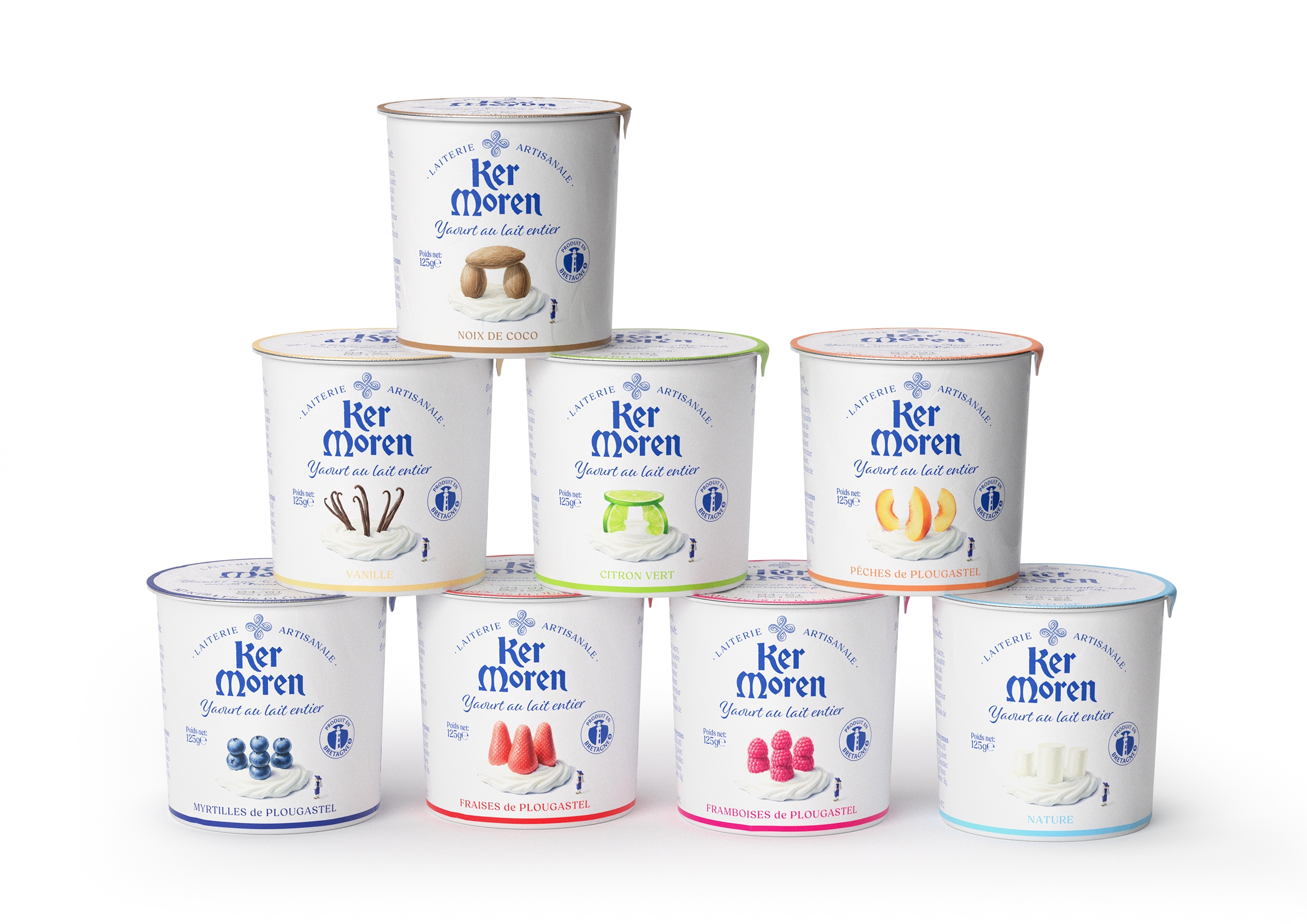
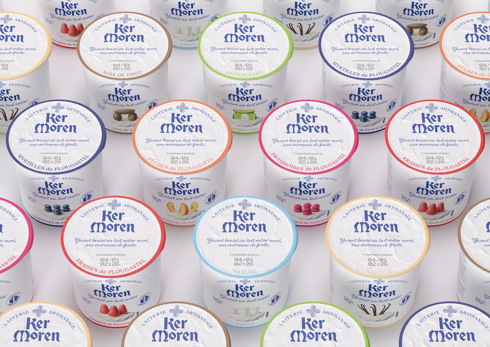

Ker Moren is an artisanal Breton dairy, promoting local know-how and the quality of ingredients. The visual identity is inspired by the Breton landscapes, menhirs and dolmens that dot it, and the dairy world, in a humorous way, mixing authenticity, softness and modernity. The logo, typography and color palette were chosen to reflect Brittany, in order to create a brand that stands out, warm, recognizable and in line with values of proximity, naturalness and responsible production.
Year 2026
Country France
Region Europe
Project type Commissioned Work