

















Parco del Marchese’s Flavored






Five Flavors, Five Personalities
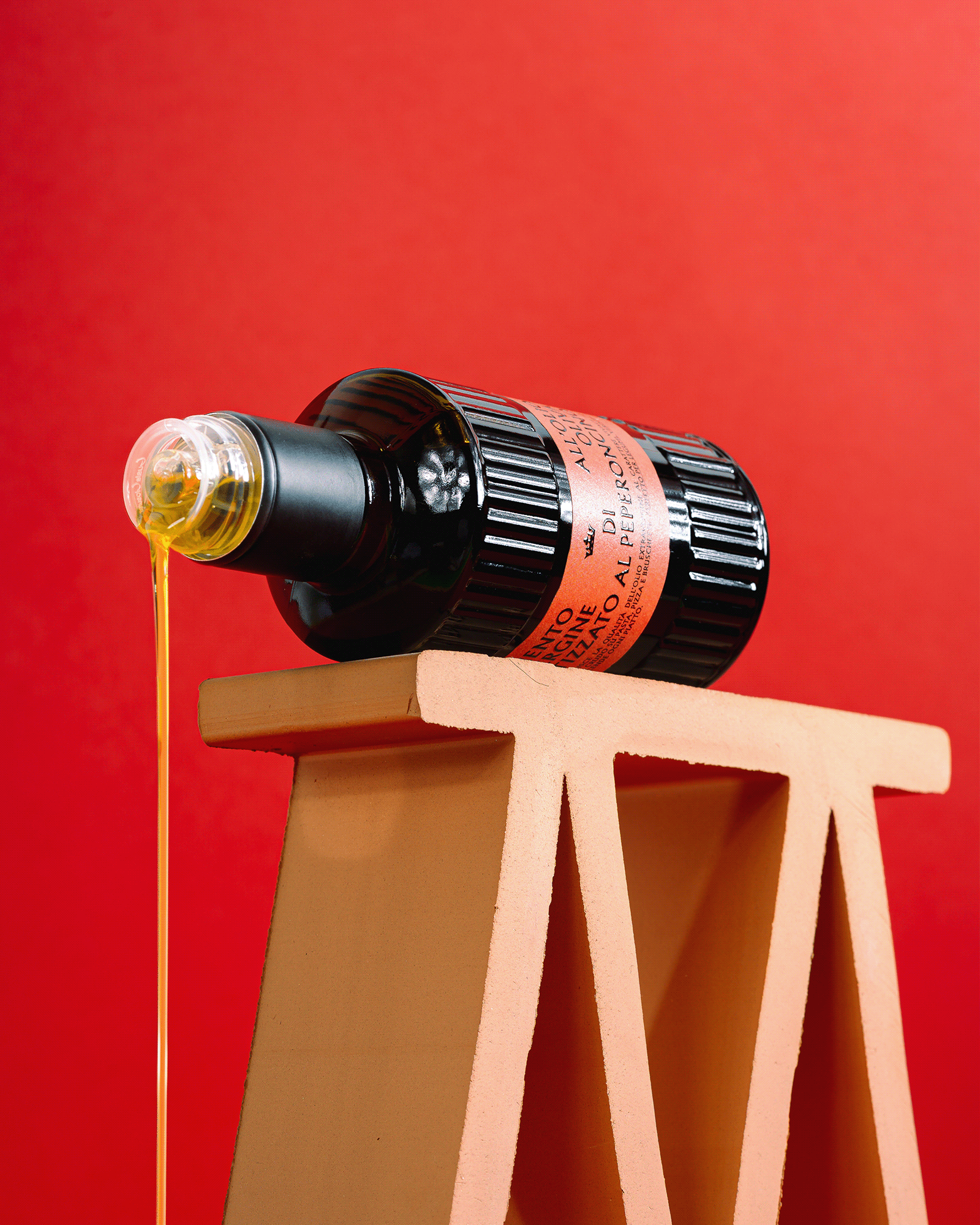
For the new line of aromatized extra virgin olive oils by Parco del Marchese, we developed a visual identity designed to make each flavor immediately recognizable while creating a strong and cohesive collection.
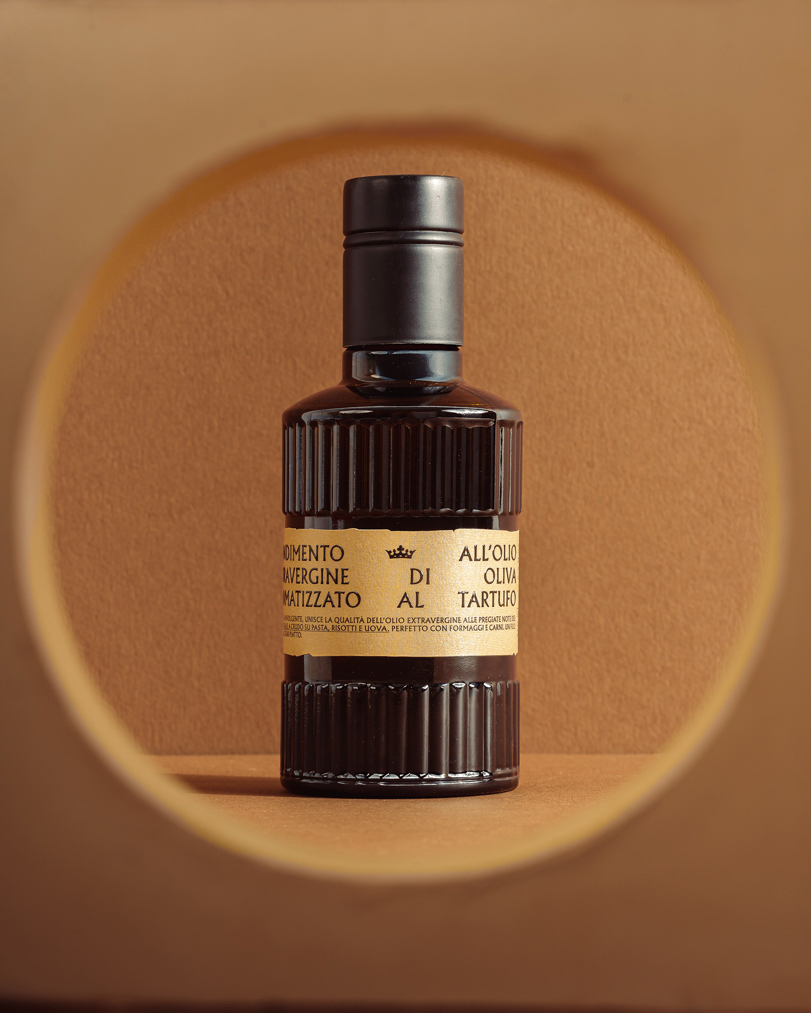
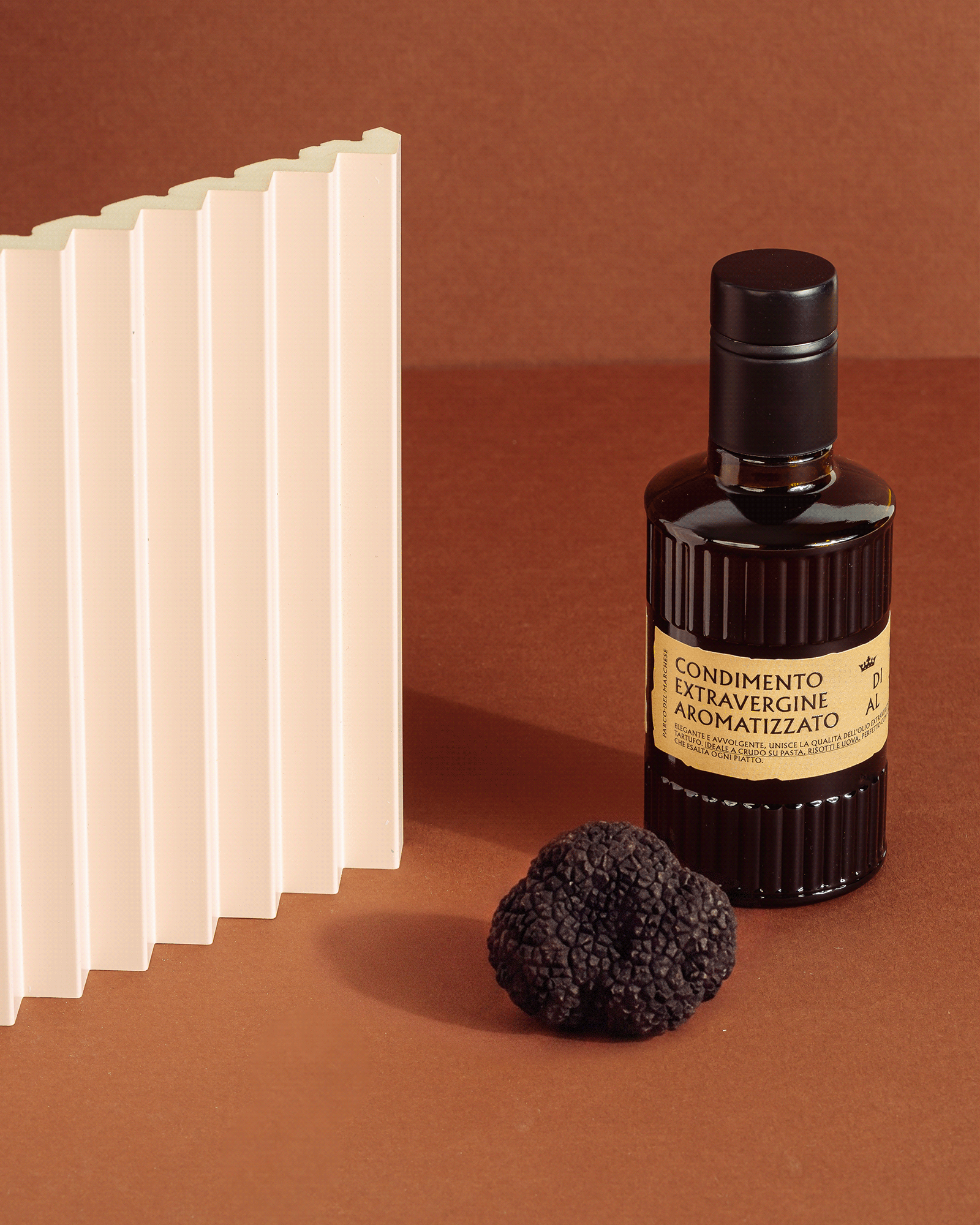
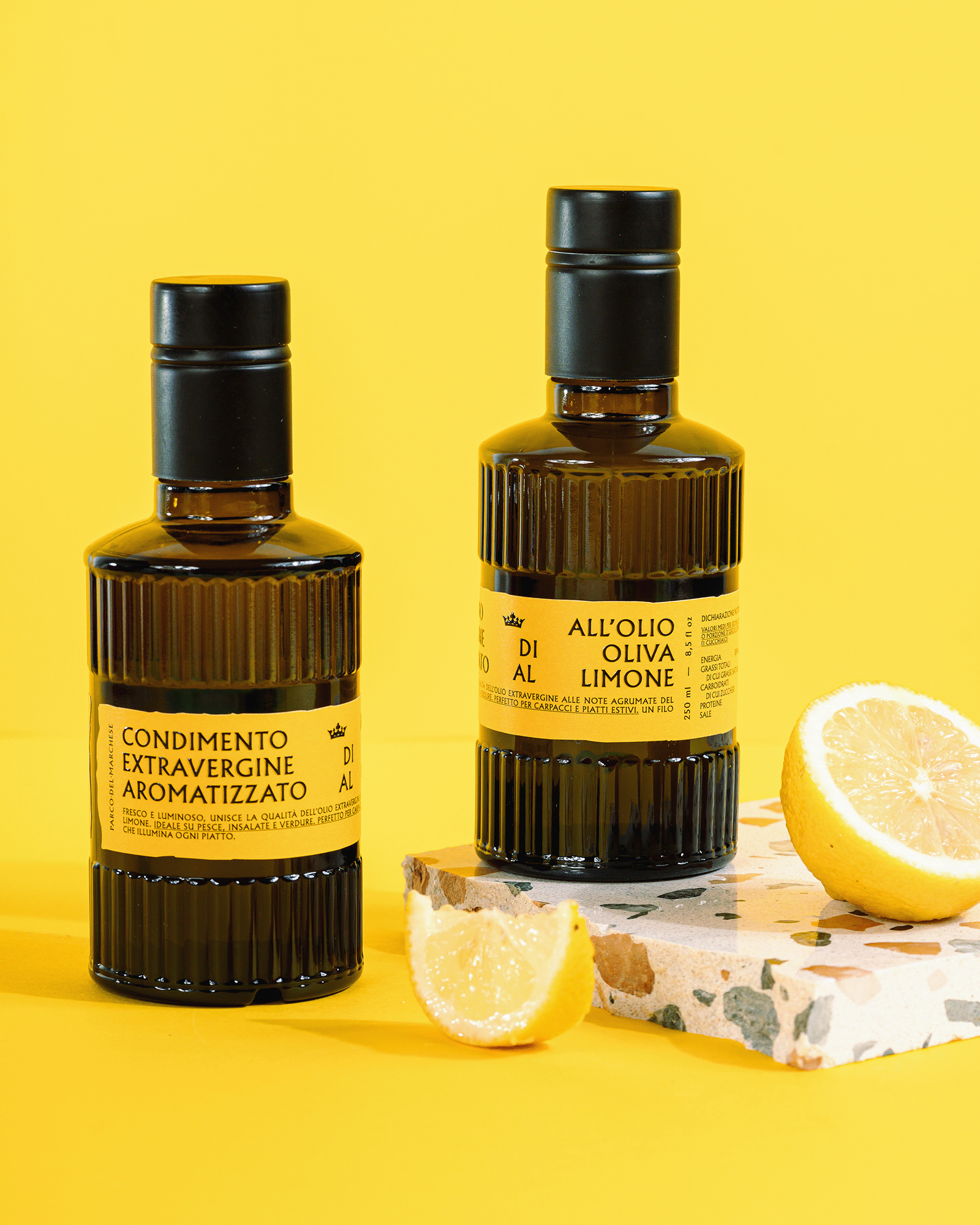
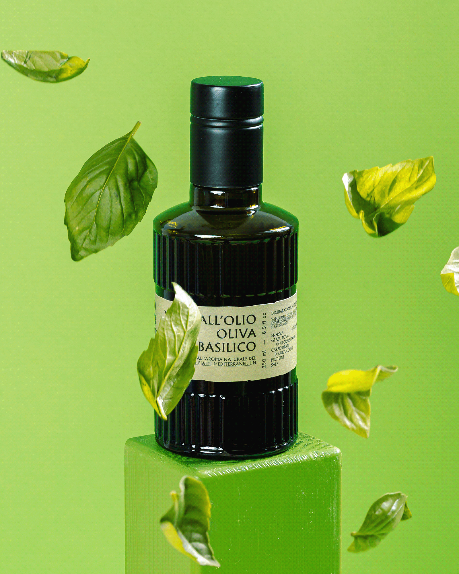
The concept revolves around color as a tool for identification and storytelling. Each flavor is assigned its own color and visual personality: blue for Garlic, red for Chilli, yellow for Lemon, green for Basil and brown for Truffle.
The labels share the same typographic structure and graphic system, creating continuity across the range. At the same time, the individual color palettes allow each product to stand out and express its own character.
The result is a packaging system that balances consistency and differentiation: five distinct products, connected by a single visual language.
Five flavors. Five colors. One identity.

