

















PRIMATTO (Brand Identity & Packaging)



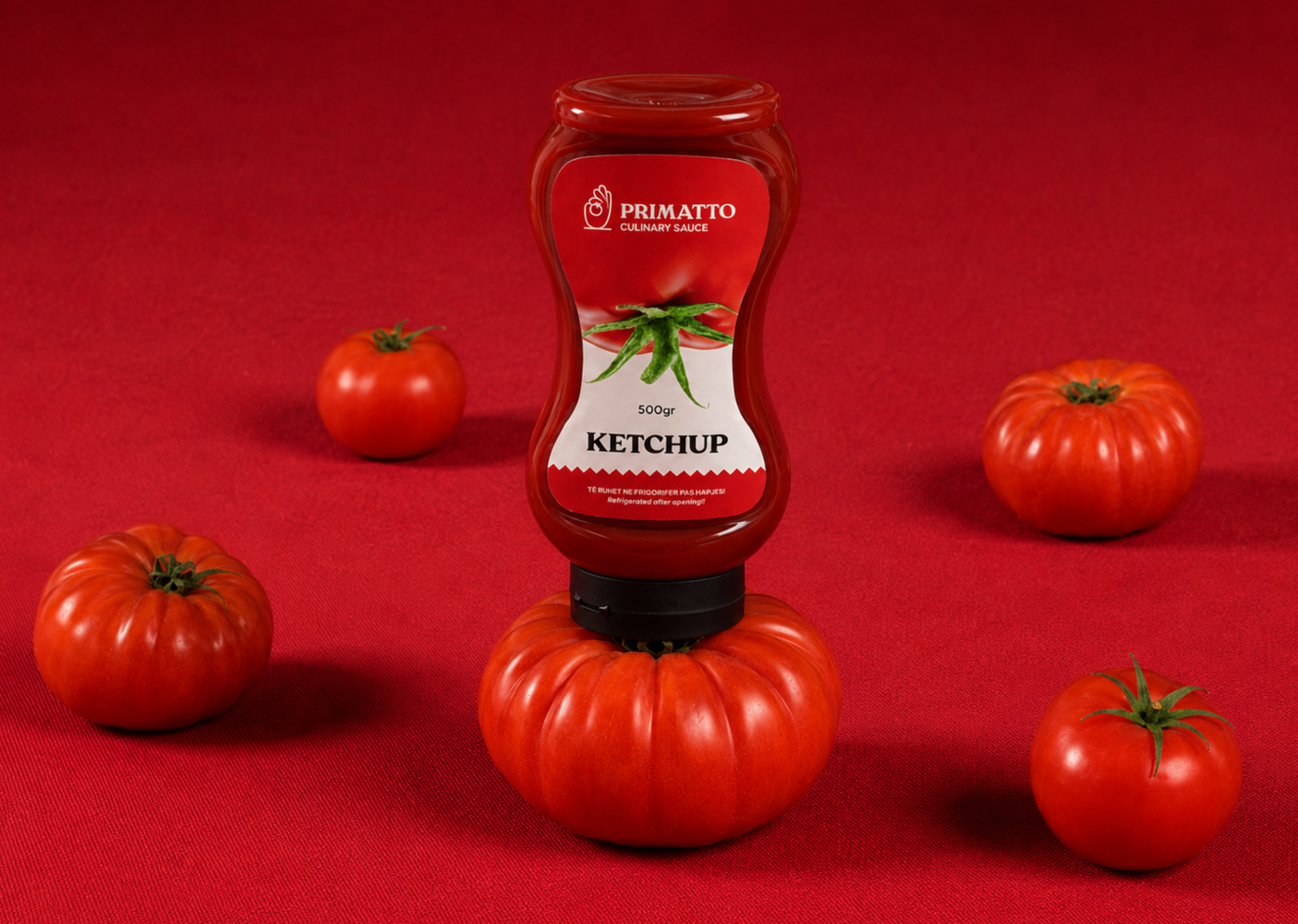
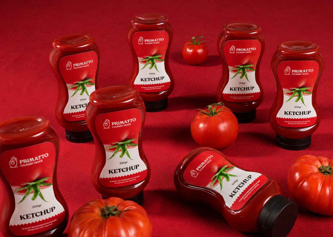
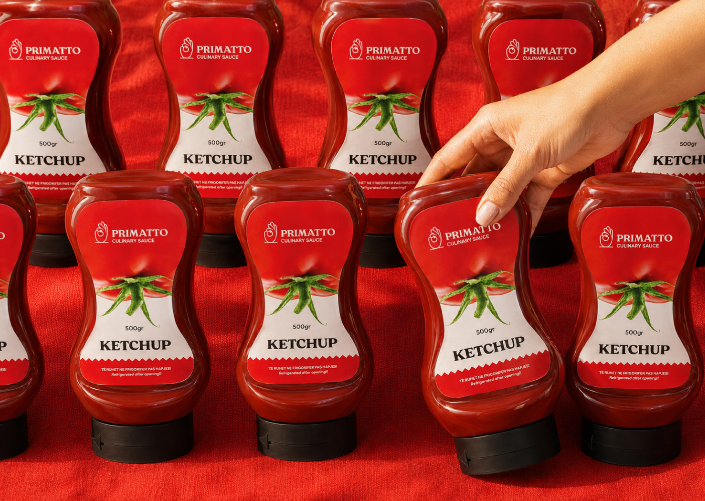
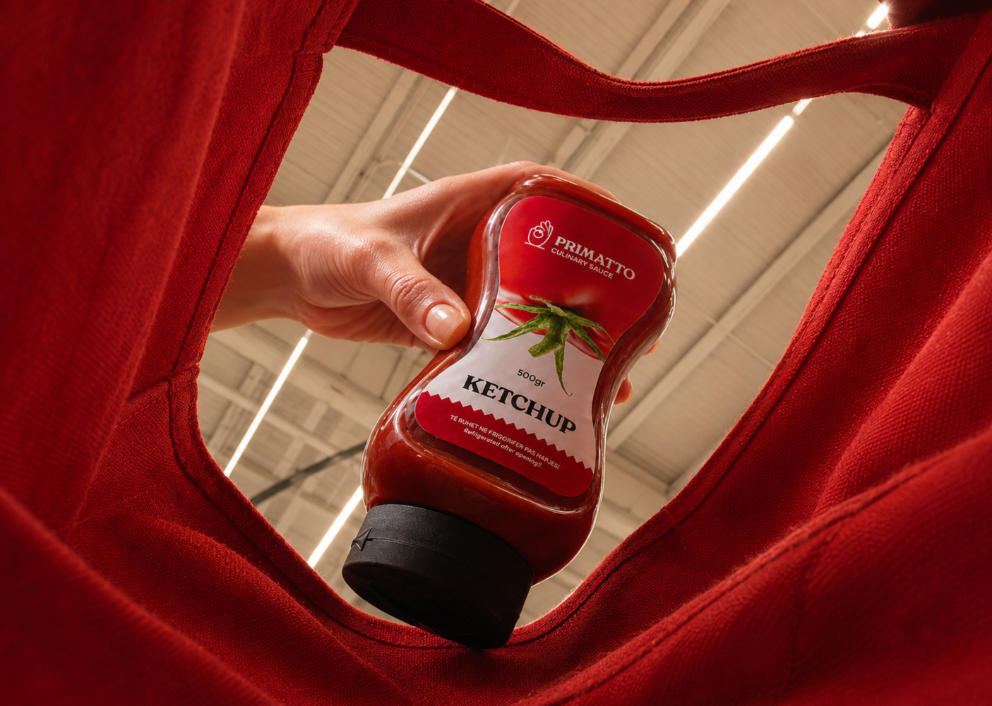


Client: PRIMATTO Industry: Food, Sauces, FMCG Scope of Work: Naming, Brand Strategy, Brand Identity, Visual Identity System, Packaging Design Place: Prizren, Kosova
Agency: Agi Haxhimurati LLC Year: 2026
BRIEF The client approached us with the ambition to create a new food brand focused on premium-quality sauces and everyday kitchen products. The brand needed to appeal across retail, HoReCa, and international markets, while combining authentic recipes, quality ingredients, and accessible pricing.
The challenge was to build the brand entirely from the ground up, beginning with the name and continuing through its identity and packaging. It needed to feel premium yet approachable, distinctive on the shelf, easy to remember, and flexible enough to grow into a recognizable local, regional, and international food brand. At the same time, the brand had to communicate authenticity and reliability while remaining relevant to contemporary consumers.
The goal was to create a strong foundation capable of supporting a broader product portfolio over time.
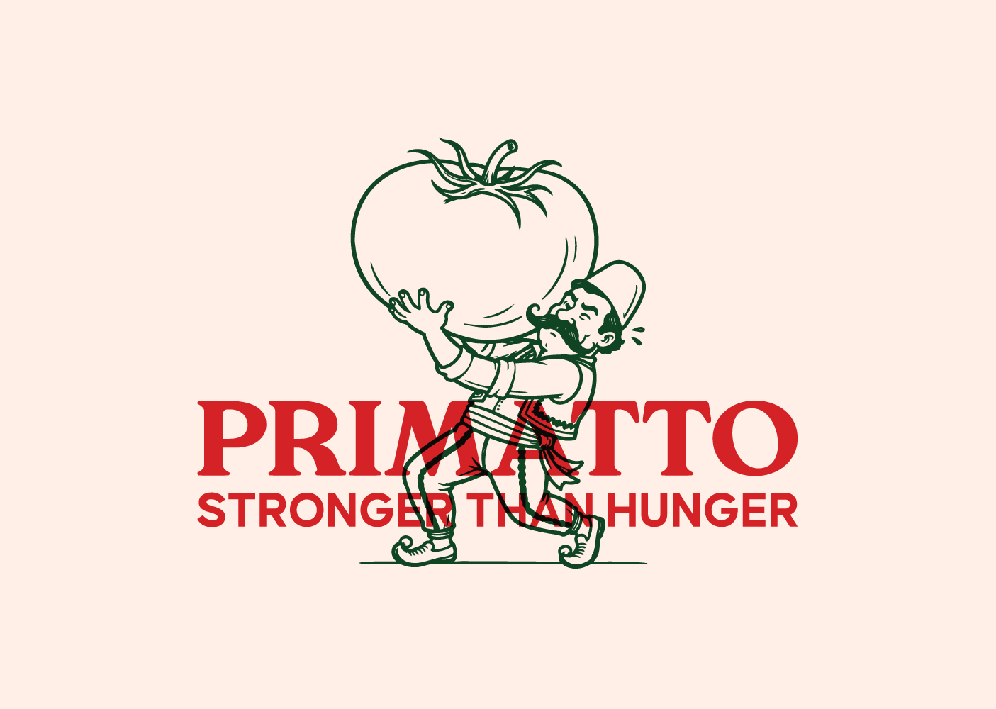
SOLUTION We created PRIMATTO from “Primary” and “Tomato”, positioning the brand as a first choice in the kitchen.
The double “TT” gives the name an Italian character, referencing the country’s culinary tradition and its strong association with tomatoes and sauces.
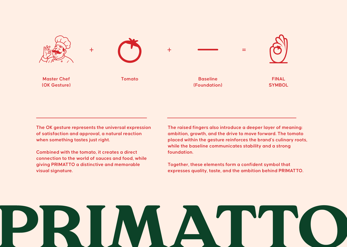
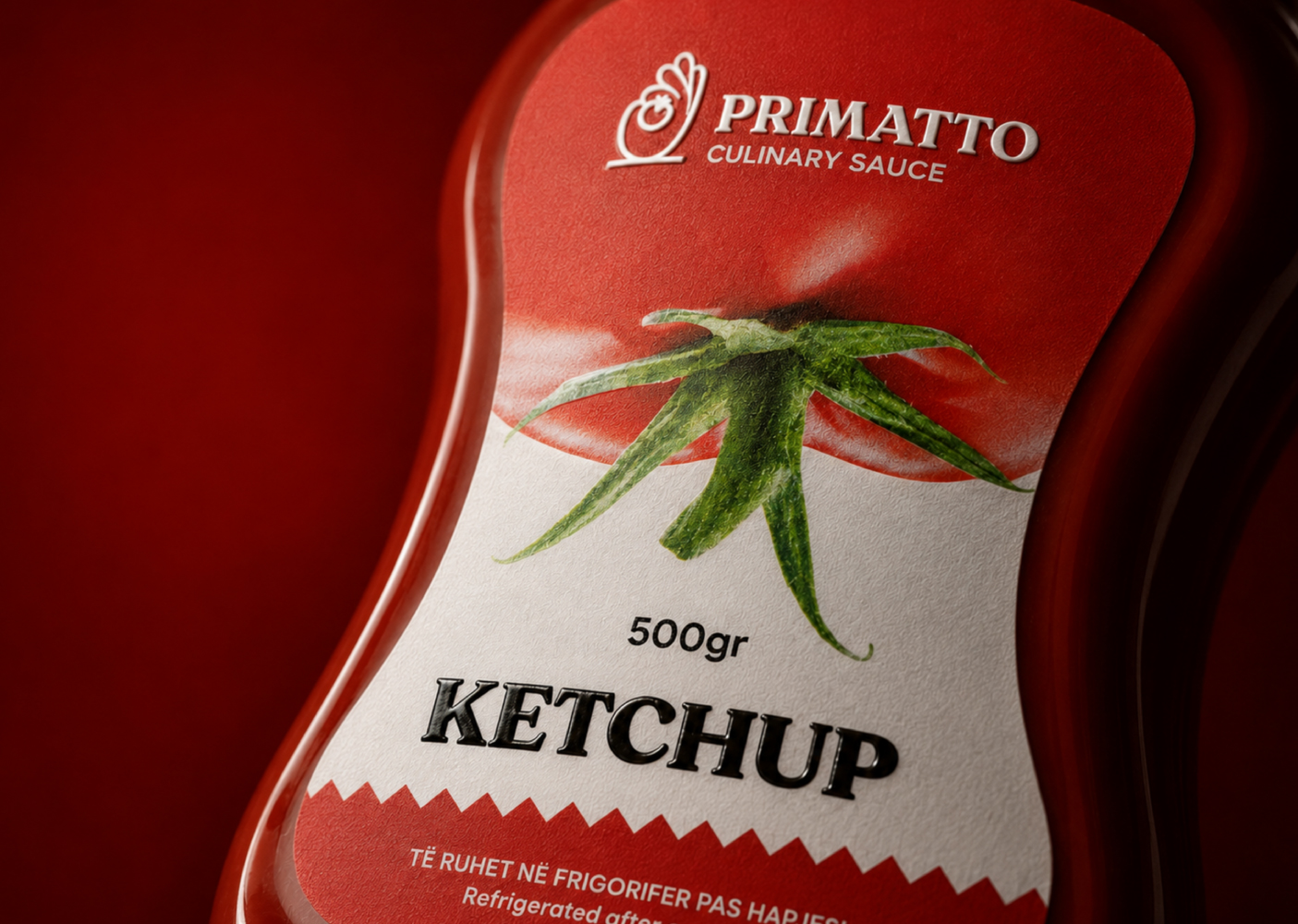
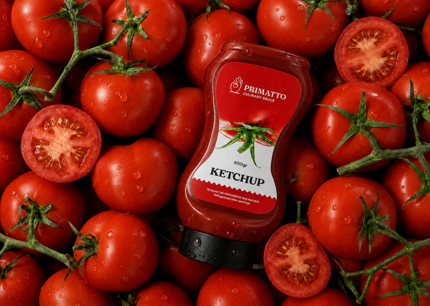
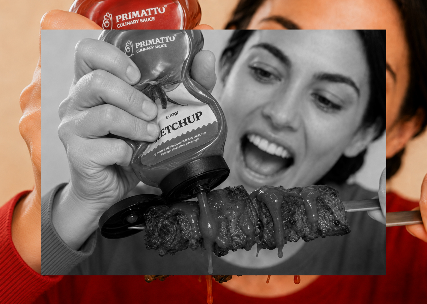
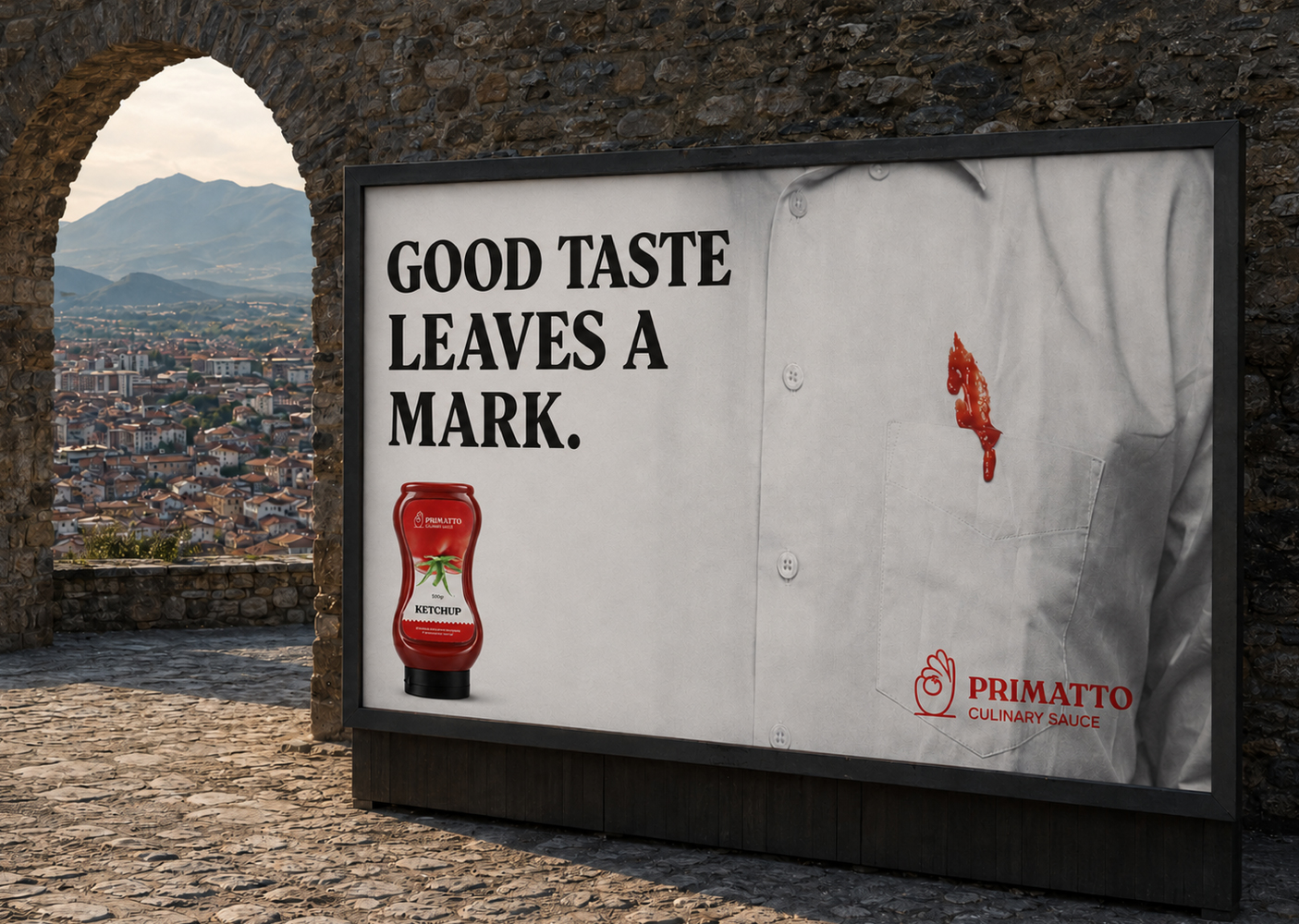
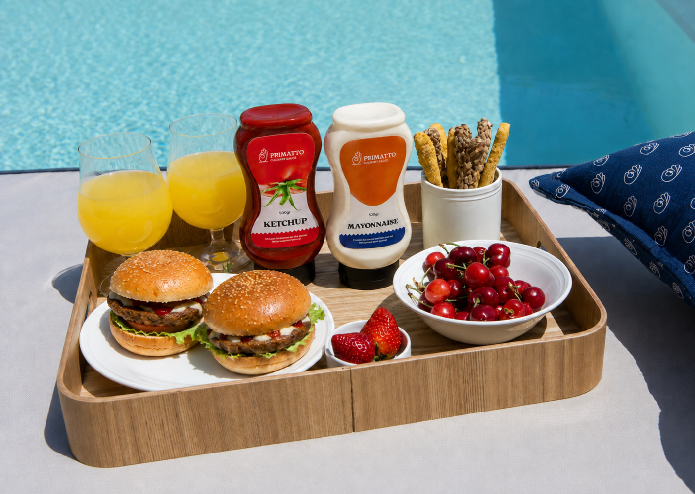
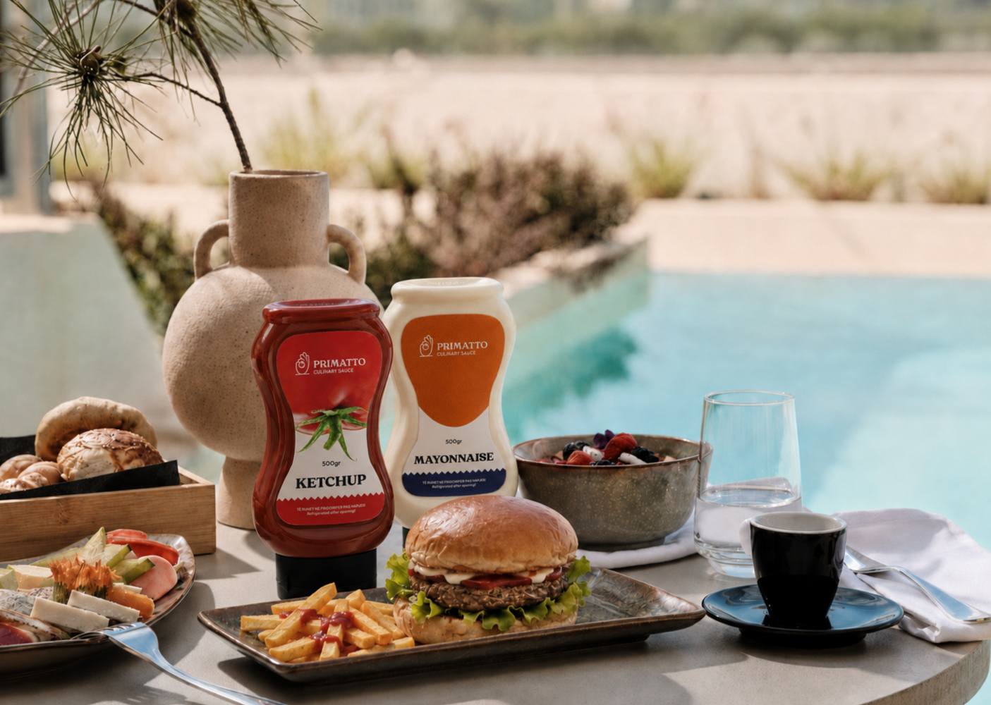
The visual identity builds on this idea through a distinctive symbol combining the universal OK gesture, a tomato, and a grounding line. Together, they communicate taste, quality, confidence, and stability. Extended into a bold packaging system, the identity gives PRIMATTO a recognizable shelf presence while balancing premium character with everyday accessibility. Strong typography, distinctive colors, and product-focused imagery create consistency across the range while allowing each product to stand on its own. The result is a flexible identity designed to remain recognizable from the kitchen table to the retail shelf.
<span data-mce-type="bookmark" style="display: inline-block; width: 0px; overflow: hidden; line-height: 0;" class="mce_SELRES_start"> </span>

