FRANTOIO DI BENEDETTO


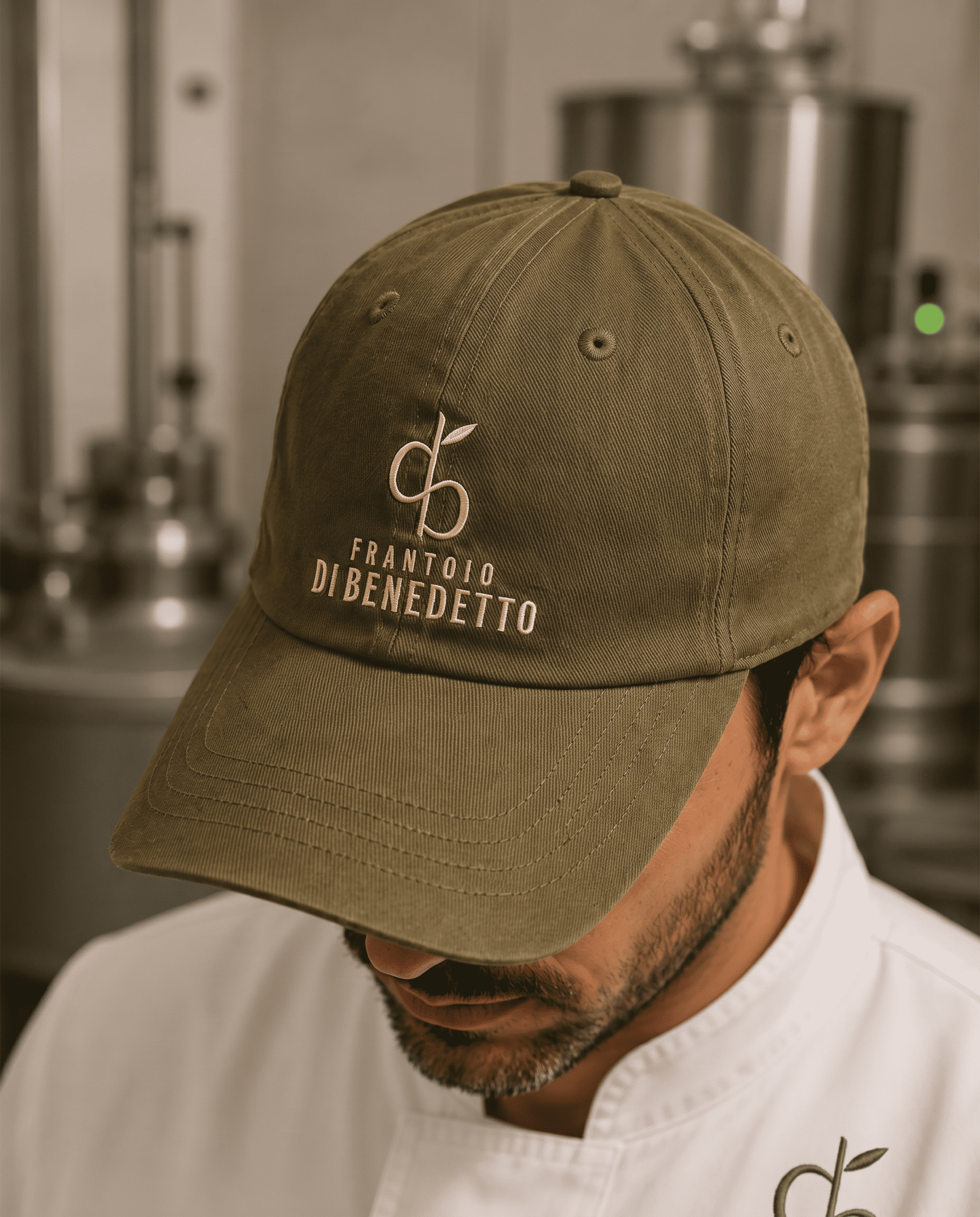

Frantoio Di Benedetto’s packaging brings together name, nature and transformation. The opposing initials “d” and “b” form a symbol that incorporates an olive branch and evokes a milling blade. Enlarged and embossed tone on tone on the tin, the symbol emerges through light, giving the concept a tactile expression. Olive green, a discreet beige wordmark and balanced proportions create a minimal, distinctive packaging identity.
Materials Metal, Tin, Steel
Year 2026
Country Italy
Project type Commissioned Work
Client Frantoio Di Bendetto