Galleté: Reimagining the Cookie Experience
 SCD Food · October 21, 2026


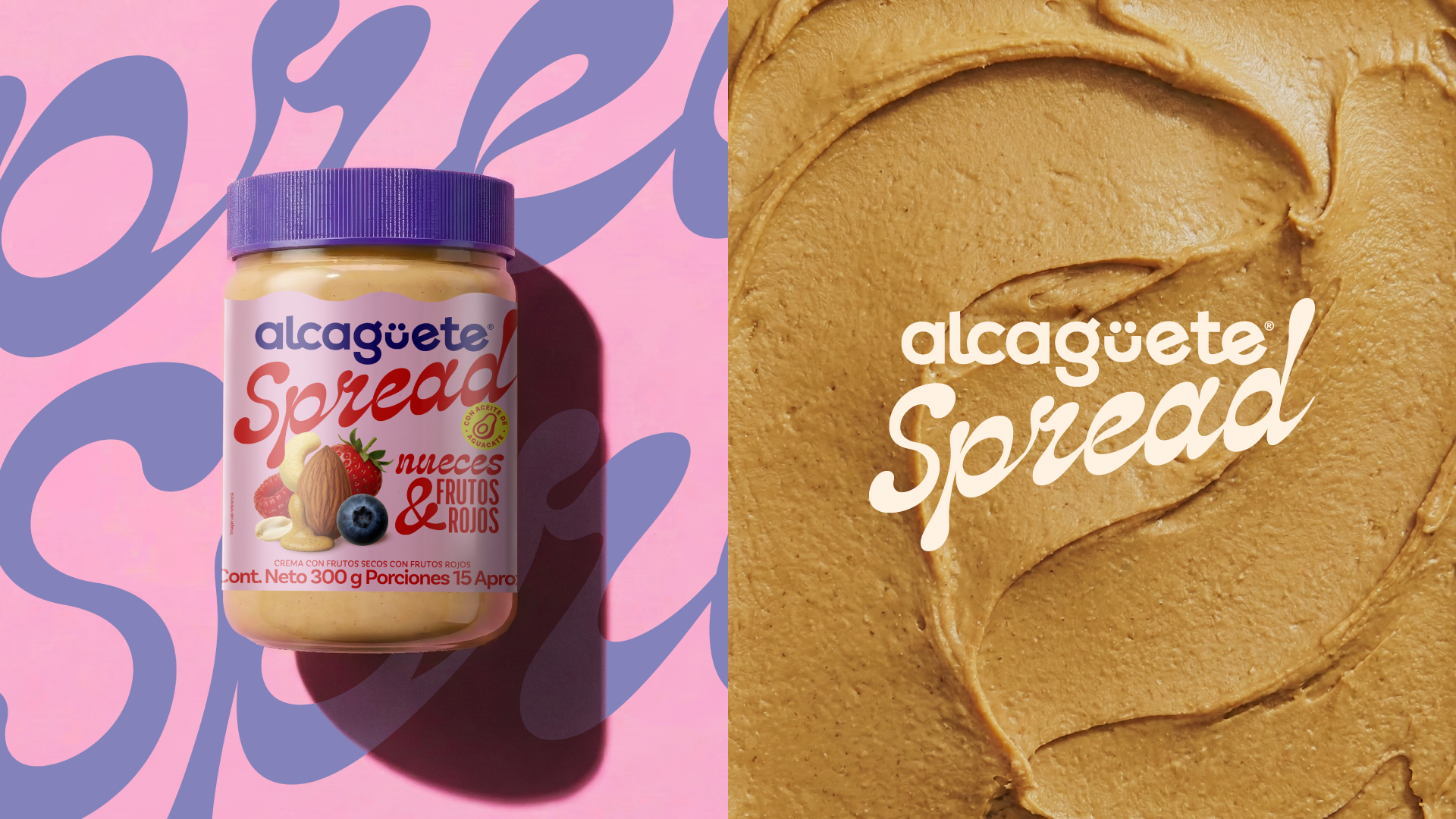
Galleté was born with a clear purpose: to turn everyday cookies into an appetizing visual experience. To achieve this, we stepped away from traditional bakery codes and built an identity rooted in striking color palettes, bold typography, and graphic elements that play heavily with contrast, texture, and composition.
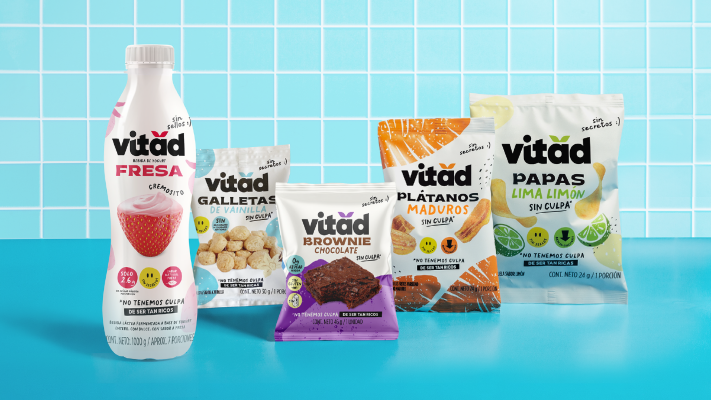
Every touchpoint was designed to give the brand a highly recognizable presence. By utilizing high-contrast art direction and an asymmetrical approach, we created a fresh visual language that elevates the moment of craving into an aesthetic experience. The packaging serves as a natural extension of this philosophy—utilizing finishes and colors that anticipate the texture and flavor of the product before the box is even opened, resulting in a highly shareable unboxing experience.
Following the rebrand, Galleté successfully captured the public’s attention, quickly standing out in a saturated market and turning its products into objects of desire across social media.
Brand: Galleté
Creative Direction & Design: Isabel Arango & Mateo Anzola