

















Gilden Baklava






Title: Gilden Baklava – Packaging Heritage, Wrapped in Layers of Delight
Description: For Gilden, the packaging was designed to feel like an extension of the baklava itself – layered, detailed, and made to be savoured.
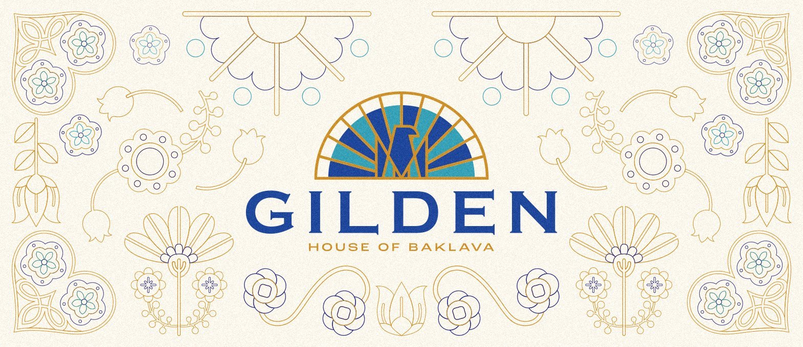
The idea was to move away from typical dessert packaging and create something that feels worthy of gifting. We drew inspiration from Ottoman architecture, Turkish ceramics, traditional floral ornamentation, and the rich visual language of handcrafted art, then translated those references into a contemporary packaging system.
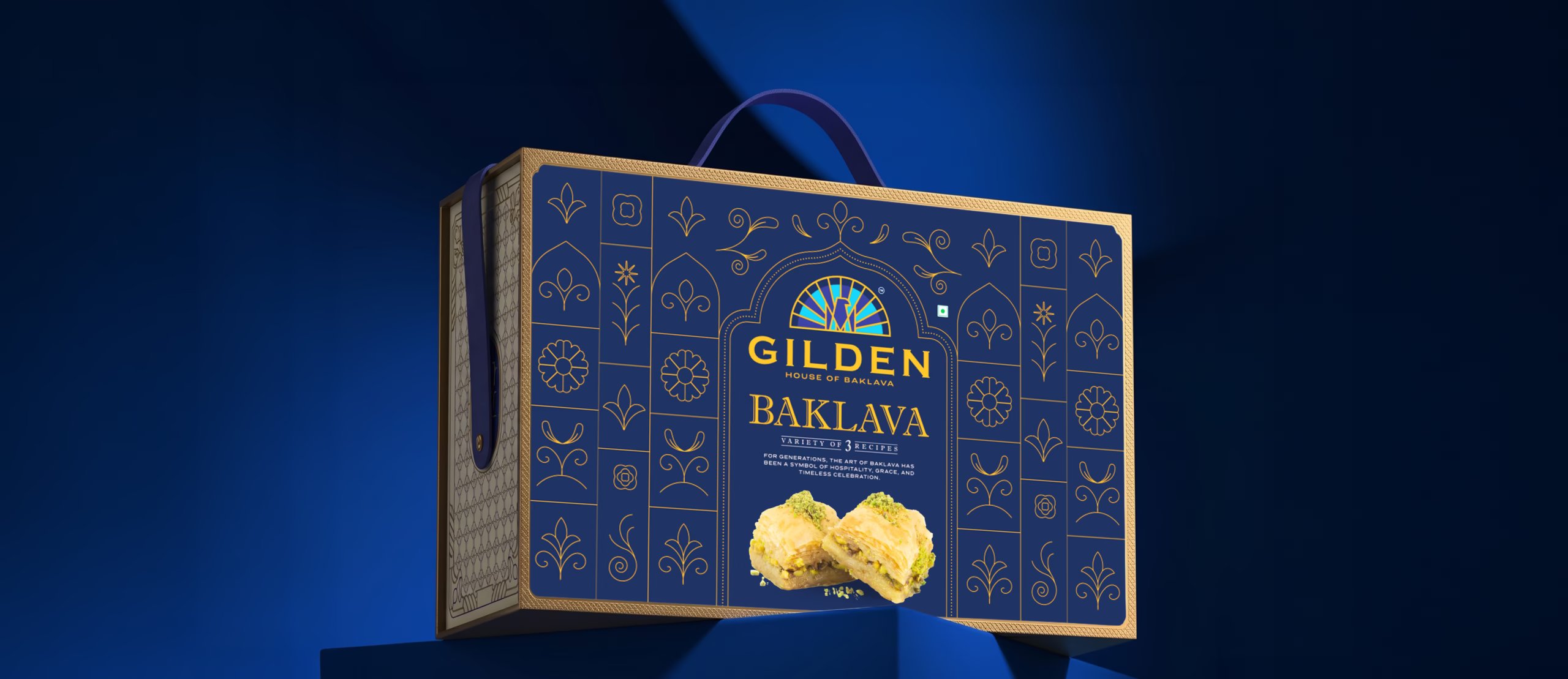
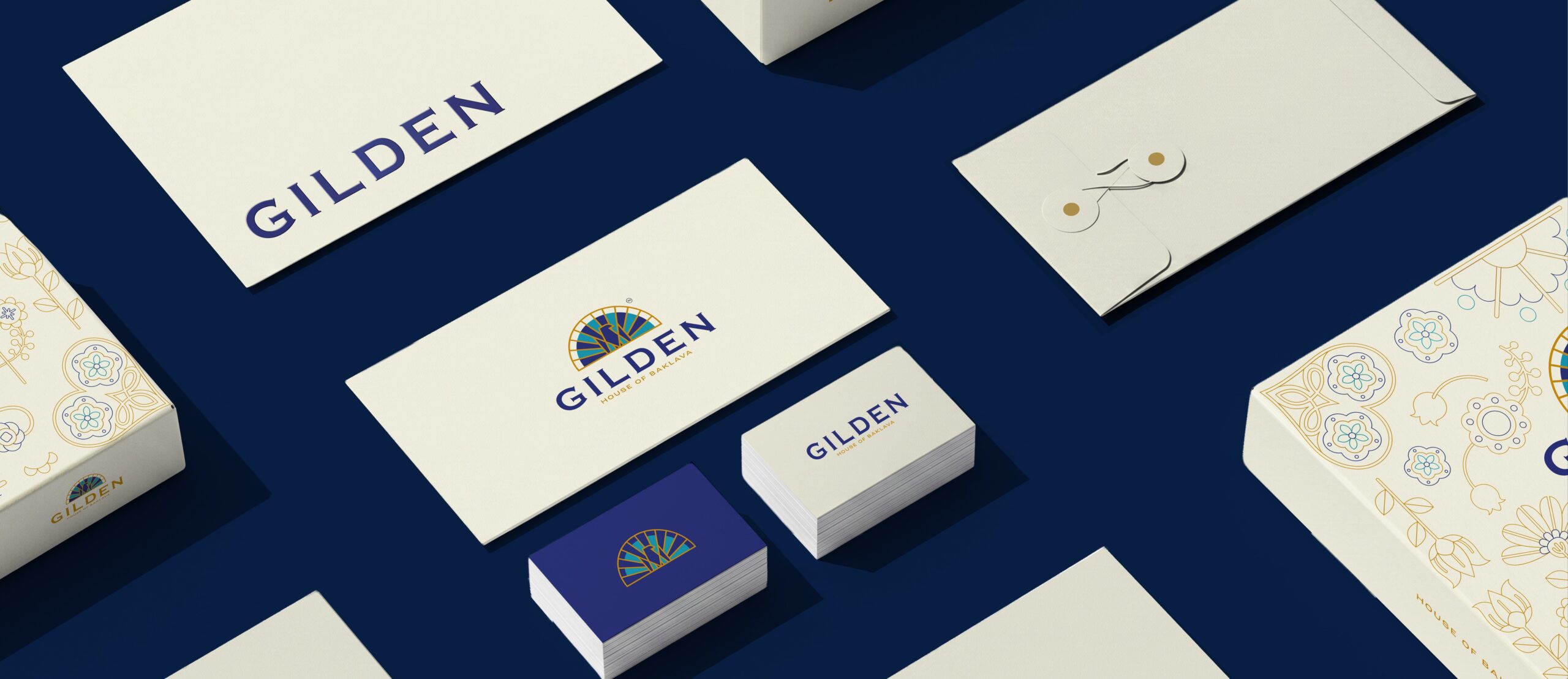
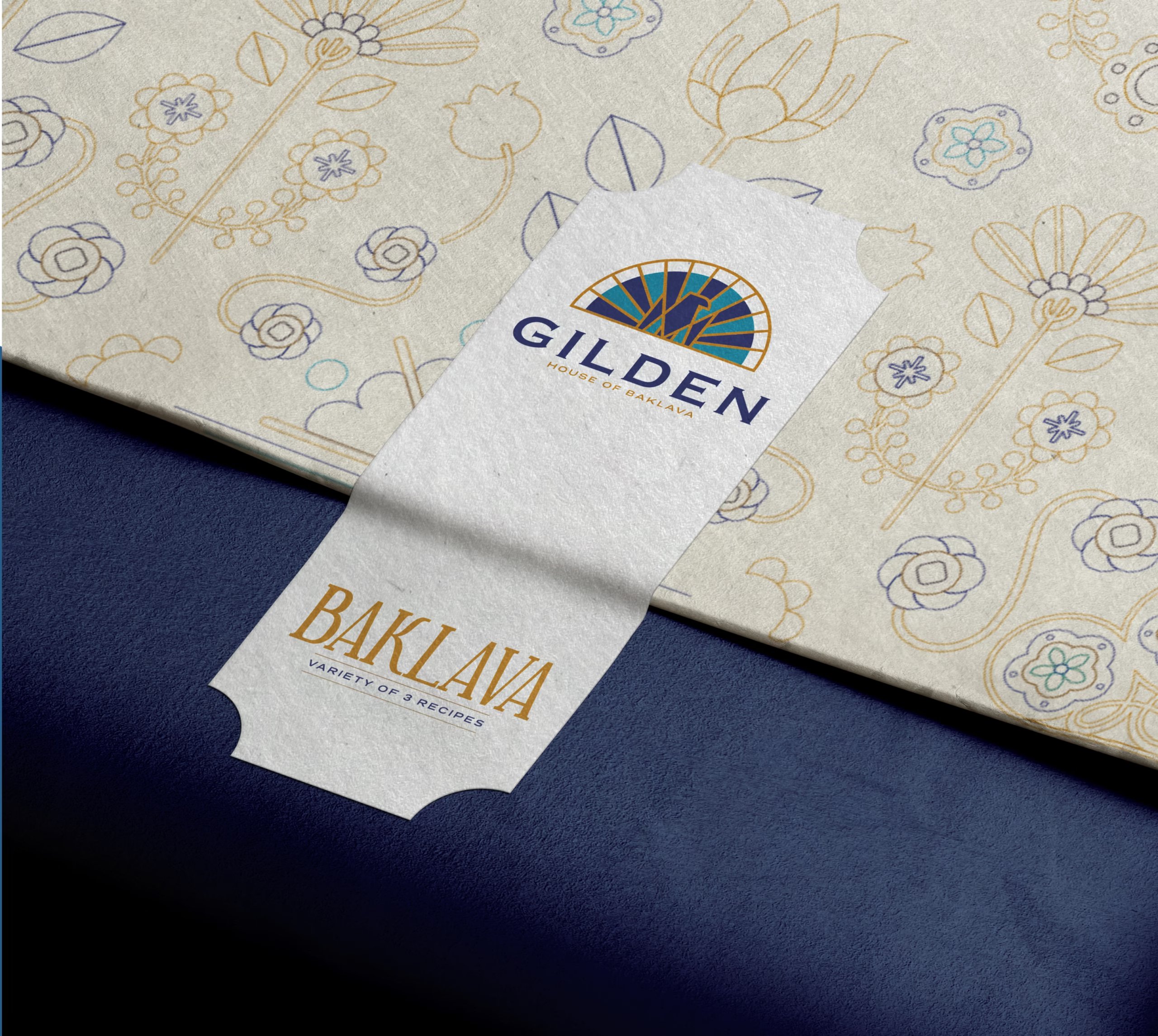
The signature blue and gold palette gives the range a premium presence, while the cream packaging introduces warmth and softness. The decorative patterns bring in the heritage without overwhelming the product, creating a balance between craft and clarity.
From the structured baklava boxes to the carry bags, wraps, cards, and smaller brand touchpoints, the system was built to make every part of the unboxing experience feel intentional.
The goal was simple: when someone receives a box of Gilden, it should feel like they’re receiving more than baklava – they’re receiving a little piece of its story.
Gilden Baklava – House of Baklava.Layers of delight, baked with love.
More by Richest Branding Pvt. Ltd. View profile

 Wildora: Branding & Packaging Design

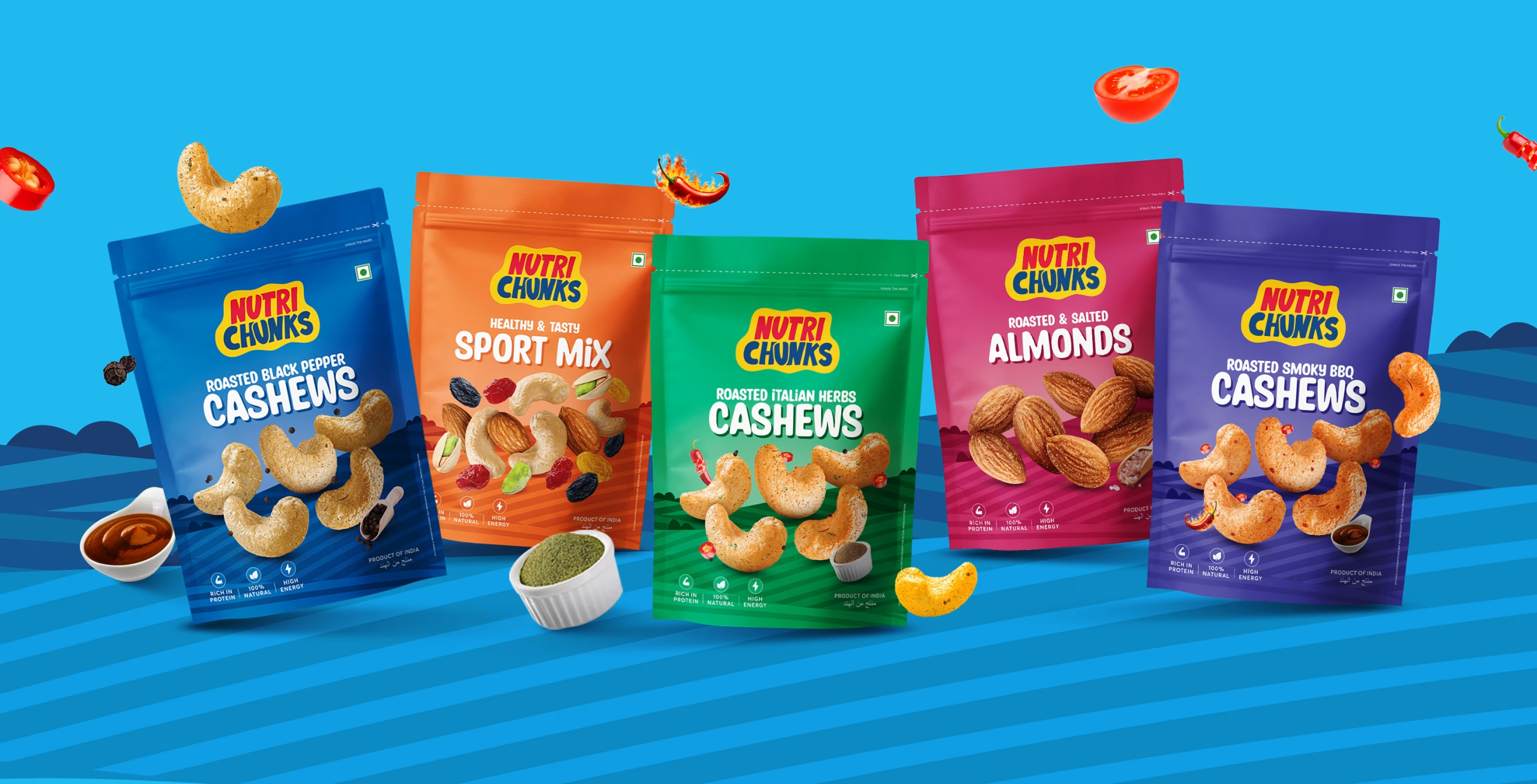 Nutri Chunks – Branding & Packaging Design

 Wellhabit — Brand Identity, Packaging & Web Design

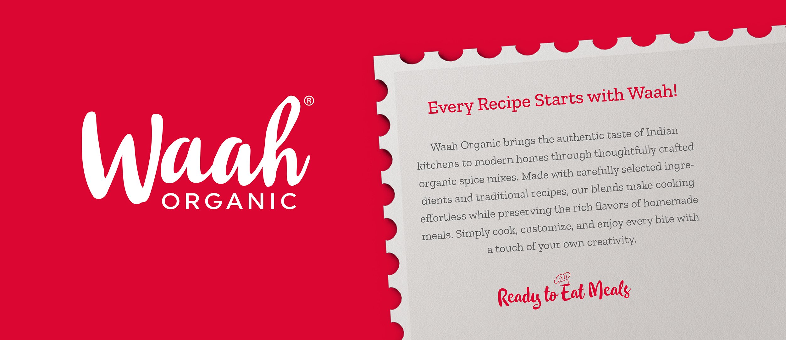 Waah Organic — Purity, Packed for the Modern Kitchen

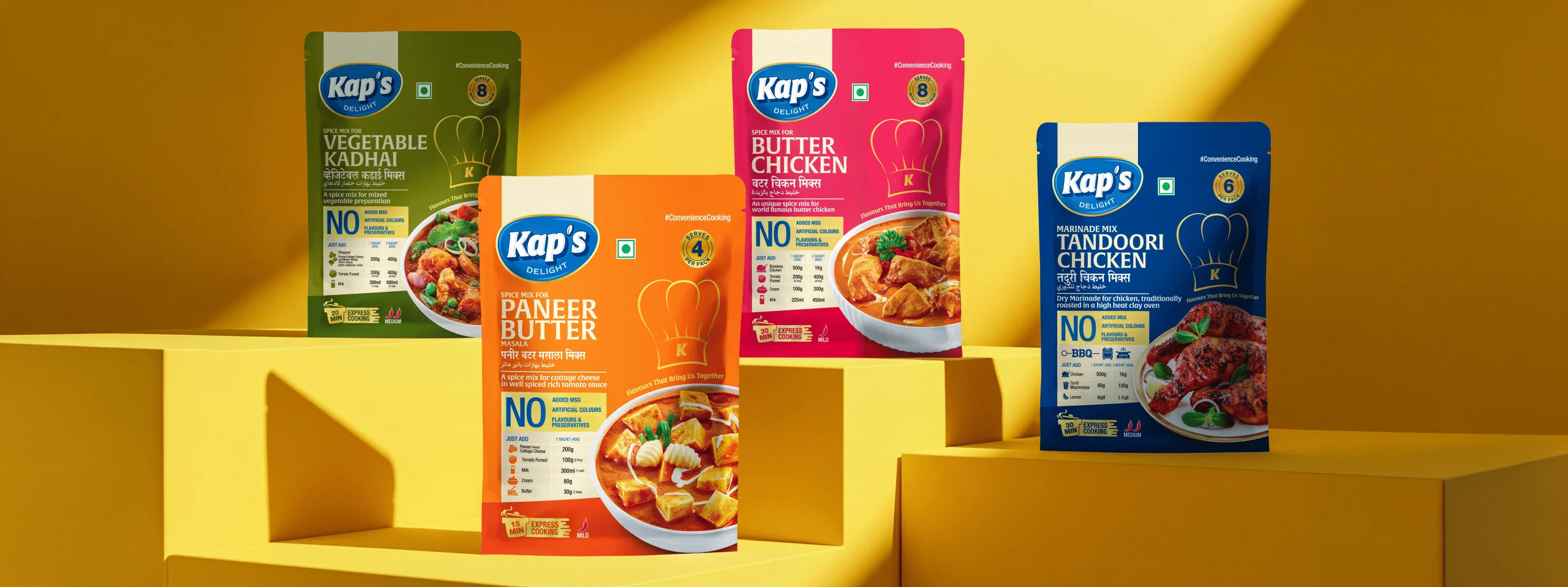 Kap’s Delight — Spice & Masala Packaging Design

 Kawkab Branding & Packaging

 Honey Packaging – 1987 by Shafia

 Mowgli’s Café – Branding, Packaging & Launch