

















Nabta

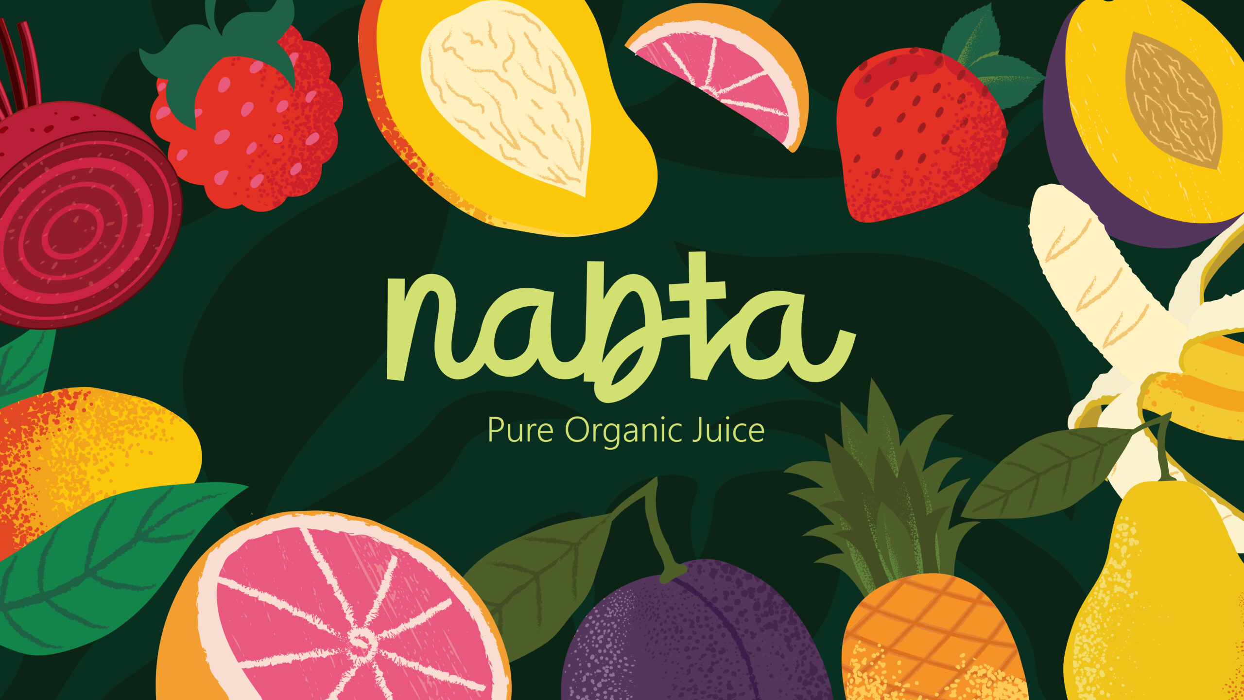


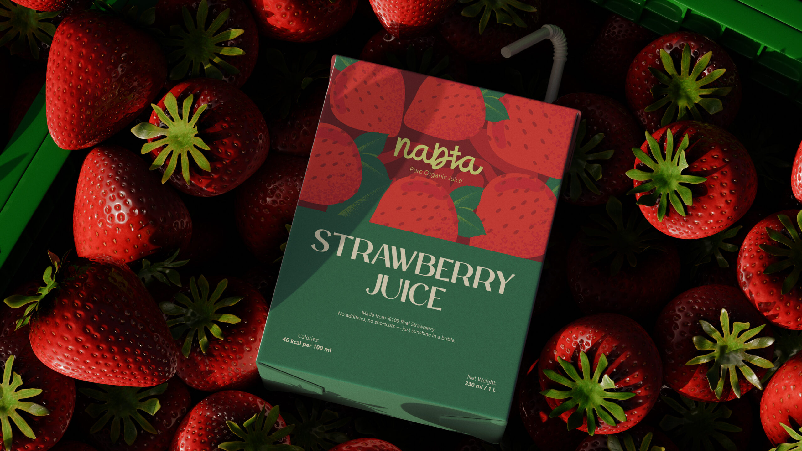


Nabta is an organic juice brand whose name means “plant” in Arabic. Pivot Studio developed a visual identity and packaging system around this connection to growth and natural origins, bringing the character of fruit to the centre of the brand.
The design balances a flowing wordmark with warm, textured fruit illustrations and a nature-inspired colour palette. Each flavour receives its own illustration and colour expression, while a shared label structure keeps the collection recognisable as one family.
Clear typography and a considered hierarchy allow the fruit imagery to lead without overwhelming the product information. The result is an approachable packaging language that combines warmth, individuality and consistency, expressed through the idea “Sip the Fruit. Love the Root.”

