Score 0:0 Full Game. Zero Alcohol.



SCORE 0:0
FULL GAME. ZERO ALCOHOL.
ABOUT
SCORE 0:0 is a packaging design for lime-flavoured non-alcoholic beer, inspired by the visual language and emotional intensity of ice hockey.
In the Czech Republic, ice hockey is more than a sport. It is part of the national sporting culture, bringing people together through anticipation, energy and shared emotions.
The name SCORE 0:0 carries a double meaning: the opening moment of a game, when every possibility is still ahead, and the zero-alcohol identity of the beverage.
⸻
CONCEPT & SOLUTION
The objective was to create a distinctive sports-inspired identity without relying on aggressive graphics, complex illustrations or excessive colours.
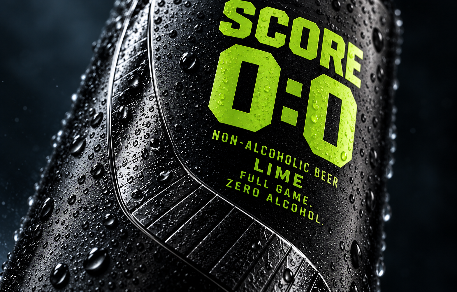
The design is built around three essential elements: deep matte black, electric lime green and a single hockey-stick motif.
Black references the hockey puck, sports equipment and the focused atmosphere of an ice arena. Lime green introduces energy, contrast and a visual connection to the LIME flavour.
The hockey stick becomes the defining graphic element. Its curved silhouette follows the surface of the can, creating a sense of continuous movement.
Bold, scoreboard-inspired typography completes the identity, making SCORE 0:0 instantly recognisable.
MATERIAL & TECHNIQUE
The design uses a conventional 330 ml aluminium can, transformed through its surface treatment.
A deep matte black soft-touch finish is envisioned in contrast with a glossy, raised hockey-stick motif. Selective 3D varnish or embossing could emphasise the blade and its tape-inspired texture.
The intention is to create a tactile experience: a smooth matte surface interrupted by the reflective relief of the hockey stick.
Packaging designed to communicate not only through appearance, but also through touch.
⸻
RESULT
SCORE 0:0 demonstrates how a familiar packaging format can gain a strong identity through typography, material contrast, texture and movement.
The result is a bold yet minimal design that connects the energy of ice hockey with a contemporary visual language.
The identity can also be extended to additional flavour variations while preserving its recognisable character.
The game, designed to be felt.