Sugar Free Candy | Packaging Design


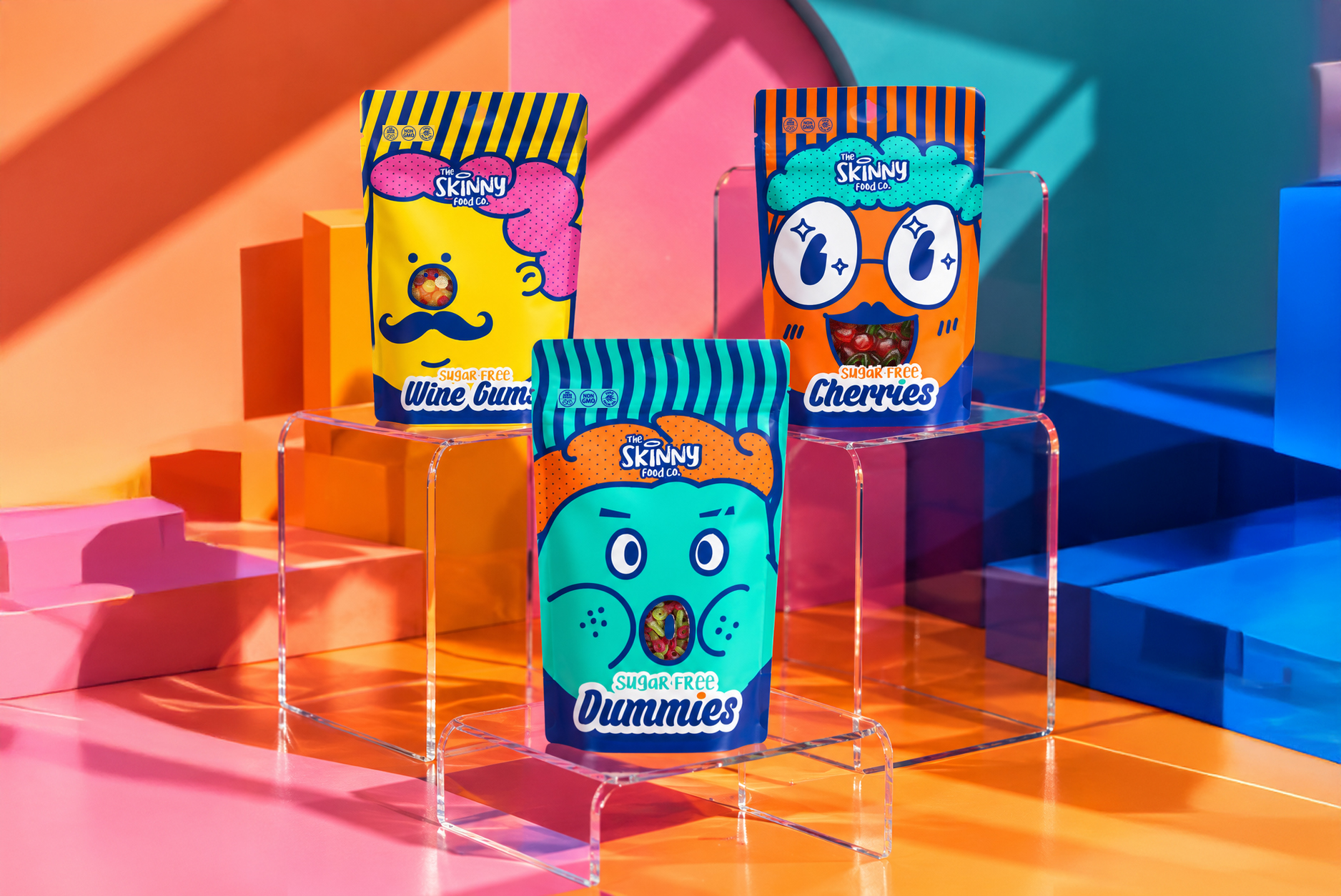


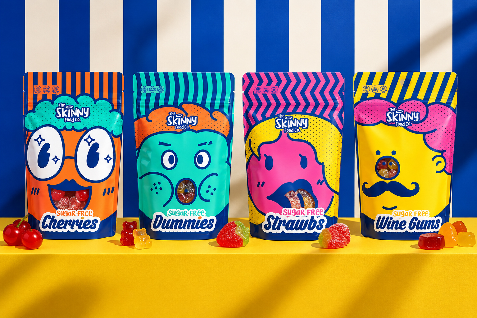
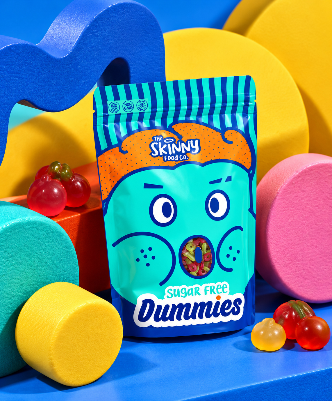


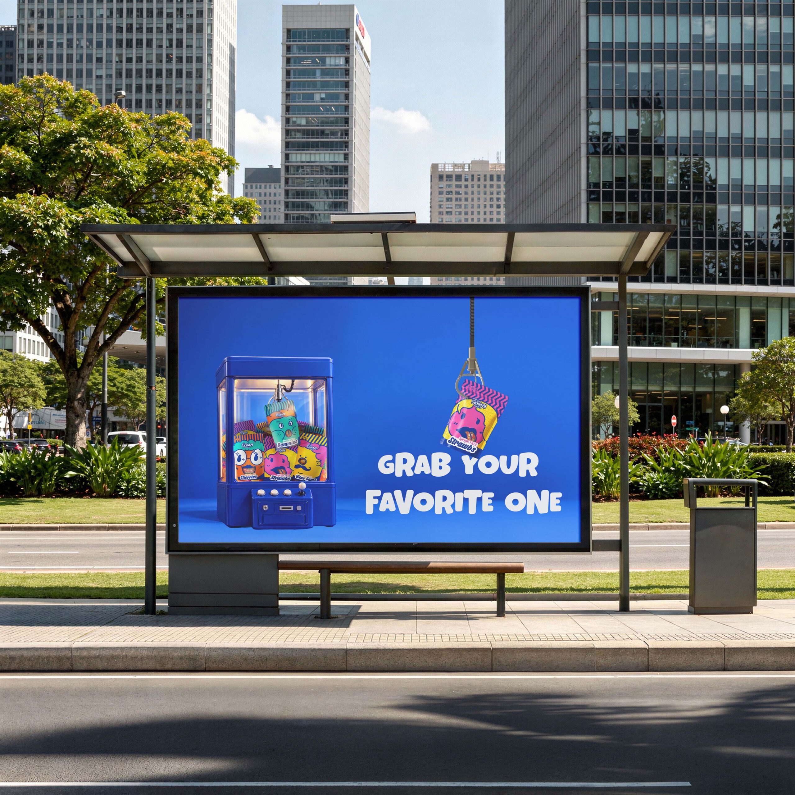
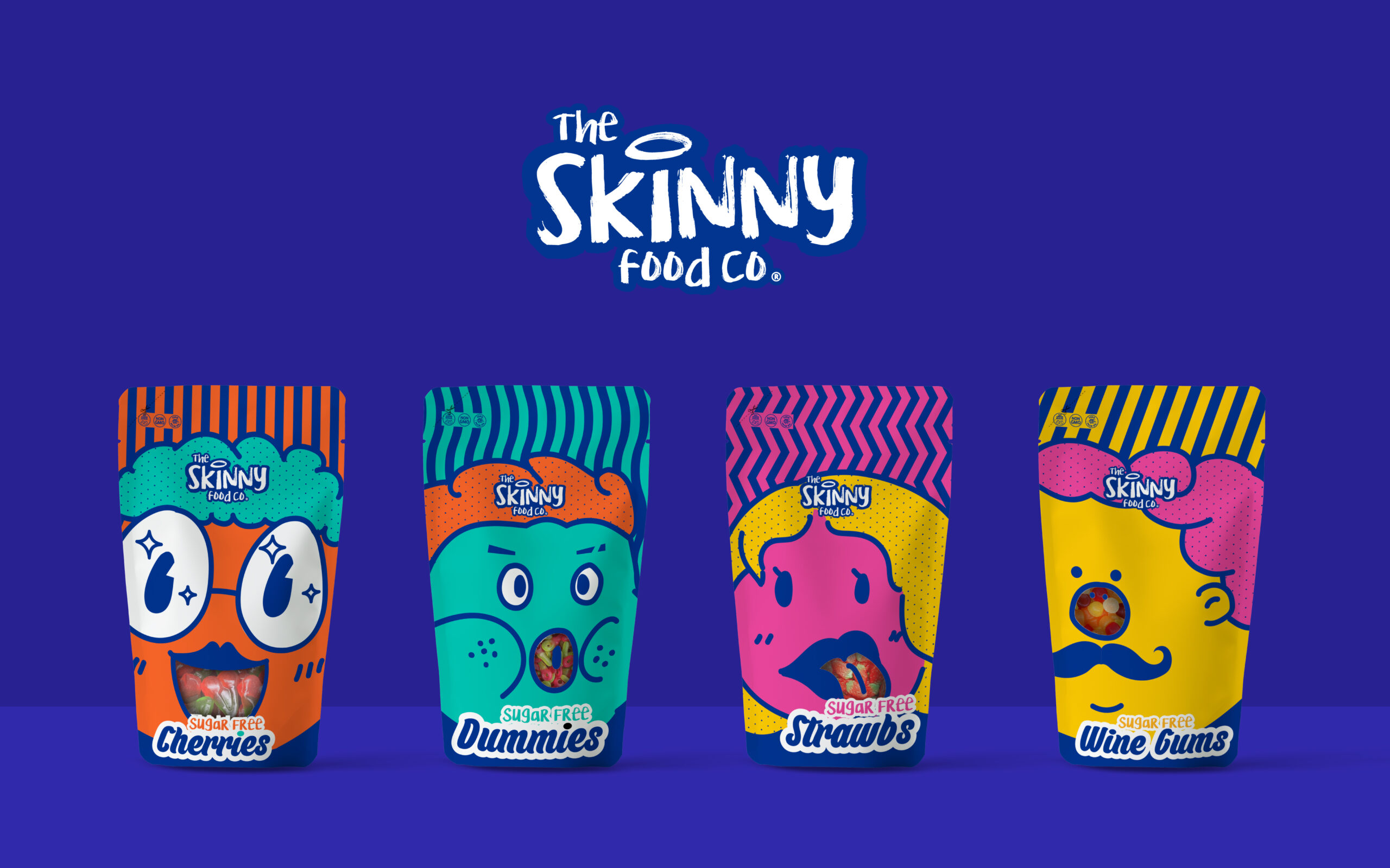
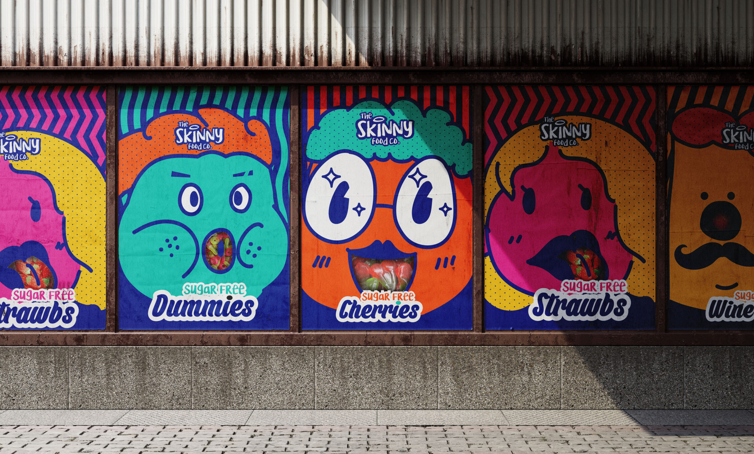

To develop the concept for this set of four packaging designs, I debated between following a safe and guideline-compliant approach, in line with The Skinny Food’s existing style, or opting for images related to the type of candy inside. After extensive consideration and market research, I realized that to attract customers, candy packaging needs to be eye-catching, unique, and inspiring, sparking curiosity and imagination. The packaging must stand out on the shelf, creating a sense of novelty and distinguishing itself from competing brands. Therefore, I decided to pursue a quirky and unconventional design that few would dare to attempt. Furthermore, I am confident in Skinny Food’s design team’s ability to create guideline-based packaging, so my unique contribution should be something groundbreaking. Thus, I chose to design packaging featuring fun characters that appeal to both children and adults, offering a fresh and exciting alternative to the products.
Design by Tuyen Lam Email: tuyenneo@neocreative.uk Studio: neocreative-studio.com
Curator’s Insight
The smartest decision here is what the window is made to do. On the Dummies pouch it becomes a startled open mouth, on Strawbs a parted pair of lips, on Cherries a wide grin, and on Wine Gums a nose above a moustache. The product is shown as part of the character rather than as a separate viewing panel. The system holds together through a few repeated rules. Navy outlines and a white sticker-style name panel stay constant, while hair colour, top pattern (stripes or zigzags) and the “sugar free” accent colour change per flavour. The halftone dots in the hair add a printed, comic texture, and the hair also sets the logo on a clean, flat field. The set photography takes the same approach, with flat geometric props echoing the colour blocking on the bags.