Packaging You Shouldn’t Miss #148






Issue #148 brings together ten packaging projects where one clear idea shapes the whole design. A mezcal label peels back to reveal an invented village, a vodka monogram slowly mutates into an insect, round pouch windows become the wheels and balloons of a playful charcuterie range, and an olive jar takes the form of a classical Greek column. Alongside them sit a ballet-inspired ice cream, a calm matcha ritual, a pump-cup sauce pack, a hot sauce with an expressive mascot, a pink gin dressed in texture and an aperitif built on complementary colour. The community vote rewarded designs where concept, branding and craft work together to shape how a product is felt and remembered.
Follow us on Instagram, Facebook, and Pinterest to stay updated with the latest in packaging design and creative work. Got a project worth sharing? We welcome submissions from designers, studios, and brands worldwide.
Sign in or create an account to submit your work to our global community.
Kamakura- Ceremonial Matcha
Kamakura gives ceremonial matcha a calm, grounded presence through soft forms and carefully chosen finishes. Inspired by the Japanese cloud, the sun-and-cloud logomark pairs a still sun with drifting clouds, outlined with a delicate stitched line that stays tonal and quiet. On the jar, a glossy cream wordmark is raised against matte, fibrous green paper, so the sun dot reads like a bead of liquid resting on stone. The gift box continues the idea with a frosted window that softens its contents into silhouettes. It earns its place on the list for letting texture carry the metaphor of stillness.
Find out more
Tanica designed by softmachine
Tanica brings a fresh, contemporary voice to a category rooted in European tradition. Soft Machine builds the identity on a bold colour contrast, pairing a cool pale blue cap and label with the rich red of the liquid so the two read as natural partners on shelf. The ribbed glass bottle adds rhythm and gives the drink a lively glow, while a bright yellow neck tag adds a playful, citrus-inspired accent. Rounded, open lettering gives the wordmark a relaxed and approachable character. It earns its place on the list as a confident example of colour, form and typography working together to make a brand stand out.
Find out more
Ficticio Mezcal designed by Hi estudio
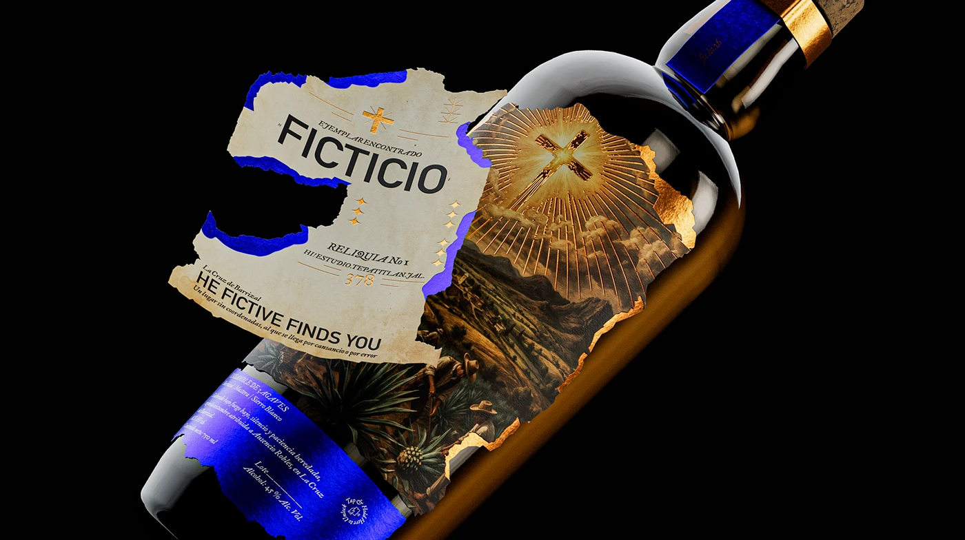
Ficticio Mezcal turns an invented origin into something that feels convincingly real. Hi estudio builds the identity like a recovered archive piece, with catalogue-style details and aged, sepia-toned paper that make the imagined village feel documented rather than decorated. Torn edges break open to reveal vivid blue foil, and fine gold lines trace each tear, adding a sharp contrast that keeps the nostalgia fresh. Layered labels invite the hand to peel and explore, so the bottle becomes part of the storytelling. It earns its place on the list for pairing a rich concept with tactile, carefully balanced craft.
Find out more
Kafka vodka: the metamorphosis designed by Eva Chistyakova
Kafka Vodka: The Metamorphosis treats the bottle as an open book, giving a category known for sameness a distinct literary character. Eva Chistyakova lets the monogram evolve rather than be replaced, so the letter K slowly grows into an insect as the bottle turns. Large, wrapping text reads like a printed page, which turns handling into reading, while translucent white glass adds a fragile, paper-like quality. A leather-textured cap brings an unsettling, skin-like touch that contrasts with the cool glass. It earns its place on the list for using form, typography and texture to make a single idea feel physical.
Find out more
Couchetoi designed by Alchimiste Studio Paris
Couchetoi brings a spirit of mischief to the deli aisle through a simple and clever idea. Alchimiste Studio Paris pairs a flat yellow ground and a bold lowercase wordmark with loose black sketches, leaving the food to complete each scene. Round windows in the pouch become wheels, balloons and spectacle lenses, so the real colour and texture of the charcuterie turns into part of the drawing. The same layout and restrained palette tie the range together while each variety keeps its own personality. It earns its place on the list for turning one repeated detail into a playful, instantly readable system.
Find out more
Ithaca Olive designed by Alina
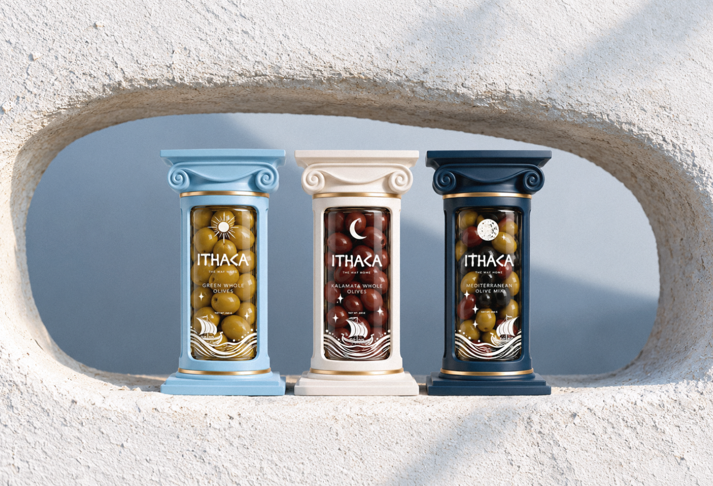
Ithaca reimagines the olive jar as a small piece of classical architecture, drawing on the idea of a long journey home. Alina lets the olives stand in for the column shaft, so the product becomes the structure itself. A scrolled capital doubles as the lid, with a stacked, angular wordmark pressed into its flat face for an inscribed, carved feel. Sun, crescent and full moon motifs create a day-to-night sequence across the three colourways, while gold bands mark the joins between sleeve and glass. It earns its place on the list for giving a heritage reference a modern, sculptural form.
Find out more
Pushe Line of Sauces designed by Lisa Pokrovskaya
Pushe reimagines the humble sauce pack as a compact, tactile object designed for life on the move. Lisa Pokrovskaya gives the lid a dark disc with a hand outline and repeating text, so it reads as a button before it reads as a cap. An oversized, cropped wordmark is printed tone on tone in a deeper shade of each flavour colour, creating texture while leaving the small copy quiet. Pill-shaped descriptors add taste cues, and the clear bowl lets the sauce become the final colour accent. It earns its place on the list for placing the instruction exactly where the hand lands.
Find out more
DevilDog designed by Studio Unbound
DevilDog steps out of the heat race and into the kitchen with a friendlier, food-led identity. Studio Unbound draws the dog mascot as a single red silhouette, and its posture shifts across the range, from a playful bow to a calm sit to an energetic leap, so rising intensity is felt without any warning language. Yellow, green and lavender bands sit against the red illustration for quick shelf recognition, while a white upper field keeps the wordmark and mascot constant. It earns its place on the list for turning one character and a simple system into a warm, scalable brand.
Find out more
PLIÉ designed by Alina
PLIÉ translates the lightness of ice cream into the fluid grace of ballet with a refined and gently playful identity. Alina draws a loose line dancer whose tutu is the real scoop, so the product completes the illustration. A distinctive mark based on the Cyrillic letter P recalls a pointe shoe, while a quiet blush cup lets soft pastel lids and silver accents carry flavour and a subtle premium feel. Together they read as one elegant ensemble on shelf. It earns its place on the list for signalling lightness with charm and restraint rather than diet-aisle austerity.
Find out more
65 BPM designed by Ximena Ureta Design Studio
65 BPM gives a pink gin a calm, musical presence through restraint and texture. Ximena Ureta Design Studio sets a pale sage label behind the liquid so its colour stays the loudest note, while foil stamping on the figure’s dress and embossed pink numerals catch the light with quiet confidence. Torn newsprint suggests the silhouette of a wing, and botanical specimen tags add a gentle, scientific counterpoint to the floral artwork. On the box, oversized numerals are debossed in the same green as the ground, so the branding stays present without shouting. It earns its place on the list for letting finish and detail carry the emotion.
Find out more