VORNE — A Pure Expression of Nature

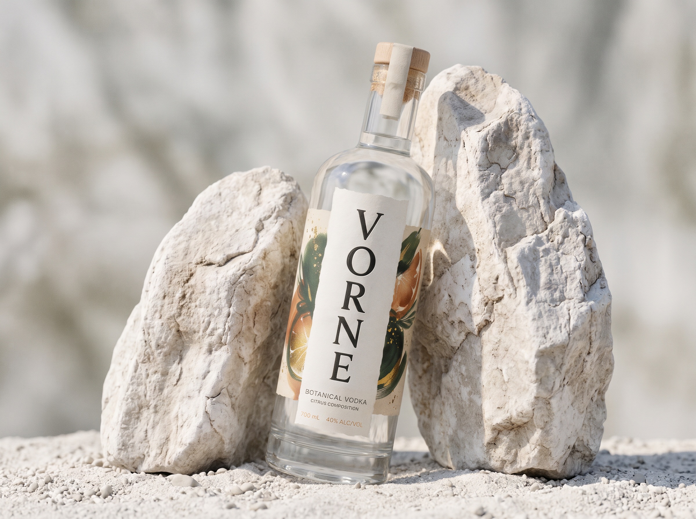
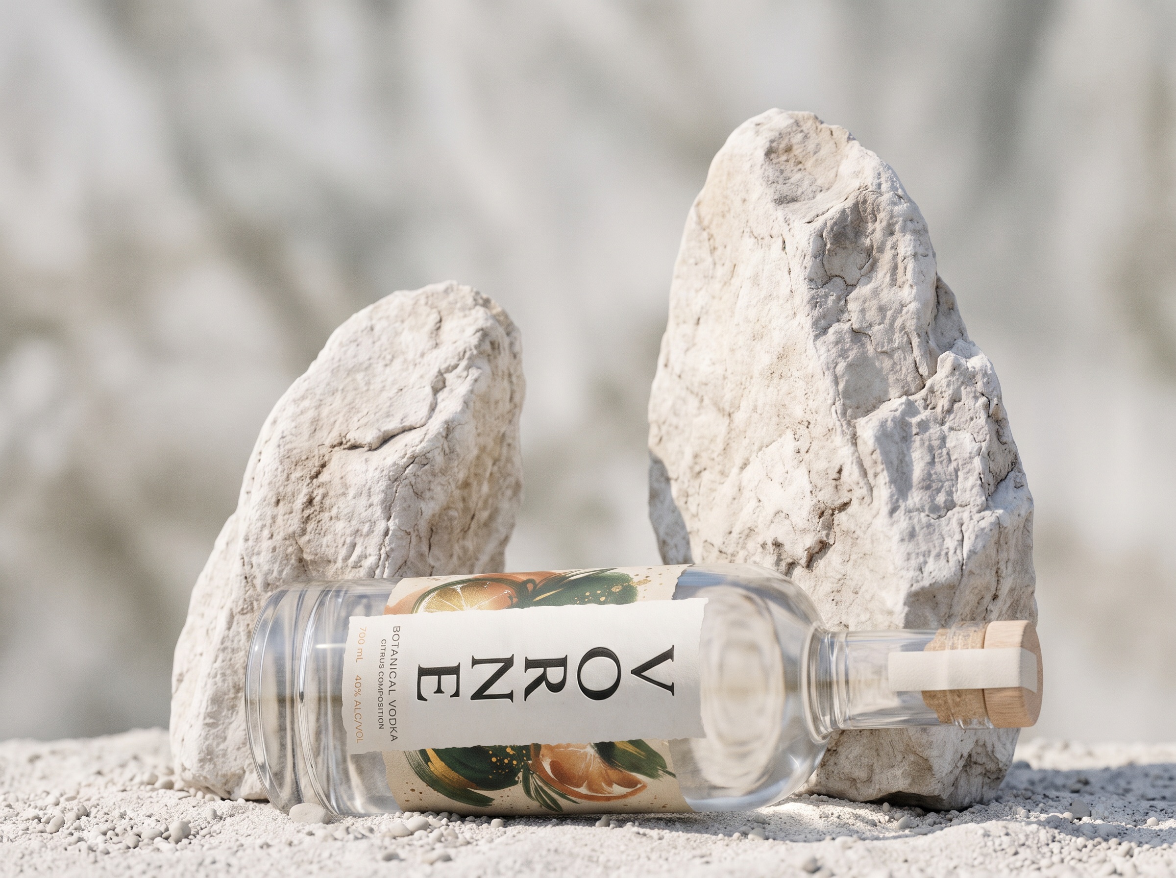
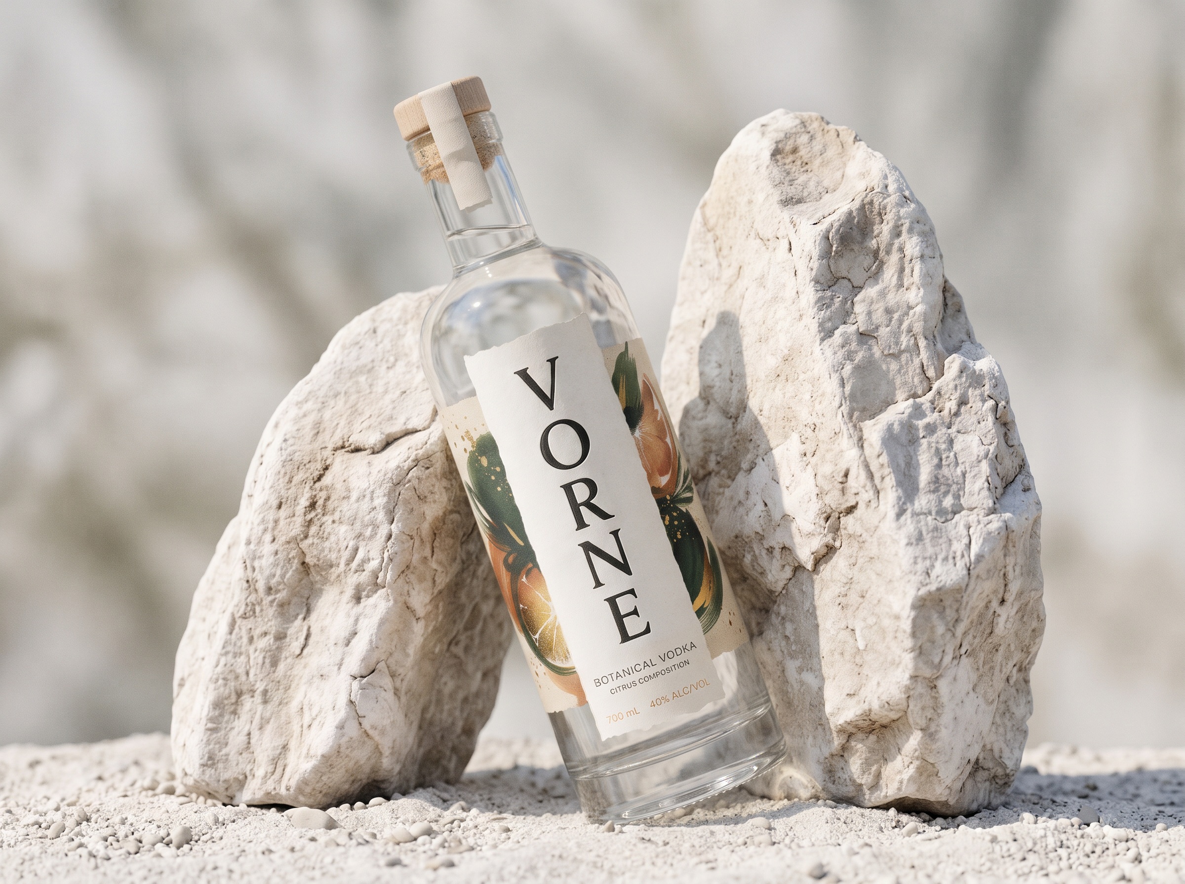

Where botanical artistry meets the elegance of simplicity.
VORNE was born from a simple philosophy: true luxury does not need to be loud. It needs to be felt.
Inspired by the purity of nature and the vibrant character of citrus botanicals, VORNE is a premium vodka packaging concept that transforms natural ingredients into a sophisticated visual identity.
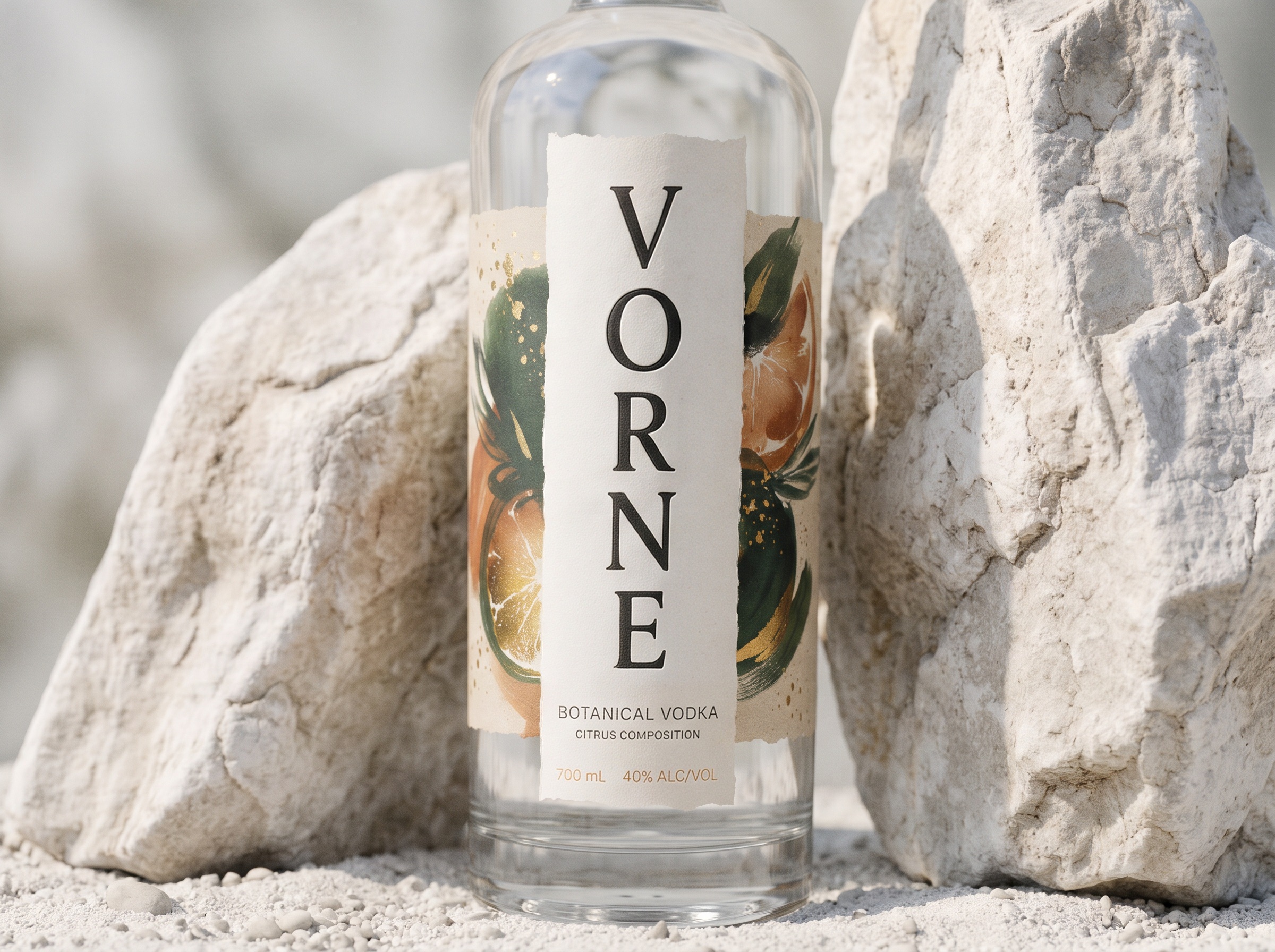
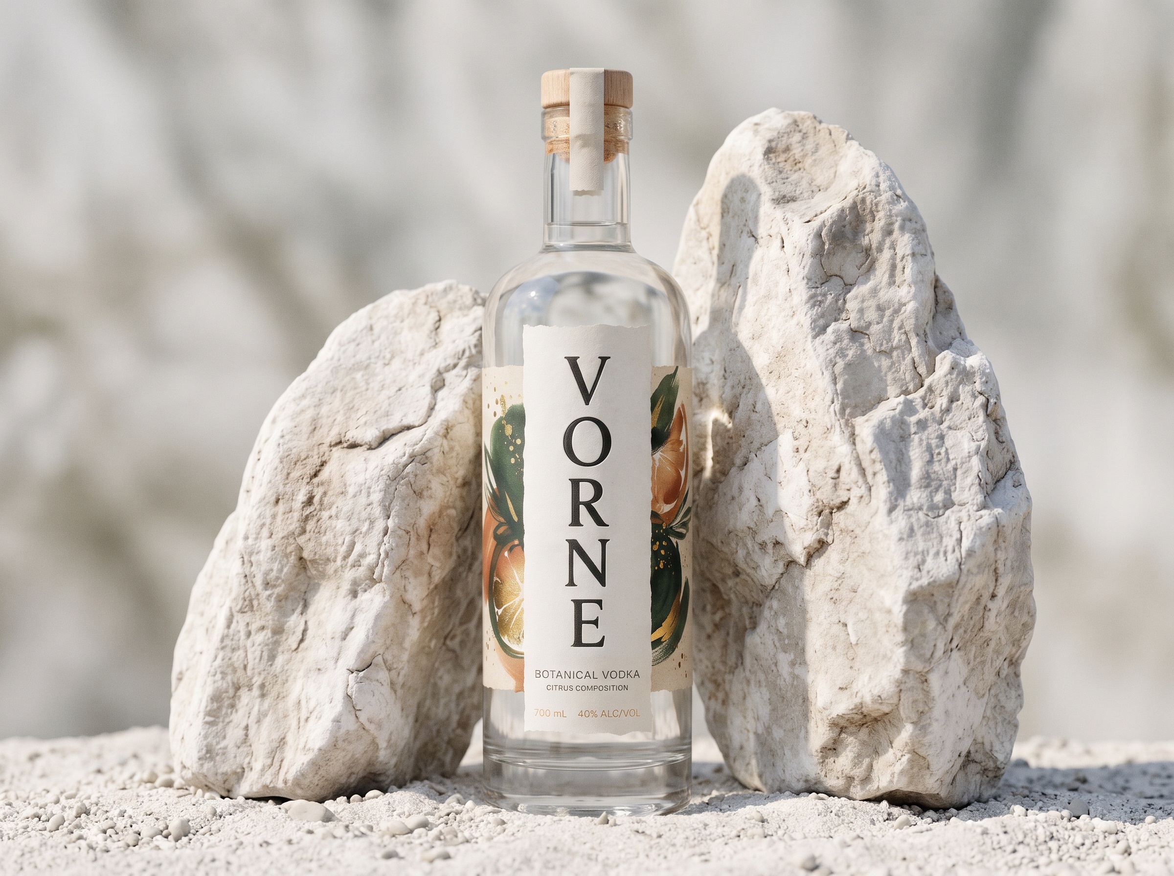
The design explores the contrast between contemporary minimalism and expressive botanical artistry. At its center, the VORNE name stands vertically in elegant serif typography, creating a bold architectural statement that immediately distinguishes the bottle.
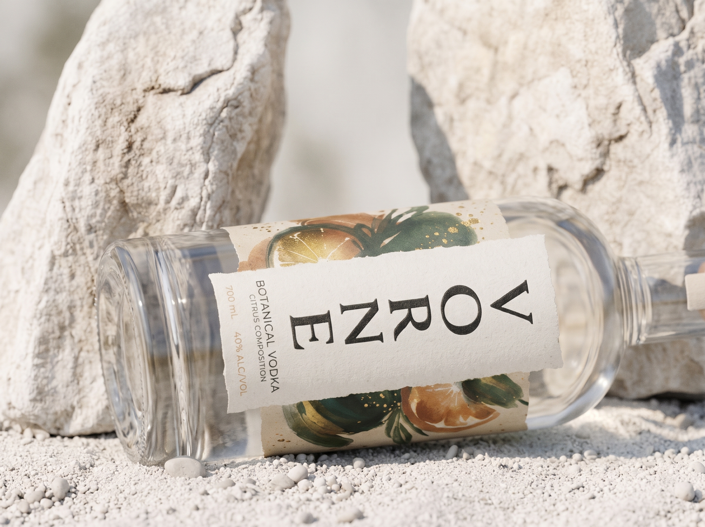
Surrounding this refined composition, richly illustrated citrus fruits and deep green botanical elements introduce a sense of movement, freshness, and organic beauty. Subtle golden details add warmth and sophistication without disturbing the purity of the overall design.
The choice of materials tells another part of the story. Textured paper with softly irregular edges brings an artisanal character to the label, while the transparent glass bottle celebrates clarity and simplicity. A natural wooden closure completes the experience, reinforcing the connection between craftsmanship and nature.
Every detail has been deliberately considered, from the balance of typography and illustration to the harmony of materials, colors, and proportions.
VORNE is more than a bottle design. It is an exploration of how nature can become a visual language of modern luxury.
Pure by nature. Distinctive by design.