Rens Coffee Packaging


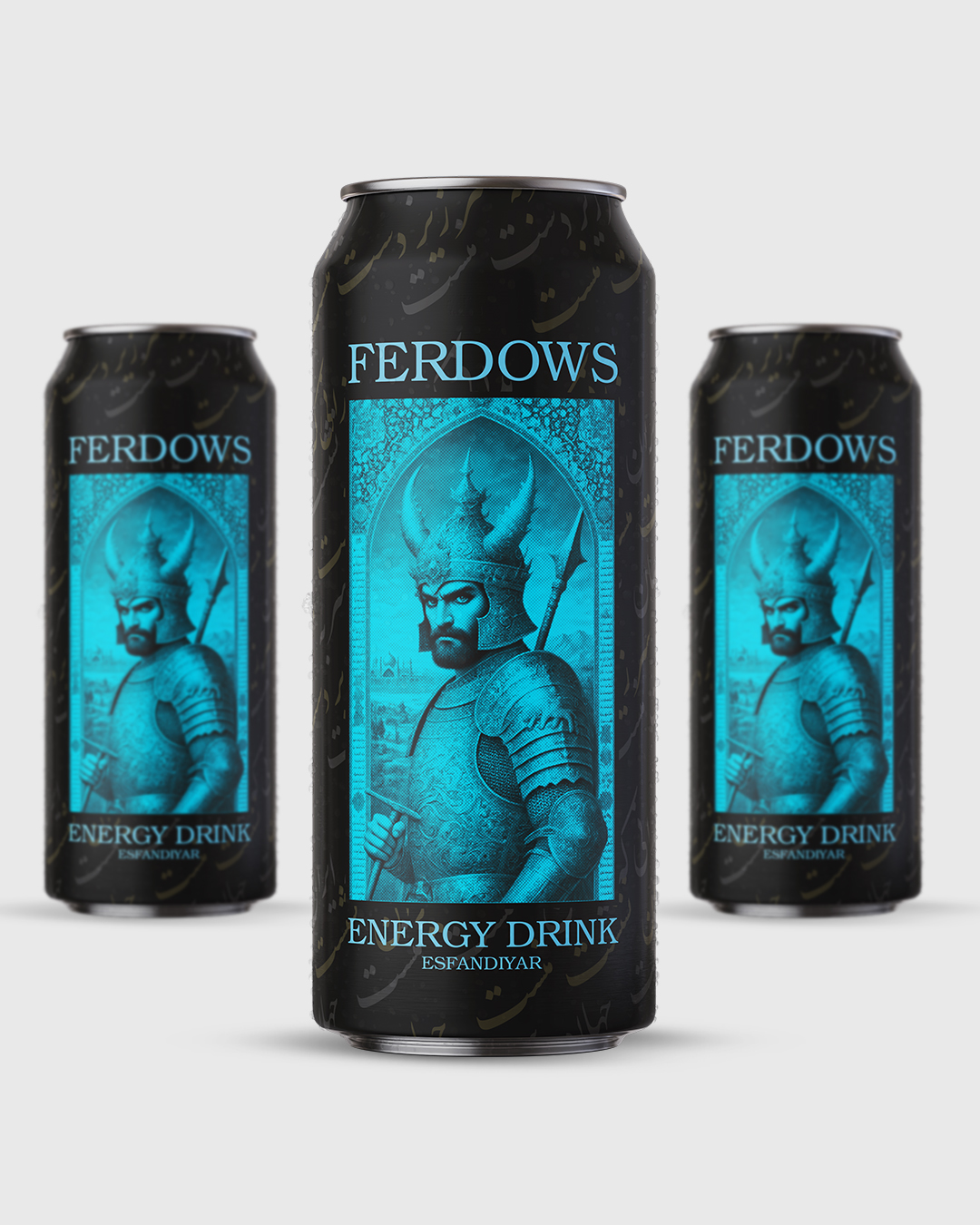
In today’s competitive world, product packaging plays a powerful role in attracting customers and differentiating brands. Energy drinks are no exception. A well-designed package can directly influence a customer’s purchasing decision.
The Challenge of Designing Rens Coffee Packaging:
Overall Design Structure The packaging design of Rens coffee uses minimalistic, geometric, and at the same time, attractive graphic elements. By combining line art illustrations and contrasting colors, it presents a professional, modern, and distinctive visual identity.
Colors are intelligently used to differentiate the coffee bean blends:
Pink (70 Robusta / 30 Arabica): A bold and energetic color, suitable for the stronger Robusta blend.
Green (20 Robusta / 80 Arabica): A natural and gentle color that aligns with the smoother taste of Arabica.
Blue (50/50): A balanced and calm color that conveys harmony between the two types of beans.
This color scheme enables customers to easily identify their desired variety at a glance.
Geometric Patterns and Symbols The use of symbols such as cups, the sun, birds, and farmland at the top of the packaging conveys a sense of everyday life, tranquility, and the joy of the moment. These elements are arranged with precision and symmetry, reflecting a sense of order, quality, and meticulous production.
The brand slogan “The Joy of the Moment” is placed at the top of the package, emphasizing the brand’s focus on the coffee experience and the pleasurable moment of drinking it.
The use of a dark background (matte black) makes the colors and design elements stand out, creating a luxurious visual appeal.