Marino – Hot Sauce



Marino Rebrands Hot Sauce Through an Honest Reaction Concept
Overview Marino is a hot sauce line built around three heat levels — Low, Medium and High — each positioned as a distinct experience rather than a simple variation on spice. The packaging was designed to let the bottle itself communicate the intensity of what’s inside, before a single word is read.
The Challenge Most hot sauce packaging relies on technical cues — Scoville numbers, flame icons, or dry descriptive language — to signal heat level. The brief called for a more intuitive, emotionally honest system: one that a consumer could instantly read on a shelf, regardless of language or familiarity with the category.
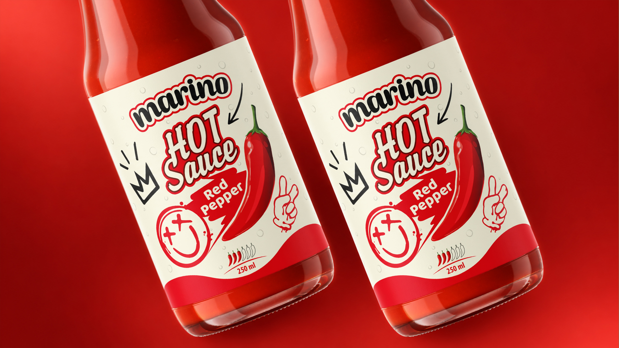
The Concept The solution centers on a single recurring character: a reactive face printed on each label. Rather than describing the sauce, the face performs the reaction a consumer is about to have — a relaxed smile on the Low variant, an overwhelmed expression with crossed-out eyes on Medium, and a flaming, knocked-out face on the High/X2 variant. The concept, internally named “Honest Reaction,” turns the label into a preview of the experience itself.
Design System This narrative is reinforced through a consistent color-coded architecture — green for Low, red for Medium, and deep red for High — allowing instant shelf differentiation at a glance. A hand-drawn, graffiti-inspired logotype and supporting marks (a crown doodle, a peace sign) give the brand a playful, street-rooted character that contrasts deliberately with the formality of traditional sauce branding. A chili-pepper intensity indicator and bottle droplets add a final layer of sensory detail, reinforcing freshness and heat across the full line. The bottle form itself follows a familiar sauce silhouette, keeping focus on the label’s storytelling rather than asking the shopper to learn a new shape.
Result Across all three variants, the system reads instantly and consistently — a single glance communicates not just which flavor, but what to expect from it, making Marino’s packaging as expressive as the product itself.