Highland whiskey · CGI

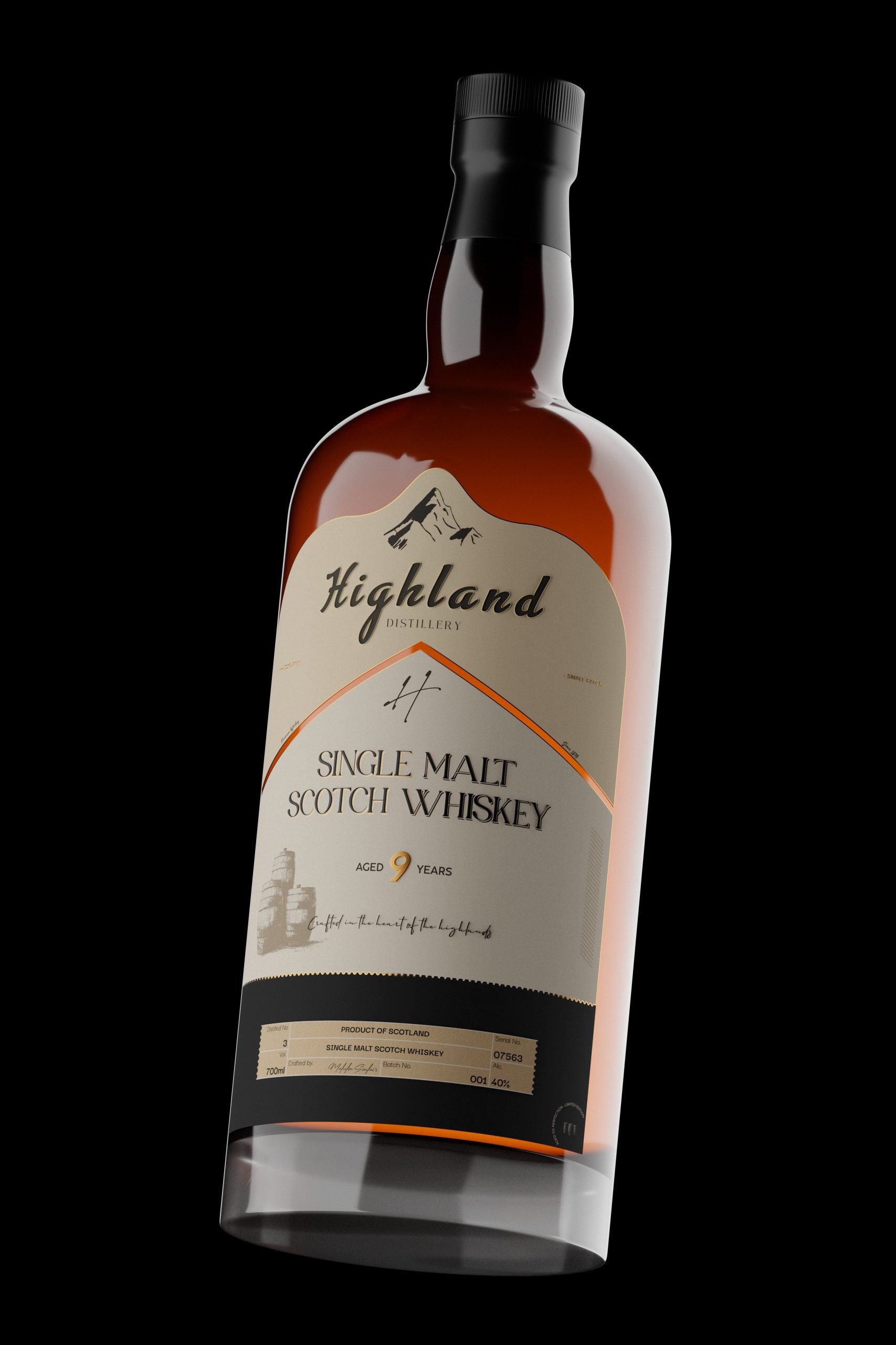
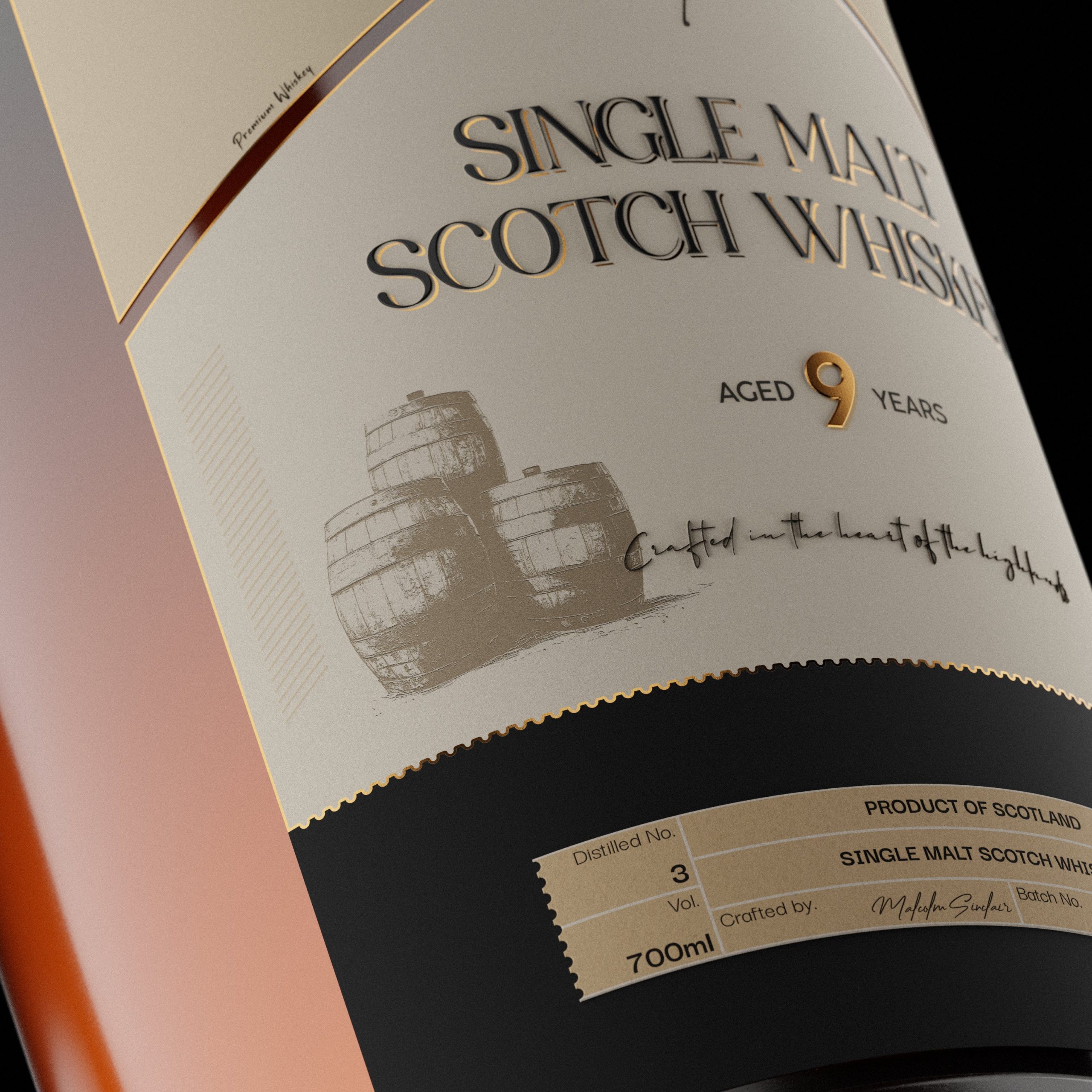
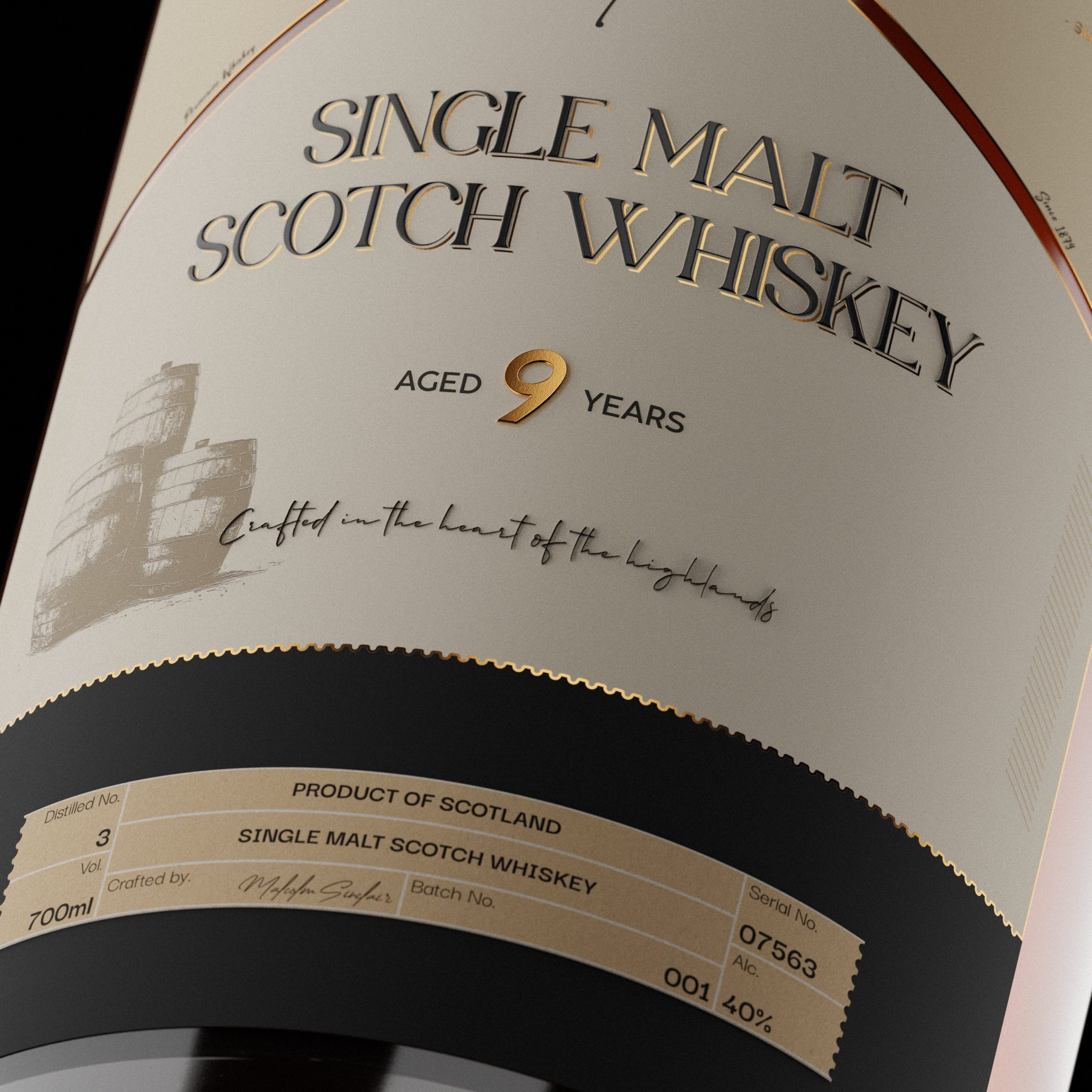
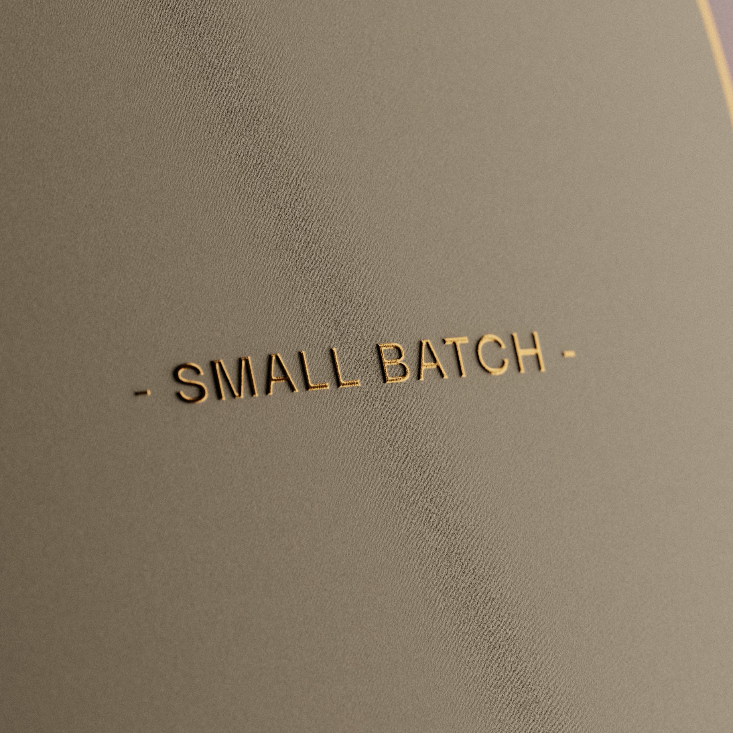
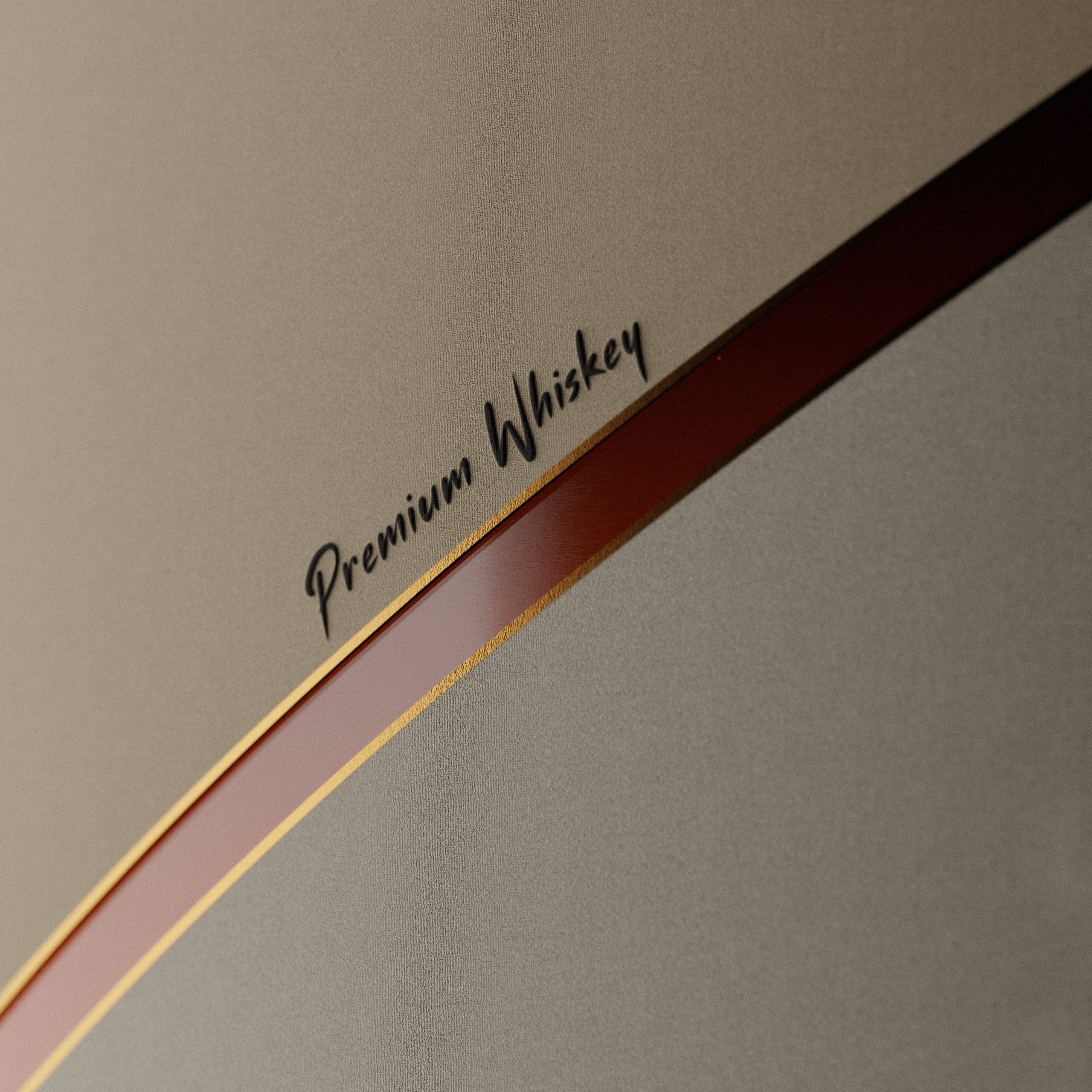
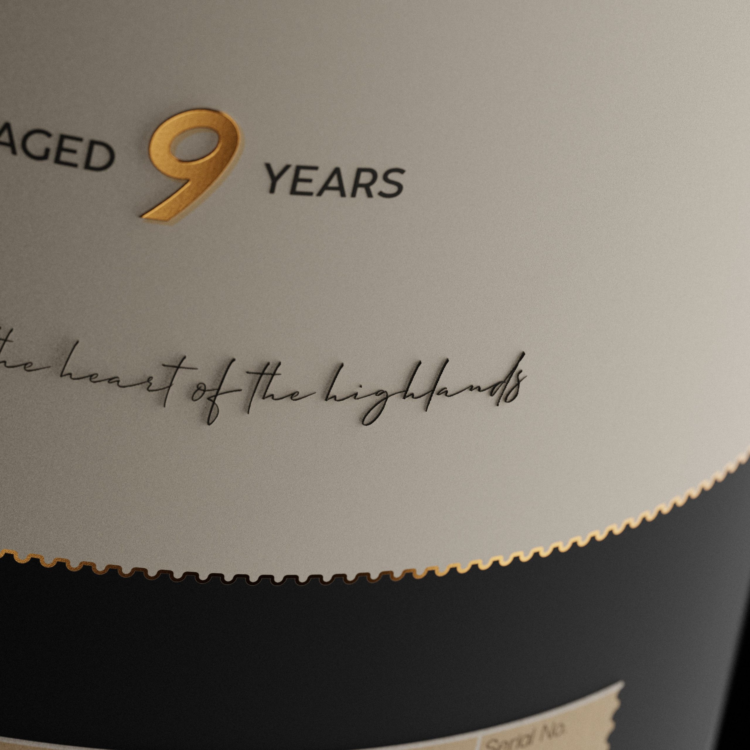
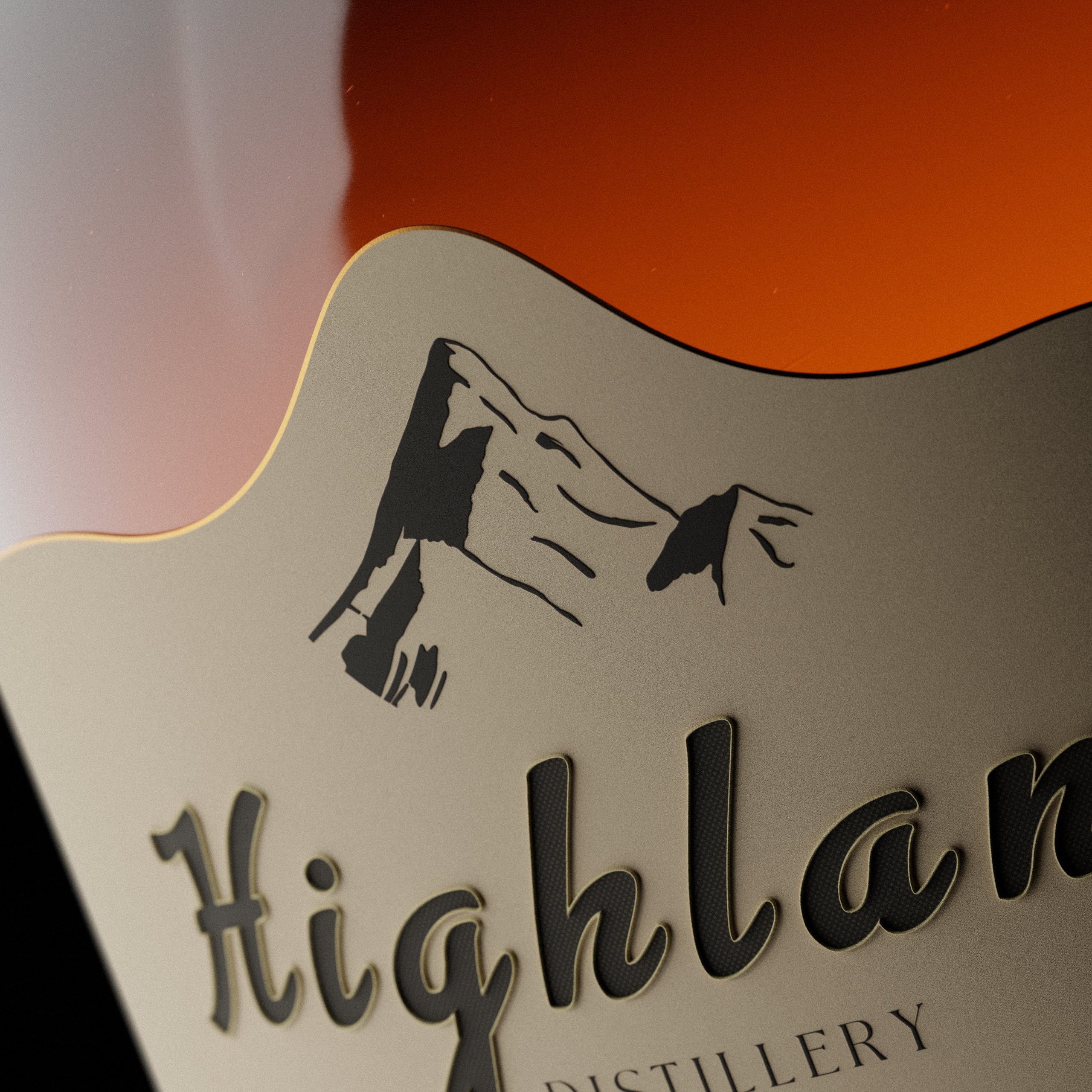
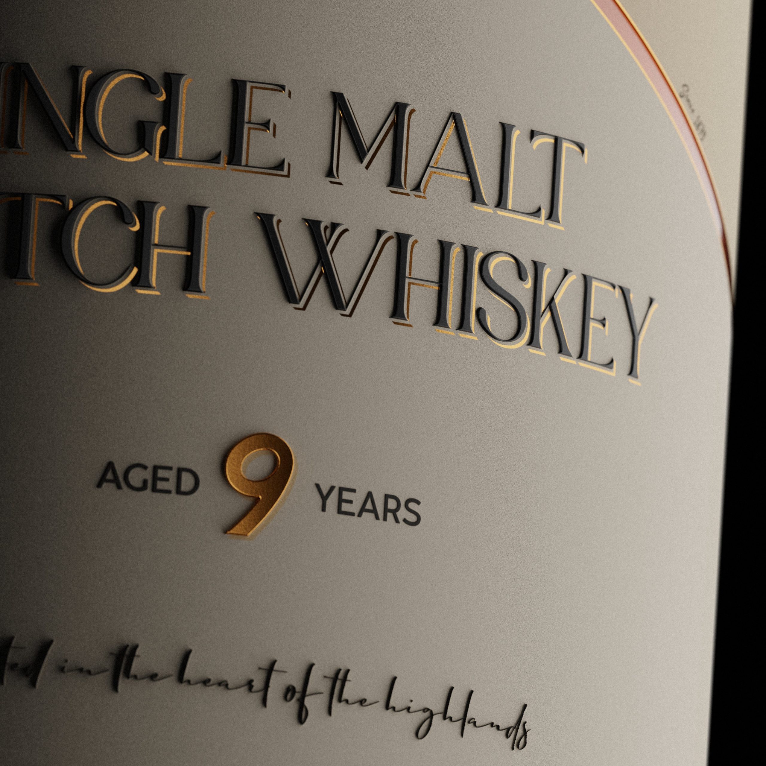

I started by choosing the name “Highland” to reflect the whisky’s Scottish heritage. The mountain logo came next, designed to clearly represent the Highlands and give the bottle a strong sense of place. I kept the label shape organic, echoing mountain contours, and picked neutral, earthy tones accented with gold to add warmth and a premium feel. All the info—age, type, origins—was organized for clarity and easy reading. My main goal was a classic, approachable look that still feels special and true to its roots.
Year 2025
Country Sweden
Region Europe
Project type Conceptual Design