

















Ding Fong – Syrup


Ding Fong – Syrup: Packaging Design
“A refreshing design that brings Ding Fong’s colorful spirit to life.”
Challenge: After refreshing the Ding Fong brand to express a brighter, fresher, and more contemporary image, the packaging for each product line was redesigned to align with its unique usage.
For the Syrup range — used to enhance beverages with sweetness, aroma, and flavor — the design needed to be distinct from the main product line while maintaining the signature identity of Ding Fong.
Idea: The diversity of flavors, aromas, and colors in each syrup inspired the overall design direction. Key ingredients of each flavor take center stage on the label, directly communicating the taste experience. Flowing ribbons featuring the flavor name sweep gracefully across the center, while mirrored reflections of the ingredients below convey depth and richness.
Soft, flowing line patterns in the background evoke a sense of delicacy and relaxation, while crystal-clear droplets add freshness and a celebratory feel — capturing the lively and refreshing spirit of the Ding Fong brand.
More by Ideogrambkk View profile

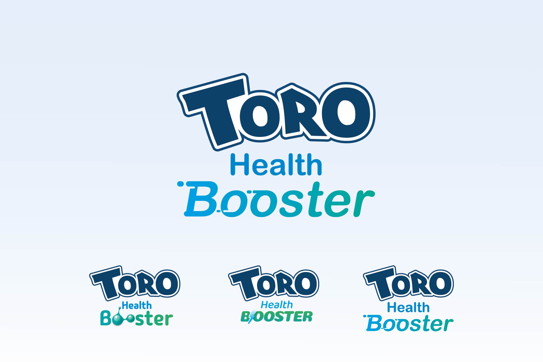 TORO Health Booster : Branding and Packaging Design

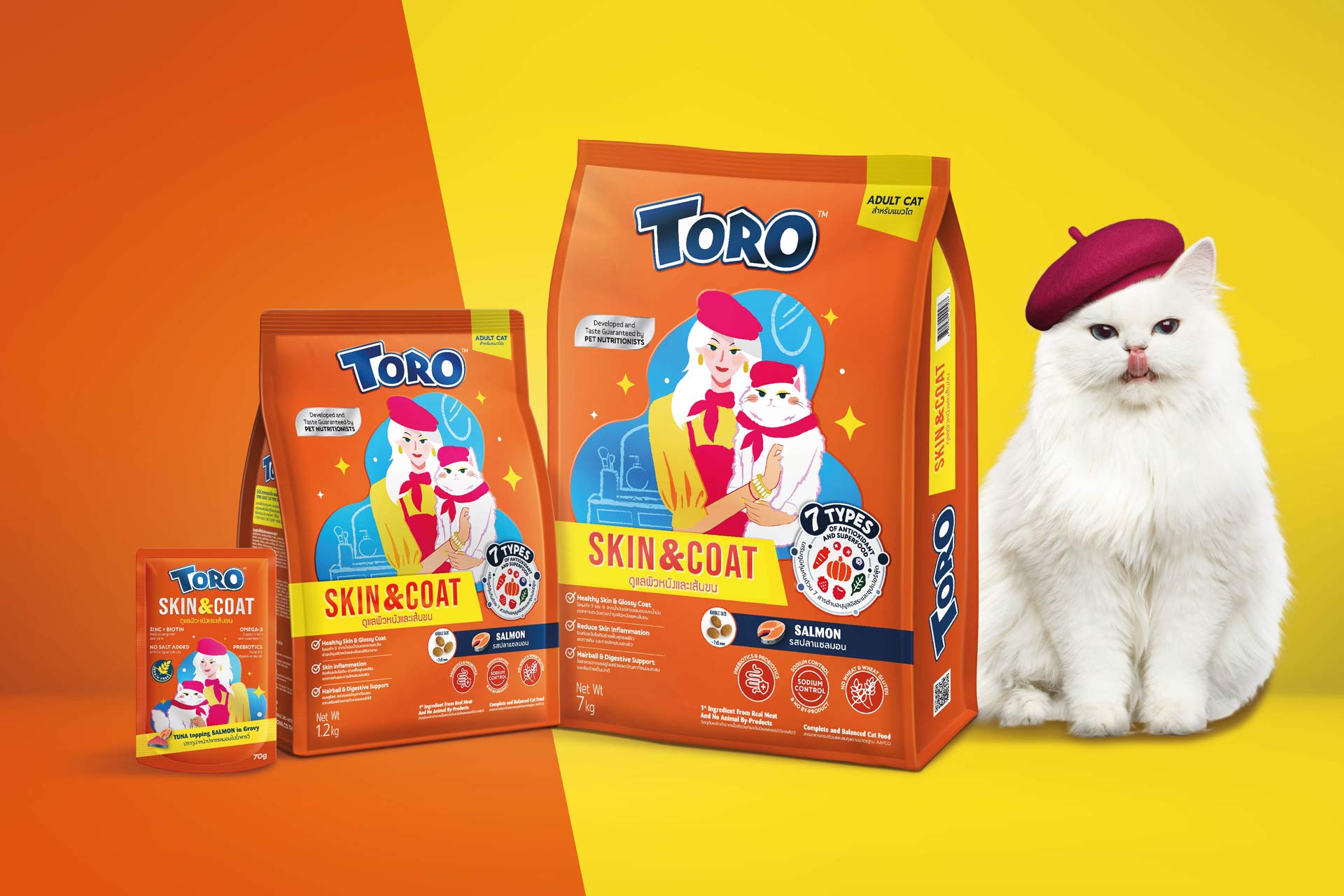 TORO – Cat food(Dry) : Repackaging Design

 XANMI – Biofood

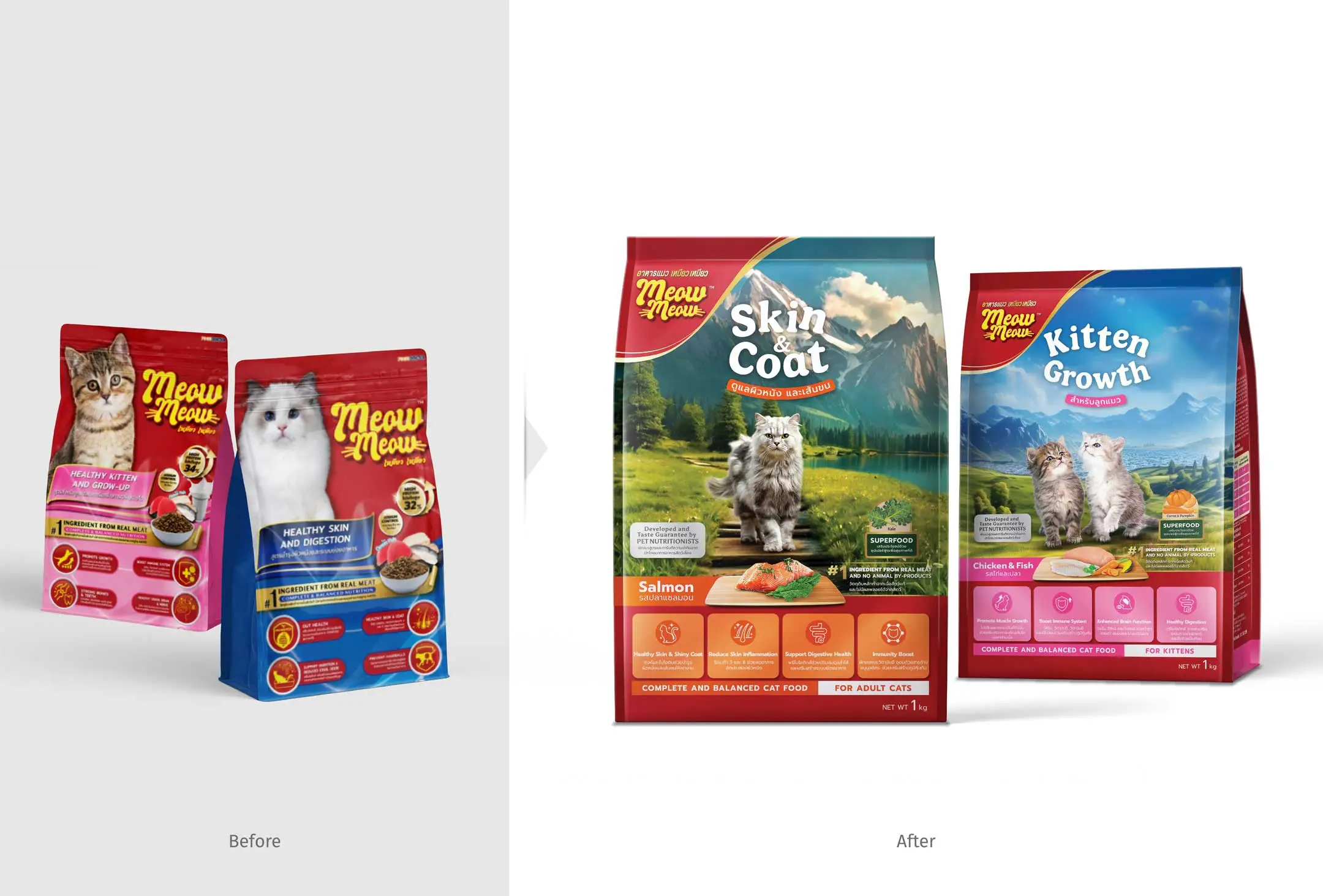 Meow Meow – Cat Food

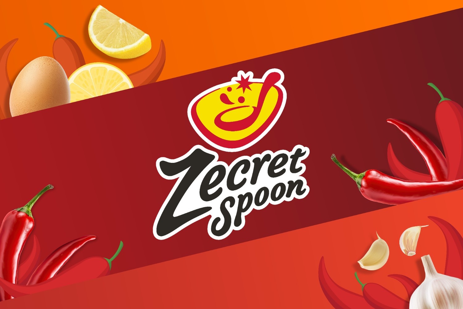 Zecret Spoon – Chili Sauce : Packaging Design Project

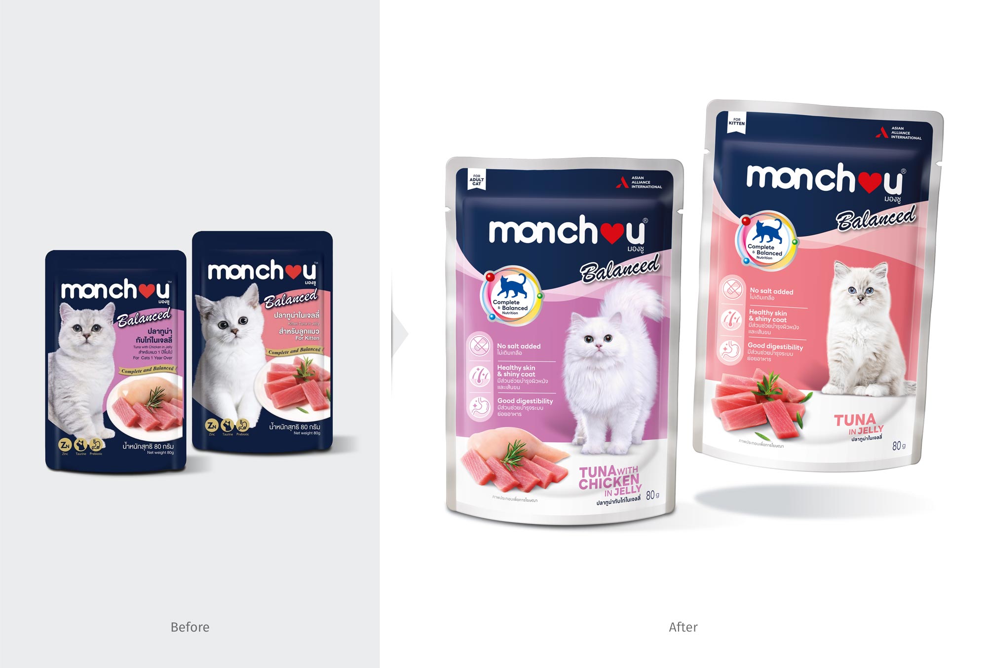 Monchou Balanced : Repackaging Design Project

 TORO – Cat food : Repackaging Design Project

 Ekachai – Salee Thip : Repackaging Design