Hasta Siempre Sotol


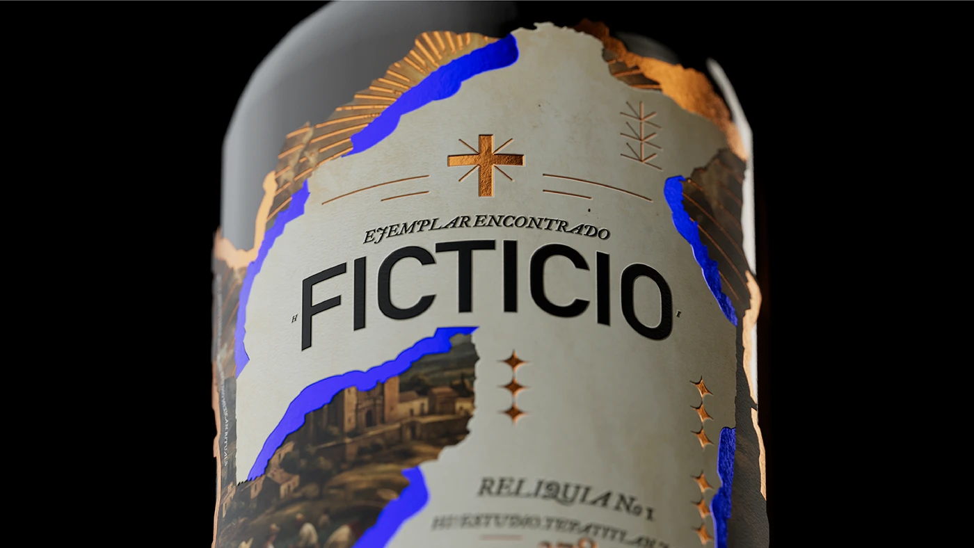
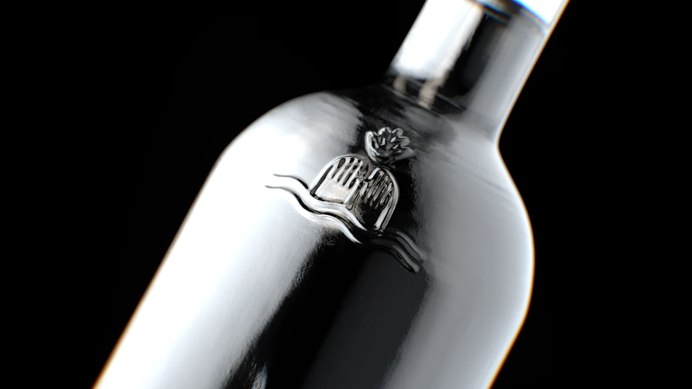
We designed this sotol brand as a metaphor for time: a bottle that changes while honoring what endures one that tells a story. We built it on three conceptual ideas, thought, and desert. It is a piece that stays, leaves, returns, converses, and lingers in memory.
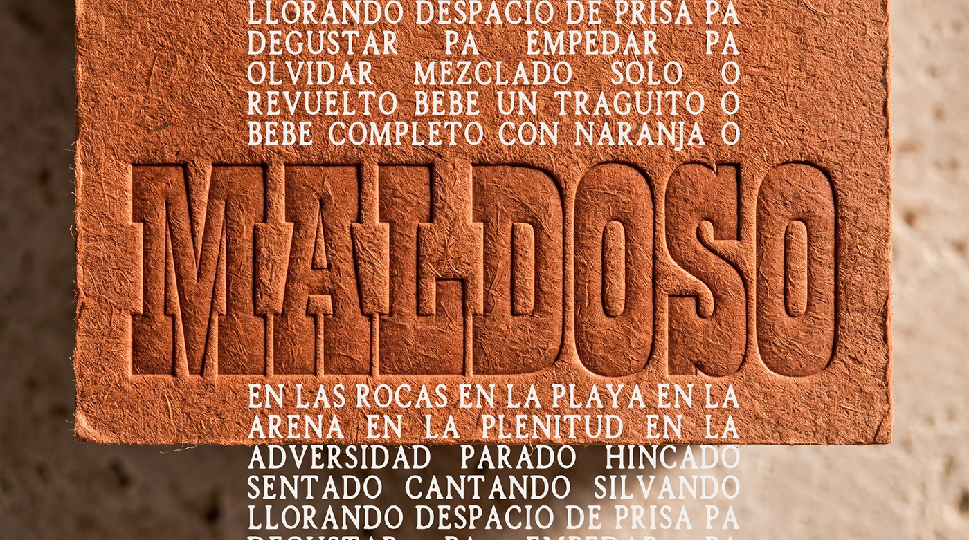
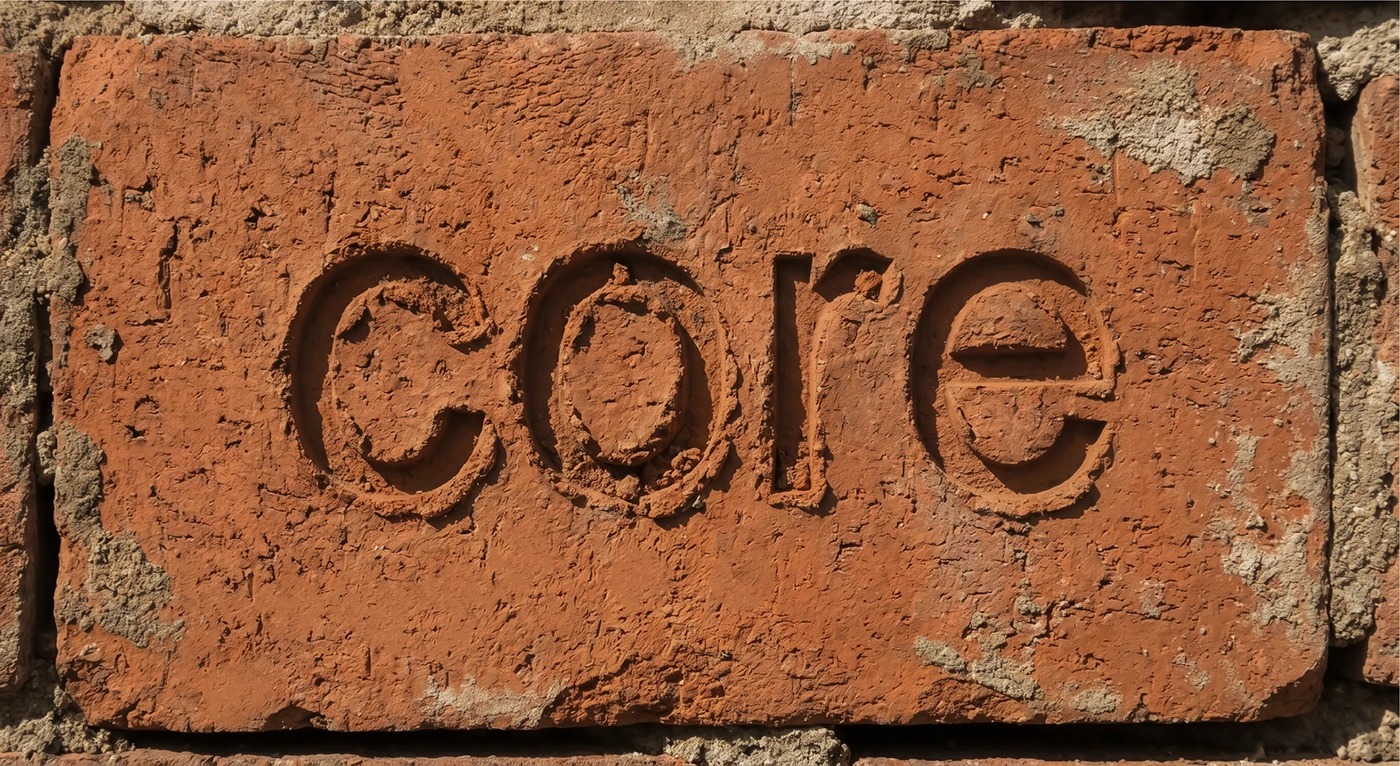
HASTA SIEMPRE Its iconography springs from the Mexican desert: austere, earth-toned, and rooted in the memory of native plants. We crafted a visual identity that merges artisanal detail with contemporary intent: clear typography, a system of marks, honest textures, and clean hierarchy meant to be read before it’s sipped.
HI! ESTUDIO UNEXPECTED BRANDS @hastasiempre.mx
Materials Glass, Ceramic
Year 2025
Country Mexico
Region North America
Project type Commissioned Work
Client HASTA SIEMPRE SOTOL