Luce di Oliva


LUCE di OLIVA
Luxury Olive Oil Skincare Packaging Conceptby Marta Čustić
The Challenge
Most skincare packaging either looks like medicine or like a Pinterest mood board gone wrong. Clinical whites, leafy patterns, “radiance” clichés, it’s all been done to death.
LUCE di OLIVA needed something different: skincare packaging that felt like a ritual object. Something that whispered heritage and quiet confidence instead of yelling wellness miracle.
The Concept
What if skincare packaging felt like it belonged on a marble vanity in Tuscany, not a bathroom shelf?What if olive oil wasn’t just an ingredient, but a symbol of patience, wisdom, and light?
LUCE di OLIVA was reimagined as an artifact of ritual, a piece of design that invites touch, not just purchase.
The Strategy
ResearchStudied luxury fashion and home brands like Hermès, Aesop, and Loewe to understand how restraint creates desire.
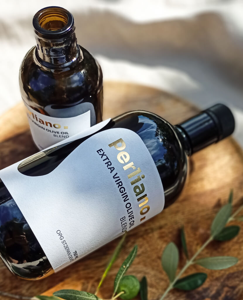
Design DirectionPackaging so beautiful you hesitate to throw the box away. Each detail invites the hand through textured papers, subtle embossing, and gold foil that glows like late-afternoon sun on olive leaves.
Tone of VoiceNo “glow”, no “self-care”. Instead:
“True luxury lies not in what we add, but in what we perfect.”
The Execution
Custom hand-drawn olive branch illustrations balanced between science and poetry
Deep neutral palette inspired by Mediterranean stone and pressed oil
Gold foil and tactile embossing that catch the light like sun through olive trees
Minimal structural design that feels heavy, quiet, and worth keeping
What Makes It Different
Rejected beauty clichés entirely: no faces, no promises, no gloss
Borrowed from fashion, not pharmacy
Designed for the senses, where touch matters as much as sight
Elevated a simple ingredient into an object of desire
The Result
A skincare line that doesn’t sell hydration or youth. It sells belief.Packaging that feels like it could fix more than your skin, maybe your whole week.
True luxury isn’t loud.It’s felt.