

















Perliano



Perliano Olive Oil
Extra Virgin. Extra Intentional.By Studio Stoked | CroatiaCategory: Food & BeverageServices: Branding, Packaging Design, Label Design, Strategy and Positioning
Project Overview
Perliano isn’t a sixth-generation Tuscan estate. It’s a young Croatian olive oil brand built by a founder who wanted to do things differently. The mission was to design olive oil packaging that feels premium and modern without relying on old-world tropes or inherited prestige.
No dusty family crests. No “since 1823.” Just honest, confident design that reflects a new generation of producers who care deeply about craft and presentation.
The Challenge
Most olive oil packaging falls into two camps:
Overly ornate and traditional, shouting about heritage
Minimalist and sterile, disappearing on-shelf
Perliano needed a third path, packaging that feels authentic, warm, and contemporary. The brand had to signal quality without slipping into cliché or cold minimalism.
The Solution
Studio Stoked repositioned Perliano as modern Mediterranean luxury: grounded in craft, refined in execution.
Design Strategy:
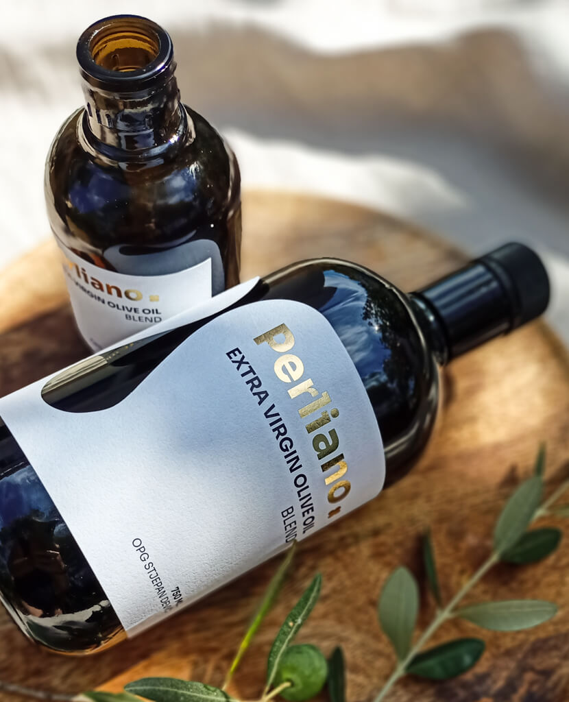
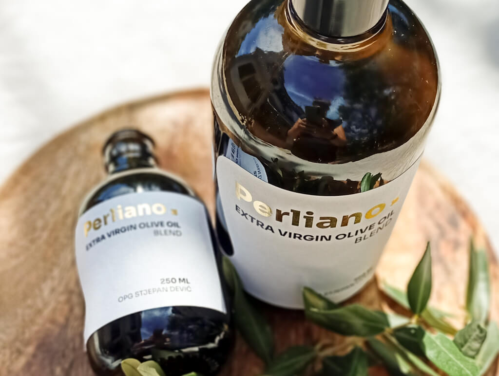
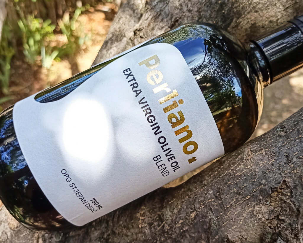
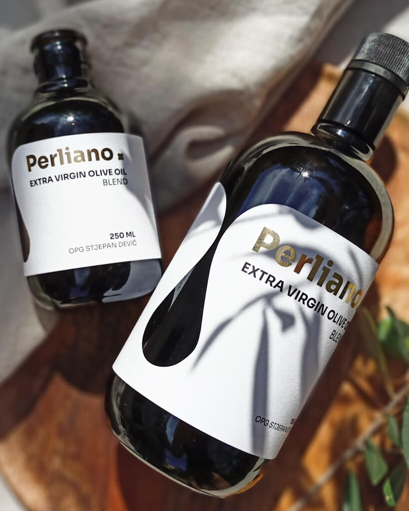
White label with an organic droplet shape inspired by the flow of oil
Gold foil detailing for subtle luxury and tactile interest
Clean sans-serif typography for clarity and trust
Dark glass bottles for UV protection and premium feel
Natural-light photography with linen and olive branches for texture and warmth
The visual identity feels pure, intentional, and export-ready — a design system built for modern kitchens and boutique retailers.
Results
Elevated shelf presence in both retail and boutique markets
Higher perceived value supporting premium pricing – client sold out and raised prices
Brand story grounded in honesty rather than heritage
Consistent design system across product sizes
When packaging looks as considered as the craft behind it, customers buy with confidence.
Credits
Design & Strategy: Studio Stoked www.studiostoked.comClient: OPG Stjepan DevićPhotography & Styling: Studio Stoked


