Rituality


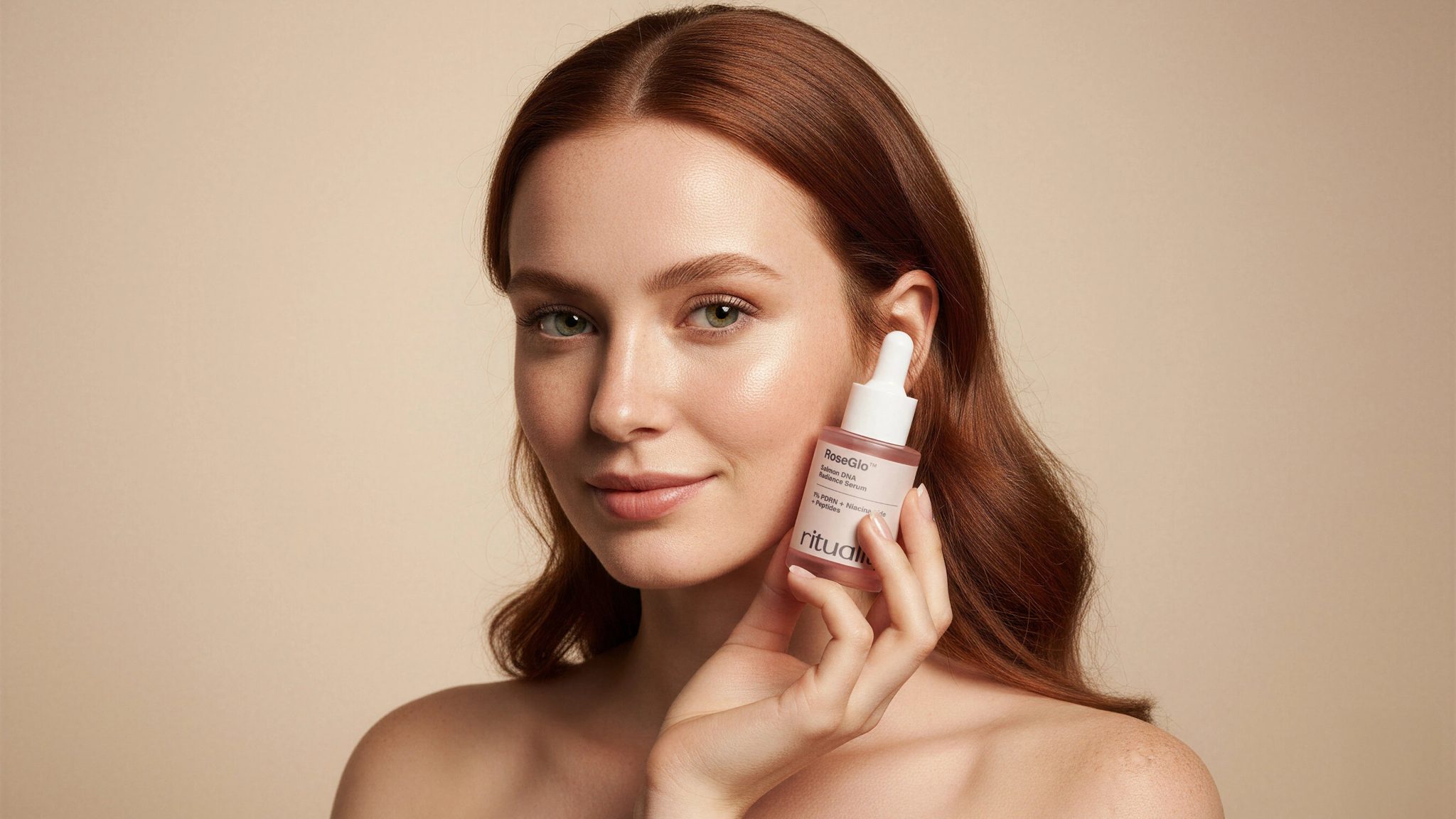
Quietly confident. Softly scientific. A visual identity where clean design meets sensorial warmth.
Rituality is a modern skincare brand built around quiet luminescence — transforming high-performance actives into daily rituals of care. The name itself stems from the word ritual, expressing the brand’s philosophy that skincare is more than routine — it’s a mindful act of presence.
The identity was designed to capture the balance between clinical precision and emotional calm, creating a world that feels both intelligent and sensual.
A muted palette of blush clay, serum beige, and deep plum brings warmth to the otherwise minimalist system — evoking clean beauty with a human touch.
The typography, Acumin Pro, was chosen for its balance of structure and softness: bold enough to convey confidence, refined enough to maintain serenity.
Packaging design follows the same philosophy — minimal, warm, and functional. Clear hierarchy, duo-tone layouts, and tactile surfaces make each piece both aesthetically consistent and emotionally inviting. Designed to be Instagrammable without excess, the packaging celebrates ritual as a moment of presence rather than performance.
Rituality turns skincare into something deeper: a quiet dialogue between science, design, and self-trust.