

















Kind Selection: Timeless Design Redefining Premium Whisky


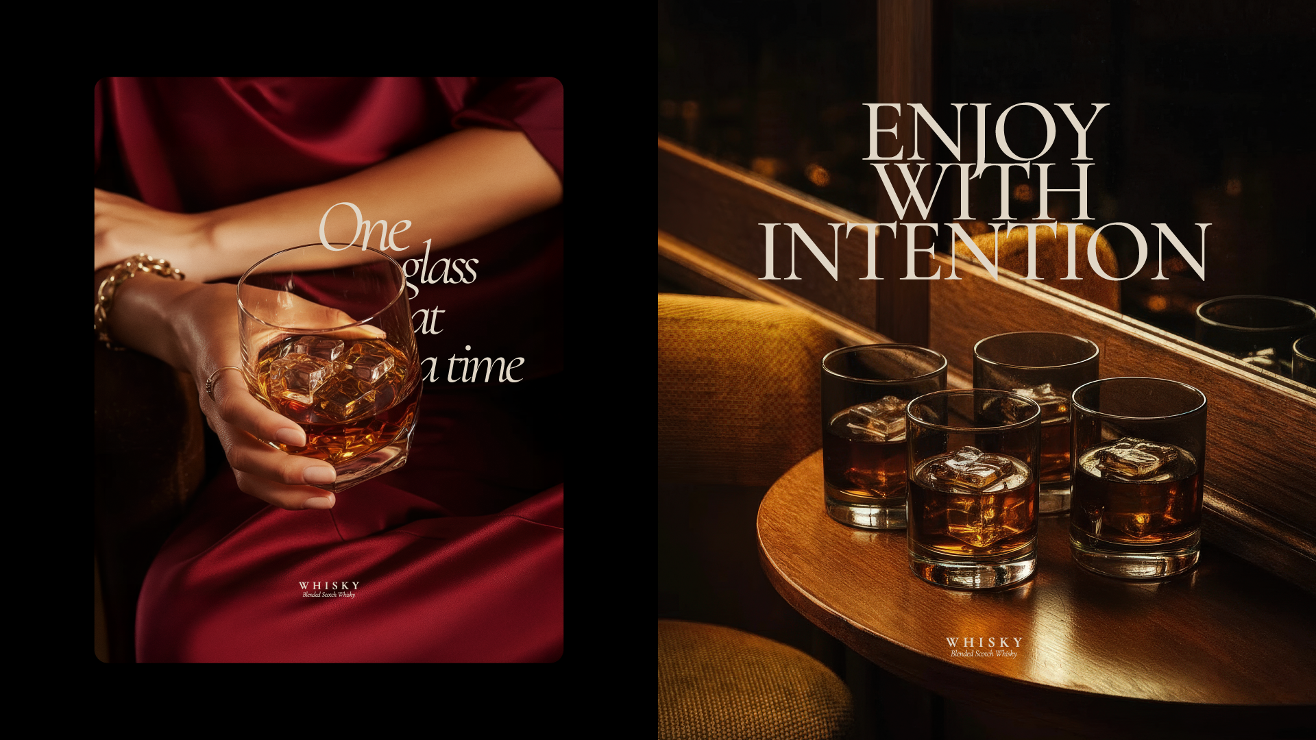
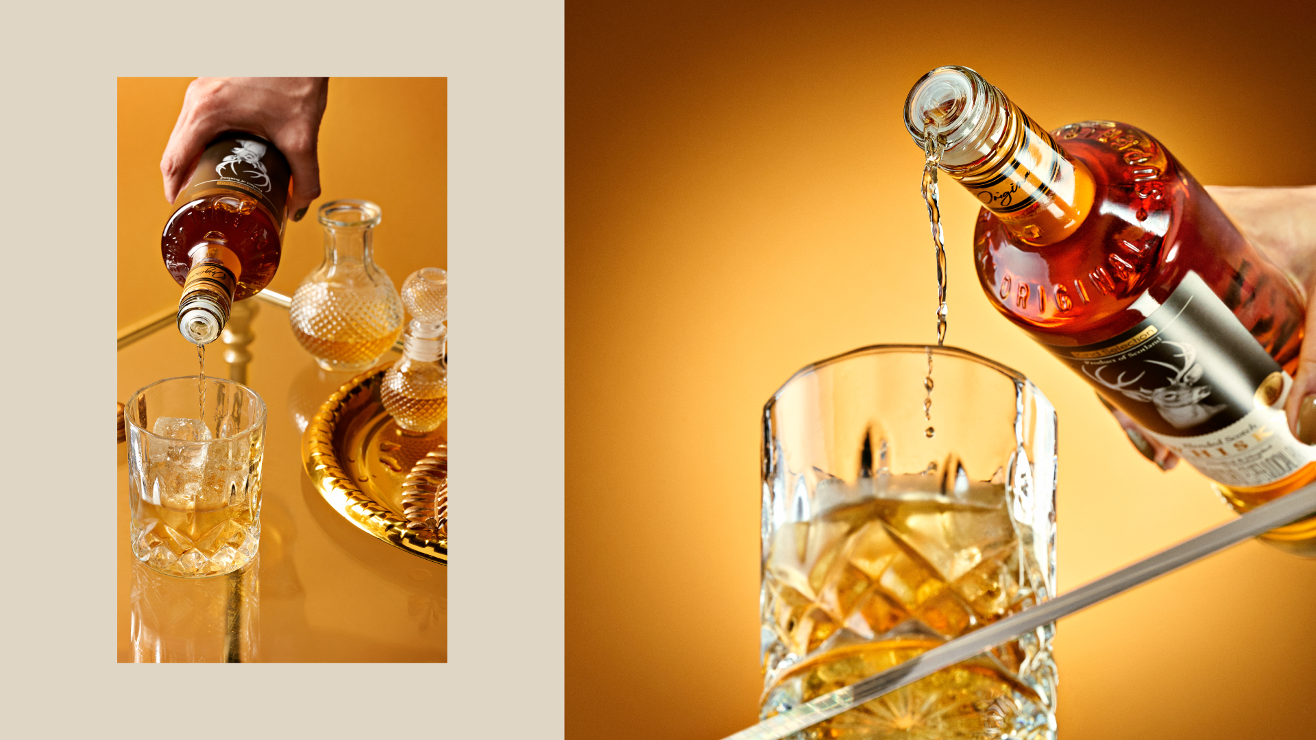
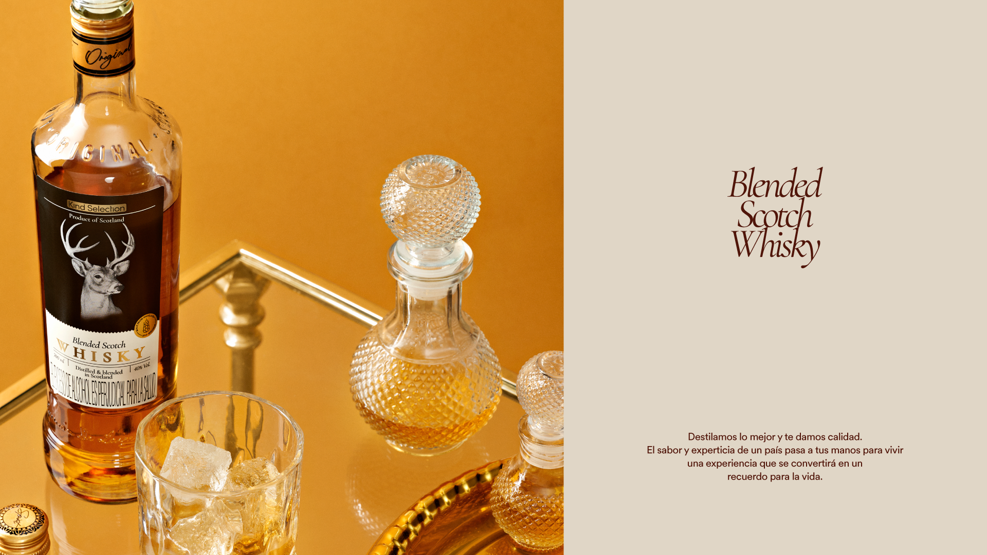
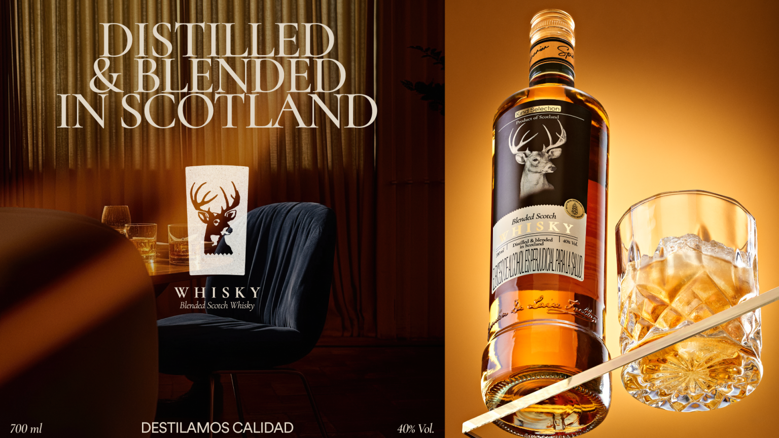
Kind Selection, a whisky importer, needed a label that authentically honored its Scottish roots while firmly establishing the product in the luxury segment. The challenge lay in capturing the essence of Scotland’s midlands—its misty hills, lush forests, and majestic reindeer—without falling back on tired industry clichés.
To achieve this, the new packaging system balances deep-rooted heritage with a sophisticated, contemporary aesthetic. The design translates the atmospheric Scottish landscape into elegant visual cues, leveraging classic typography alongside a highly refined composition. By elevating these cultural markers, the packaging ensures the region’s identity is unmistakable on the shelf, delivering a look that is both fresh and timeless.
The label now serves as a powerful strategic asset. It transforms into a compelling brand narrative that invites consumers to experience exquisite craftsmanship, successfully driving the product’s premium appeal.
View this post on Instagram A post shared by La Table | Commercial Product Photography (@latable_studio)
More by Goat Studio View profile

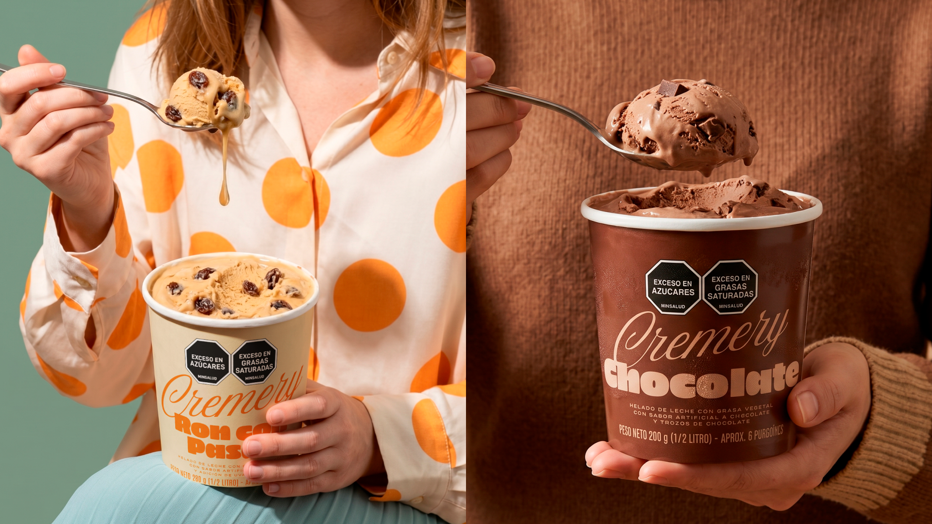 Cremery: Bringing Warmth to the Ice Cream Aisle

 Nashi Tea: Designing Instant Freshness

 The Crunch Heard Through Design: CRONCHUDOS

 Prime Kött: White Label with Meaning and Mastery

 Ruta Andina: The Journey of Colombian Coffee

 Costa Verde: A Fresh Take on Frozen Foods

 Sangría: A 19th-Century Elegance with a Modern Twist