

















Cremery: Bringing Warmth to the Ice Cream Aisle

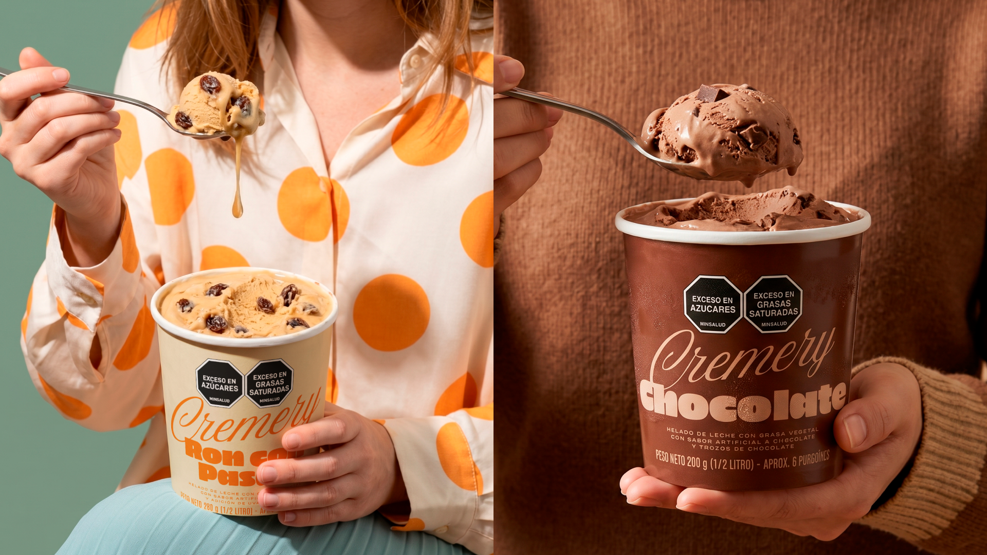
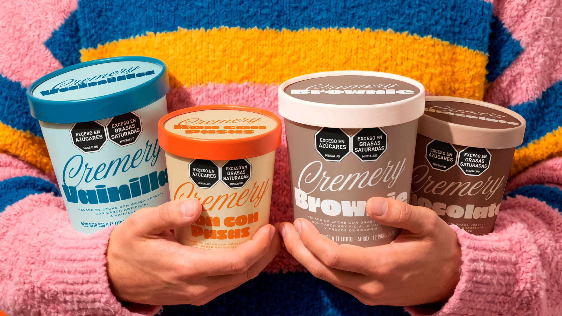

Mass consumer brands often risk feeling cold and disconnected from their audience. Cremery’s packaging design sets out to achieve the exact opposite, aiming to bring warmth, approachability, and a distinct human touch back to the ice cream aisle.
To achieve this, the typographic development was crucial. We selected a continuous stroke script typography for the central logo, placing it in deliberate tension with thick, mechanical fonts for the flavor descriptors. This striking typographic contrast provides a nostalgic, artisanal character that establishes an emotional connection from the very first glance, disrupting the overly clinical look of traditional mass-market competitors.
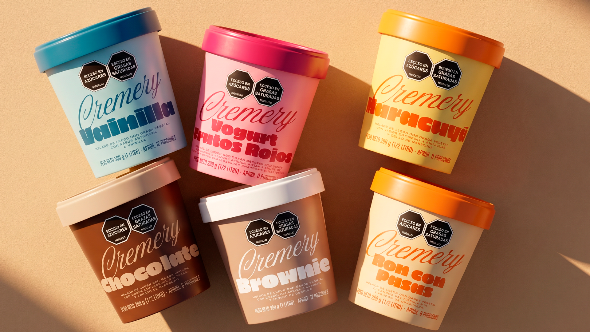
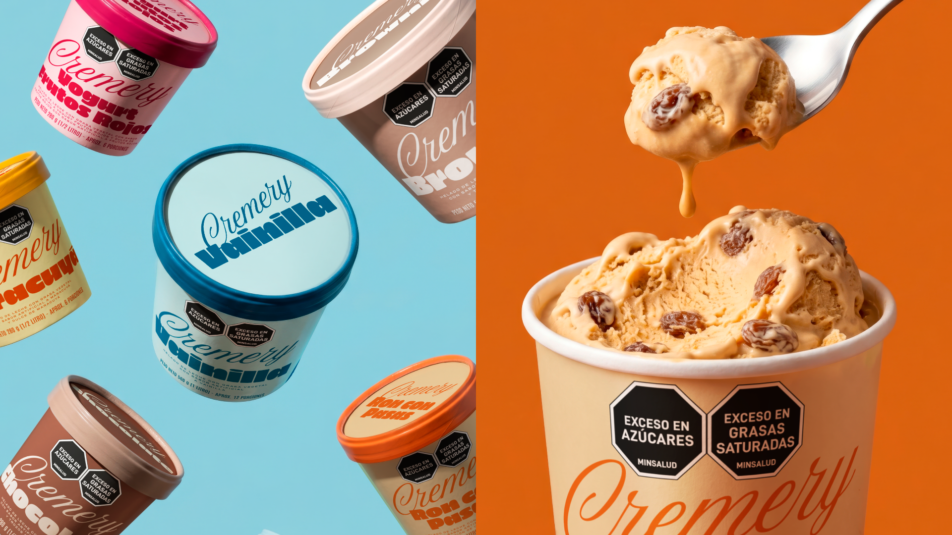
Furthermore, navigating a diverse flavor portfolio must be an effortless experience for the consumer. With Cremery, the color palette is far more than just decorative; it is a highly functional navigation strategy. We defined bold, solid color blocks that code each flavor variation, creating a high visual contrast against the brand’s red signature. This intentional color system quickly guides the eye, cohesively groups the portfolio on the shelf, and builds strong brand memory.
More by Goat Studio View profile

 Kind Selection: Timeless Design Redefining Premium Whisky

 Nashi Tea: Designing Instant Freshness

 The Crunch Heard Through Design: CRONCHUDOS

 Prime Kött: White Label with Meaning and Mastery

 Ruta Andina: The Journey of Colombian Coffee

 Costa Verde: A Fresh Take on Frozen Foods

 Sangría: A 19th-Century Elegance with a Modern Twist