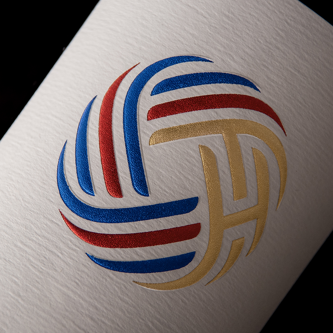
P & W Spirits


Longman’s Gin wanted to develop a parent brand for their new distillery, P & W Spirits Company, named after the distillery’s Produce & Waterfront District location in Oakland’s Jack London Square. This area was a shipping hub in the 19th century, with a flurry of transportation by train, car, and ship. Recently, the area has transformed into a lively neighborhood with a mix of homes, restaurants, bars, and entertainment. P & W came to us to develop their parent brand logo as well as the packaging for their new offering of limited edition, single-barrel spirits.
The branding needed to reflect the industrial feel of the neighborhood and be easily extendable to a variety of spirits. We created a logo that was a callback to the Produce & Waterfront District’s history of trade and commerce. The typography-driven label has a modern, industrial sensibility and was designed to allow for easy replacement of spirit type, alcohol, and proof, as well as a section where the bottle number could be hand numbered to emphasize each offering’s scarcity. Each single-barrel spirit will have a unique alphanumeric code for collectability and easy portfolio tracking as the product line grows.