Barman’s


Founded by a 30-year hospitality veteran, Barman’s is a line of Vodkas inspired by real bartenders, their stories, and their stellar cocktail recipes. The premium Vodkas are infused with 100% real fruit to create unique Vodkas without added sugar that are perfect for craft cocktails – for both the professional and at-home bartender. The packaging design needed to reflect the expertise behind the brand and the quality of the small batch fruit-infused Vodkas.
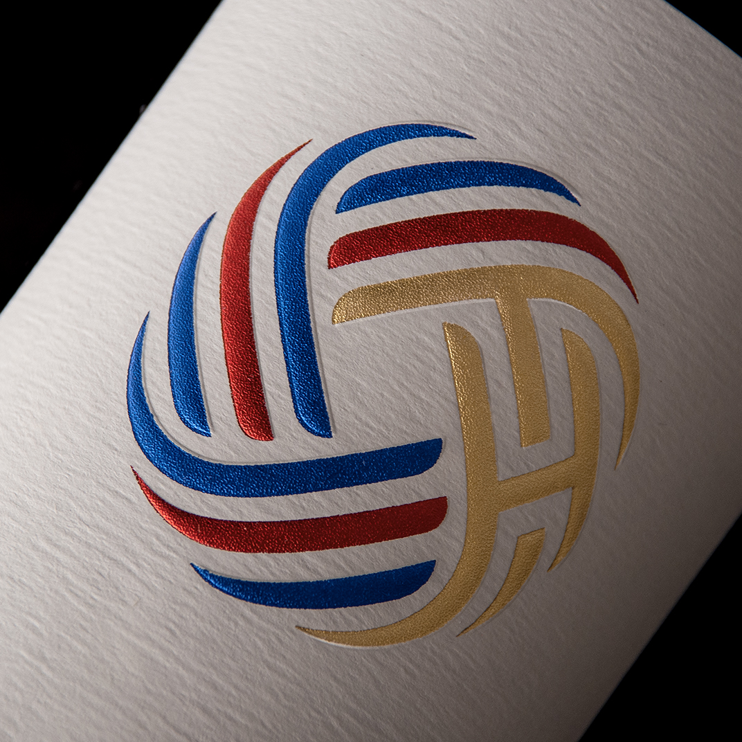
The Barman’s wordmark and icon were inspired by the vibrant bar and restaurant signage found throughout Chicago. The unconventional diagonal label shape provides a dynamic and contemporary twist. Each of the Vodkas features a signature drink recipe and an illustration of the bartender who created each cocktail – highlighting the people behind the bar and the art of crafting cocktails.