

















Seoksu _ BI, Label & Package Design

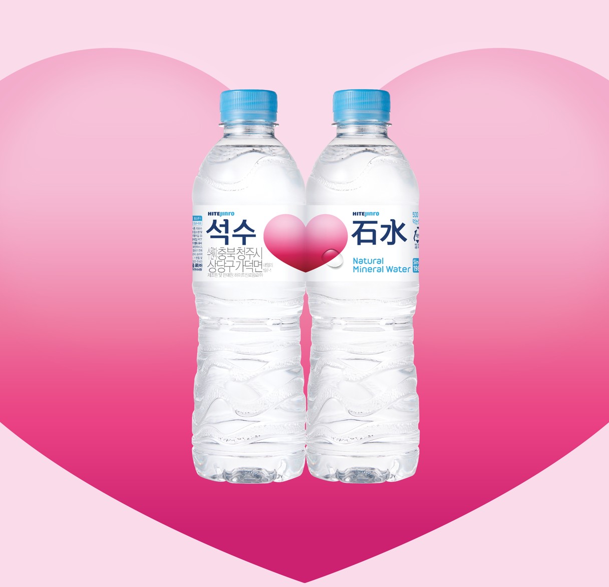
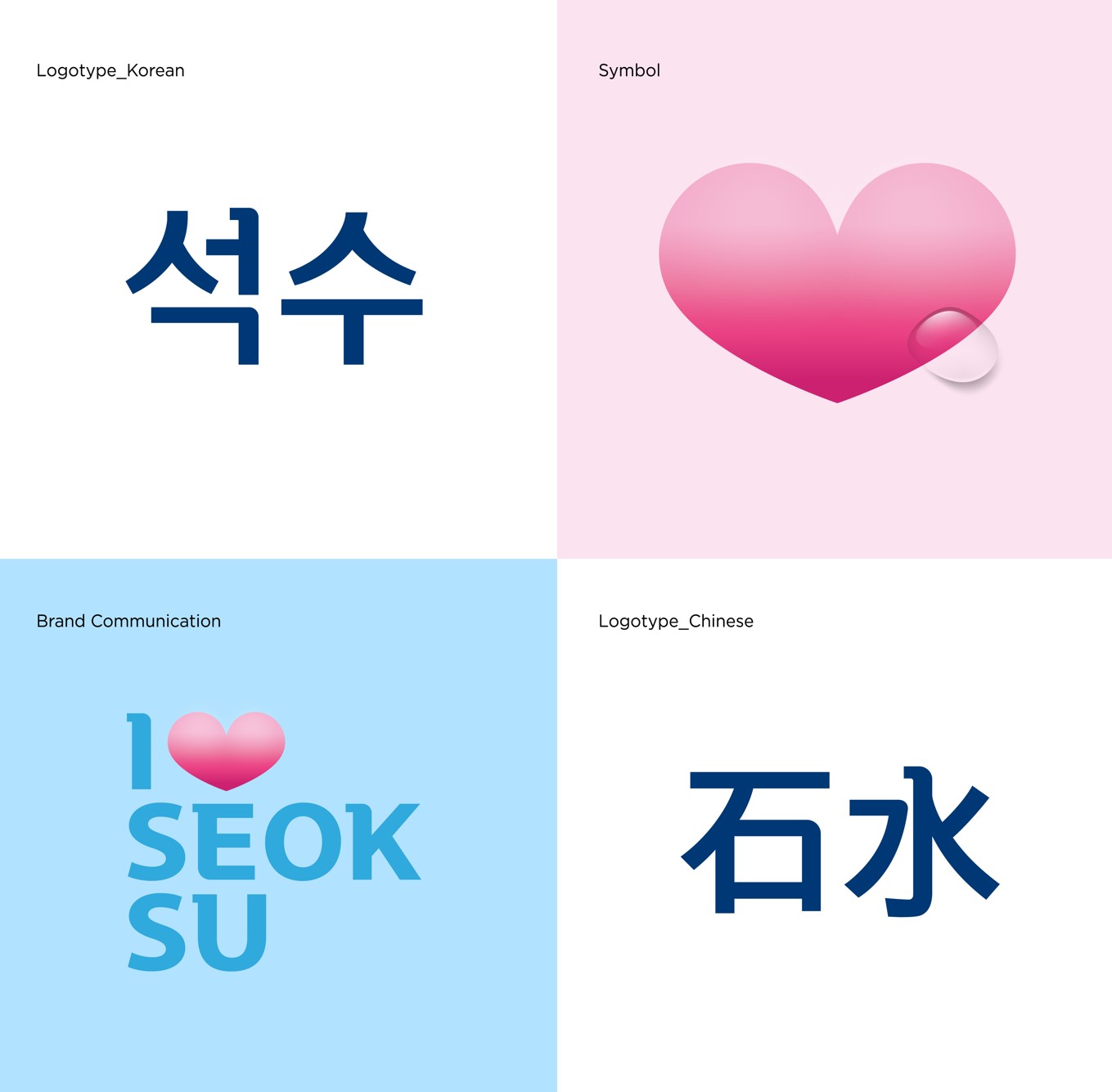
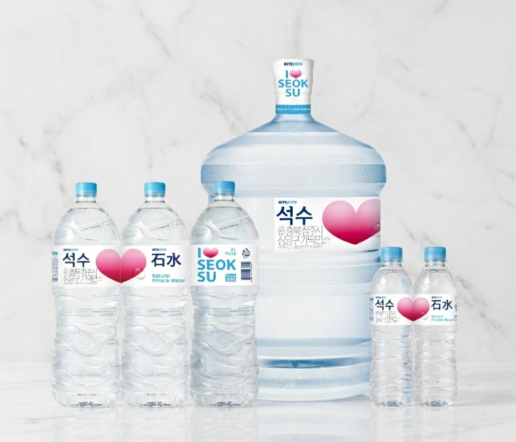
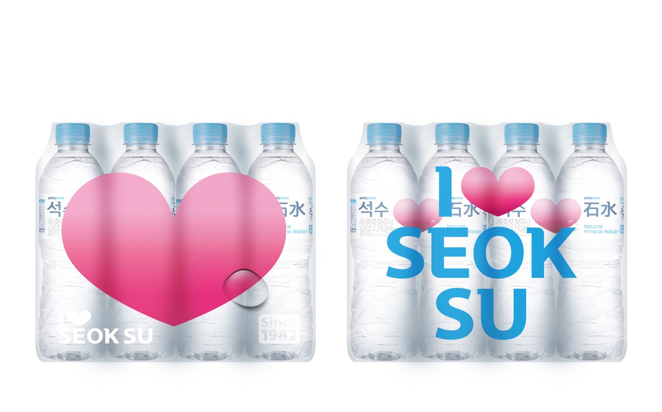

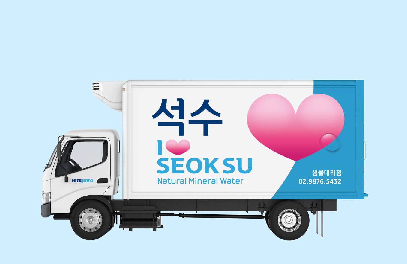
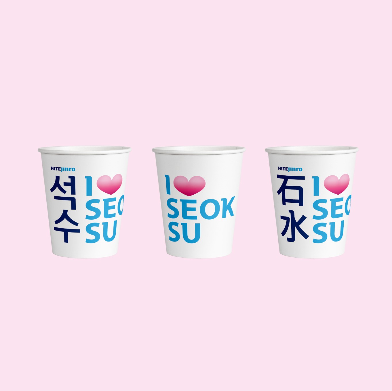
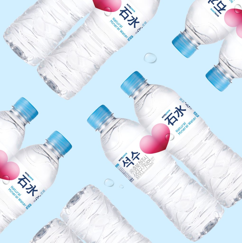
Celebrating the 37th anniversary of the launch of “Seoksu,” the Korea’s first bottled spring water, the brand has been completely renewed. The importance of water to protect the family’s health was set under the concept of <Water of Love>, adding to the emotional feeling by placing the pink heart symbol as the key visual. It also combined the birth year ‘1982’ with the sophisticated Chinese character logo of the existing brand color, blue, to enhance the delivering power of concept message by strengthening the soft image while maintaining the history and legitimacy of “Seoksu.” In addition, visual communication design was developed so that consumers could feel “Seoksu” as a newer and young brand in the consumers’ touch-points, strengthening brand experience at the brand Newness level.
More by IDNB Inc. View profile

 FITZ Super Clear Beer_BI, Package Design

 Samsung Electronics_Global Retail Shop Communication Design

 Mokjang Wooyu (Milk) _ Naming & Package Design

 HONE _ Naming, Bottle, BI, Package Design

 Green Jacket _ Bottle, BI, Label & Package Design

 Scotch Blue – Brand Renewal & Package Design

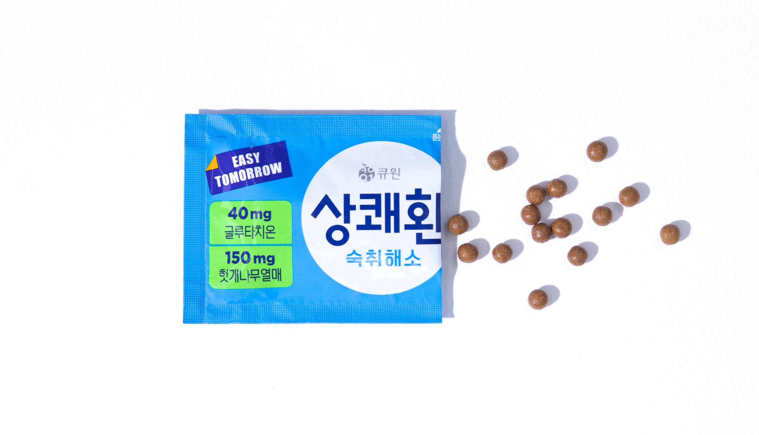 Sangkwaehwan _ Stop Hangover

 homesoolkwan