

















FITZ Super Clear Beer_BI, Package Design


Fitz Super Clear’s <Best Clearness by Super Yeast> has been designed with a new visual. To capture the freshness and coolness of beer, the brand logo is expressed in a fast diagonal line, and the low-case letter i is used to emphasize crunchiness. Through the combination of red and blue against the white background, the color asset construction and visual attention were increased, and White Tiger(‘Baekho’) symbol was developed as the representative beer of Korea and the iceberg was used as the main motif to emphasize the extreme coolness and clearness.
Year 2026
Country Republic of Korea
Region Asia
Project type Commissioned Work
Client LOTTE CHISUNG
More by IDNB Inc. View profile

 Samsung Electronics_Global Retail Shop Communication Design

 Mokjang Wooyu (Milk) _ Naming & Package Design

 HONE _ Naming, Bottle, BI, Package Design

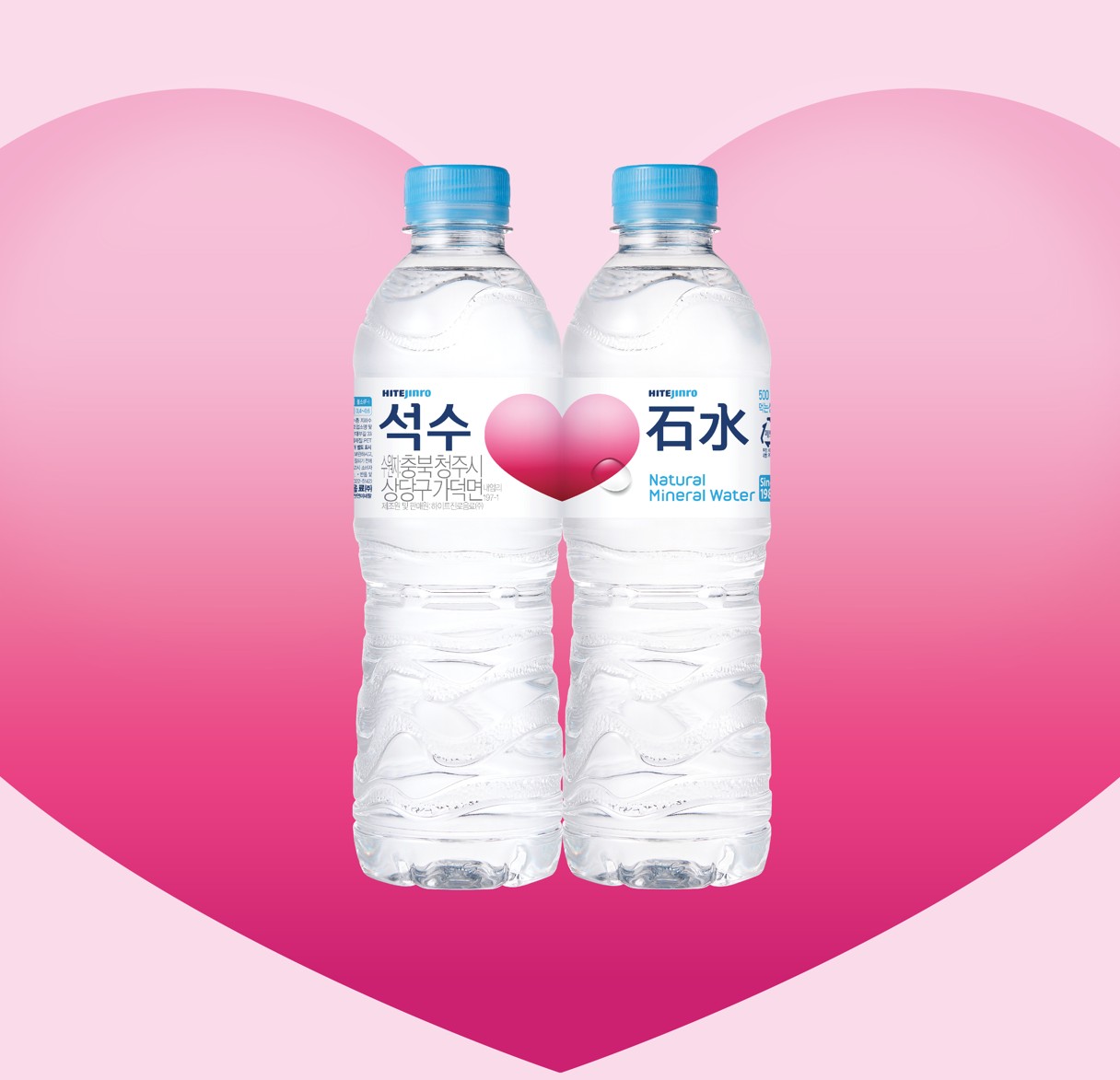 Seoksu _ BI, Label & Package Design

 Green Jacket _ Bottle, BI, Label & Package Design

 Scotch Blue – Brand Renewal & Package Design

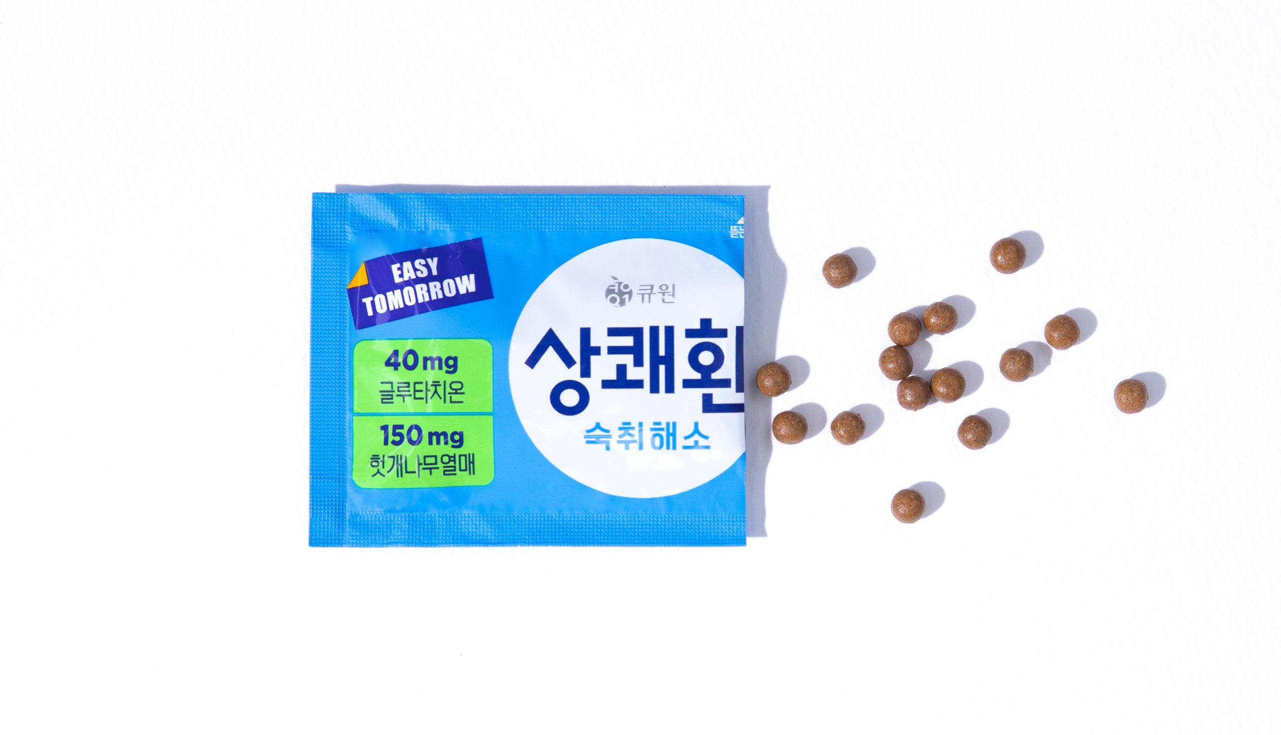 Sangkwaehwan _ Stop Hangover

 homesoolkwan