Chalú


Chalú is the new standard of freshness, authenticity, and origin for apples grown in Cuauhtémoc, Chihuahua — one of Mexico’s most iconic apple regions.
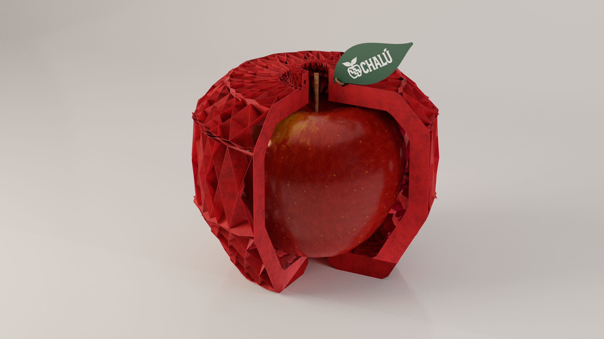
The brand was born from a simple idea: to turn the identity of the land into the identity of the product. The result is a packaging system that celebrates the landscape, the purity of the fruit, and the legacy of Manzanas El Indio, a name deeply rooted in local tradition.
Design Concept Chalú represents purity, strength, and simplicity — exactly how an apple should be. Short, natural, and universally pronounceable, the name carries a soft, positive sound that feels accessible across cultures. The visual identity brings together:
A geometric apple icon inspired by indigenous symbolism and the rhythms of the land.
A bold red illustration capturing the apple valley, its sunrise, trees, and fields.
A packaging system that blends modern simplicity with timeless agricultural storytelling.
A crafted, monochromatic aesthetic that elevates the fruit’s natural power.
Brand Values Chalú is:
Natural
Honest
Powerful
This project is a tribute to the region, the growers, and the people behind every harvest. Proudly Made in Mexico. Proudly Hecho en Prime.
Team:CCO: Charly AriasExecutive Account: Ileana BravoBrand Leader: Julie HouteveltsArt Director: Tony AgüeroArt Director: Samir Gómez3D Artist: Stephanie Peters
ThePrime® — carias@theprimemx.com
2025© All Rights Reserved